
Zoned Color Blocking for Multi-Functional Living Spaces: Design Magic in Action
What if I told you that you can completely transform the way you live without moving a single wall? Whether you’re working with a small studio or an open-plan home, zoned color blocking in multi-functional living spaces can define purpose, create structure, and spark joy. Through the strategic use of geometric colors, minimalism becomes more than clean lines—it becomes emotionally resonant, function-driven, and downright magical.
Understanding the Power of Color Zones in Minimalist Living
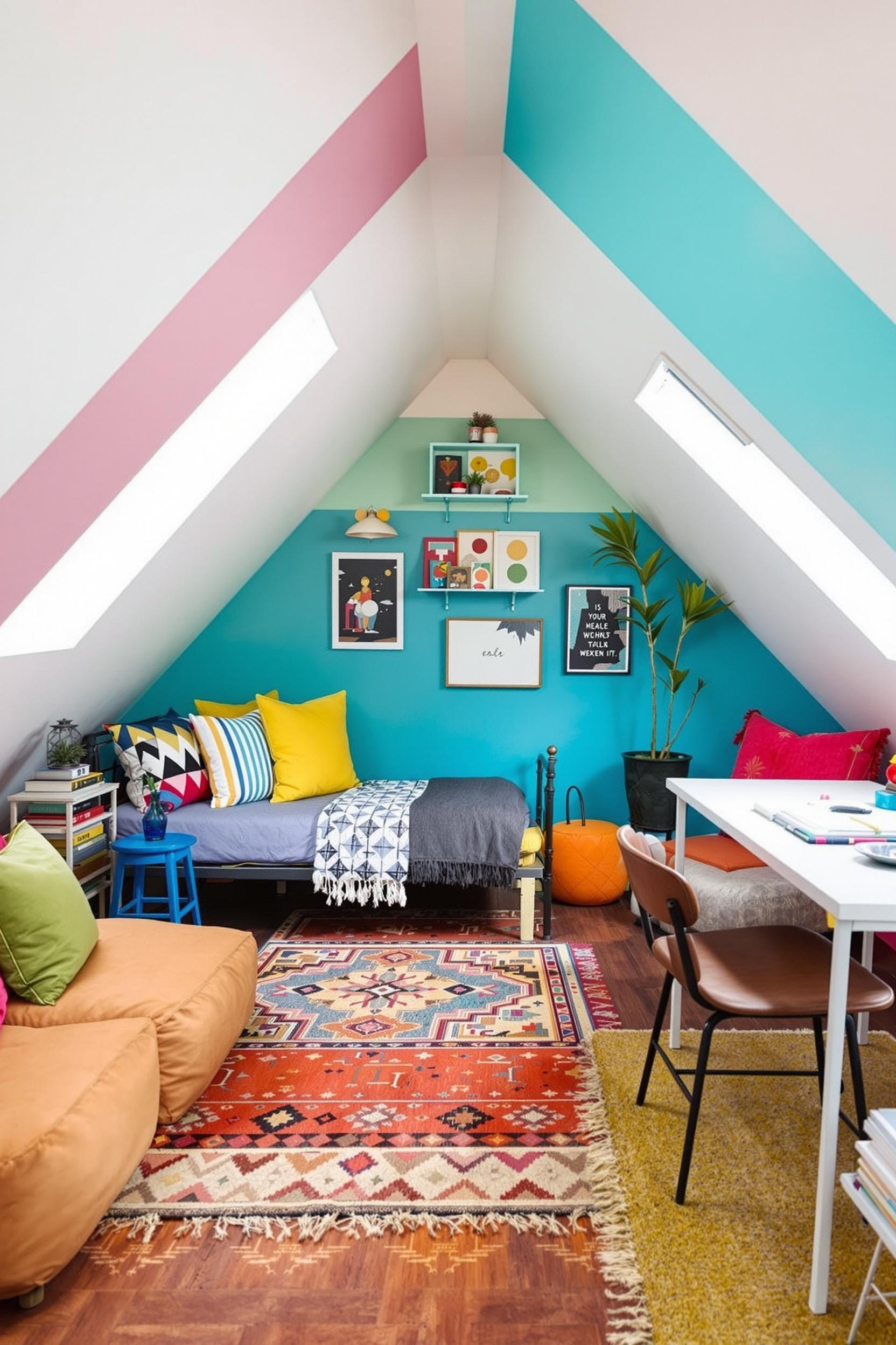
Minimalist color blocking doesn’t mean bland palettes. In fact, it’s quite the opposite. You start with a solid neutral base—about 60% of your space—and then use pops of color to define specific functions. For instance, a zoned color blocking living room may use geometric mustard panels behind a reading nook and calming muted teal to zone an office corner.
According to Homes & Gardens, color zoning taps into spatial psychology. Instead of walls, bold, intentional color decisions divide space and communicate purpose. You can read more of my secrets here where I show how to make small rooms appear larger with color blocking.
Psychological Effects of Color Blocking Design
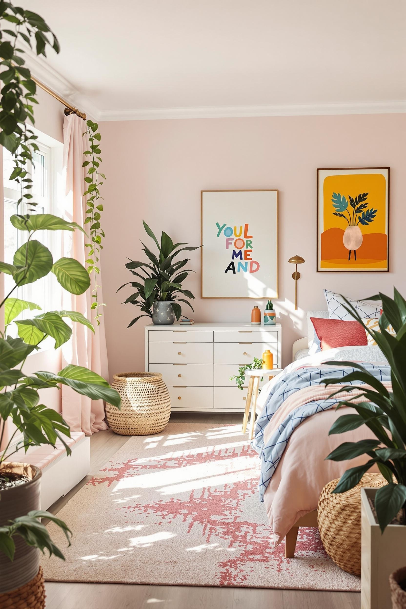
I always consider how different colors make people feel. Blue and sage invite focus—perfect for home offices—while warm earthy tones like terracotta make a space feel cozy. These color choices aren’t accidental. A study in the Livingetc guide on zoning with color supports that even ceilings and floors play a role. Lighter tones expand space. Darker tones ground a room. I implemented this approach in a recent project, where color zoning helped visually expand a compact living room.
Minimalist Color Block Ratios: The 60-30-10 Rule
This is the formula I use for just about every zoned design:
- 60% of the space uses a neutral base (think white, soft greys, or eggshell beige)
- 30% introduces functional zoning colors (sage green for work, blush pink for self-care)
- 10% becomes your visual accent (navy trim, canary yellow accents)
This ratio ensures minimalist color blocking interior techniques stay cohesive and calming. Without this balance, interiors may become noisy or disorganized—exactly what minimalism avoids. I lay out more detail on this in my article, Minimalist Paint Ideas for 2025.
Functional Zones Without Physical Dividers
Creating physical divisions in small apartments or open plans isn’t always practical. That’s why I use visual color boundaries instead. A color-blocked room divider can instantly suggest a transition from a workspace to a chill-out area without blocking light. When space is limited, I recommend color blocking to define multi-functional zones in small spaces using affordable paint and a roll of masking tape.
Small-Space Strategies Using Color Blocking
In tiny homes and apartments, color blocking visually enlarges rooms. I like using lighter hues in recessed areas and grounding colors like walnut or charcoal for floors. This creates perceived depth and makes your home feel balanced. You can explore more strategies for color zoning in small apartments that I’ve used in real-life design cases.
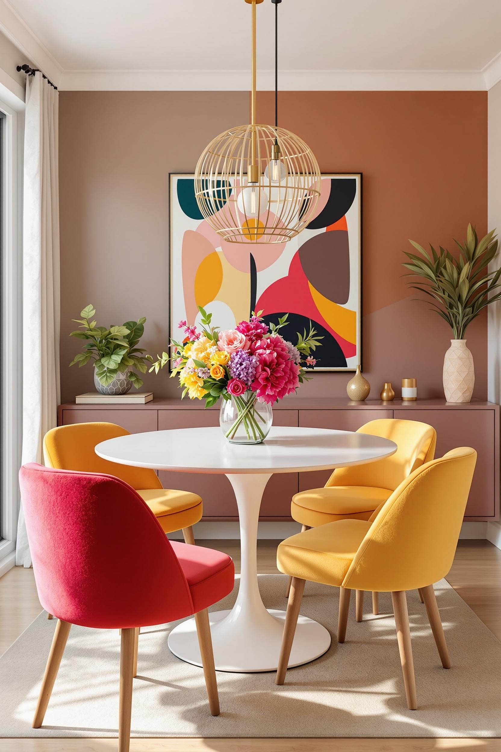
Color Placement Secrets from the Experts
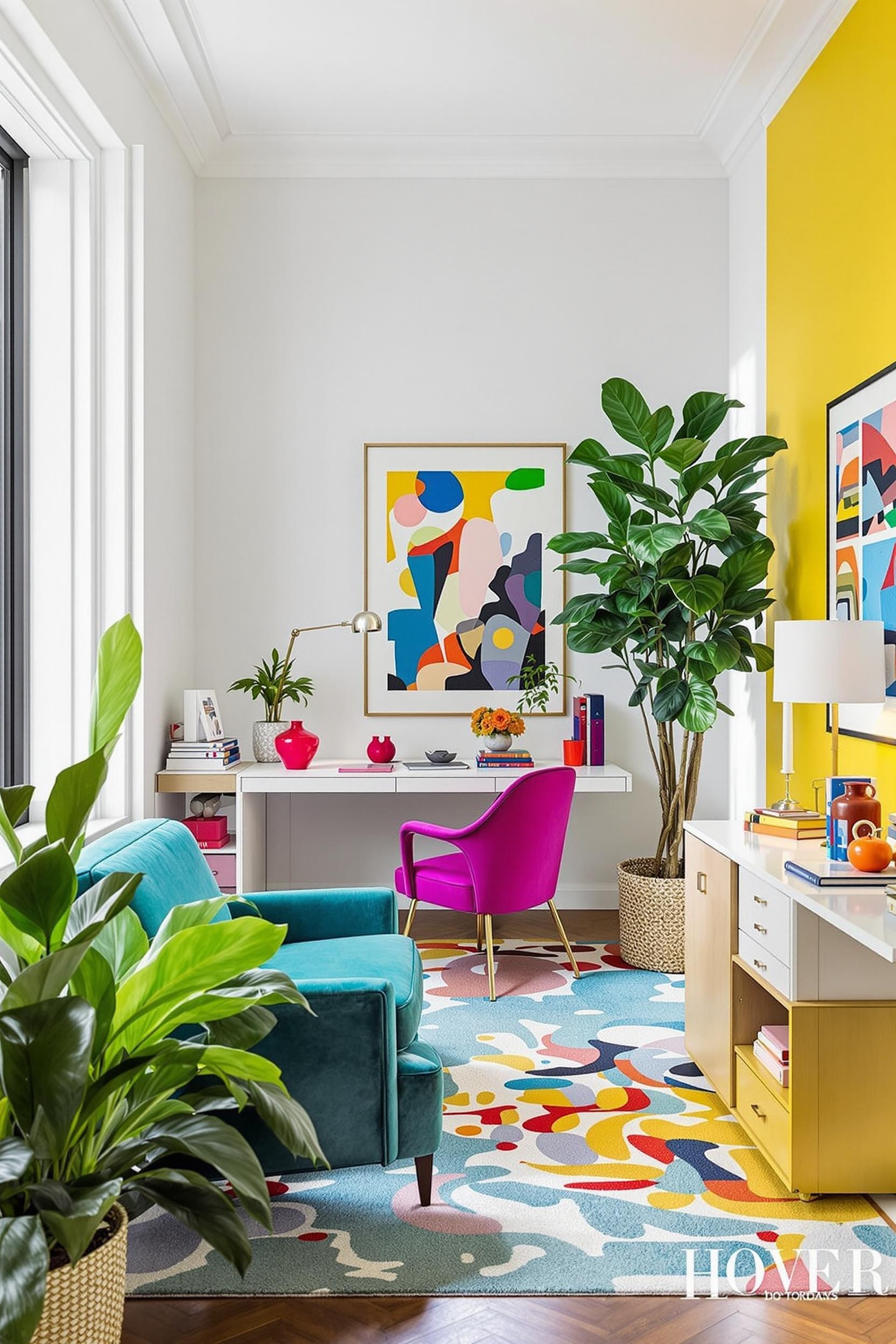
After years of working with clients on modern minimalist interiors, I’ve noticed preferences for darker baseboards and lighter upper wall zones. It gives a grounded feel. When zoning spaces with color, I always start with mood and purpose:
- Focus areas: muted darker blues or deep greens
- Relaxation zones: soft corals, pastels, or warm ivory
- Social areas: spicy hues like amber, rust, or sunny yellows
Want more ideas? Check out my zoned design on the Color Zoning Bedroom Design guide.
Color Zoning Tools You Already Own
You don’t need fancy tools. A simple roller, good quality tape, and some patience go a long way. I suggest reading my DIY color blocking post for bold design to get started. Add softness and movement using curtains or area rugs to reinforce zones—a trick I use to make space feel layered and curated even in the most minimalist layouts.
From Studio Life to Penthouse Style: Zoned Color Blocking Works Everywhere
Whether I’m working on a downtown studio or a penthouse, color blocking adjusts to different scales beautifully. For example, the Color Blocking Magic for Penthouse Design strategy blends modern and classic styles by mixing deep charcoal with dusky lavenders—perfect for elegant city living.
Transform Your Space: Unlock Color Zoning Design Potential Now
In the world of interior design, knowledge is power, and action is transformation. As we’ve explored the art of color zoning, it’s time to apply your insight.
Master Your Space: Free Color Zoning Design Guide Awaits
Imagine having a design toolkit made just for you. I’ve created a detailed Color Zoning Guide for geometric color blocking and spatial strategy.
- Color psychology maps for every room
- Color ratio calculations
- Custom palettes for minimalist styles
- Specific tactics for studios, open plans, or small spaces
Personalized Color Zoning Consultation
I offer one-on-one color zoning consultations. This includes:
- Functional space assessments
- Custom design plans
- Implementation walkthroughs
Join the Color Zoning Design Community
Want monthly design inspiration, trends, and access to user case studies? Subscribe now.
Unlock Your Design Potential Now
Color Zoning FAQs: Your Minimalist Design Questions Answered
Q1: How can I effectively use color blocking in a small open-plan living room?
Use a neutral base, then add block colors to define spaces. Try sage for the workspace, terracotta for relaxation, and accent hues that coordinate within the same palette.
Q2: What are the best color combinations for minimalist color blocking in multi-functional spaces?
Stick with grounded combos: navy with warm whites, blush with taupe, or sage with muted clay. Use my signature 60-30-10 balance to maintain harmony.
Q3: Can color zoning really help make a tiny apartment feel more spacious?
It can! Light colors in corners, darker zones on the floor, and smart accents create powerful illusions of separation and space.
Q4: How do I choose the right colors for different functional zones in my home?
Think: cool tones for focus, warm tones for lounging, bright tones for social energy. Let the room’s purpose guide your colors.
Q5: Is color zoning expensive to implement in a minimalist design?
Not at all. With some painter’s tape and thoughtful strategy, you can dramatically improve your layout on a modest budget.
Ready to Redefine Your Living Space?
Zoned color blocking is more than paint. It’s a powerful design tool that supports the way you live, work, and recharge. Your home deserves to reflect your lifestyle—with purpose in every color choice.
Want the fastest way to start? Sign up below.
Subscribe now and join other design lovers exploring zoned color blocking living room strategies, multi-functional space color zone solutions, and minimalist decor transformations like never before.


