
Zoned Color Blocking Tips for Home Office Design: Maximize Productivity with Minimalist Appeal
Ever walk into your home office and feel stuck or scattered? I’ve been there. As both a design enthusiast and interior designer, I’ve learned that unlocking productivity doesn’t start with fancy tech—it starts with color. Specifically, zoned color blocking for the home office. These strategic design choices go far beyond aesthetics and tap into color psychology, helping you define functional zones that elevate your focus, mood, and creativity all at once.
Using minimalist color block office design ideas, I’ve helped clients transform blank walls into bold tools for productivity. Want in? Let’s begin by breaking down how you can use savvy color zoning to optimize your own workspace—whether it’s a studio nook or an entire room.
Unlock Your Productivity: Color Zoning Magic for Your Home Office Design
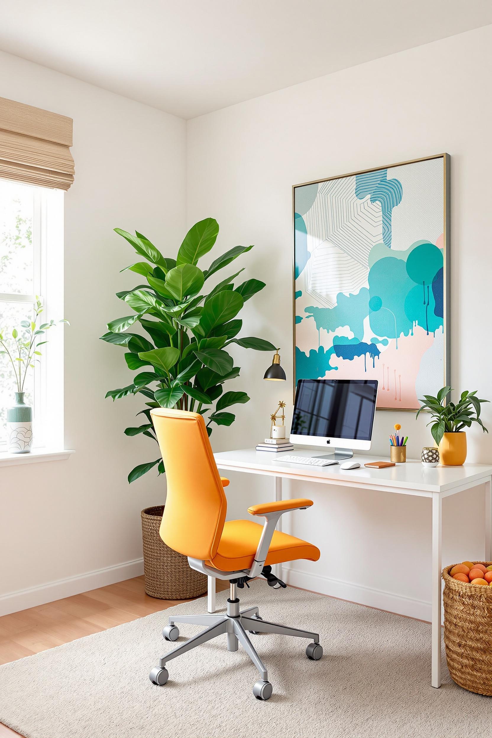
Color blocking isn’t just a design trend—it’s a productivity tool. It sets visual boundaries that train your brain to shift between tasks and enter different mindsets. Especially for remote workers, where space can blur between personal and professional, a minimalist color blocking office design can be a game-changer.
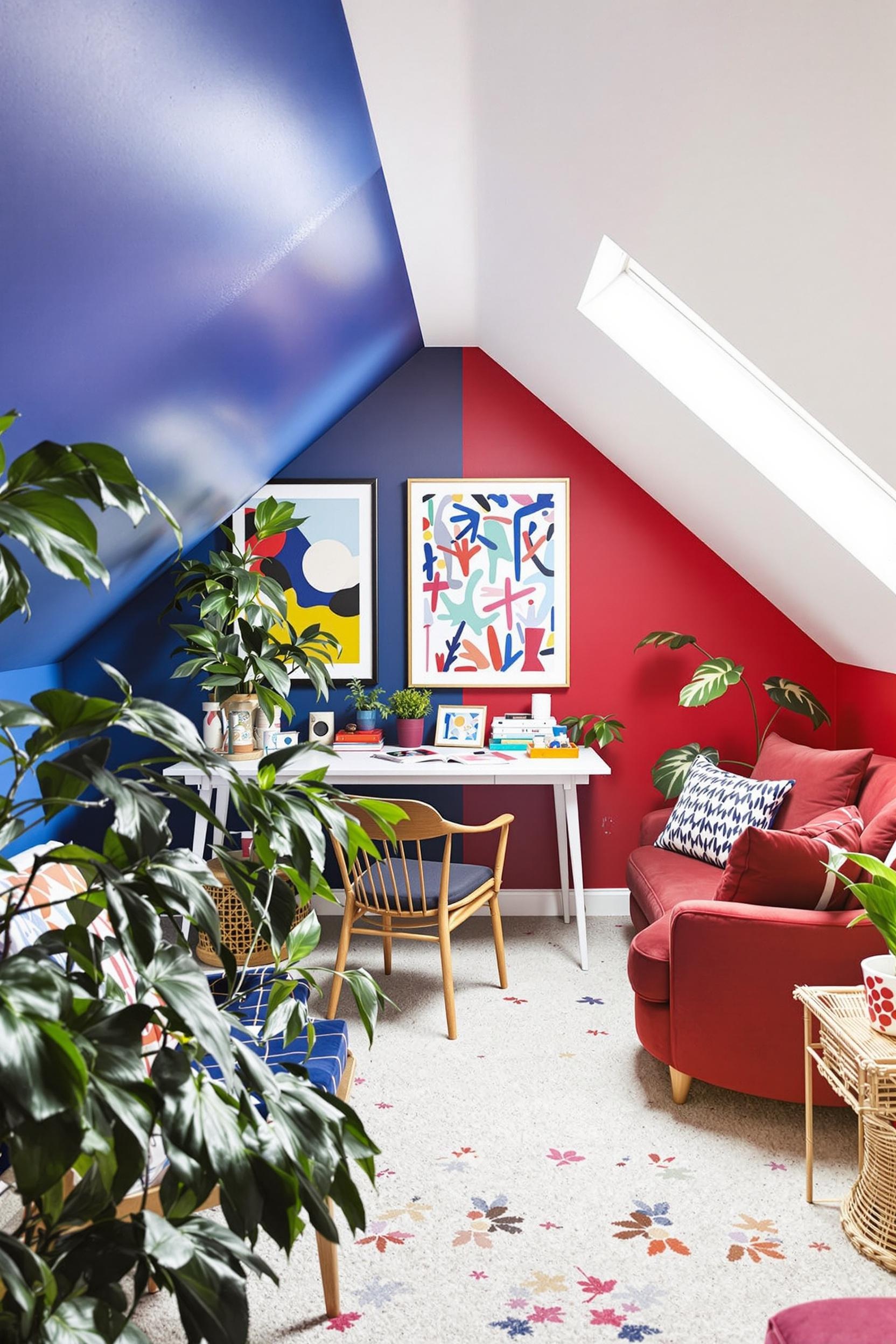
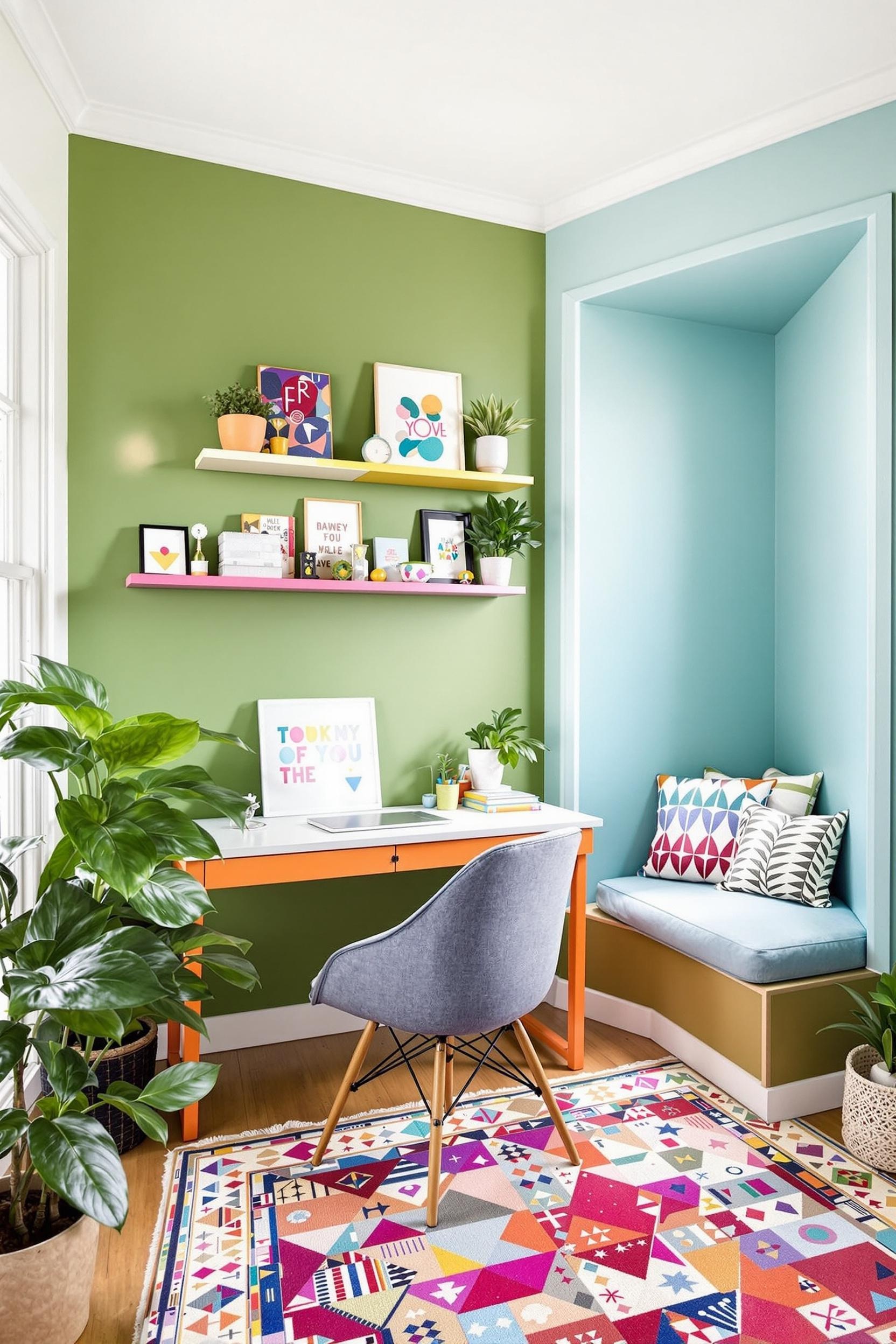
Strategic use of geometric color blocking not only creates eye-catching interiors but also defines zones like “focus mode” or “creative brainstorming” without building walls. That’s the power of using color blocking for small office spaces.
Why It Works
- Blue and green color zones have a calming effect, ideal for focused work.
- Coral and yellow zones stimulate creativity and energy.
- The three-color rule (60% dominant, 30% secondary, 10% accent) ensures balance.
Strategic Color Zones: Defining Workspace Functionality with Minimalist Design
When I design home offices, function always comes first. That’s where color zoning strategies come into play. Color zoning maps visual cues to specific cognitive states—basically training your brain to respond to your surroundings.
Let’s say you’re building a workstation within your living room or bedroom. You don’t need to wall it off. Instead, use bold contrast zones to visually tell your brain, “This is work mode.” Popular minimalist workspace combinations include:
- Navy blue for deep-focus zones
- Coral accents for brainstorming spots
- Soft gray for administrative work
Still unsure how this plays out in real spaces? I recommend visiting this post where I break down room zoning using minimalist furniture and contrast.
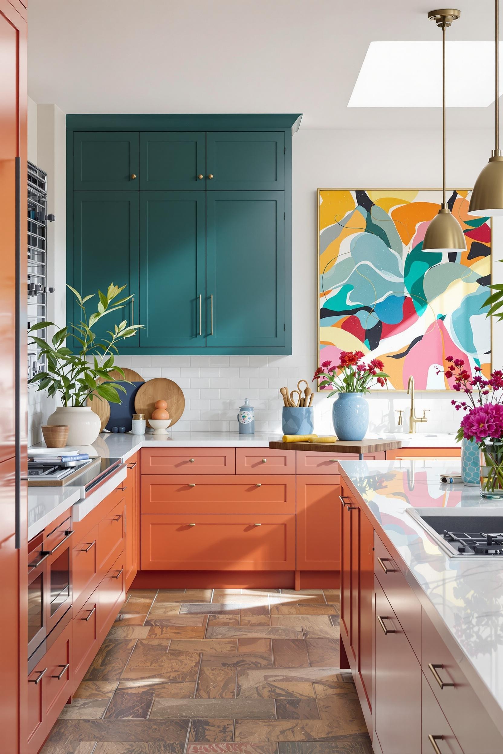
Geometric Color Blocking: Give Your Office Modern Minimalist Edge
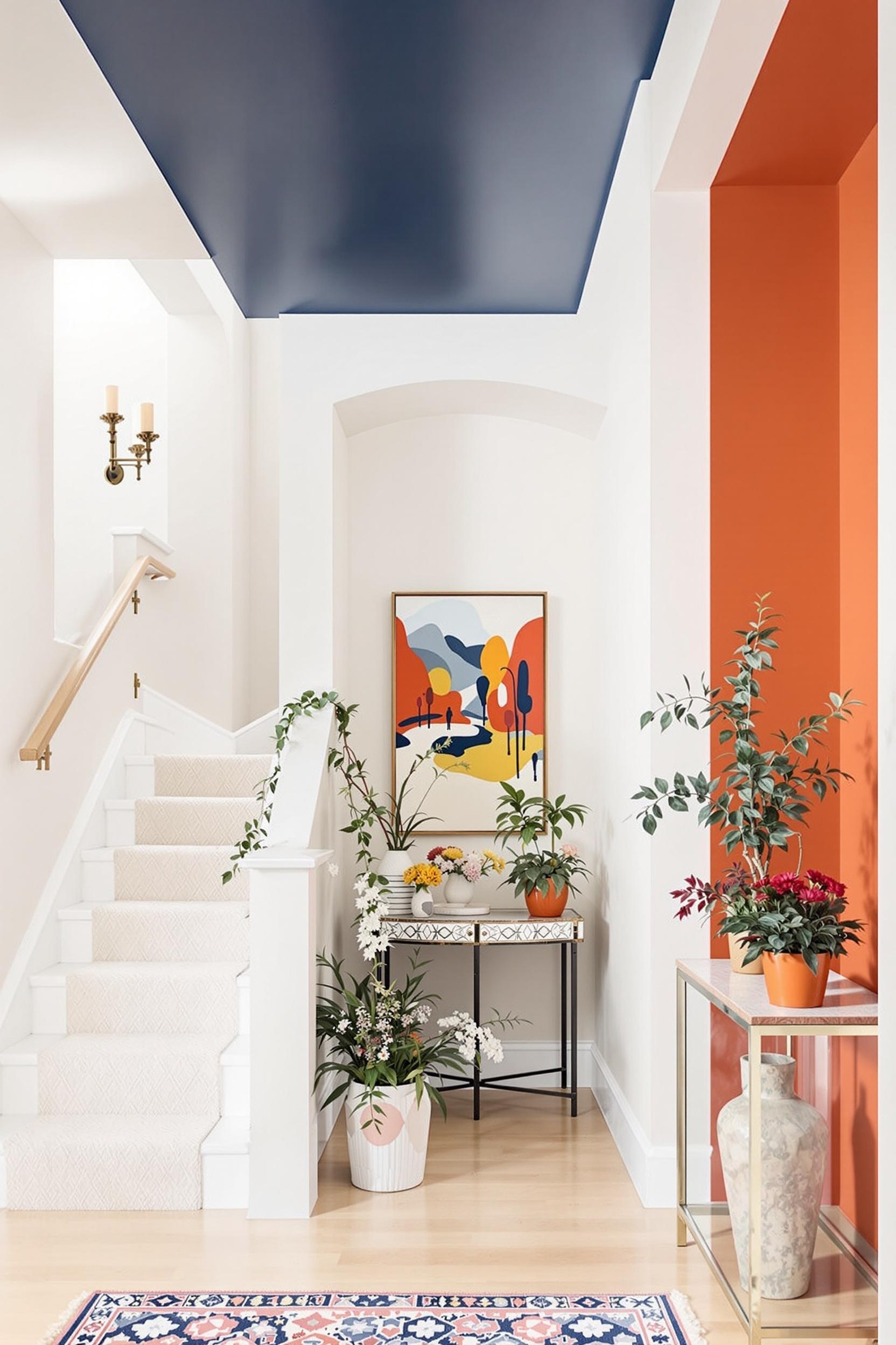
If you’re into modern clean lines, you’ll love geometric color zones. These sharp contrasts offer more than just visual interest. They give your space direction. Think of angles and diagonals in a warm terracotta or cool slate blue. This isn’t just design—it’s productivity architecture.
For example, a section of coral on your main wall signals it’s time to think big. While a surrounding neutral softens your gaze for rest and reset. Whenever I use modern color block wall ideas, my main goal is to let the space guide the person—not the other way around.
Lighting and Texture: Elevating Color Blocking Design Strategies
Color blocking zones come to life through lighting and texture. Just painting a wall isn’t enough—your lighting should work precisely with your color scheme. For instance, I’ve seen deep navy concentration corners become serene cocoons with soft daylight filtering in. Meanwhile, a bold red under spotlight intensifies creativity.
Layered lighting lets you adapt environments to the task at hand. Try complementing your zones with:
- Wall washers or LED strips around color zones
- Matte walls for calm vs. glossy accents for stimulation
- Textured acoustic panels in matching hues
This strategy adds a sensory dimension. I often draw on ideas from this design post to integrate textural elements where the paint stops. It’s not just what you see—it’s what you feel.
Revolutionize Your Workspace: Color Zoning Mastery Starts Now!
Your workspace is more than a desk. It’s a reflection of your ambition. By applying strategic color zoning for productivity in home offices, you don’t just design—you optimize. Inspired by research and personal experience, I’ve developed a 7-day plan to help you own your workspace transformation.
Day-by-Day Color Zoning Challenge
Day 1-2: Workspace Assessment
- Take photos of your current work setup
- Identify what each area is used for
- Note any color or lighting challenges
Day 3-4: Color Psychology Research
- Study colors linked to productivity (like this guide)
- Pick a palette using the 60/30/10 rule
- Choose 1-2 bold hues and anchor with a neutral
Day 5-6: Color Implementation
- Paint your zones or use peel-and-stick panels
- Highlight borders with trim or lighting
- Match textures (rough neutrals vs. sleek accent hues)
Day 7: Space Optimization
- Rearrange furniture to complement each zone
- Adjust lighting to work with colors
- Take “after” photos to track your design progress
Color blocking can transform even the smallest work corners into productive, inspiring spaces. Ready to begin? Unlock Your Color Zoning Secrets Now!
Color Zoning Home Office Design: Frequently Asked Questions
FAQ: Color Blocking for Home Office Productivity
Q1: How does color blocking impact home office productivity?
Color blocking sets visual signals for your brain. Specific color zones prompt focus, creativity, or calm. According to research shared here, a calming blue can boost concentration, while coral inspires creativity. It’s workspace programming through color.
Q2: What are the best color combinations for minimalist home office color blocking?
Minimalist combinations thrive when you keep it simple. My favorite pairings:
- Deep navy with light grey for clarity
- Soft mint or sage green with a neutral white
- Warm coral accents paired with cool gray zones
Q3: Can color zoning work in small home office spaces?
Absolutely. Especially when combined with geometric color blocking minimalist interiors. Sharp paint lines or split-color walls can separate your tasks visually, even in compact corners. This post has more tips on using color to expand perceived space.
Q4: How do lighting and texture enhance color zoning in home offices?
Light and texture activate your zones. Smooth areas with reflective finishes feel brighter and more alert. Rough or matte sections feel grounded. Learn more about this sensory layering approach here.
Q5: How often should I update my home office color zoning design?
I recommend reassessing your zones every 12–18 months. Your work changes, and so should your space. Keep tracking how your color layout supports your goals. Add a new accent color if your focus shifts, or re-adjust lighting to match seasonal changes.
Still curious? Don’t miss out on new insights and exclusive minimalist design strategies. Subscribe now and receive a free quick-start color zoning guide!
Your home office is more than a room—it’s your professional command center. Through strategic color blocking and minimalist design, you’re not only decorating but designing for success.
**Transform your focus zones. Boost creativity. Redefine how you work.**


