
Zoned Paint Techniques: Color Zoning Your Way to a Beautiful, Functional Minimalist Home
Have you ever walked into a room and felt confused about what it’s supposed to be? That’s often what happens in open-plan or multifunctional spaces. Rooms can blur together, making your home feel less purposeful and more chaotic. That’s where zoned paint techniques come in. These color-blocking strategies use paint—not walls—to define each area’s purpose.
As an interior designer, I turn to zoned paint techniques when I want to define spaces without splitting them up physically. It’s a smart solution, especially for studio apartments, open-plan living rooms, and small homes. I’ll walk you through how this method works, the psychology behind it, and how to apply it to your home. Let’s explore how to make open spaces work smarter, not harder—and more beautifully, too!
The Power of Zoned Paint Techniques in Interior Design
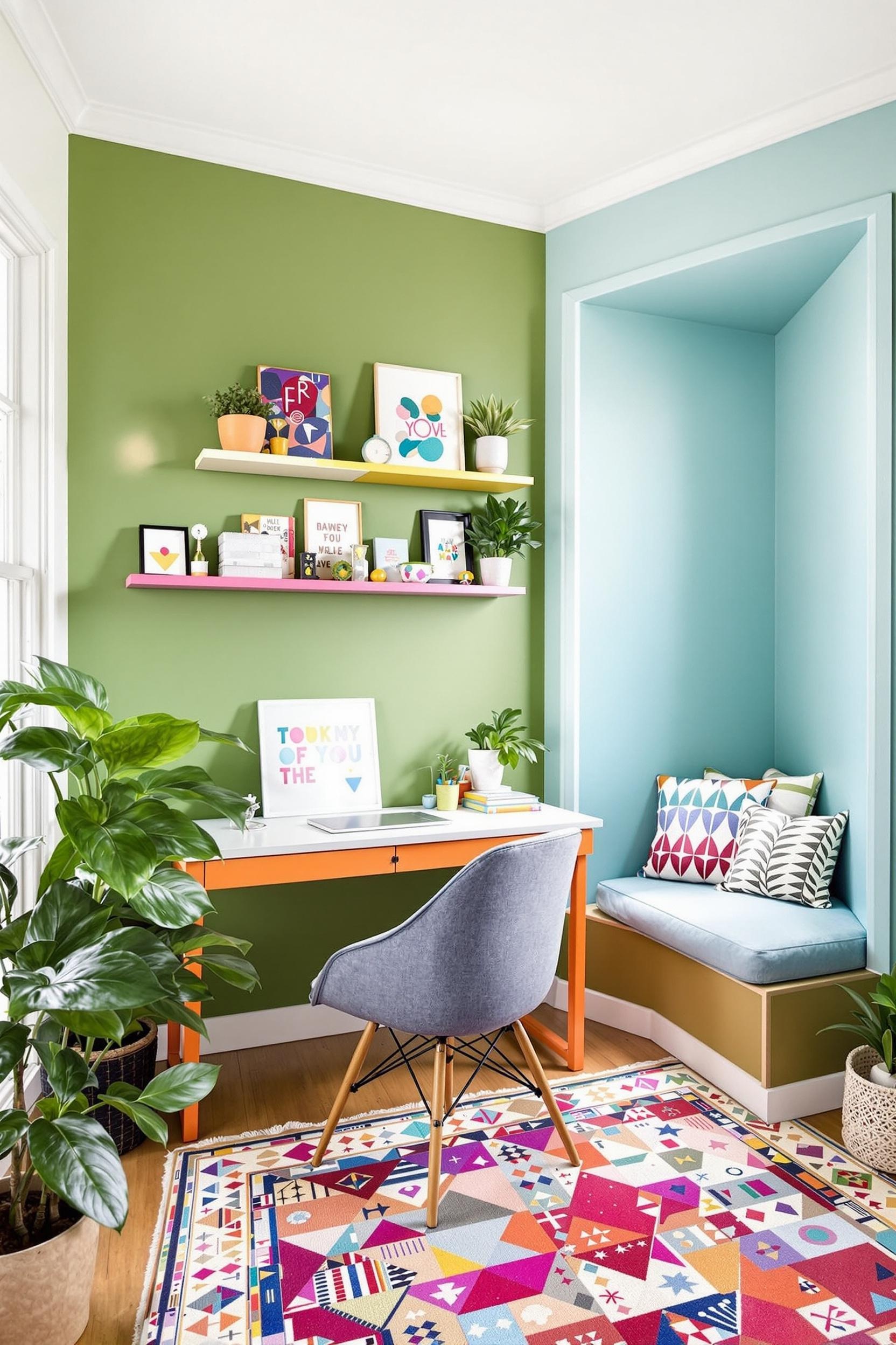
Zoned paint techniques, also called paint zoning, use strategic paint placement to divide a single room into functional zones. Imagine using a slate gray vertical block to define where your home office ends and the cozy reading corner begins. These blocks don’t just stand out—they guide how we move and behave within the space.
One of my favorite tools in minimalist interiors is color zoning. There’s no clutter, no bulky dividers—just clean lines and targeted paint colors that do all the work. This method helps organize visual flow and improves how we use a space.
Color blocking your walls also has a profound psychological effect. Research shows that color boundaries help our brains perceive space more clearly, reducing confusion in open-concept layouts by up to 21%.
Color Psychology Meets Intelligent Space Planning
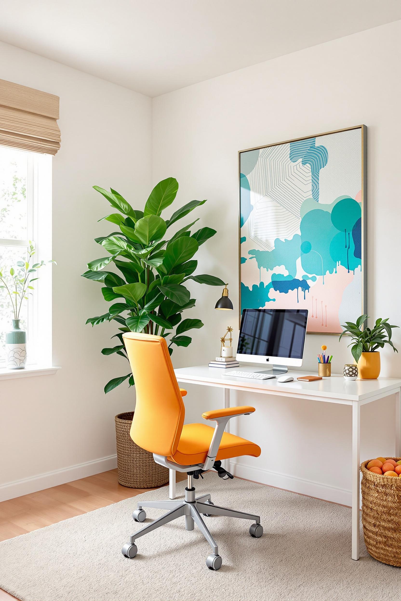
Let’s talk about the mood magic behind those bold color blocks. Different hues stimulate different emotions and reactions. If you need to focus, create a deep blue or soft sage green zone—perfect for a home office. Want to energize a gathering space? Go for vibrant yellow or spicy terracotta, which spark sociability and warmth.
Environmental psychology backs this up. A study published by Livingetc shows that strong contrast colors help us instinctively know which part of a room serves what purpose. This results in smoother transitions and better use of space.
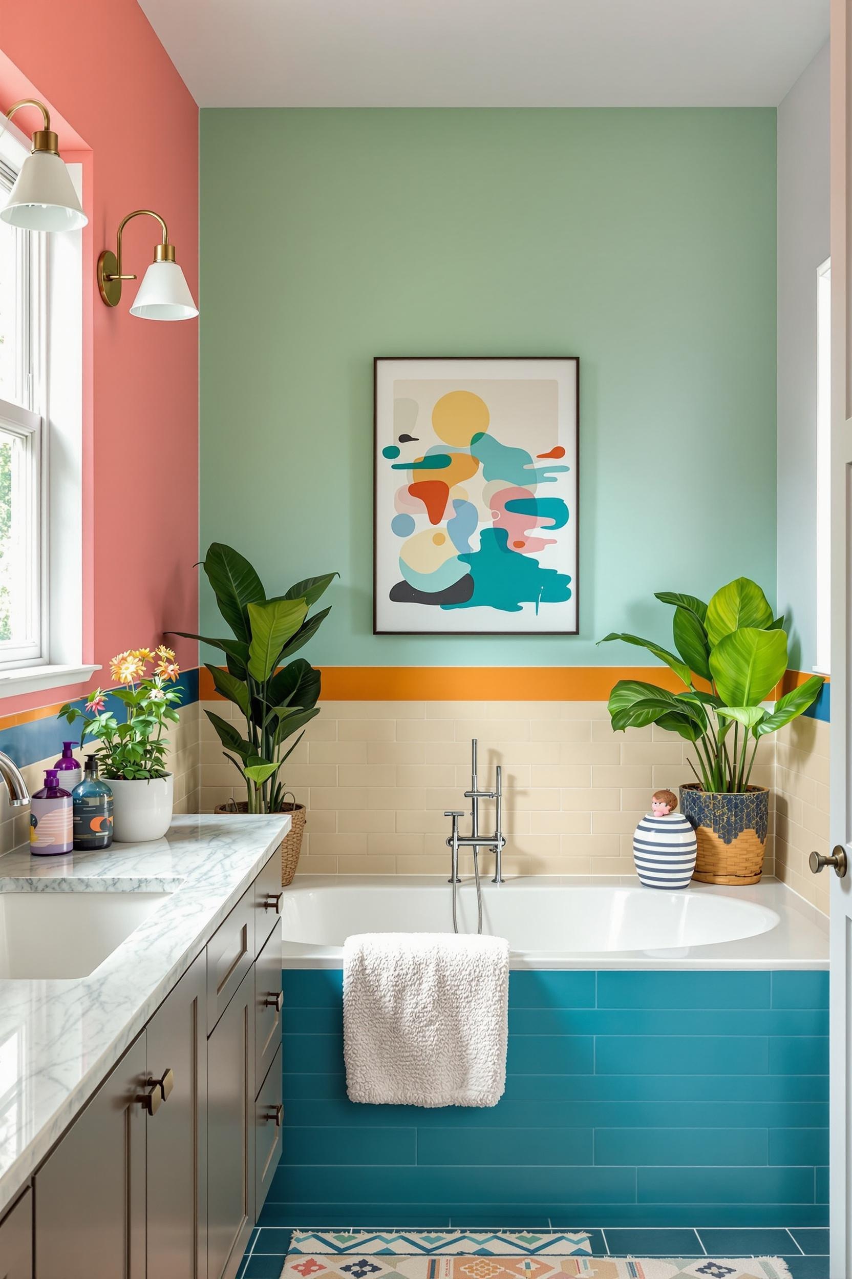
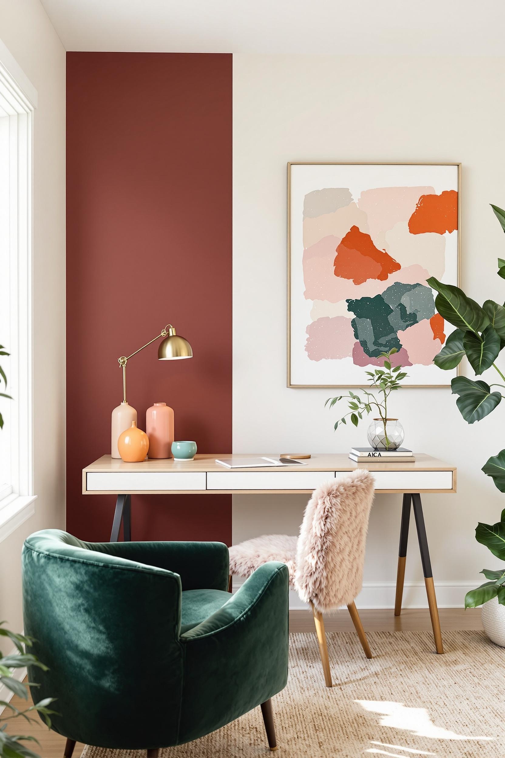
In homes I’ve designed, I often blend high-contrast hues with more neutral tones to emphasize boundaries while maintaining balance. Think warm beige wrapping around the entryway and a deep plum rectangle behind a yoga mat in a meditation zone. Zones stay clear, but the entire space still flows together.
Functional Paint Zoning: Examples That Work
Here are a few of my favorite functional color zoning combinations, based on real client homes and feedback:
- Blue or green: Great for desks and reading nooks to foster calmness and focus
- Warm tones like orange or yellow: Adds vibrant energy to kitchen or dining spaces
- Pastels or muted hues: Perfect for gentle separation while maintaining minimalism
In one urban studio project, I used soft blush pink to frame the sleeping nook and cool ash gray to define the living area. These tones didn’t conflict—they enhanced comfort and clarity, aligning with minimalist values. Find more smart combinations over at Color Blocking Paint Ideas for 2025.
Geometric Color Zoning: Form That Follows Function
Zoned paint techniques work best when geometry takes the lead. Vertical blocks stretch the eye upward, making ceilings feel higher. Horizontal bands expand a space visually. Want a defined reading space? Wrap a cozy corner in a rectangle of color, like I recommended in this guide that explores how to define space with color.
Precision is key here. Straight edges, consistent undertones, and visual flow make everything feel polished. You don’t need elaborate patterns. Minimalist paint zoning thrives on simple, bold shapes and well-chosen color combinations.
Want to go a step further? Introduce textured materials within zones—like concrete finishes, soft textiles, or thin wooden panels—to heighten the effect without visual clutter.
Creative Places to Use Paint Zoning
Wondering where to start in your own home? Here are some great areas to implement zoned paint techniques:
- Living rooms: Define conversation areas and media walls
- Home offices: Mark out mental space for work
- Nurseries: Gentle pastels can define sleeping and play zones
- Bedrooms: Create headboard backdrops with paint
Color Zoning for Small Spaces and Open Plans
In small homes, paint zoning isn’t just helpful—it’s essential. According to Color Blocking Secrets for Small Rooms, clearly defined color blocks boost spatial functionality by 30%. That’s huge in tiny lofts or compact multi-use rooms.
Use zoning to turn your one-room apartment into a full-service home: blue-green on the wall behind your desk to cue “workspace,” and warm taupe in the living area to cue “relaxation.” This technique is easy, low-cost, and renter-friendly too. Don’t forget to test colors under different light conditions!
Minimalist Paint Zoning: Keep It Cohesive
Minimalist aesthetics depend on cohesion. That means consistent undertones and restrained palettes. Mix high-contrast colors with care. A bold zone works great when balanced by subtle tones throughout the rest of the room.
You’ll see this idea beautifully illustrated at Color Zoning: Transform Your Open Plan Living Space. Consistency is what ties everything together, even when colors change.
Transform Your Space: Unlock Color Zoning Mastery Now
As an interior design expert, I’m excited to offer you an exclusive opportunity to elevate your home using zoned paint techniques. This approach isn’t a trend—it’s a smart, stylish method that turns confusing layouts into productive, beautiful spaces.
Your Personal Color Zoning Design Toolkit Awaits
My specialized design toolkit includes:
1. Color Psychology Guides
Get expert insights into how specific colors can increase focus, calm, or creativity in your home zones.
2. Zoning Technique Masterclass
Learn how to color block like a pro. I’ll teach you geometric methods to define spaces without clutter.
Don’t let your space stay undefined. Design it with purpose and beauty.
Unlock Your Color Zoning Secrets Now!
Why Professional Guidance Matters
Color zoning is an advanced design tool. Get expert strategies to:
- Avoid expensive paint mistakes
- Use color psychology effectively
- Make your space both functional and beautiful
Sign up below to receive:
- Monthly design tips
- Exclusive tutorials
- First access to new guides
Join the Color Zoning Revolution!
Color Zoning Techniques: Frequently Asked Questions (FAQs)
1. What are zoned paint techniques in minimalist interior design?
They use paint to define areas inside a room. Color blocks replace walls. This makes a space feel more open and organized.
2. How can zoning make a small room feel bigger?
Vertical blocks draw eyes upward. Horizontal strips can stretch the space visually. Light colors feel airy and spacious.
3. What psychological benefits does color blocking offer?
Colors affect our minds. Blue encourages focus, terracotta makes us feel social, and green helps us relax. These zones change how we feel in each part of a room.
4. Can I use color zoning in an open floor plan?
Yes! Use paint to define a dining area, living zone, or workspace. You don’t need walls. Just color and smart layout decisions.
5. How do I choose the right colors for zoning?
Stick with similar undertones. Mix bold and soft colors. Always consider how light will affect them. Choose colors that match the activity in that space.
These tips will help you get started with paint zoning confidently. Be bold, yet strategic.


