
Zoned Color Schemes: Transform Your Minimalist Space with Strategic Color Blocking
Are you looking to transform your home without building walls or rearranging furniture? Let me show you how zoned color schemes in interior design can do just that. By using color blocking techniques and strategic color placement, I’ve helped countless homeowners turn their minimalist dreams into reality. Whether you’re living in a studio apartment, open-concept loft, or a small home, color zoning minimalist decor can revolutionize your space.
Color blocking home ideas rely on using 2–3 bold, harmonious shades to define functional zones. Think of colors not just as decoration, but as visual dividers that breathe structure into any space. According to color psychology studies, this design method isn’t just visually appealing — it also helps increase focus, boosts mood, and organizes your home in ways traditional layouts can’t.
Unlocking the Magic of Zoned Color Schemes: Smart Design for Real Living
Have you ever walked into a room and didn’t know where to sit or relax? That confusion often comes from lack of visual structure — something a well-planned color-blocked minimalist room eliminates immediately. With the right color placement, your home can feel more spacious, cohesive, and purposeful.
I’ve used zoned color schemes for minimalist interiors in small living rooms, sprawling lofts, and busy kitchens alike. Want to define a dining area in an open floor plan? Use a darker shade like navy in that section, then paint the adjoining workspace in a soft green. This themed contrast visually shows where one zone ends, and the next begins.
Mastering Minimalist Color Blocking Techniques
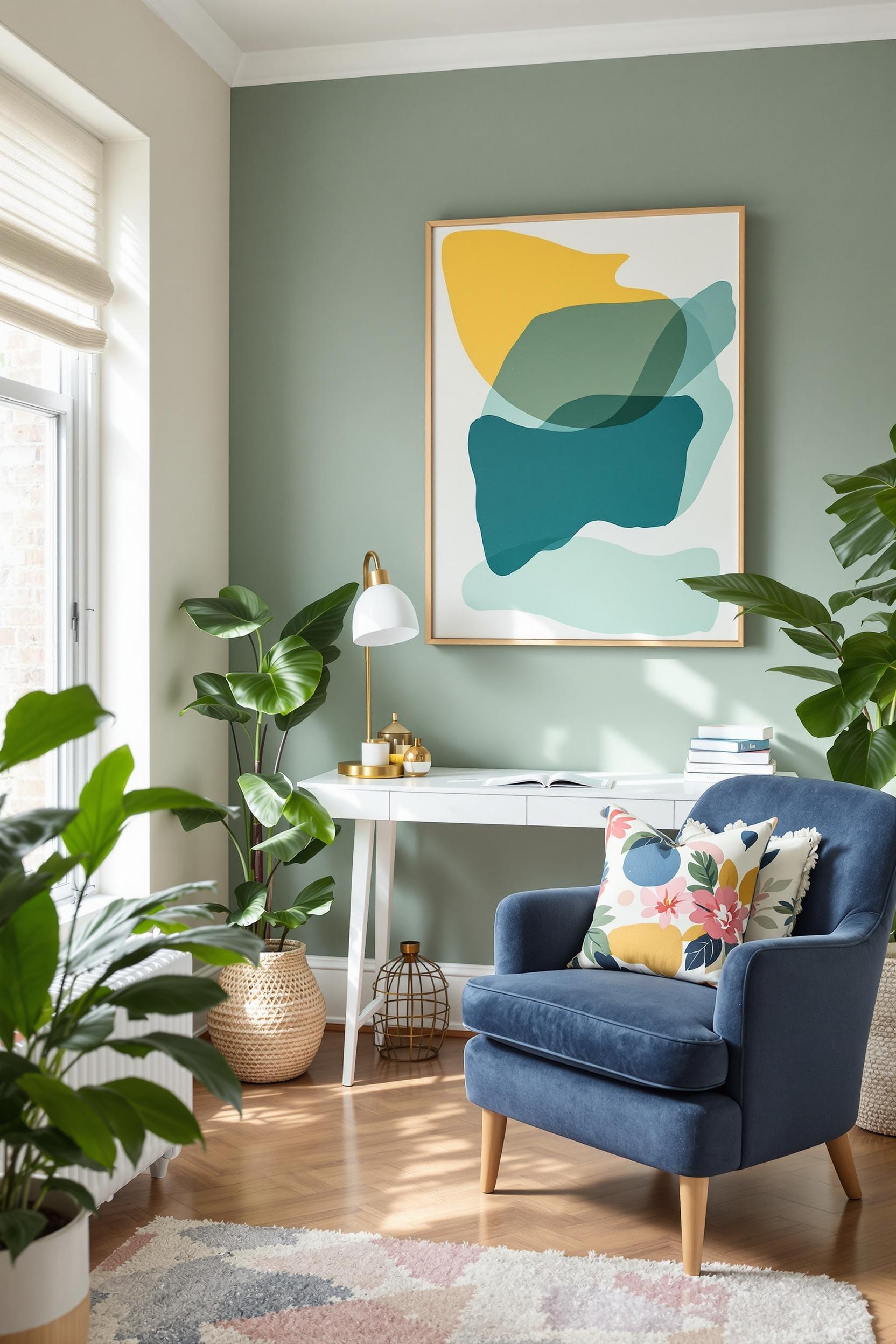
When working with color zoning techniques, I always start with restraint. A minimalist color block living room should avoid using more than three distinct hues. I choose modern zoned color palettes that combine warm/neutral bases with mindful splashes of color.
Here are a few of my go-to combinations:
- Soft gray base with sage green and navy blue accents
- Neutral white paired with terracotta and deep teal
- Warm taupe matched with muted blue and mustard
These options allow for split complementary color blocking and support visual harmony. Neutral tones serve as the foundation, giving rooms a sense of expansiveness, while deeper shades anchor specific functions like lounging or dining.
Why Color Zoning Works Better Than Walls in Modern Homes
Physical partitions often clutter a space and kill visual flow. That’s why I advocate for strategic color zoning. Whether it’s a small apartment interior or a large open-concept layout, zoning with color adds definition without barriers.
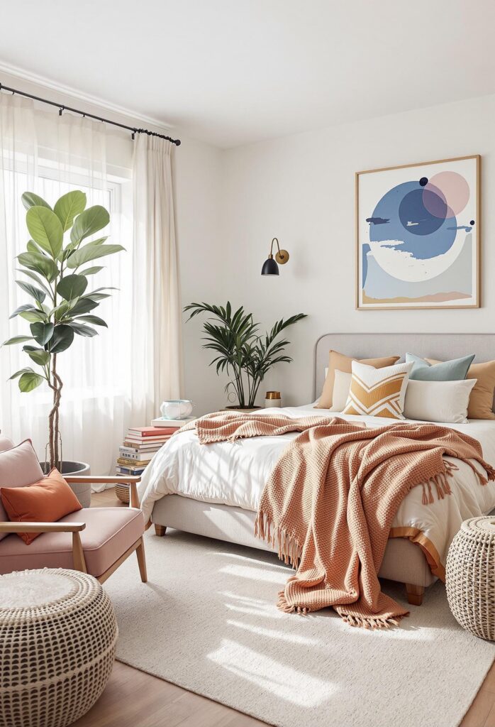
Did you know that certain color psychology principles can directly influence behavior and mood? Warm shades like terracotta or burnt orange work great in kitchens and work zones. Cooler tones like soft blue or eucalyptus green create restful areas for reading, sleeping, or reflection — perfect in a minimalist bedroom.
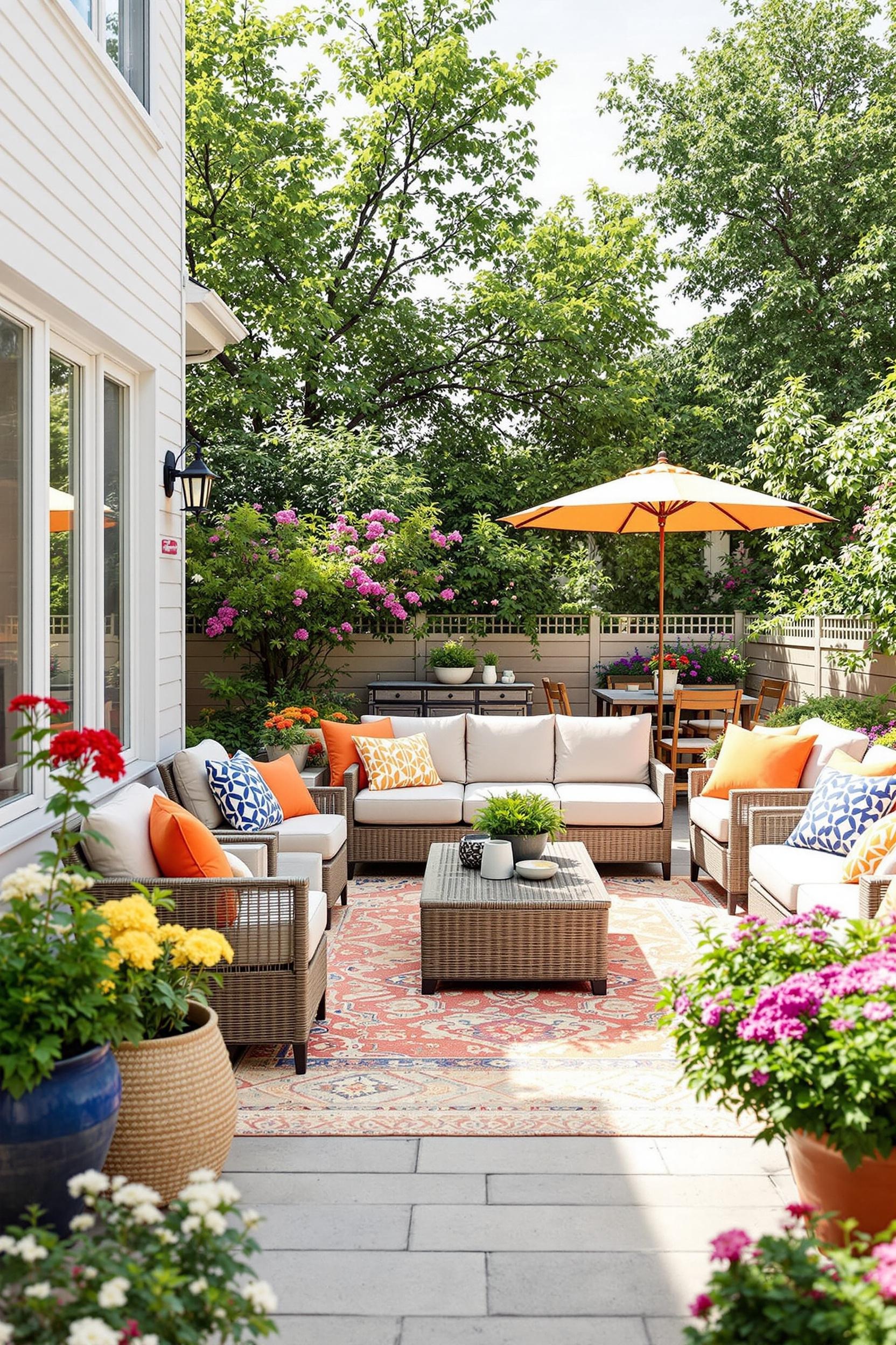
Best Use Cases for Color Zoning
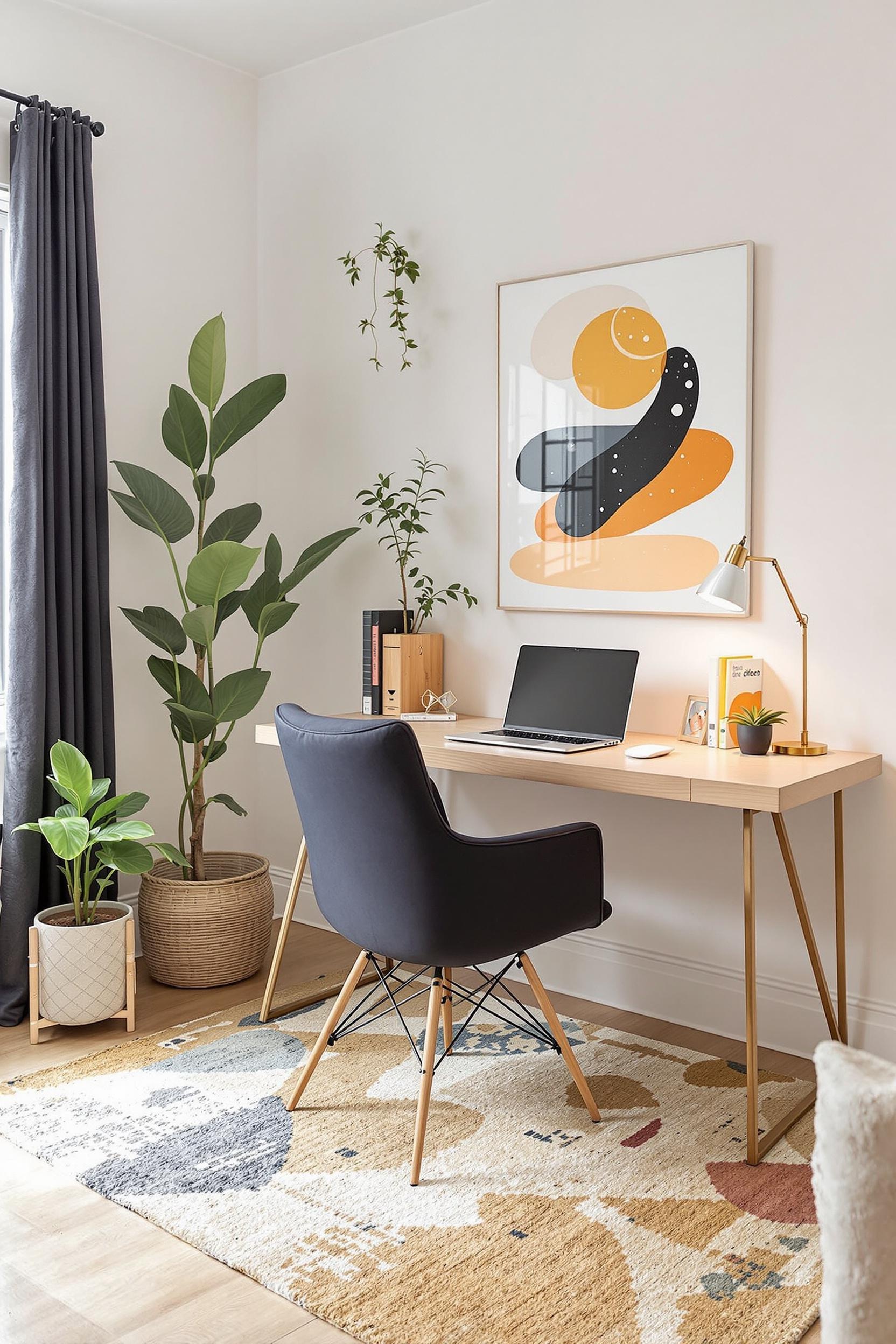
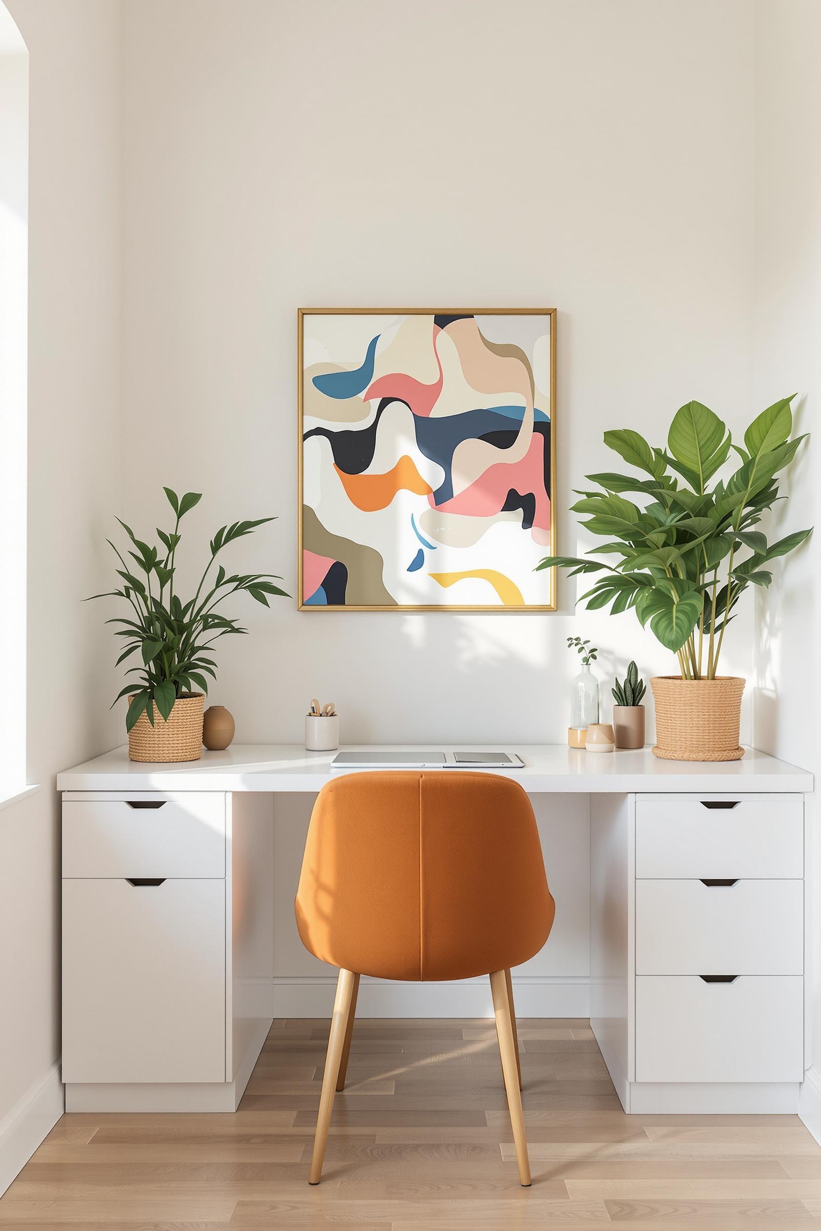
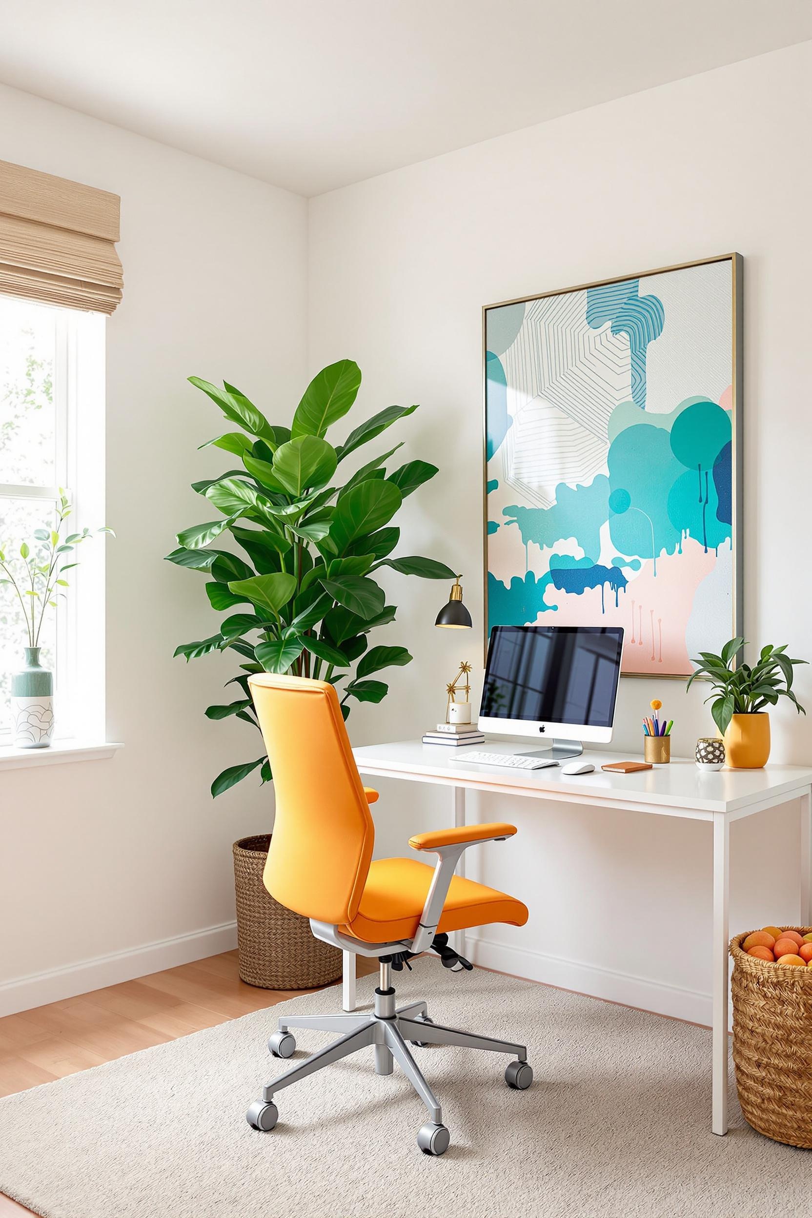
- Home offices: Add a burst of color to stimulate concentration and improve emotional well-being
- Entryways: Use bold contrast to welcome guests and carve visual separation from living areas
- Studio apartments: Different wall shades help break up small square footage into functional micro-environments
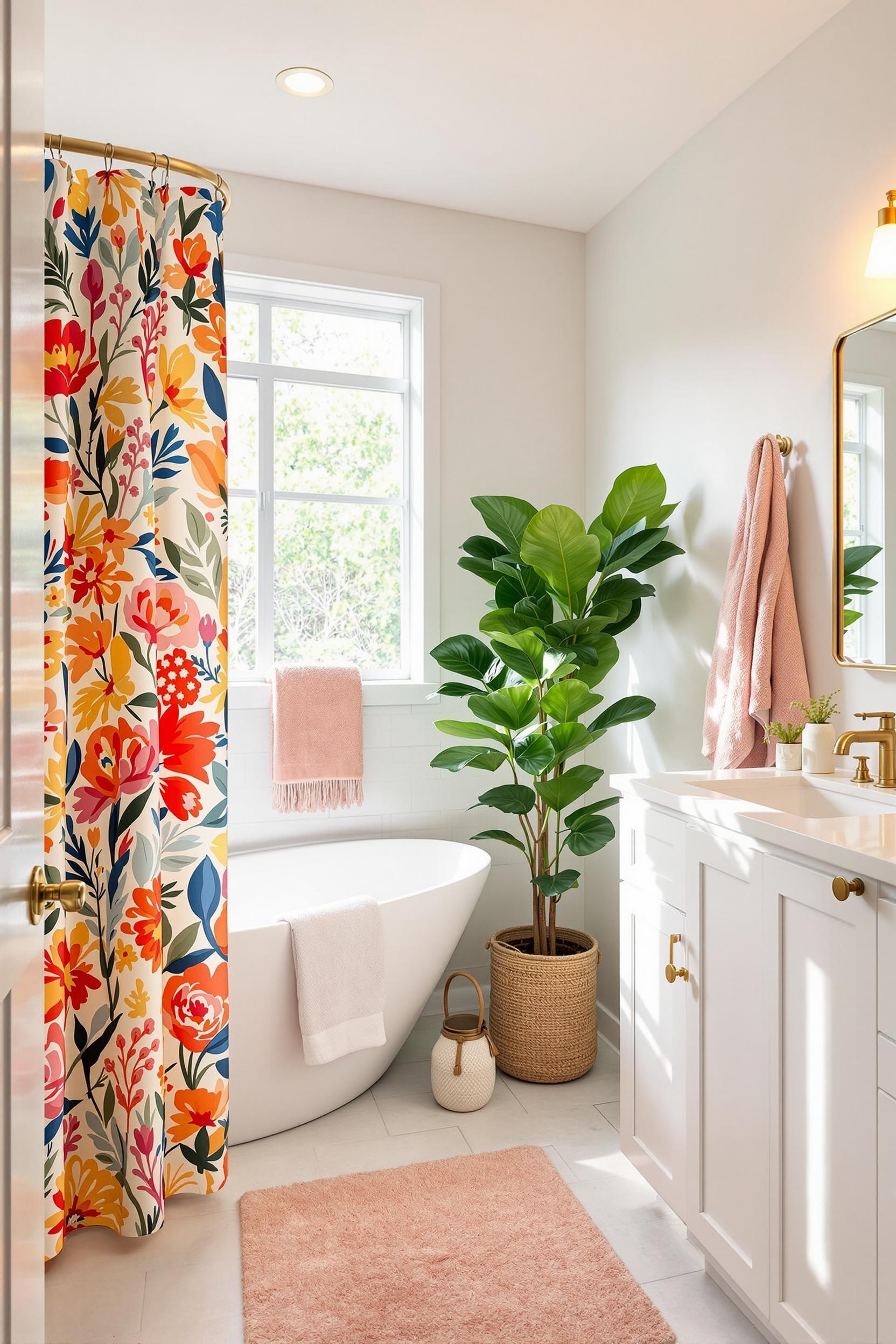
- Bathrooms: Subtle color blocking uplifts the smallest of rooms (bathroom color blocking tips here)
Designing with Geometry: The Power of Bold Lines
One of my favorite color zoning techniques for minimalist bedrooms includes using sharp lines and shapes. Geometric color blocking delivers strong visual cues and defines how each corner of your room should feel. In a small loft I designed, I used color blocks that ran vertically from floor to ceiling. This added height and helped emphasize architectural features.
You can explore more creative color blocking for small apartment interiors in my room-specific guides, including colorful entryways, bedrooms, and even clever mudroom makeovers.
Transform Your Home: Color Zoning Design Revolution Starts Now!
Color zoning isn’t just another buzzword — it’s the key to adapting any space to modern needs. I’ve seen how color can optimize both form and function in minimalist interior design.
Unlock Your Home’s Hidden Potential with Strategic Color Blocking
Zoned color schemes allow you to organize your home without changing the floor plan or buying new furniture. According to the experts from the Paint and Paper Library, zoning techniques using complementary shades can separate open spaces effectively while keeping aesthetic cohesion.
Design Your Dream Space: Color Zoning Masterclass
My training emphasizes precision, balance, and versatility. You’ll learn how to:
- Master functional zones without walls
- Use geometrics and backgrounds to your advantage
- Apply monochromatic color zoning ideas or vibrant triadic palettes
- Choose paint schemes that support emotional wellness
Your Personal Color Zoning Transformation Starts Here
Color zoning is easy to test. Use removable wallpaper or color-blocked art to preview layout improvements you’d love to make. Then explore full color transitions when you’re ready. Small shifts, like contrasting trim, can give life to your living room or elevate your curtain color scheme.
Unlock Your Design Potential Now!
Join our exclusive color zoning design community and receive:
- Free color zoning guide
- Monthly design inspiration newsletter
- Exclusive design consultation opportunities
Color Zoning FAQs: Your Ultimate Guide to Minimalist Design Transformations
1. What exactly is color zoning in minimalist interior design?
It’s a way to divide your space using color rather than walls. This lets you maintain openness while distinguishing different zones like dining or work areas.
2. How can color zoning make a small place look bigger?
Light colors expand space visually. Combine them with bold accent zones and you instantly gain depth. See how it works for small homes.
3. What color combos work best for minimalist color blocking?
- Soft gray + sage + navy
- Pure white + terracotta + deep teal
- Taupe + dusty blue + muted mustard
4. Can renters try color zoning?
Yes! Use peel-and-stick wallpaper or large framed art. Rugs and color-blocked room dividers also offer flexibility.
5. How does color affect emotions?
Warm tones energize while cool tones calm. You can design zones based on your daily needs. Want a peaceful sleep space? Use greens or blues.
Let’s Get Started
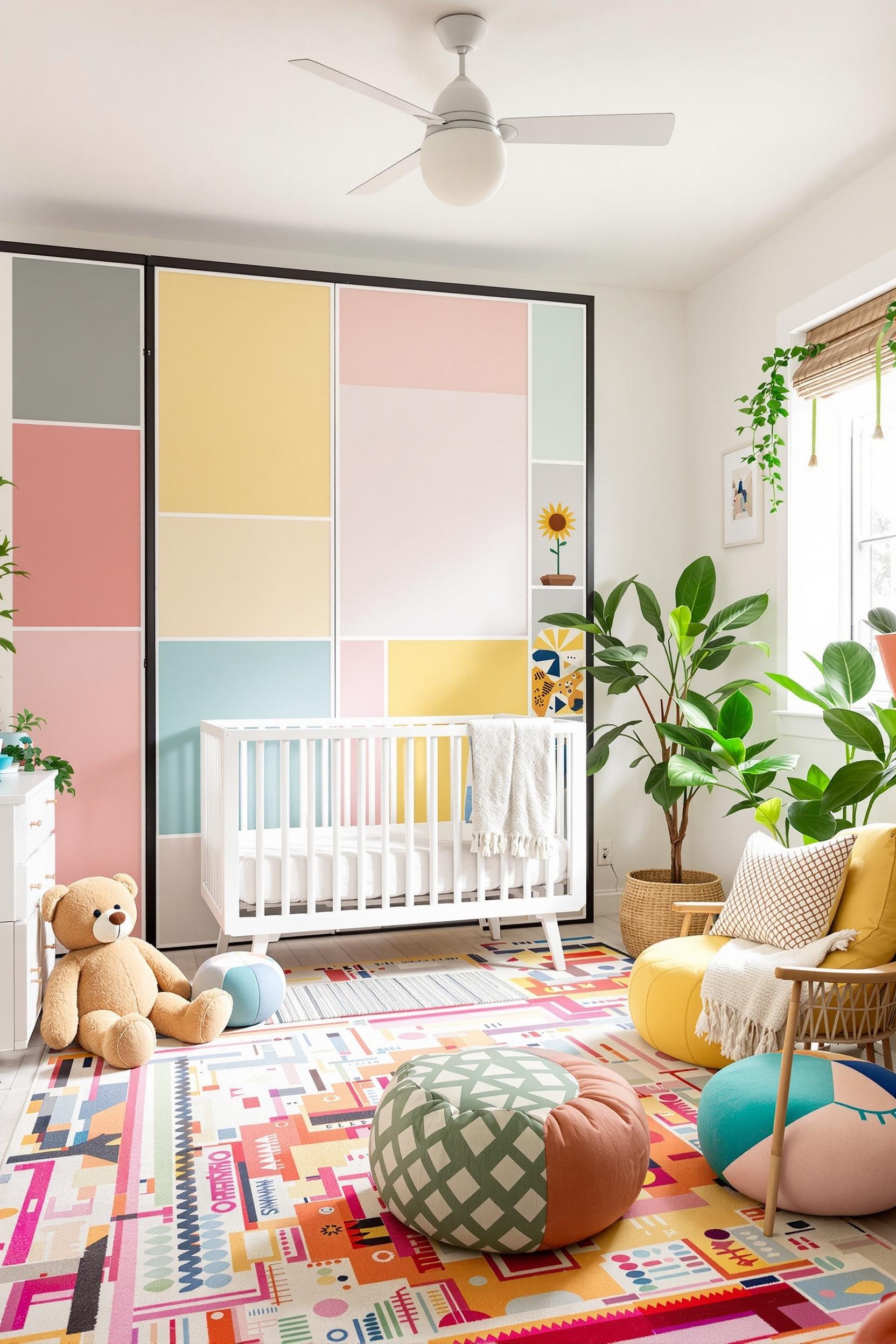
My goal is to help you build the home you’ve always wanted — one defined by clarity, function, and color. Choose modern color block paint ideas for entryways or subtle pastel zoning for a nursery. (Check out my guide on nursery color zoning too!)
Design isn’t about price or size — it’s about intention. Your home deserves to reflect your lifestyle, and zoned color schemes give you the freedom to explore that creativity.
Want expert tips and free design tools? I’ve created a community just for you. Sign up and start your home transformation today!


