
Open Plan Color Schemes: Minimalist Color Blocking That Transforms Your Space
Have you ever stepped into an open-plan room and wondered why it felt chaotic or disjointed? Open spaces are desirable—but without a clear visual structure, they can feel incomplete or overwhelming. That’s where open plan color schemes and color block interior design come in. Through years of design practice, I’ve learned how to bridge spaciousness and intimacy by using color as a powerful architectural tool.
In this post, I’ll guide you through the art of color zoning and color blocking—a transformative strategy that redefines how you live and move within modern, open-concept homes. By combining minimalist interior color schemes, intentional paint pairings, and trendy architectural techniques, you can create a home that not only looks incredible but also feels cohesive and functional.
Why Color Blocking Works for Open Concepts
Let’s be honest—walls are no longer the sole answer to space separation. With open-plan homes, the real magic lies in color zoning techniques. These methods let you define living zones without physical dividers. Imagine combining light neutral color schemes for open spaces with bold accent hues to carve out a reading nook, kitchen, or office—all in the same room.
One of my go-to methods involves the use of the 60-30-10 rule. For a natural flow throughout a room:
- 60% Neutral base: like soft white or warm greige for unified calm
- 30% Secondary tone: terracotta, dusty sage, or muted charcoal for depth
- 10% Accent color: bold hues like navy, emerald, or plum for impact
I dive deeper into these principles in this guide on modern color zoning, showing how balanced combinations create architectural harmony and visual structure.
Color Psychology in Open Plan Interiors
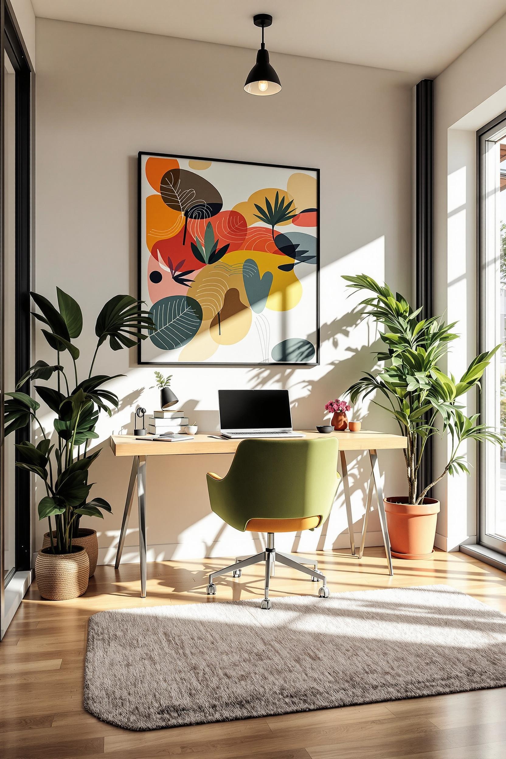
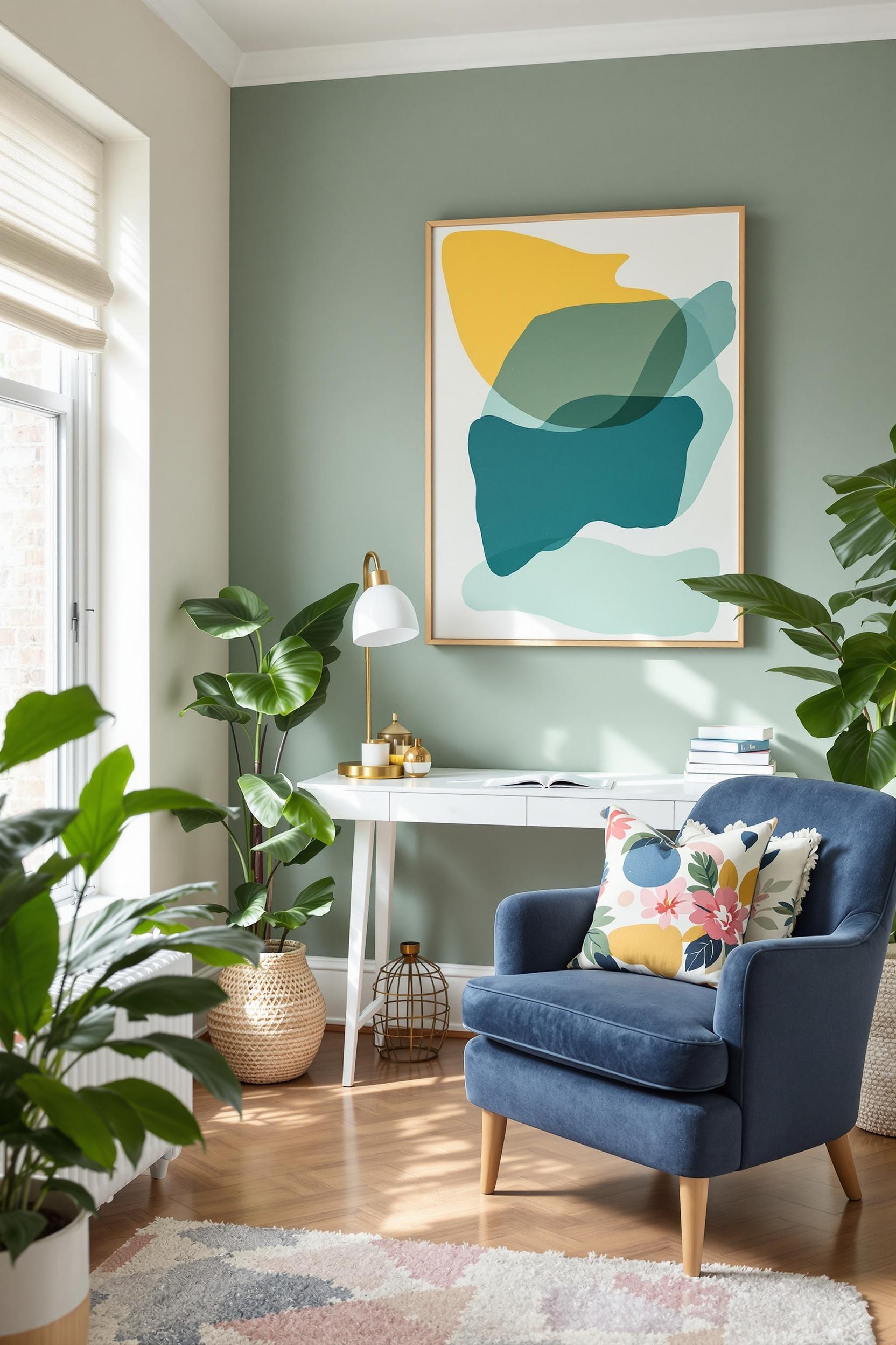
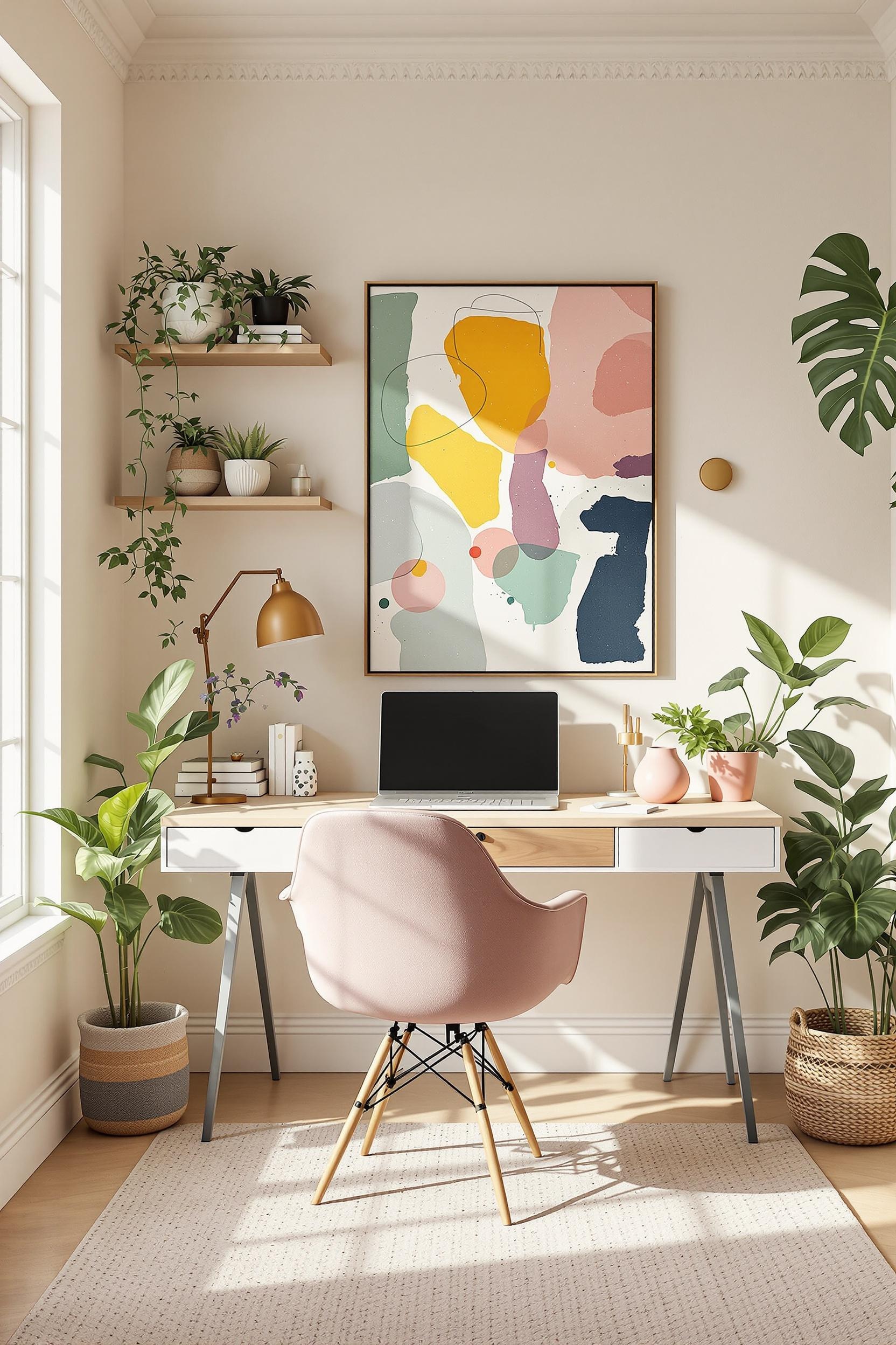
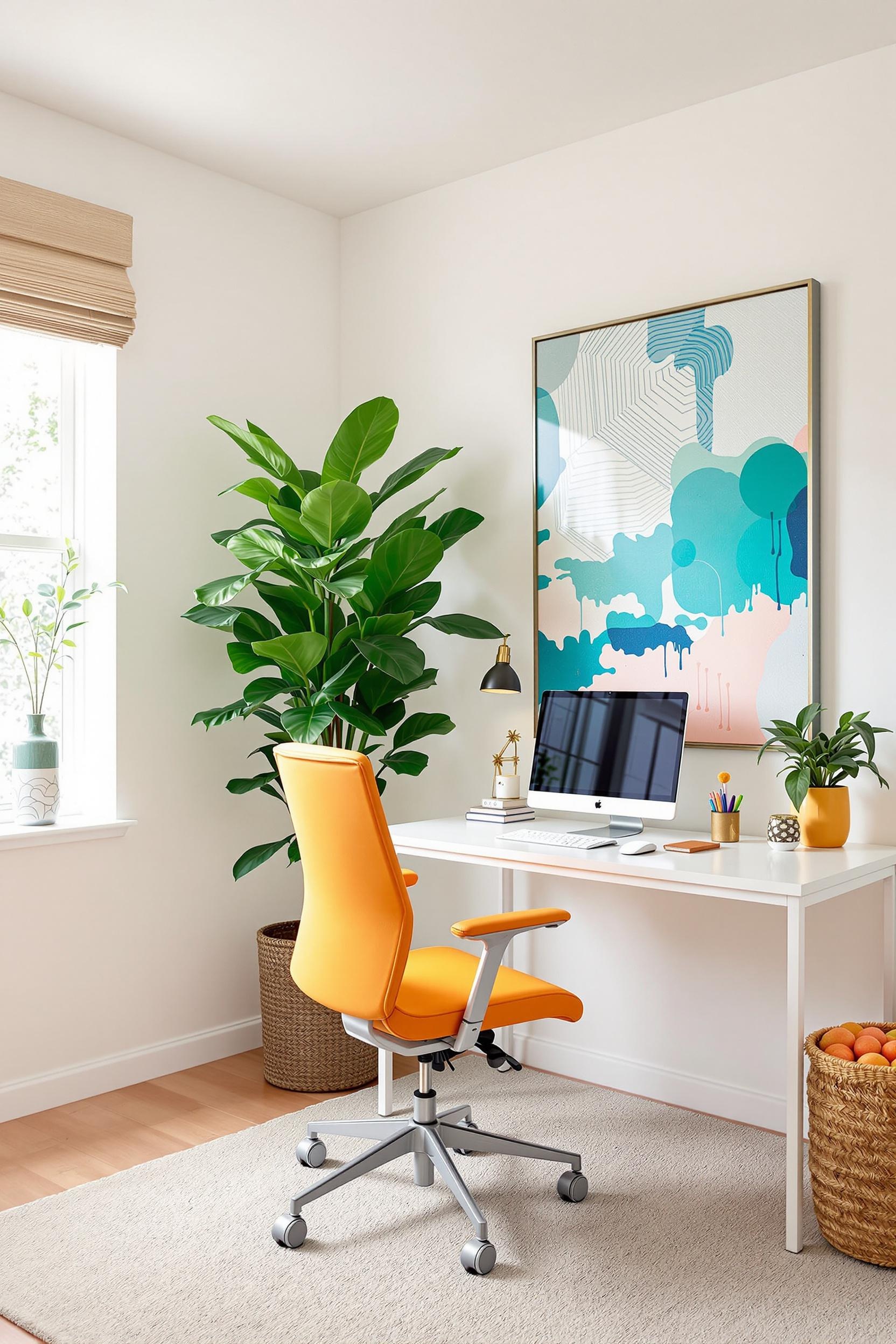
Each color speaks its own language, and in open-concept spaces, understanding that language is vital. I often use color psychology strategies to amplify the purpose of each zone. For example, soft sage creates serenity in the living room, while deep navy brings focus to your desk area.
Saturated colors evoke intimacy. Lighter shades encourage movement and airiness. In homes where you cook, work, and relax all in one room, color becomes more than decoration—it becomes navigation.
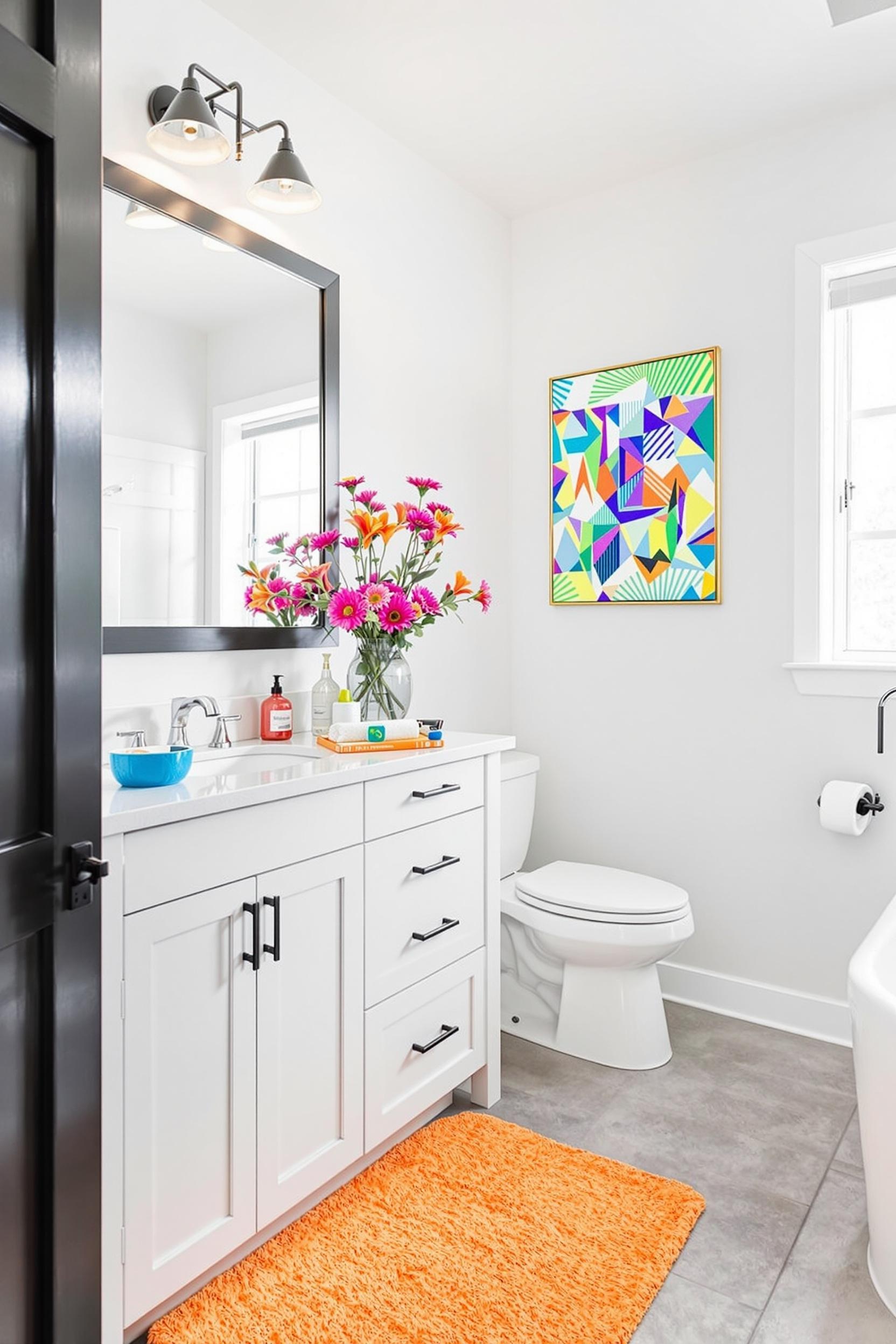
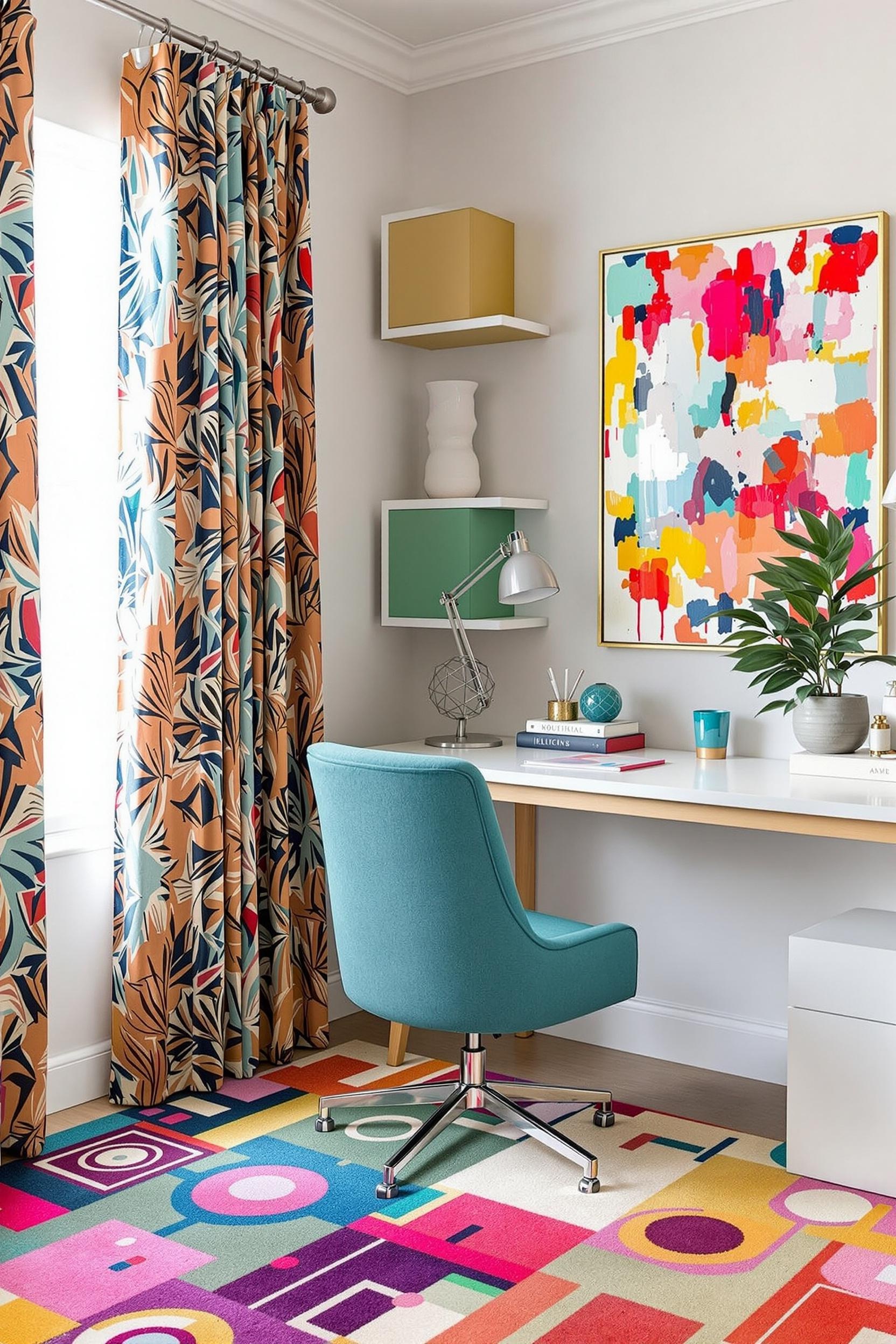
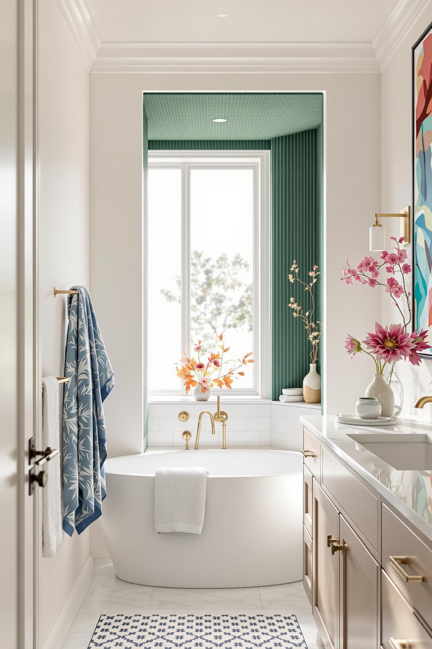
Geometric and Architectural Color Blocking That Stuns
If you’re aiming for bold visual transformation, look no further than architectural color blocking. I’ve used techniques like angular contrast, colored ceiling treatments, sculptural paint zones, and floor-to-ceiling divide lines to give rooms dynamic structure without ever lifting a hammer.
In a recent loft renovation, I used a two-tone wall split—terracotta below and creamy white above—creating both dimension and rhythm. Want to see this in action? Check out how geometric zoning with accent shapes can energize a minimal home without overpowering the space.
Using a Cohesive Color Palette Across Open Spaces
The trick to maintaining unity is developing a cohesive color palette for open spaces—not just painting different walls; it’s about crafting a visual story throughout your home. One of my favorite techniques is using graduated shades of a dominant hue (sometimes called monochromatic color schemes). These maintain simplicity while offering movement and dimension—you’ll never need to worry about visual clutter again.
For inspiration, I love the blend of neutrals and muted pastels used in this pastel blocking guide. It shows how to keep things interesting while staying grounded.
Modern Color Palettes for 2025
Looking ahead, color trends reveal that warm earth tones, soft blacks, and nature-inspired hues are in. According to design forecasts for 2025, colors like deep plum, cinnamon browns, gentle greens, and terra rosa will lead the charge in elegant contrast against a clean backdrop—ideal for modern open plan color schemes.
If you want to see how upcoming palettes work for minimal homes, explore my guide to 2025 minimalist paint ideas which breaks down top color blocks for modern interiors.
Small Space? No Problem!
You don’t need a massive loft to make use of these techniques. Color blocking makes small rooms appear larger by guiding lines, enhancing flow, and defining key visual territories. In fact, when working with an apartment in New York, I used strategic zoning with subtle borders to differentiate the kitchen from the lounge using nothing more than two adjacent colors from a muted palette.
A bold color block behind your bed or a sculptural paint shape on a wall that’s otherwise neutral can redefine a tiny studio efficiently and elegantly. For more examples, this post on color blocking in studio apartments is filled with clever ideas you can apply today.
Furniture and Accessories That Reinforce Color Block Zones
Furniture isn’t just for utility—it’s part of your color story. I often recommend using color-blocked furniture to reinforce existing zones. Think: a cobalt armchair that anchors your reading nook or pale blue stools that define your kitchen island. Want a fast transformation? Try color-zoning with textiles like rugs, art, or even curtains as shown here.
Transform Your Home: Color Blocking Design Revolution Starts Now
If you’ve read this far, you’re probably ready to bring the magic of color zoning into your own home. Now’s the time to act. Don’t let great ideas live only in your head—your space deserves this transformation.
Get My Exclusive Design Starter Kit
As a professional designer, I’ve curated a set of tools for readers ready to jump into color zoning:
- Minimalist Color Palette Worksheet
- Strategic Space Separation Guide
- Personalized Consultation Offer
This isn’t just about a new coat of paint—it’s about redesigning the way you live, relax, entertain, and thrive in your home. Make your next move the one that changes everything.
Frequently Asked Questions: Mastering Open Plan Color Blocking
Q1: How do I choose the right color palette for an open-plan space?
Start with the 60-30-10 rule. Use a 60% base of warm whites or greige, 30% of hit colors like muted sage, and 10% bold touches like deep navy. To add structure, try strategic color zoning techniques for visual flow and spatial clarity.
Q2: Can color blocking work in small open-concept apartments?
Definitely! In fact, it works best in tight areas. Try minimalist color blocking methods that maximize perceived space while dividing zones—no walls needed.
Q3: What are the most trendy color combinations for minimalist open-plan spaces in 2025?
Warm taupe, dusty sage, and terra cotta are leading the pack, along with innovation-friendly combinations like grayscale and neon. I’ve covered more in my top 2025 color picks.
Q4: How do I implement color zoning without making my space feel choppy?
Use gradients! A dark-to-light transition, repeated undertones, and architectural elements can tie everything together organically.
Q5: Can color blocking help define zones in an open-plan home?
Absolutely. That’s the core benefit. Specific color sectors give function to space: darker for work, lighter for lounging. Use modern color zoning methods to influence how people experience the room.
Still curious about transforming your home with color blocking?
Join thousands of design-forward homeowners who get monthly tips from me.


