Using a Neutral Base Color: The Secret to Minimalist Color Blocking Magic
Have you ever walked into a room and instantly felt calm, yet strangely energized? That’s not luck—it’s intentional interior design. And one of the strongest strategies I swear by is using a neutral base color for minimalist color blocking interior design. In fact, I often tell my clients that the power lies not in the bold colors themselves—but in the unpainted space that surrounds them.
Color blocking is more than trendy. It’s a smart way to turn ordinary rooms into expressive, functional, and stunning spaces. Whether you live in a studio apartment or a multipurpose loft, using neutral walls with bold color blocks for negative space can totally redefine your space. For creative homeowners, this technique offers endless chances to transform with simplicity and intention.
Unlocking Minimalist Magic: Start with a Neutral Foundation
What do ivory, soft grey, and warm taupe all have in common? They all make stellar starting points for neutral base color interior design. These hues allow bold tones to pop while preserving a sense of spaciousness. When you create a canvas of calm, every color block stands out like a purposeful piece of art.
Minimalist color block wall ideas thrive on visual contrast. The key is balance. Not too much color, not too little space. By mastering this, you can create captivating zones, illusions of expansion, and stylish statements without physical clutter.
Geometric Paint Block Magic
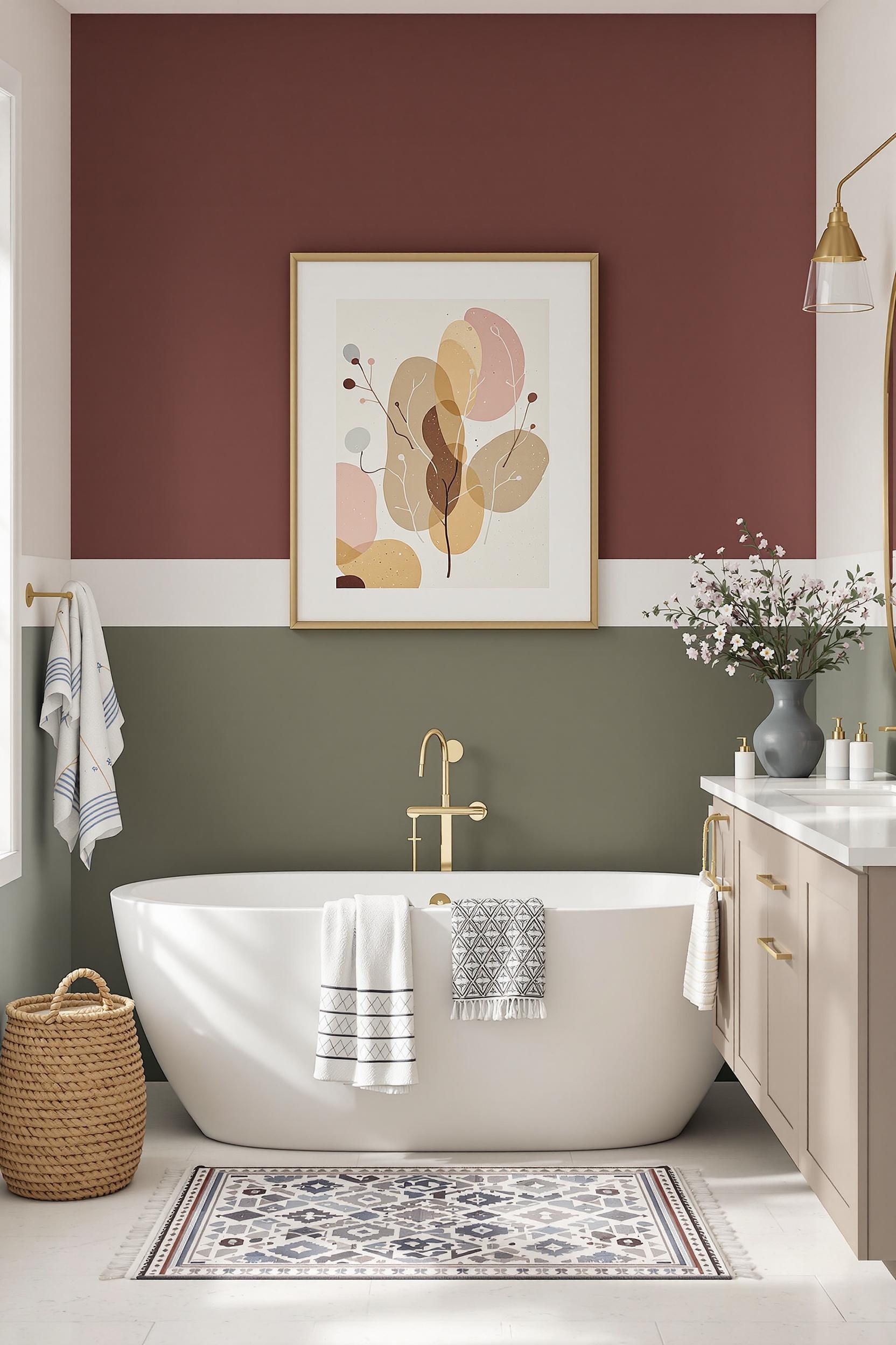
I’ve always loved working with geometric paint blocks interior. They create structure in places that would otherwise feel too open or vague. A rectangle in navy blue on a soft beige wall? That’s instant sophisticated contrast. A mustard triangle in the corner of a living room? That’s architectural interest without lifting a hammer.
If you feel unsure of where to begin, try shapes with clean lines over spacious walls. Use painter’s tape to outline your design and choose tones strategically. With just 2-3 bold colors, you can anchor your space using strategic color block placement in modern homes.
Negative Space: The Hidden Star of Minimalism
Designing with negative space color blocking isn’t just about what you add; it’s also about what you leave untouched. I love this technique because it offers breathing room. It creates an uncluttered zone where each accent feels thoughtful and intentional.
You can apply this by blocking only a portion of a wall, letting the rest of the neutral background shine. These unpainted area design patterns serve as calm zones amidst brighter elements, reducing visual stress and anchoring the room. Learn how to balance color and untouched space by exploring these minimalist color blocking principles.
Carving Zones Without Physical Walls
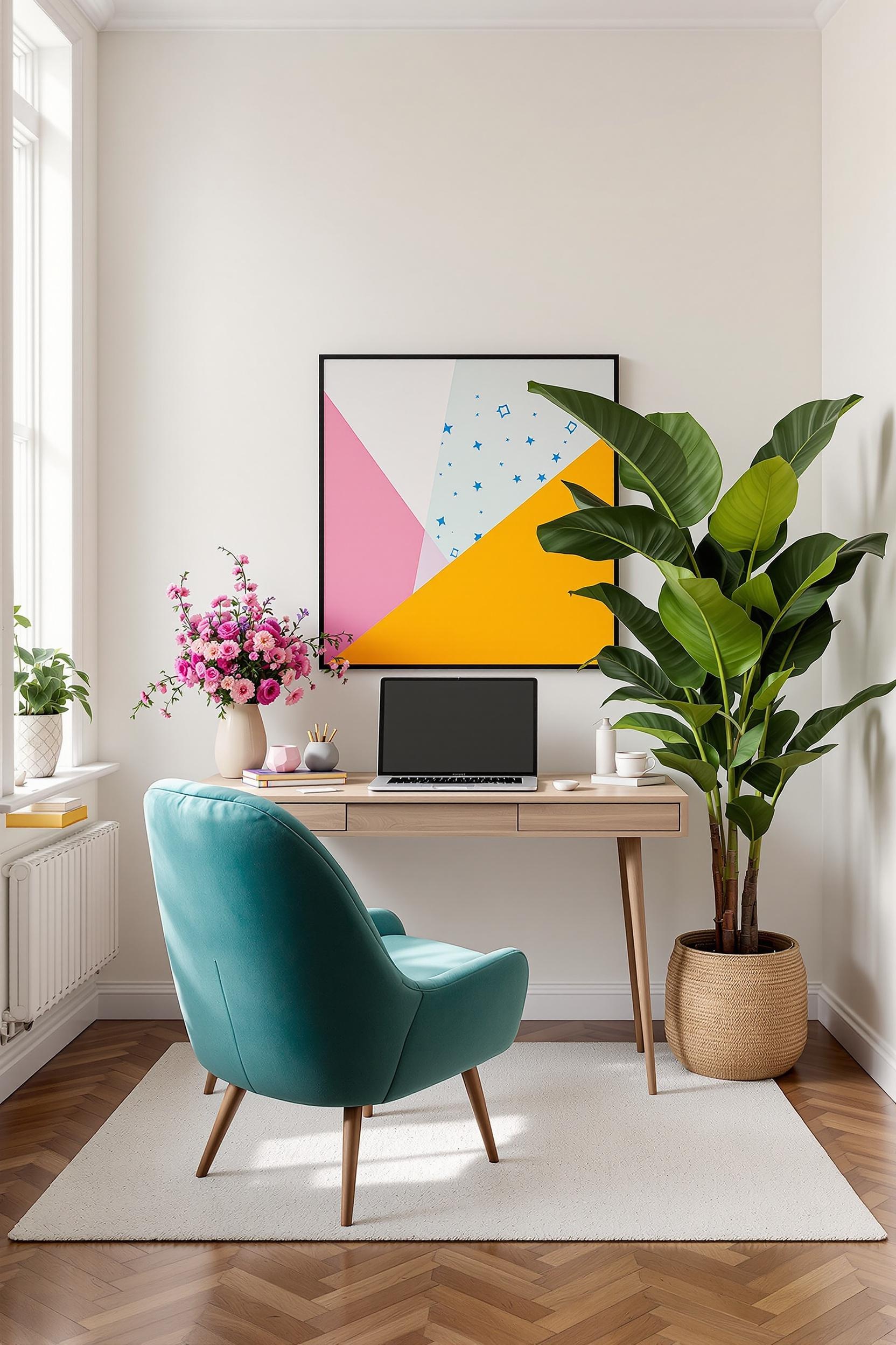
One of the most powerful uses of color blocking is color zoning magic to transform your open floor plan. Have a studio apartment? Use a bold block to separate your office space from your sleeping area. This works remarkably well when you use a neutral foundation with geometric shapes.
Painting a rectangle in emerald green behind your desk on a warm grey wall creates a clearly defined office nook. No drywall needed. This is how color blocking interior minimalist design works in real life—it’s stylish and useful.
The Psychology of Bold Color Meets Minimalist Calm
Design isn’t only about the way your home looks. It’s also about how it feels. Studies show that strategic color blocking can influence behavior and moods. For example, a grounded olive accent calms the nerves. Bright yellow can lift the spirits. Blue promotes focus.
When paired with a neutral base, these colors don’t overwhelm the senses. They enhance spatial perception, reduce stress, and create balance. That’s the superpower of neutral color block wall designs for small spaces. Every room becomes a place that supports how you want to live and feel.
Practical Tips: Achieve Color Blocking Elegance
- Use no more than 2–3 bold colors per room.
- Keep your tools simple: painter’s tape, high-quality brush or roller, and calm neutrals.
- Focus on proportion—smaller walls may call for smaller blocks.
- Repeat colors throughout your décor: pillows, art, rugs, or accessories like in this guide.
- Float color blocks in key zones—behind the bed, above desks, or within reading corners.
Looking for inspiration? Check out this guide on how to create dynamic decorating stories using color and negative space.
Transform Your Home with Color Blocking Magic: Design Your Dream Space Now!
In interior design, color blocking isn’t just a trick—it’s transformation. With strategic color placement, every home can become extraordinary. This is your chance to use modern design techniques to shape something personal and visually powerful.
Unlock Your Design Potential: Minimalist Color Blocking Masterclass
By choosing a neutral base color for minimalist color blocking interior, you’ll unlock endless styling options. For those wanting stylish, serene spaces with impact, this guide gives you the roadmap.
Why Your Home Needs a Color Blocking Intervention
- Visually enlarge compact rooms
- Define areas without moving walls
- Lower stress by simplifying design
- Offer exciting behaviors through color psychology
Design Your Space, Transform Your Life
Current design trends favor daring, bold blocks paired with muted palettes. They’re not just pretty. They’re emotionally smart.
Your Exclusive Design Transformation Toolkit
Subscribe and get pro tips, monthly guides, and exclusive design intel for using neutral color blocking wall art for modern interiors that uplift your life.
Your Color Blocking Journey Starts Here
Modern color blocking ideas for negative space effect aren’t style fads. They’re tools to help you craft functional, reflective interiors. With each wall, you tell a story—one color block at a time.
Limited-Time Design Revolution Offer
- Color blocking consults
- Access to digital look-books
- Monthly trend drops
- Priority access to design events
Frequently Asked Questions About Neutral Color Blocking in Minimalist Design
Still curious? These common questions might help!
Q1: How do I choose the right neutral base?
A: Look for tones that match your space’s lighting. Use grey for cool calm, ivory for bright freshness, or taupe for cozy depth.
Q2: What shapes work best in color blocking?
A: Go geometrical! Rectangles, triangles, and asymmetrical shapes add drama, especially when paired with strong proportions.
Q3: How many color blocks should I use?
A: I recommend two or three. Make sure they each serve a clear purpose and don’t crowd your space.
Q4: Does this work for small rooms?
A: Yes! In fact, it’s perfect. With the right block placement, you can simulate depth and separation without breaking walls.
Q5: How do I keep it minimalist?
A: Use restraint. Choose a neutral base, focus on clean lines, and avoid busy patterns. Simplicity and intention are key.
Need more ideas? Explore these curated inspirations for neutral color block designs.
Sign Up for More Design Magic!
Want to get even more tips, tricks, and straight-from-the-source style secrets? Sign up below to get my latest updates right to your inbox.


