
Room Color Zoning Techniques: How to Transform Spaces with Minimalist Color Blocking
Have you ever stepped into an open-plan home and felt like you couldn’t quite “read” the room? I’ve been there too—wondering where the living area ended and the dining space began. That is when room color zoning techniques came into my life, flipping the way I design spaces both for myself and my clients. With strategic application of color, you don’t need physical walls to create visual boundaries. Instead, you use carefully chosen hues to establish function, mood, and flow in your home.
This design solution is especially powerful for small apartments and open-concept homes where distinct areas melt into one another. Using color blocking interior design, you can achieve not only separation but also cohesion, keeping your home beautiful and practical.
Strategic Color Zoning: Mastering Minimalist Space Division Techniques
When I discovered strategic color zoning, it felt like unlocking a secret to minimalist home design. From creating invisible walls with paint to giving smaller rooms an expansive feel, strategic color choices are essential for smart interior design.
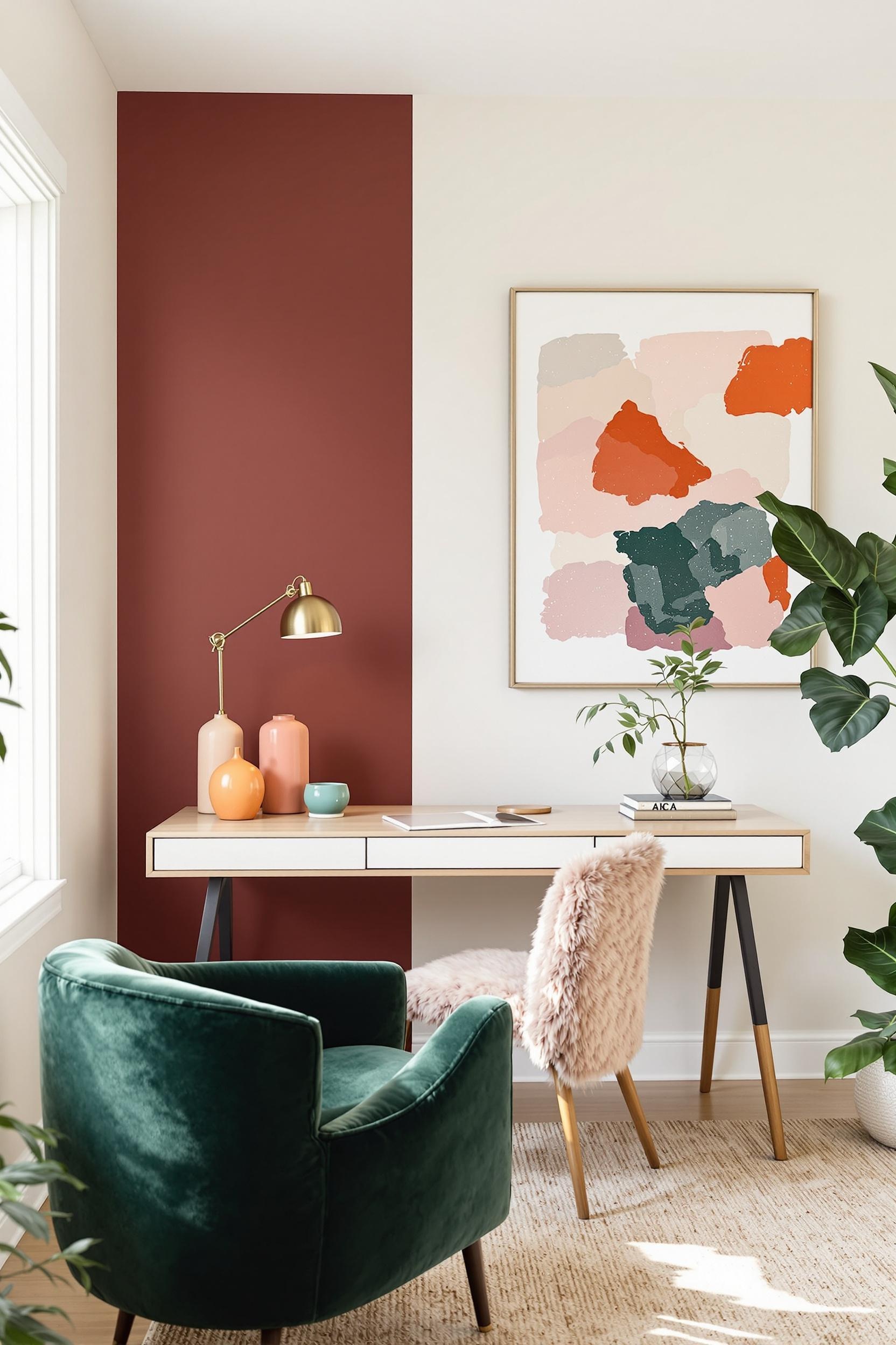
Color psychology plays a big role here. Cool hues like sage or blue are known as receding colors, ideal for creating perceived depth. In contrast, warm colors like mustard or terracotta act as advancing hues—perfect for intimacy and drawing attention.
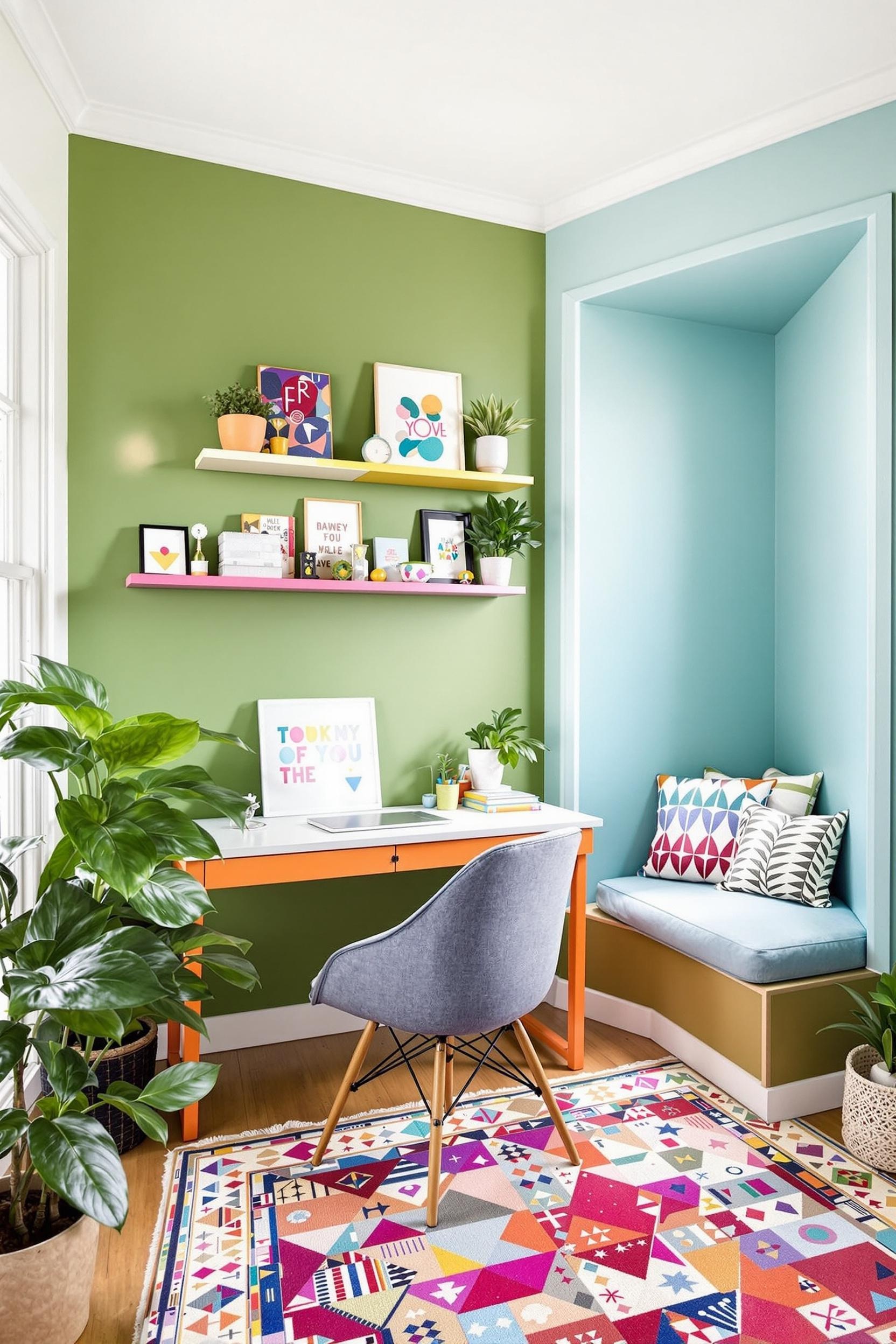
Take my client’s loft as an example. We used vertical blocks of sage green to mark the workspace and terracotta for the dining corner. These weren’t just aesthetic decisions—they had purpose, helping to define daily routines through visual structure.
Key Principles of Minimalist Color Zoning
- Use no more than 2–3 strong hues for a clean look
- Coordinate with room function and emotional tone
- Integrate existing materials (floors, rugs, textiles)
This method shines most when paired with minimalist color palettes, allowing zones to stand apart while remaining part of a larger visual story.
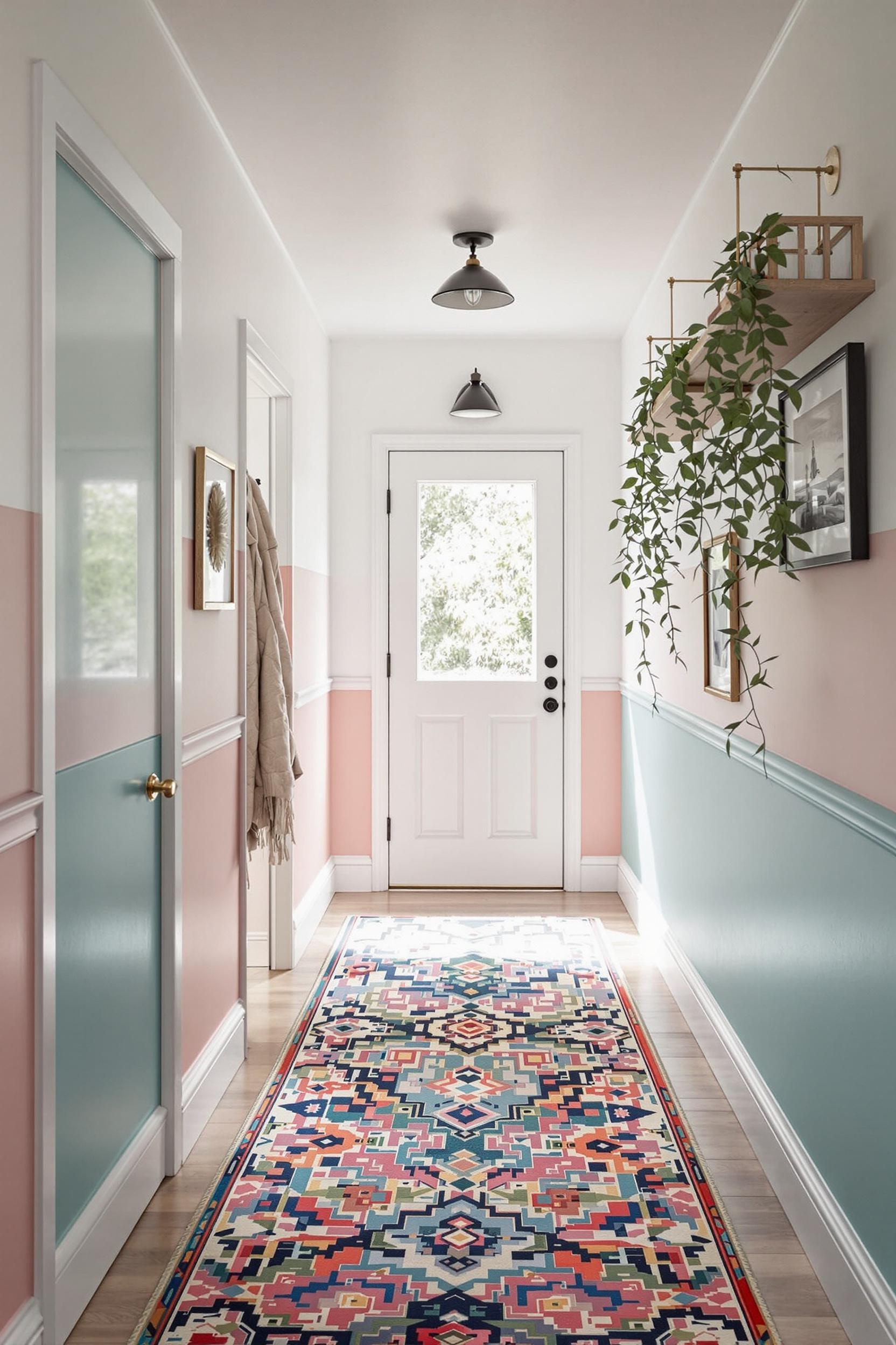
The Geometry of Color: Create Boundaries Without Walls
Using shapes to separate spaces is one of my go-to techniques. Geometric paint applications—such as arches, rectangles, and cords—can signal a zone without any furniture or dividers in sight. This works beautifully in studio apartments where floor space is at a premium.
Vertical stripes can elongate a room, while horizontal blocks define broader areas like a lounging or reading nook. In my own apartment, I created a cozy nook for reading just by adding a half-wall paint block in dusty pink behind the bookshelf.
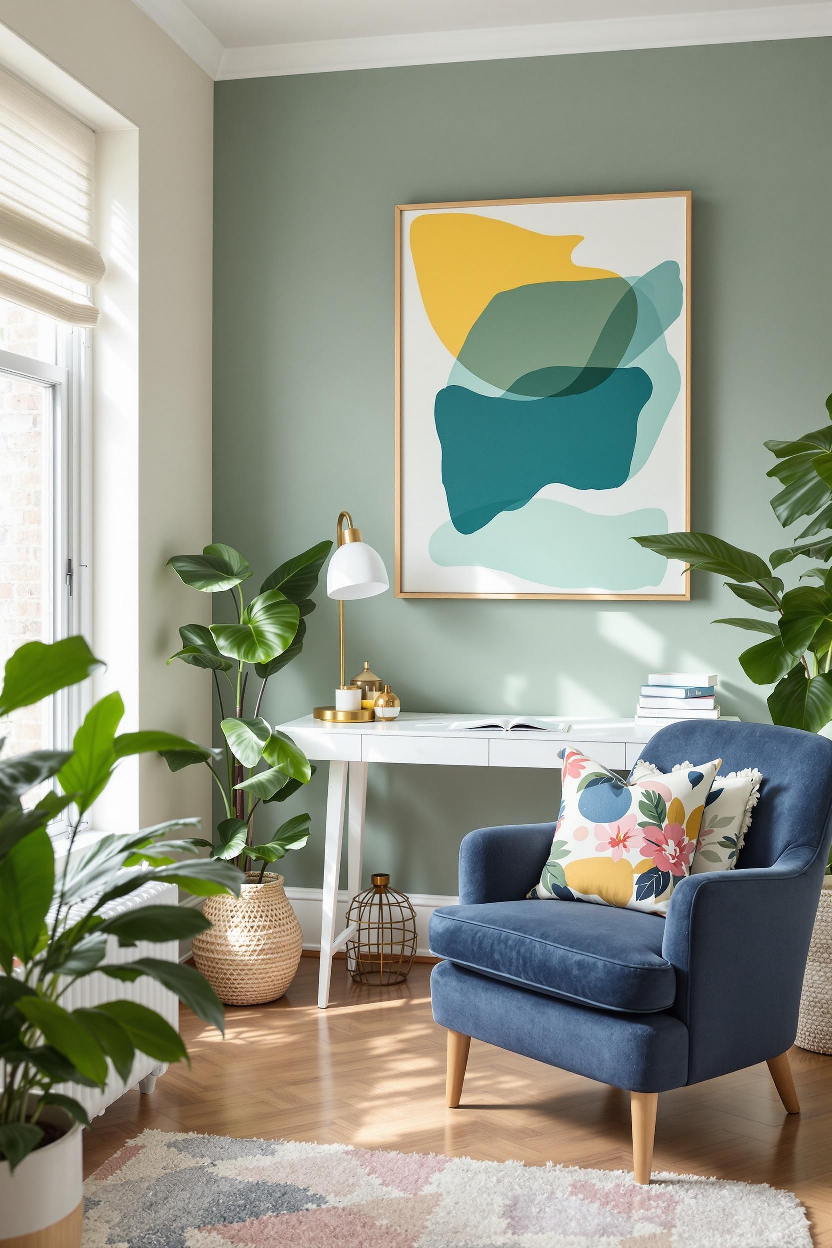
How Texture and Color Work Together in Minimalist Design
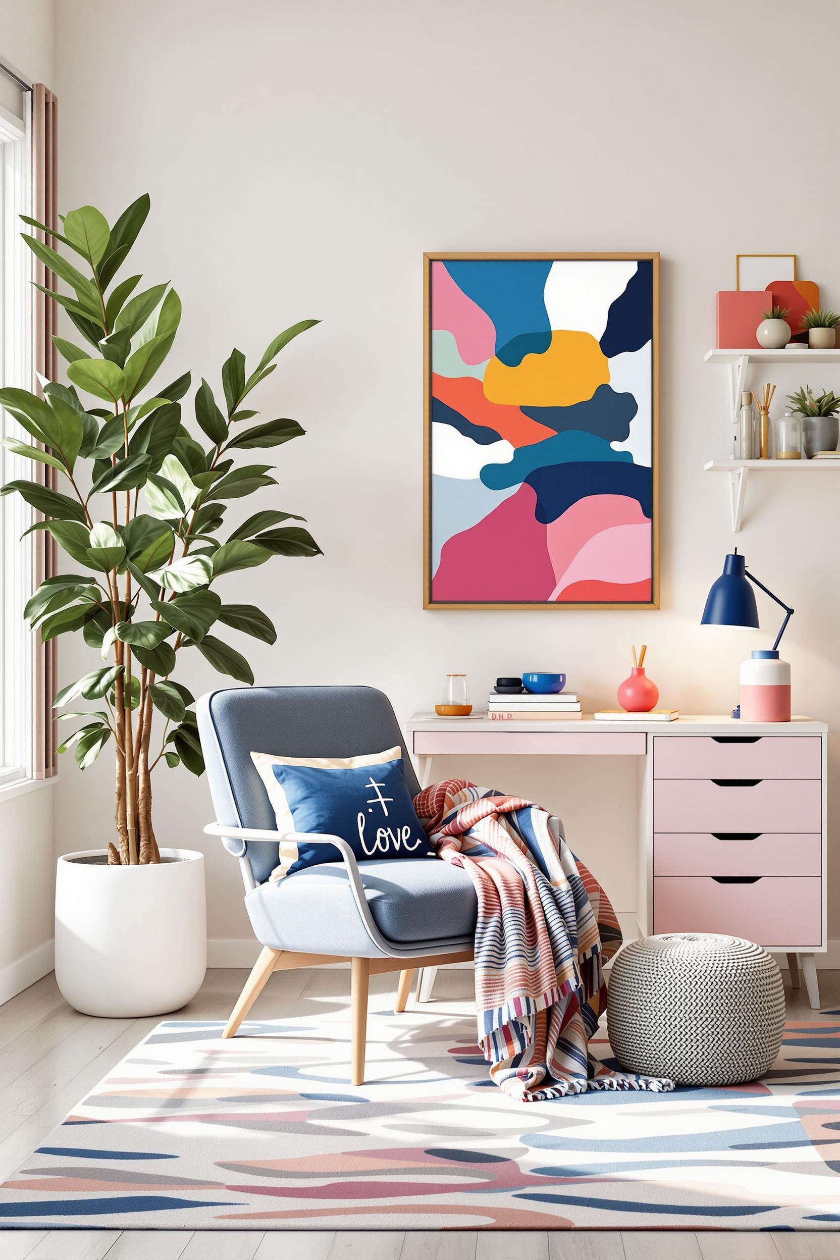
Color doesn’t act alone—it works with **texture** to define space and create a layered design. For instance, pairing matte paint finishes with woven textures and natural woods adds visual interest while maintaining simplicity.
I love grounding my zones with tactile decor—think boucle cushions in the lounge zone, textured woven rugs in the dining area, or a smooth ceramic vase on a painted desk in a workspace zone. Each layer adds depth without adding clutter.
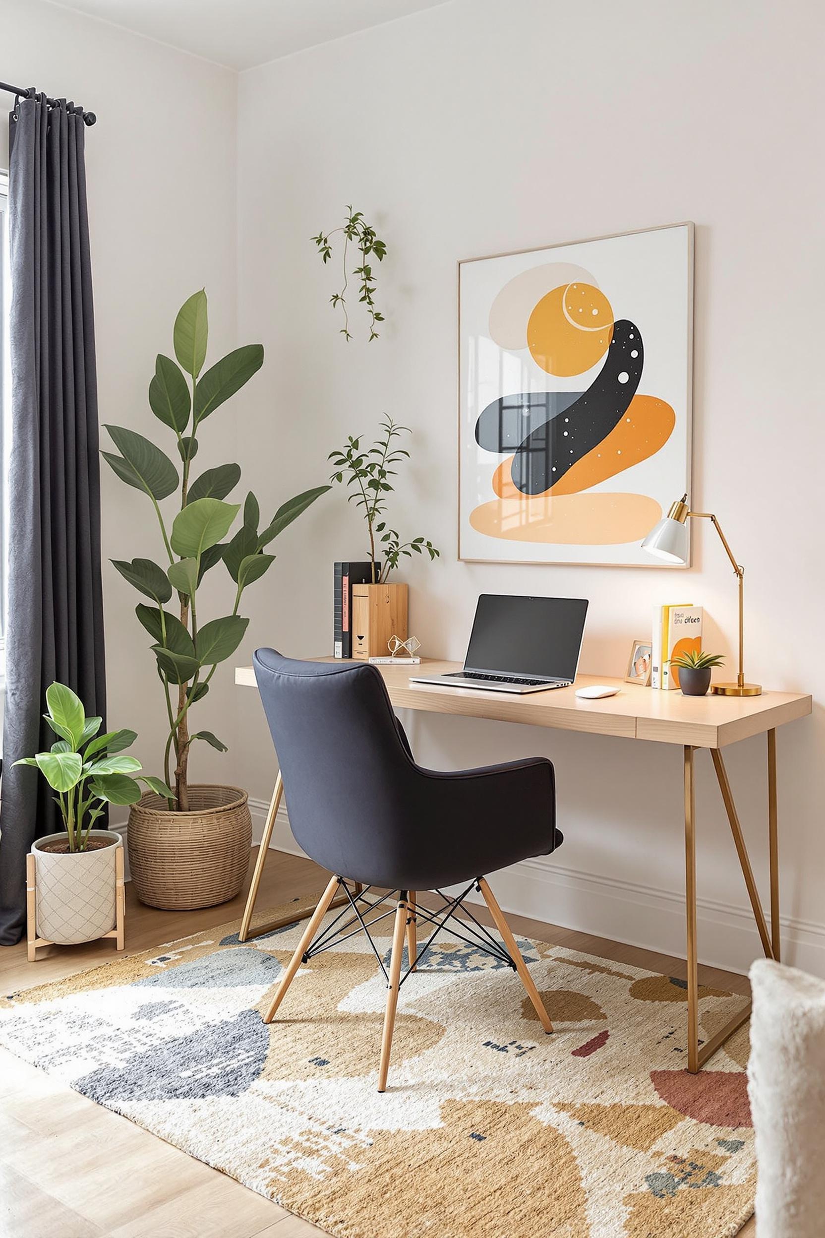
Advanced Techniques for Small Spaces: Using Color to Expand
Living in a small space doesn’t mean sacrificing great design. In fact, color zoning in small apartments is one of my favorite challenges. Cool tones like dove gray, soft green, or powder blue allow you to visually expand the room.
I’ve used vertical color zoning in many small spaces—especially bedrooms. Vertical blocks draw the eye upward, helping walls feel taller. It’s a trick inspired by strategic layering techniques that bring both height and structure to tight layouts.
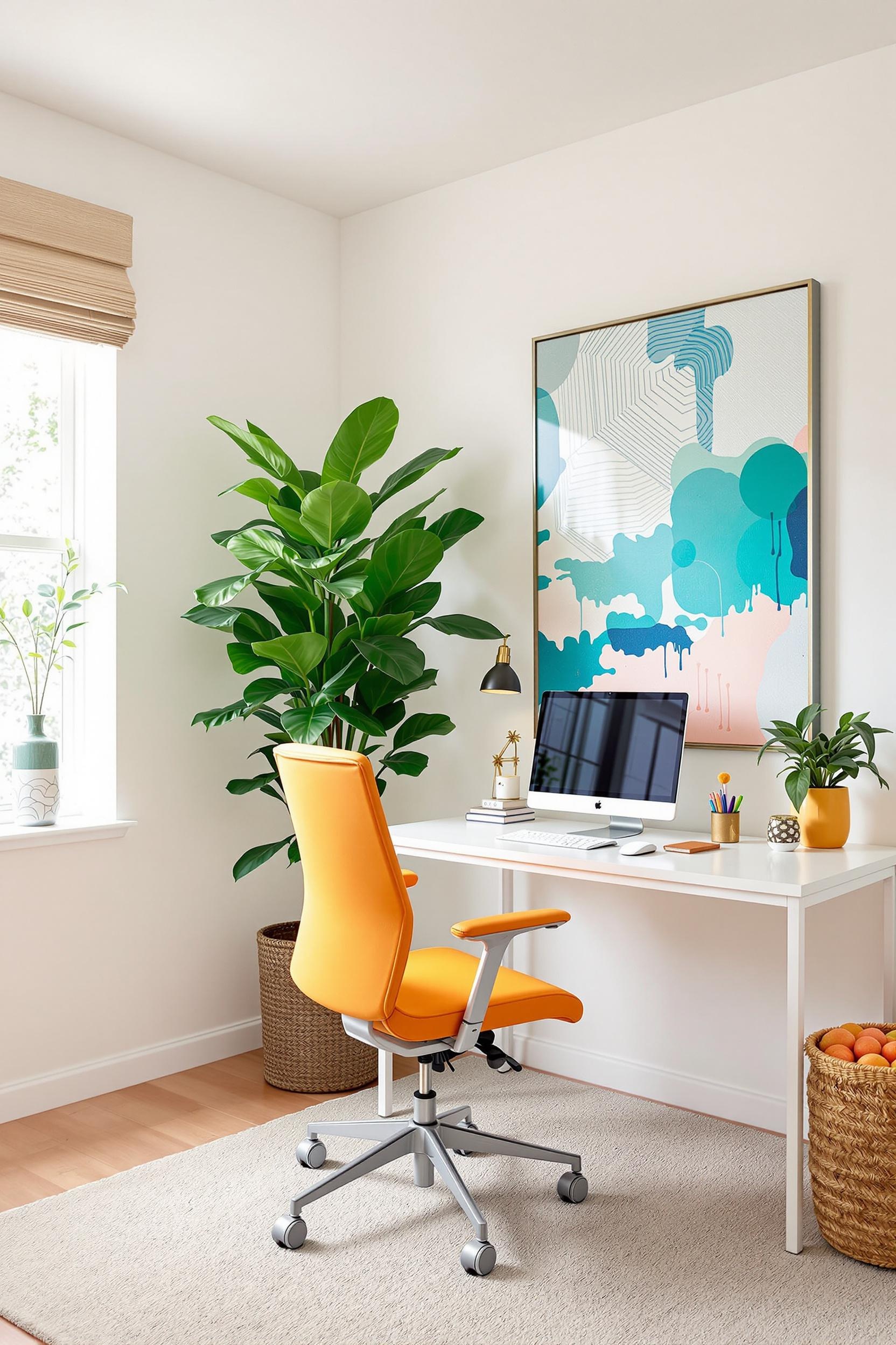
Color Zoning Techniques for Open-Plan Living Rooms
In large, open-concept homes, achieving separation without disconnecting zones can be tricky. That’s where color zoning for open plan living comes into its own. Choose a neutral base like soft white, then layer in functional accent colors that follow you from the kitchen to the living room and beyond.
Want to distinguish your home office in a shared space? A color-zoned wall in forest green or navy can create instant focus and energy. Or use a warm tone like ochre to signal “relaxation” areas like the lounge.
This method works best when extended onto ceilings, trims, or even large furniture pieces. That’s why I often recommend visiting this guide on paint zones for more advanced applications.
Transform Your Space Now: Unlock Color Zoning Potential
Color zoning is not just about painting walls—it transforms the way we experience our spaces. If you’re ready to create a more intentional, dynamic home, I have something special for you.
Design Your Dream Space: Personalized Color Zoning Consultation
Every home tells a unique story, and color zoning is the most powerful tool to shape that story. My personalized consultation includes:
- Color Psychology Assessment: Understand emotional and functional responses to color.
- Tailored Zoning Strategy: Whether you live in a tiny apartment or a large loft, I’ll create a custom plan for your space with techniques like vertical color blocking, geometric patterns, and shape-driven design.
- Implementation Guide: A clear step-by-step path including paint brand suggestions, texture ideas, and application tips.
Unlock Your Color Zoning Potential
Plus, get your FREE “Color Zoning Essentials” PDF guide! It includes:
- Top 10 color zoning strategies for minimalist design
- Color psychology tips by zone
- Room-by-room layout suggestions
Your design transformation starts now. Don’t just redecorate—redefine how you live!
Color Zoning FAQs: Your Ultimate Guide to Transformative Space Design
Q1: How Can I Use Color Zoning in a Small Apartment to Make the Space Feel Larger?
Use cool and calming tones like sage or dusty blue. Vertical color blocking visually expands the space. Separate activity zones by combining soft hues with texture or shape.
Q2: What Are the Best Color Blocking Techniques for Open-Plan Living Spaces?
Try geometric blocks, different paint sheens, and contrast with furniture or rugs. Follow the principles in this color zoning guide for seamless harmony across your zones.
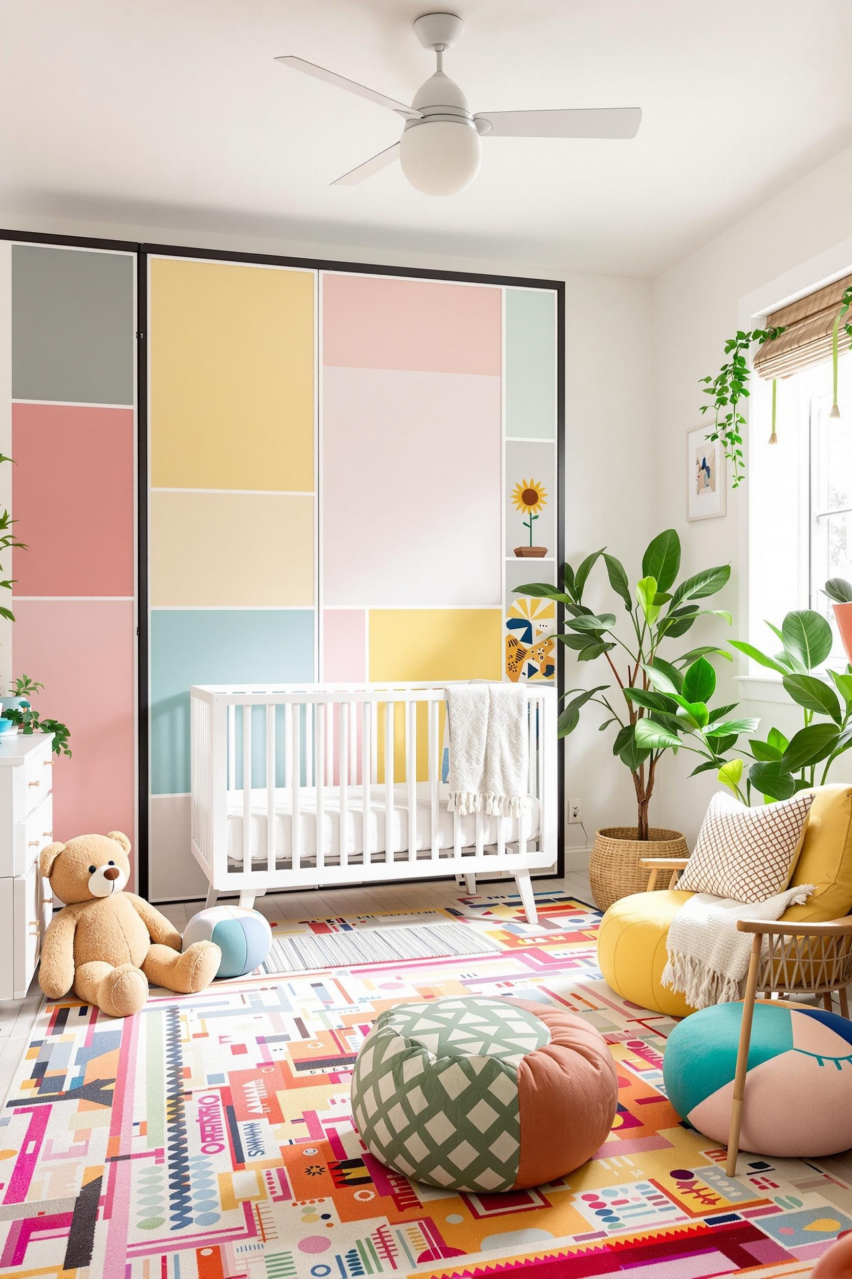
Q3: Can Minimalist Color Zoning Work in Different Rooms of My Home?
Yes! It works in bedrooms, kitchens, mudrooms, nurseries—you name it. Use a limited palette for consistency and add color only where needed to mark zones.
Q4: How Do Texture and Color Work Together in Color Zoning?
Texture enhances depth in zones. Try matte for background zones and use woven or shiny details to mark important spots—like your reading nook or entryway.
Q5: What Are the Most Effective Colors for Minimalist Color Zoning?
Some of my favorites are sage green, terracotta, pale blue, and dove gray. You’ll find these used beautifully across several projects on this site.
Your next step: Join the community of design-forward readers today and get exclusive interior design tips focused on color zoning and minimalist living.


