
Color Blocking for Minimalists: A Modern Design Guide
Understanding Color Blocking: The Basics
Color blocking originated in art and fashion, using solid contrasting blocks of color in compositions. In minimalist design, this translates to creating visual interest through strategic color placement. Remarkably, 95% of minimalist websites use monochromatic colors from a limited palette, a principle we can directly apply to interior design.
Choosing Your Minimalist Color Palette
When selecting colors, I recommend focusing on these key strategies:
- Use a base of neutral tones (black, white, gray)
- Select 1-2 accent colors
- Consider complementary or analogous color schemes
Interestingly, 46% of minimalist designs use up to two accent colors, with popular choices including red, orange, green, and purple.
Practical Color Blocking Techniques
Color blocking can visually transform spaces by:
- Creating visual separation in open floor plans
- Highlighting architectural features
- Making small spaces feel larger or more dynamic
Color Blocking in Different Rooms
Different rooms offer unique opportunities for color blocking:
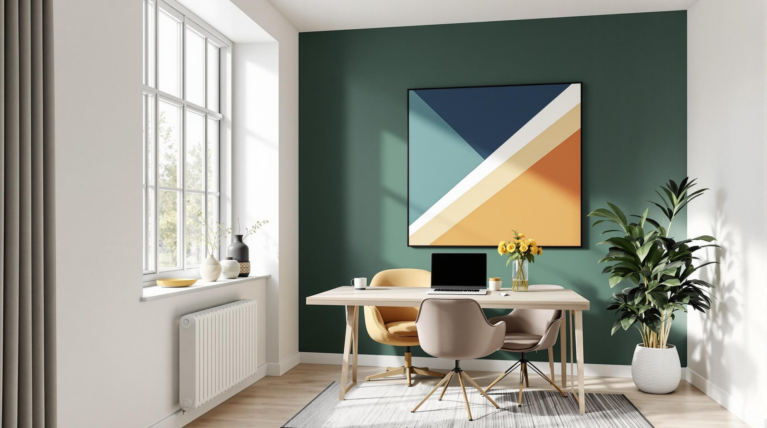
- Living Rooms: Use accent walls or furniture pieces
- Bedrooms: Create calm with monochromatic schemes
- Kitchens: Introduce color through backsplashes or cabinet details
Conclusion: Your Minimalist Color Blocking Journey
By embracing these principles, you can create a sophisticated, modern space that feels both intentional and effortless. Remember, in minimalist design, every color choice matters.
FAQ: Color Blocking for Minimalists
What is the most important rule in minimalist color blocking?
Keep your palette limited and intentional, focusing on 2-3 colors maximum.
Can I use color blocking in a small space?
Absolutely! In fact, strategic color blocking can make small spaces feel larger and more dynamic.
How do I choose accent colors?
Look to complementary or analogous colors on the color wheel, and consider the mood you want to create.


