
Color Zoning Interior Design: Transforming Multifunctional Spaces with Strategic Design
Have you ever walked into a room and felt unsure of its purpose? That’s often the case in open-plan or small layouts. In modern homes, boundaries between work, rest, and dining areas are increasingly blurred. In fact, over 78% of city dwellers now prefer flexible multifunctional spaces that adapt with ease.
Color zoning interior design solves this beautifully. With strategic use of color, paint techniques, and smart design, I create spaces that feel both cohesive and clearly separated by function. This goes far beyond just aesthetics—it’s about building smarter, more adaptable homes that work for you.
In this blog, you’ll learn how I use zoning with paint techniques to define multifunctional spaces. You’ll also discover:
- Creative two-tone wall designs for subtle transitions
- Minimalist interior color schemes to maintain harmony
- Color blocking interior design tips for open layouts
- Psychological strategies for functional zone separation
Let’s explore how color zoning for open spaces can truly transform your living areas.
Modern Color Zoning: Smarter Design for Multifunctional Rooms
Understanding the Power of Color Zoning Interior Design
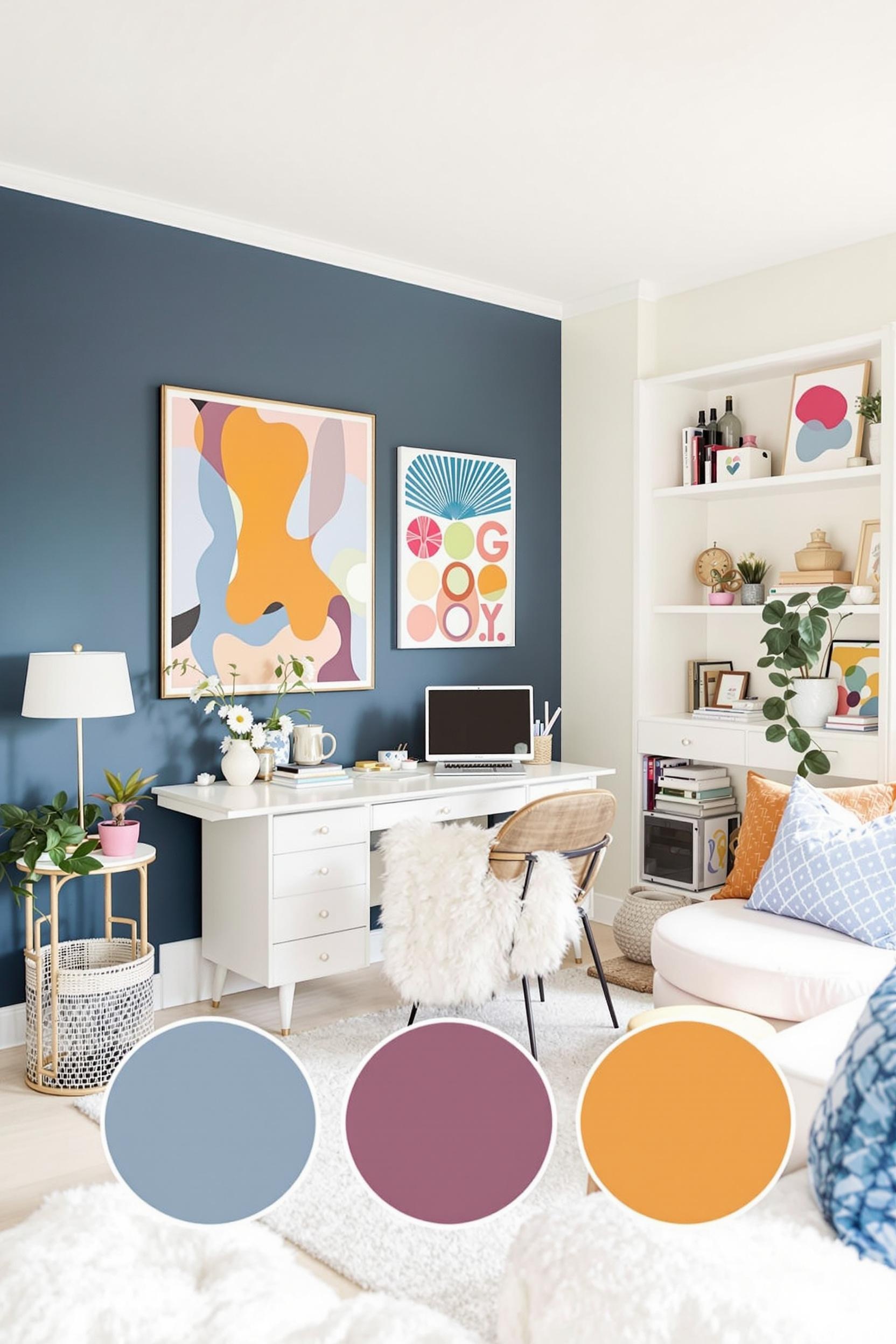
Color zoning creates visual and emotional boundaries without using walls. Whether designing a studio apartment or large open-plan area, I use color shifts to guide people through the space. A bold accent wall, a muted rug, or even textured finishes can clearly establish separate zones.
This approach enhances both form and function. Among the greatest benefits:
- Better organization of different home activities
- Visual clarity and improved navigation of space
- Psychological separation between work, rest, and dining
- Maximized space in smaller homes
For example, I often use deep navy in compact office nooks to boost focus. Just steps away, soft sage green signals a more restful living zone. These intentional color transitions mentally signal when it’s time to switch gears.
The Science of Zoning with Paint Techniques
Color psychology plays a key role in color blocking interior design. According to color theory, cool hues like blue or green foster calm, while warm tones energize and invite social connection.
My preferred method includes:
- Following the balanced 60-30-10 color rule
- Introducing accent walls to indicate purpose
- Layering complementary tones for flow and comfort
- Blending colors with varied textures such as matte, gloss, or fabric
Mastering Multifunctional Space Color Ideas
Strategic Two-Tone Wall Designs and Accent Zones
Two-tone walls are a subtle yet powerful way to add definition. I might paint the bottom half of a wall in terracotta to denote a reading nook, while a soft ivory above lightens the setting. This is just one of many modern color blocking trends that make small spaces work harder.
To keep things cohesive, I recommend using minimalist interior color schemes. Stick to clean neutrals, incorporating subtle contrasts like pale mint with warm beige or soft gray with blush rose.
When using architectural color blocking, I often apply bold colors sparingly to draw attention to specific areas like an entryway or creative corner. Shapes matter too—geometric lines and unexpected angles enhance visual interest while also guiding movement through the room.
Psychological Color Mapping and Flow
Each zone should support how you use it. I select hues based on their emotional influence. Clients looking to define work zones benefit from focused, saturated shades—navy, forest green, or steel blue. Social spaces thrive with uplifting colors like apricot, coral, or even mustard yellow.
This form of emotional design improves how the entire home feels. Even in single-room homes, strategic color helps you feel in control and focused. It also boosts productivity, better sleep, and even social engagement, depending on the palette.
Adding texture can reinforce these divisions. A matte painted area feels different from a glossy one. Throw in a textured linen wallpaper or woven rug under a seating area to support color borders without adding clutter.
Architectural Color Blocking: Sophisticated and Functional
Applying Minimalist Room Zoning Design in Small and Large Spaces
My personal method is grounded in three key pillars:
- Psychological Color Mapping: Choose colors that support each activity emotionally.
- Texture and Color Integration: Reinforce zones by adding layers of texture within each color.
- Minimalist Color Blocking Principles: Stick to the 60-30-10 rule for balance and simplicity.
These principles make color zoning for open spaces easier to implement no matter your square footage. With a minimalist interior color scheme, unnatural divisions disappear. Instead, flow and comfort dominate.
Try these practical steps at home:
- Use color blocking interior design shapes like stripes or rectangles
- Blend adjacent hues like navy to gray, or sage to cream
- Paint ceiling beams or baseboards in a different zone color
- Segment furniture arrangements to match paint boundaries
By pairing modern color blocking trends with logical layout adjustments, your home becomes adaptable and intuitive.
Transform Your Space: Color Zoning Magic Revealed
Color zoning has become my favorite way to make rooms feel purposeful, even small ones. It helps clients see, feel, and live differently—all through smart paint and palette choices.
My current projects use architectural color blocking to separate zones visually with no construction needed. Some of my top methods:
Key Color Blocking Interior Design Tactics
- Bold accent walls that give identity to your work or dining areas
- Two-tone wall designs to show soft transitions without clutter
- Geometric paint patterns to visually break up walls
Quick Tips for Everyday Use
- Choose two or three colors with good contrast—but harmony too
- Think about the emotions colors create and match them with functions
- Make sure the whole room still feels like one home
Ready to Revolutionize Your Living Space?
I invite you to explore these color zoning techniques in your home. Try zoning with paint techniques or dive into minimalist room zoning design. If this sparked your interest, don’t stop here!
- Subscribe to Our Newsletter: Get free tips, mood board inspiration, and design guidance.
- Share Your Thoughts: Comment on your favorite uses of color zoning or share any challenges you’re facing!
- Spread the Inspiration: Tag us on social media and show off your new zones!
Sign up for the Color Block Home Newsletter
Color Zoning FAQs: Transform Your Multi-Functional Spaces with Smart Design
What is color zoning in interior design?
Color zoning is a technique to define multiple zones in a room using color instead of walls. It’s perfect for open-plan homes.
How can I use color blocking in a small apartment?
Try two-tone wall designs or simple geometric shapes. Use complementary shades like beige and navy. Keep it unified with a soft color palette.
What are the best color schemes for multifunctional rooms?
Go for:
- Monochromatic schemes with soft color shifts
- Neutral bases with bold highlighters
- Muted palettes with strong contrast in accents
Can color zoning work in minimalist interiors?
Yes


