
Color Zoning Open Plan Living Spaces in a Mountain House with a Two-Story Ceiling
Have you ever stepped inside a mountain home with soaring ceilings and a wide-open layout, only to feel… lost? I have. While two-story ceilings and open-plan living rooms may be breathtaking, they often lack clear definition and purpose. That’s where color zoning in open plan living rooms comes in—my favorite way to transform intimidating wide-open interiors into cozy, functional sanctuaries.
In this post, I’ll walk you through proven color zoning strategies for mountain homes. I’ll share real examples from my projects, cover minimalist methods, and show how to use vertical color blocking to maximize your space. Plus, I’ll give you pro tips on color psychology, natural material pairings, and how mountain light changes everything.
Why Color Zoning Works So Well in Mountain Homes
When I think of a mountain home interior color zoning project, I picture high ceilings, open rooms, and stunning views. But without defined zones, these open plans can feel messy. Unlike traditional layouts, color zoning helps organize your space without blocking light or views.
Color zoning means separating spaces visually using strategic color placement—on walls, trim, or even ceilings. It’s about guiding your eye and movement throughout the space while keeping things open and breathable.
The best part? Modern open plan color separation doesn’t require walls. A shift in color, a bold accent panel, or even a two-tone ceiling can define a lounge from a dining zone while still keeping everything connected.
Minimalist Color Zoning for Open Concept Living
I love minimalist color blocking for its simplicity and clean design. In open-plan mountain homes, simplicity keeps things cohesive. Too many styles—or too many colors—make the space feel busy and chaotic.
So how do I choose the right paints? I always follow the 60-30-10 design rule—60% base color, 30% secondary shade, and 10% accent. In mountain homes, that usually means muted neutral walls (like warm grays), darker flooring or furniture, and bold or earthy pops like deep forest green.
How to Create Color Zones in a Two-Story Living Area
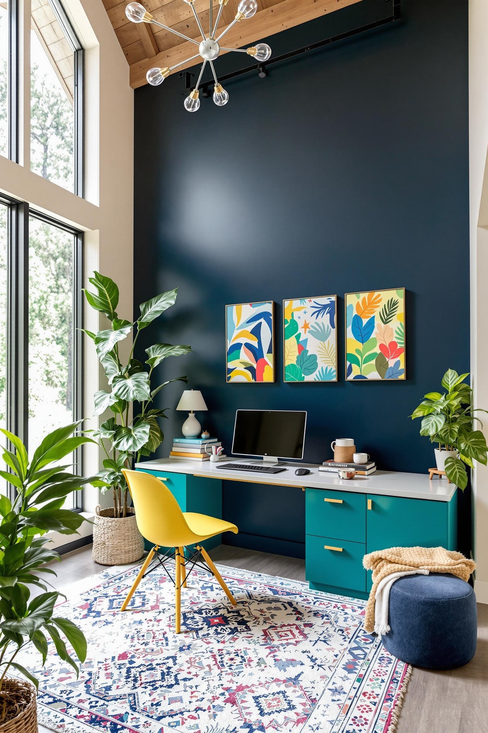
That tall, echoing height in a two-story ceiling looks dramatic—but it can feel cold without thoughtful design. To fix that, I use vertical color zoning. Imagine painting a tall panel that runs from floor to ceiling in a rich, warm tone. That vertical line draws the eye up while also anchoring the space, helping you feel enclosed—cozy, even.
Want to keep the height airy but still organized? Choose slightly darker hues near the lower walls and let them fade into lighter tones near the ceiling. This trick, called aerial color transition, takes advantage of tall space without dividing it too starkly.
Built-ins help too. Shelves, loft edges, or rafters in contrasting tones can add rhythm and color without clutter.
Best Paint Colors for Mountain House Interiors
Mountain homes are surrounded by nature, so I usually draw inspiration from the outdoor palette for my open plan living space color palette ideas. I lean toward:
- Warm grays, like riverbed stones
- Soft terracotta and cinnamon hues
- Deep greens from pine and juniper
- Mossy earth tones and muted taupes
These colors pair well with natural materials too. Think weathered wood, matte black fixtures, and hand-troweled plaster. For more ideas, check out my 2025 minimalist paint ideas.
Color Psychology: Crafting Emotional Zones
Every color speaks a language. Understanding color psychology for mountain homes lets me design rooms for emotion—not just function. Here’s how I break it down:
- Blues/Greens: Ideal for reading, resting, or meditating
- Terracotta/Yellows: Energizing tones perfect for kitchens or dining zones
- Muted neutrals: Perfect for quiet workspaces or hallways
Color can also manipulate how space feels. Design experts recommend warm tones to “pull in” double-height spaces, creating intimacy, while cool tones help open and expand them.
How Texture Enhances Color Zoning
You don’t need to rely on paint alone. One easy way I add richness is by pairing texture and color. In one of my recent projects, I wrapped the fireplace column in vertical wood slats painted a deep forest green. Against the white walls, it created a striking focal point in the living zone.
Natural stone, woven fabrics, clay walls—these give your space tactile color. And best of all, no heavy remodeling required. Just like that, a living area feels separate but still part of the larger room.
Other Ways to Zone Without Paint
Color zoning also works with mobile or soft furnishings:
- Area rugs: Separate eating spaces from sitting areas
- Cushions and throws: Coordinate color themes without commitment
- Furniture finish: Try using different wood tones for contrast
These let you update your zones as seasons shift or your layout changes.
Advanced Mountain Home Zoning Strategies
Want to take your design a level higher? Try layered zoning strategies. I use “color gradation zoning” in great rooms that include multiple functions—kitchen, dining, and lounge. This method slowly shifts from one color zone to another. Think pale sand in the kitchen transitioning to olive in the lounge. It’s seamless, and it keeps your design fluid.
Another clever approach is strategic color zoning—where architectural features like photo ledges, lighting, or even shadow lines become part of the visual definition.
Common Mistakes to Avoid
Even experienced designers make zoning missteps. Here are a few misfires I always warn my clients about:
- Choosing too many bold colors all at once
- Not considering lighting—colors change throughout the day, especially with big windows
- Creating harsh transitions that stop the eye instead of guiding it
Instead, test paint swatches at different heights. What feels elegant in the morning might look dingy at dusk!
Color Zone Your Mountain Home Like a Pro
If you’re still wondering where to start, I always recommend clients pick one feature to highlight first—like a fireplace, window seat, or tall shelf. Zone it with a bold color. Then build the room’s palette outward from there, staying within the 60-30-10 ratio.
Need more inspiration? My full color blocking design guide dives into accessories, furniture, and layout tips for homes just like yours.
Transform Your Mountain Home: Color Zoning Mastery Awaits!
Your journey into mountain home design doesn’t end here—it’s just beginning. Color zoning is more than picking paint. It’s about shaping emotion, organizing your space, and celebrating your mountain environment.
Unlock Your Design Potential: Free Color Zoning Consultation
Feeling unsure where to begin? I’m offering a free consultation for homeowners ready to explore color zoning strategies.
This includes:
- Vertical color blocking strategies
- Mountain-inspired palettes
- Open plan color blocking ideas
- Psychology-based space planning
Your Mountain Home Color Zoning Toolkit
I’ve also created a free pack filled with expert resources:
- Mountain color palette guide
- Vertical color cheat sheet
- Open-plan zoning worksheet
- Color psychology quick guide
Get Your FREE Color Zoning Toolkit Now!
Frequently Asked Questions: Mountain Home Color Zoning Mastery
Q1: How do I create color zones in a tall, open-plan space?
Focus on vertical color divides. Try bold chimney walls or floor-to-ceiling paint accents. Stick to the 60-30-10 rule and test samples at all heights.
Q2: What colors work best in minimalist mountain homes?
Stone grays, pine greens, terracotta, and off-white shades. Keep it natural and earthy to blend with the outdoor views.
Q3: Can I use color psychology to zone?
Definitely. Cool tones help with focus or calm. Warm accents add energy to social zones. Tailor each area with purpose in mind.
Q4: What mistakes should I avoid?
Don’t use too many colors. Avoid harsh transitions, and always factor in how light affects color in large, window-heavy rooms.
Q5: Does color zoning work in small mountain homes?
Yes! In fact, it may be more important. Lighter zones make rooms feel larger, while darker hues give cozy definition.
Your mountain home has incredible potential. Color zoning can give you clarity, comfort, and beauty.
Join the Community!
Want more color zone tips, tools, and transformations? Sign up today and be the first to access free tools, expert advice, and minimalist design ideas just for mountain homes.


