
Muted Pastel Color Blocking for Minimalist Interiors: Serenity Meets Sophistication
Have you ever entered a room and felt instantly calmer? That calm isn’t accidental—it’s often created by smart color design. As an interior designer passionate about minimalist styling, I’ve found that muted pastel blocks are magic for creating mood. These soft hues—sage green, powder blue, blush pink—are the secret to transforming any home into a serene, emotionally comforting space. In this guide, I’m diving deep into how muted pastel color blocking can turn your minimalist home into a sanctuary of style and tranquility.
Muted pastel color palettes are ideal for minimalist color blocking. They reflect more natural light, reduce visual clutter, and enhance the perception of spaciousness. In smaller homes and apartments, I rely on this strategy to carve out zones—without adding walls. A simple dusty pink block behind a desk or a sage green border around a reading nook can change how a room functions and feels.
Why Muted Pastels Work in Modern Minimalism
There’s a reason muted pastels are making waves in minimalist interior design. Unlike harsh contrasts or highly saturated colors, these quieter tones lower visual stress and promote psychological comfort. In fact, studies show that spaces designed with muted color palettes increase user satisfaction, perceived quality, and even dwell time [source].
From top paint ideas for 2025 to reinventing walls with geometric layouts, I’ve seen how colors like dusty blue, pastel greys, and blush pinks not only look good—they feel good. These soft pastel accent trim ideas infuse a space with warmth without breaking the minimalist vibe.
Color Psychology Meets Emotional Design
Let’s talk about the emotional side of pastel block design. I recently worked on a client’s home office where we used muted pastel color zoning—dusty pink for focus, sage green for calm, and powder blue for reflection. The client reported feeling less stressed and more productive. This isn’t surprising. Studies show that muted pastels reduce cortisol levels, enhance natural light, and support cognitive clarity [source].
Muted pastel blocks also fit well in open floor plans. By subtly dividing areas using color instead of furniture, you get the benefit of functional zoning—without visual noise. It’s great for flow and keeps that minimalist harmony intact.
Muted Pastel Color Blocking Techniques for Every Room
💡 Living Room: Calm + Conversation
Create a cozy, color-blocked pastel oasis using soft earthy tones and layered textures. A muted clay pink behind the sofa and sage across adjacent walls creates a backdrop that’s perfect for conversations and downtime. Need more inspo? This living room color blocking guide is packed with ideas.
🛏️ Bedroom: A Soft Retreat
Muted pastels in the bedroom deliver peace and rest. I love using dusty blue headboard walls paired with blush pink bedside panels for a cocooned feel. These tones reduce stress at night and soften mornings. For a little more structure, try vertical pastel blocks like in this bedroom zoning guide.
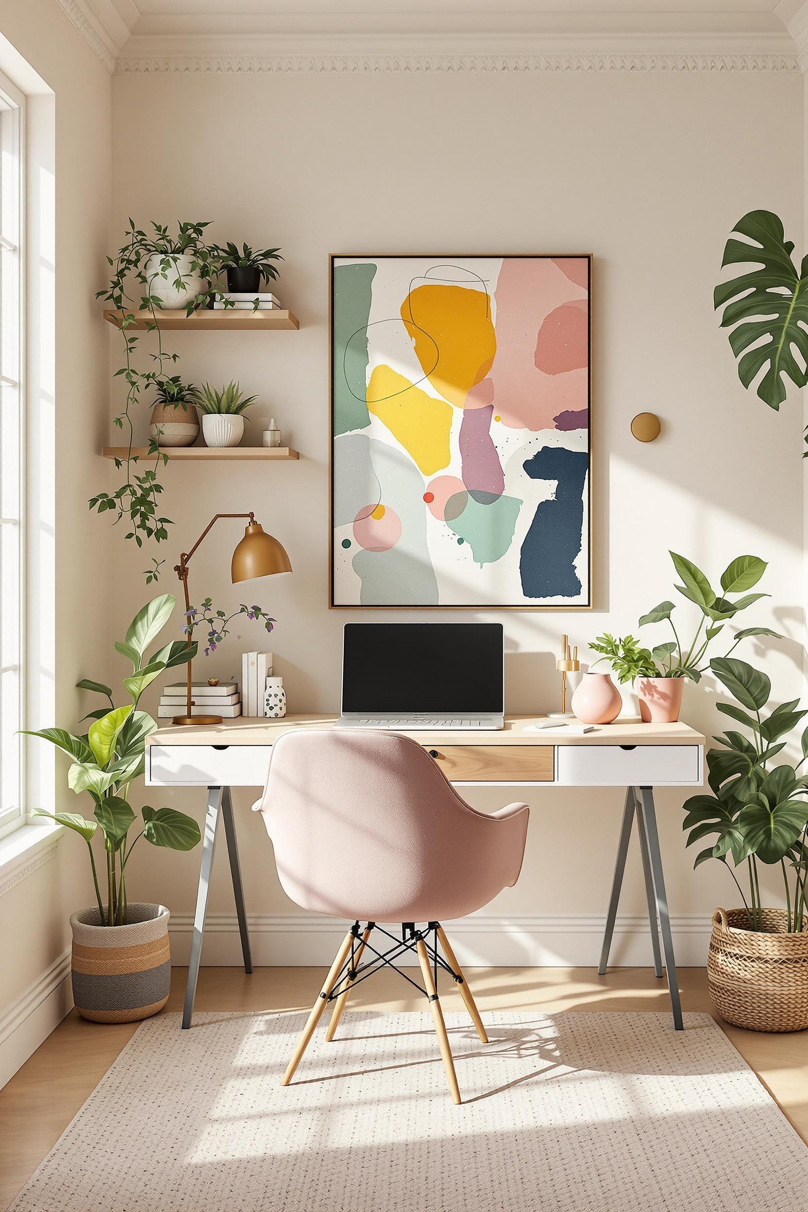
🧑💻 Home Office: Zoned for Focus
Soft pastel blocks in your workspace promote psychological alertness. Use geometric zones in muted greens or greys behind your desk to define your work zone. I often refer my clients to this awesome resource on how to transform your office with color zoning.
🚪 Entryway: A Gentle Welcome
Introduce visitors to your pastel paradise with a color-blocked entry. I used a combination of mellow lavender and pale terracotta in my own home’s foyer. It’s warm, but quiet—exactly the minimalist look I go for. Try something similar with this helpful guide on transforming your entryway.
Muted Pastel Pairing Tips: Keep It Balanced
- Blush Pink + Pastel Grey — Soft contrast that still feels neutral
- Dusty Blue + Beige — Classic combo for timeless style
- Mint Green + Off-White — Super fresh and clean
When selecting combinations, make sure all tones share the same temperature (cool or warm). Keep stronger colors as accents and let light pastels dominate the main surfaces. It’s also smart to match blocks with monochrome furniture or minimalist lighting to prevent clashes.
Strategic Pastel Color Zoning in Small Spaces
I often work in small homes and apartments where space-saving color zoning shines. A muted pastel block behind your dresser or dining table can visually anchor that function without any bulky furniture. These strategic pastel block feature wall ideas open up floorplans while keeping that warm, modern feel. Visit this guide for small apartment color blocking tips.
Pastel Finishes and Textures: A Quick Guide
To avoid a bland look, I always recommend mixing finish textures:
- Use matte pastel paints on walls
- Pair with linen curtains or bouclé throws
- Add soft metallic accents (gold, brushed brass)
- Incorporate raw elements like rattan or light wood
This elevates the muted pastel palette without interrupting the minimalist tone.
Color Blocking for Emotional Comfort
Muted pastels promote well-being. That’s not just theory—it’s backed by research. These soft tones are shown to reduce stress, boost cognitive clarity, and help define emotional “zones” in rooms. As someone who’s worked in high-stress home environments, I’ve seen muted pastels make a real difference. If you’re creating a nursery, home library, or even a quiet meditation area, muted pastel color blocking is a scientifically sound—and elegant—option.
Transform Your Home: Muted Pastel Design Revolution Starts Now!
Feeling inspired? Great—now it’s time to put it into action.
Your Personalized Color Blocking Consultation
I’ve developed a unique way to guide you through muted pastel color blocking. Together, we bring your minimal aesthetic to life—tailored to your home, your style, and your emotional needs.
Free Design Transformation Toolkit
Claim access to my free transformation toolkit, including:
- Color Compatibility Assessment
- Muted Pastel Blocking Guide
- Psychological Design Worksheet
- Expert Video Consultation Invite
Join our community to start your pastel design journey. You’ll receive monthly design tips, early access to new resources, and personalized consultation opportunities.
Muted Pastel Color Blocking: Your Ultimate FAQ Guide
Q1: How do I choose the right muted pastel color palette?
Pick three to four tones based on lighting and space purpose. Start with a core neutral (like muted sage), then layer in dusty pink or soft sky blue for depth.
Q2: Can muted pastel color blocking work in tight spaces?
Yes! Geometric blocks in pastel colors can define spaces like reading nooks or sleeping zones without closing up the room.
Q3: What are the health benefits?
Muted pastel rooms lower stress, improve sleep, and encourage focus. They also enhance natural light for a brighter mood.
Q4: How do I stop pastels from looking boring?
Add layers—different textures, finishes, subtle metals, handmade ceramics. This creates depth while keeping it calm.
Q5: Which rooms benefit most?
Bedrooms, home offices, and living rooms. But I’ve also used muted pastels in bathrooms and kitchens to surprising effect. Try this guide for kitchen updates.
Your minimalist design revolution starts now. Whether you’re planning a bold update or a subtle pastel refresh, I’m here to help you every step of the way. Let’s create spaces that aren’t just beautiful—but healing, too.


