
Monochrome with a Twist: Adding Bright Accents to Neutrals for a Penthouse
Have you ever walked into a minimalist penthouse that felt a little… lifeless? Sleek, yes. High-end, definitely. But missing that spark that sets a space apart? I’ve seen it time and again—open concept floor plans cloaked in muted neutral tones that, while elegant, often lack warmth and personality. The game-changer? Monochrome interior design with bold accent colors. It’s the magic twist that turns stark into stunning and minimalist into magnetic.
In my interior design work, especially with luxury penthouses, I use color block interior design to bring monochromatic spaces to life. I’m excited to share how to thoughtfully inject bright accent home decor into your neutral palette penthouse while preserving its clean, sophisticated essence. We’ll explore purposeful splashes of color, textural depth, and geometric precision—all through a practical, artistic lens. Let’s design your dream space one bold statement at a time.
Color Blocking Techniques: Transforming Neutral Penthouses with Bold Accents
I often begin with the 70/30 rule: 70% neutral tones (like whites, grays, and beiges), and 30% strategic accent colors. This keeps the overall feeling calm and cohesive while allowing for standout focal points. In one penthouse, I transformed an all-white living room by adding a deep emerald green accent wall paired with matching velvet chairs. The transformation was profound.
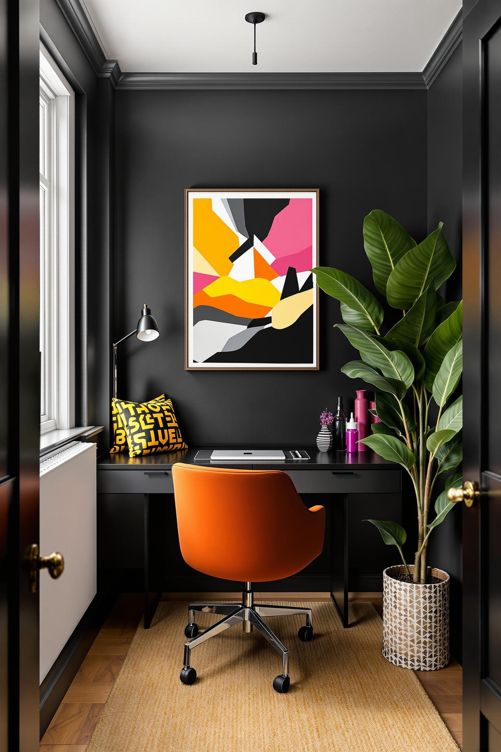
Incorporating bright accent furniture for modern penthouse design doesn’t require a major renovation. A bold orange geometric rug, cobalt blue art, or even color-blocked shelving can serve as powerful design tools. Color psychology supports this too—blues create calm, yellows ignite creativity, and reds boost energy. These elements, when tied to your modern neutrals interior base, offer exciting contrast without clashing with minimalist principles.
Texture: The Secret Ingredient of Monochrome Design
When working with a monochrome penthouse interior with bold color accents, texture is everything. Without it, spaces feel flat. I mix materials like sleek marble, raw wood, matte ceramics, and brushed metal to bring visual excitement to otherwise quiet palettes.
For example, I designed a stress-free wellness zone inside a penthouse using shades of white and gray with wool textures, wood beams, and brass lamp fixtures to add depth. The neutrals told a calming story, while the rich tactile experience made the story worth feeling.
Geometric Color Blocking as Visual Architecture
Geometric precision plays a major role in color blocking wall ideas for luxury apartments. I often match color breaks with architectural elements—beams, columns, doorway outlines. In one of my favorite projects, I used charcoal gray on the lower third of a wall, white above, and added a mustard chair placed perfectly at the transition. The geometry felt both artistic and structured.
This works beautifully in small spaces, like foyers and hallways, where bold colors can energize without overpowering the room. According to Laurel Bern Interiors, integrating various tones of the same color—even within the same wall—brings sophistication and depth.
Using Color Psychology in Modern Penthouse Monochrome Living Rooms
Color isn’t just visual—it’s emotional. In therapy rooms, as discussed on Dare Therapy, calm blues foster tranquil moods and greens help restore balance. The same applies in interiors. In large spaces, cool colors tend to recede, making rooms feel bigger. Warm colors bring walls visually forward, making large open concepts feel intimate.
In one client’s open-plan penthouse, we designed a neutral kitchen with bold accent decor: taupe cabinetry, ivory backsplash, and a fire-engine red espresso machine as the surprise element. Little color inclusions like this create interest and break up monochromatic sameness.
Adding Pops of Color Without Commitment
If you’re hesitant about permanent changes, start small. Try colorful accessories for minimalist luxury interiors like throw pillows, art prints, or vases grouped by color family. Go for analogous color blocking—shades that sit next to each other on the color wheel—like soft greens and teals, or rust and tangerine. They offer harmony and subtle transition without harsh contrast.
For example, grouping rose pink vases on a console in a beige hallway can shift mood with zero paint involved. If you ever feel emotionally stuck in your design journey, like your space just doesn’t reflect “you,” I advise taking small actions. Just like in therapy, transformation doesn’t require drastic measures—it’s about intentional progress. You can learn more about taking those first steps at Dare Therapy’s guide on breaking free.
Advanced Color Blocking Techniques for Luxury Minimalist Penthouses
To elevate your interior story, you can use color blocking zoning within your space. A slight color shift can redefine rooms without walls. In one project, I used light gray for the dining area and transitioned into navy in the lounge. The two spaces felt connected yet distinctive.
That spatial division created emotional variety (calm vs. cozy) and visual rhythm. Remember, with open-plan penthouses, elements must feel continuous. That’s where repeating accent colors—like using a sapphire blue found both in the kitchen stools and a hallway painting—build harmony without monotony.
Conclusion: Elevating Your Penthouse Design Through Strategic Color Blocking
Color blocking is more than style—it’s intentional design. Let’s summarize what transforms a neutral penthouse from elegant to emotional:
- Color psychology matters: Color influences feelings, energy, and perception.
- The 70/30 rule: Balance neutrals with thoughtfully chosen bold accents.
- Texture adds depth: Mix materials to avoid flatness in color-drenched rooms.
- Strategic color placement: Be deliberate with furniture, art, and architectural accents.
- Holistic design: Let your penthouse reflect your story, not just your style.
Design isn’t just about following trends—it’s about shaping how you feel every day. Whether your style is bold or subtle, colorful or monochrome, I encourage you to explore your visual voice and design accordingly.
Transform Your Penthouse: Design Your Dream Space Now!
Unlock the Power of Color Blocking in Minimalist Luxury Interiors
In the world of luxury penthouses, the smallest design decisions make the biggest impact. Color blocking isn’t just design—it’s an emotional tool for transformation. I’ve helped so many clients reimagine their neutral homes with just one color twist.
- Try an emerald accent wall for powerful contrast
- Add yellow cushions to bring joy into a gray bedroom
- Use geometric lines to section space in an open concept without construction
Design Your Future: Professional Tips and Resources
JOIN THE COLOR BLOCKING REVOLUTION
Sign up and you’ll get:
- Professional insights into monochrome interior design
- Monthly design inspiration and accent color palettes
- Expert advice on neutral tones with bold accents
A small splash of courage—like a mustard chair or teal art piece—could be the start of a design revolution. Let’s do this together.
FAQs: Your Color Blocking Design Questions Answered
Q1: How do I successfully add bright accents to a neutral penthouse interior?
Use the 70/30 rule. Stick with 70% neutral decor and add 30% bright accents through pillows, art, or furniture. Let your accents stand out while blending with the minimalist base.
Q2: What are the best color blocking techniques for minimalist penthouses?
Use architectural lines as natural color breaks. Choose furniture that reflects accent hues. Create transitions between function zones with color gradients for a seamless look.
Q3: How can color psychology influence my penthouse interior design?
Colors create subtle emotional shifts. Soft greens promote balance. Blue brings calm. Red energizes. Place specific hues to match your space’s emotional purpose.
Q4: What mistakes should I avoid when color blocking in a minimalist penthouse?
Avoid using too many bold shades. Stick with a consistent color temperature. Layer textures to keep minimal spaces interesting. Don’t forget proportional balance.
Q5: How do I choose the right accent colors for my neutral penthouse?
Think about natural light and room function. Use a color wheel to find pairs or contrasts. Match colors to your personality, not just your furniture. Test small items before committing.
Ready to reimagine your penthouse into something truly extraordinary? Get insider ideas and explore bright accent design weekly. Sign up today:


