
Painting Sections of the Ceiling with Different Colors to Create a Visually Dynamic Overhead Space
Most homeowners overlook the ceiling when designing their interiors. But what if I told you your ceiling—or the “fifth wall”—is the secret to transforming your space into a bold, modern, and minimalist masterpiece? By painting sections of your ceiling with different colors, you can create a dynamic and spacious feel, define areas in an open concept home, and add unexpected artistic flair. As someone passionate about minimalist color blocking, today I’ll share how ceiling color blocking can give your home a bold refresh.
Color blocking ceilings introduces zones of color that add structure and personality to a room. This approach isn’t just a passing trend—it’s a design technique backed by spatial psychology. Studies have shown that brighter ceilings appear higher than darker ones, altering perceptions of room size and structure. When integrated strategically, ceiling color blocking becomes a sophisticated design move that enhances both aesthetics and functionality.
Geometric Ceiling Color Blocking: Modern Techniques for Minimalist Rooms
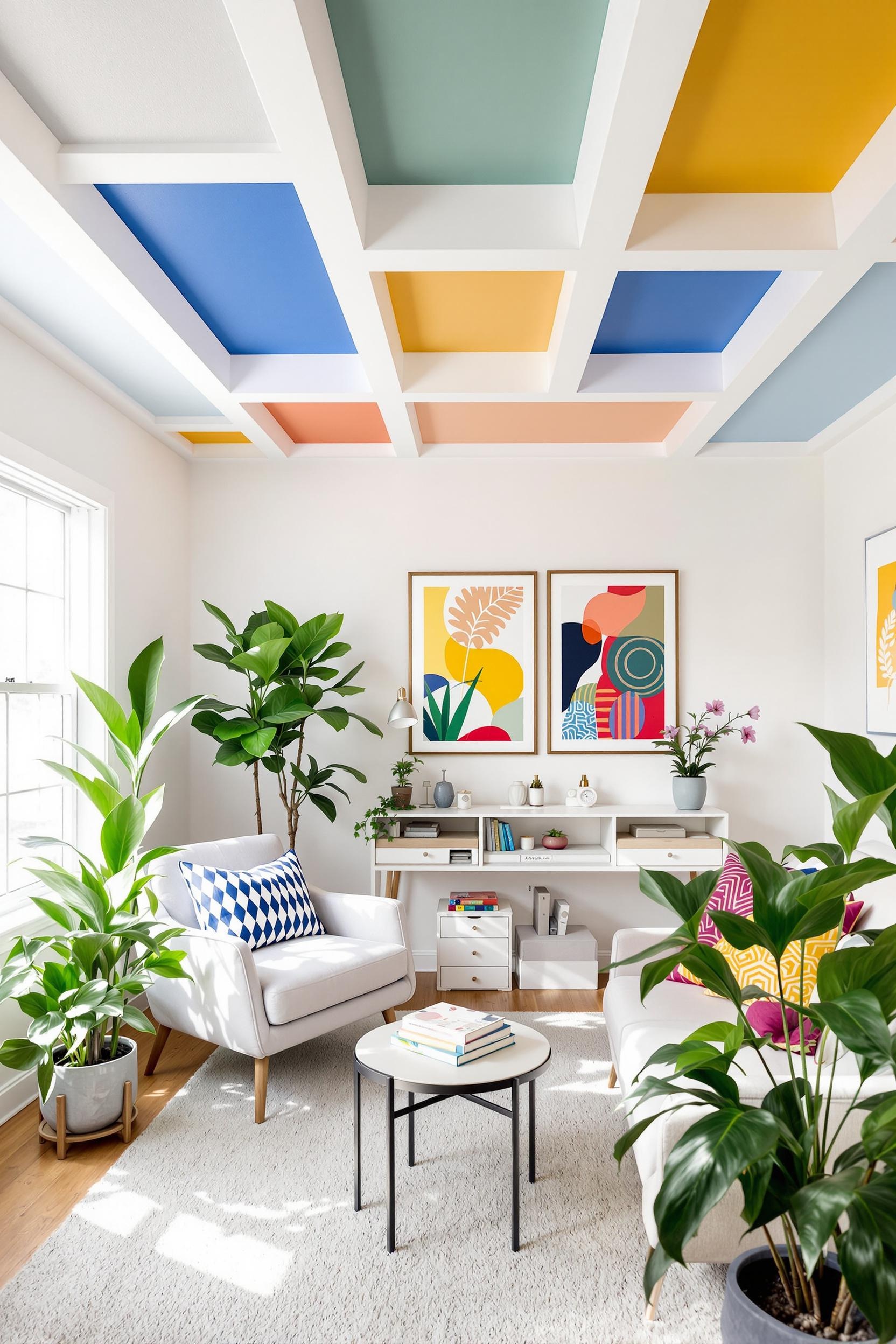
Geometric ceiling paint patterns are an elegant way to introduce color blocking ceiling strategies into a space. When I started experimenting with color zoning overhead, I quickly realized how essential crisp lines and clean shapes are in making the look intentional. I follow a grid or a triangle layout when designing these patterns and often extend wall colors onto the ceiling to create a connected and immersive space.
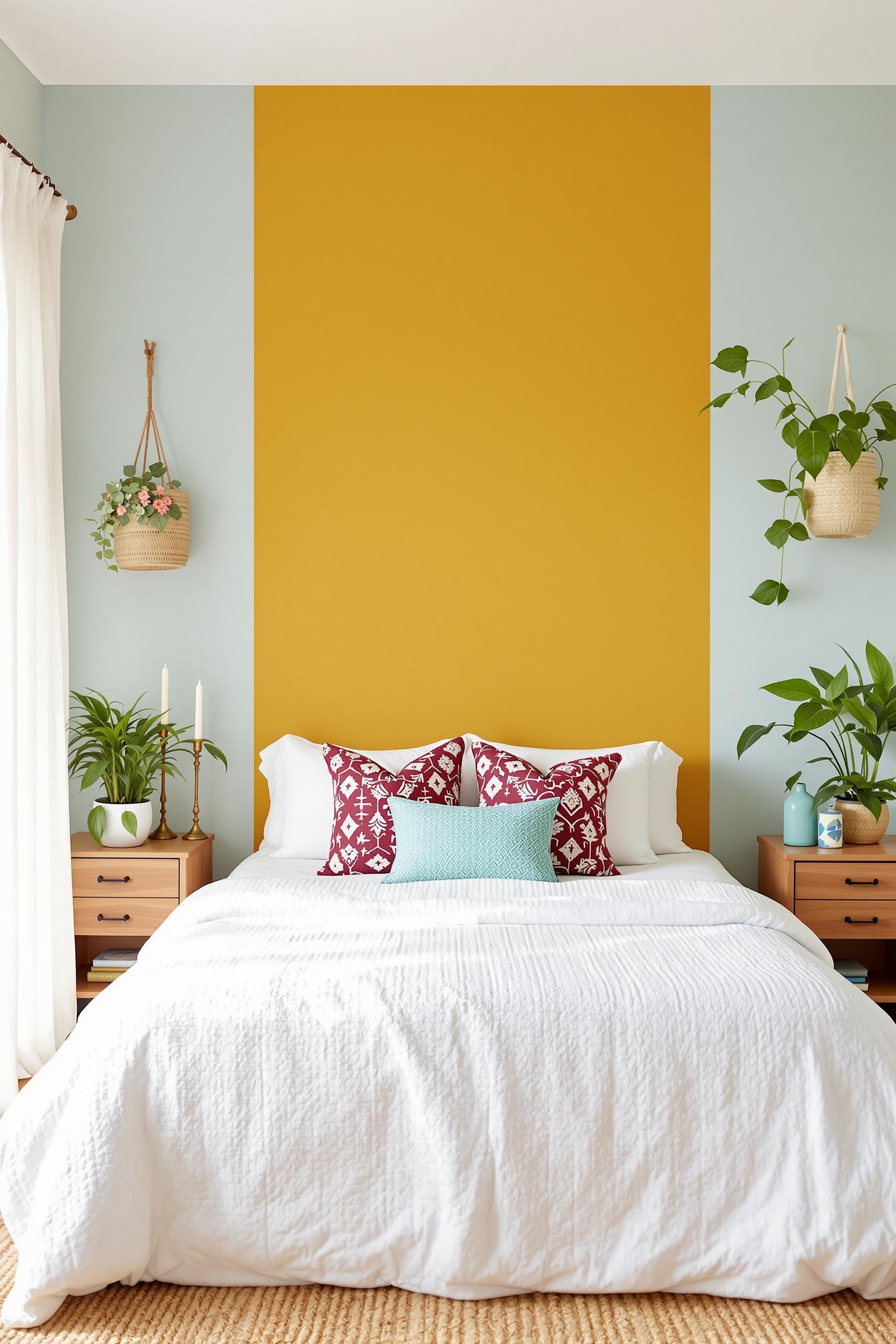
For example, extending a headboard wall color onto the ceiling can establish a strong focal point above the bed, reinforcing the bed as the most important feature of the room.
Choose simple shapes like rectangles, bands, or diagonal cuts for a modern painted ceiling idea. You can see this executed beautifully in this geometric color blocking tutorial where vertical shapes elongate the room and reframe the eye upward.
These modern painted ceiling ideas aren’t just for aesthetics—they’re practical too. By using lighter color zones in the center of the ceiling and darker hues on the perimeter, the ceiling seems to rise, giving smaller rooms added height. I especially recommend this in compact interiors where optimized space perception is everything.
Ceiling Color Block Ideas for Open Floor Plans
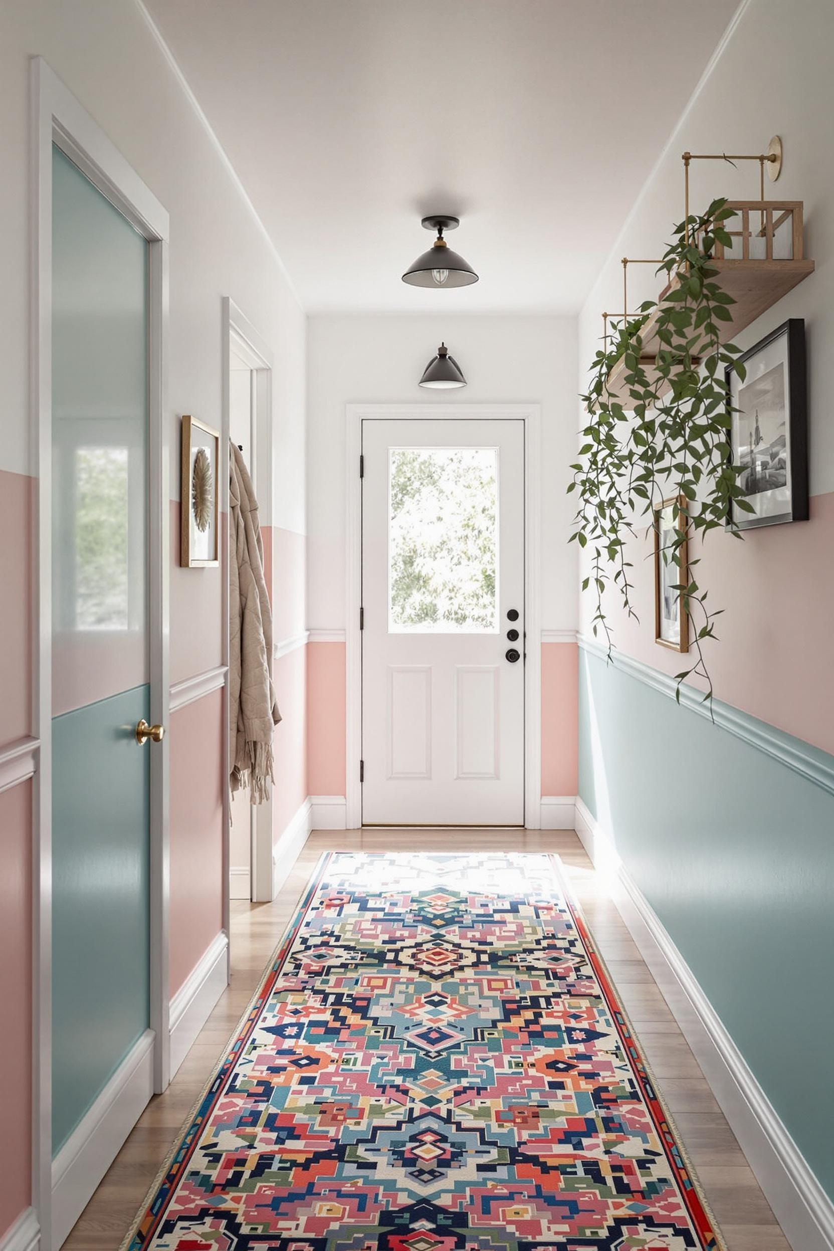
Open concept interiors benefit greatly from painted ceiling color combinations that define functional zones like dining, living, or workspace areas. Color blocking the ceiling helps visually divide these zones without relying on physical barriers. I’ve applied this technique using warm earth tones above the seating area and cooler blues above the kitchen in an open studio—it completely shifted the energy of each space.
Incorporating color zoning techniques overhead balances flow with separation, ideal for minimalist homes where furniture and walls are kept sparse. It’s about redefining layout with paint, not partitions.
Choosing Colors: Minimalist Ceiling Paint Design with Impact
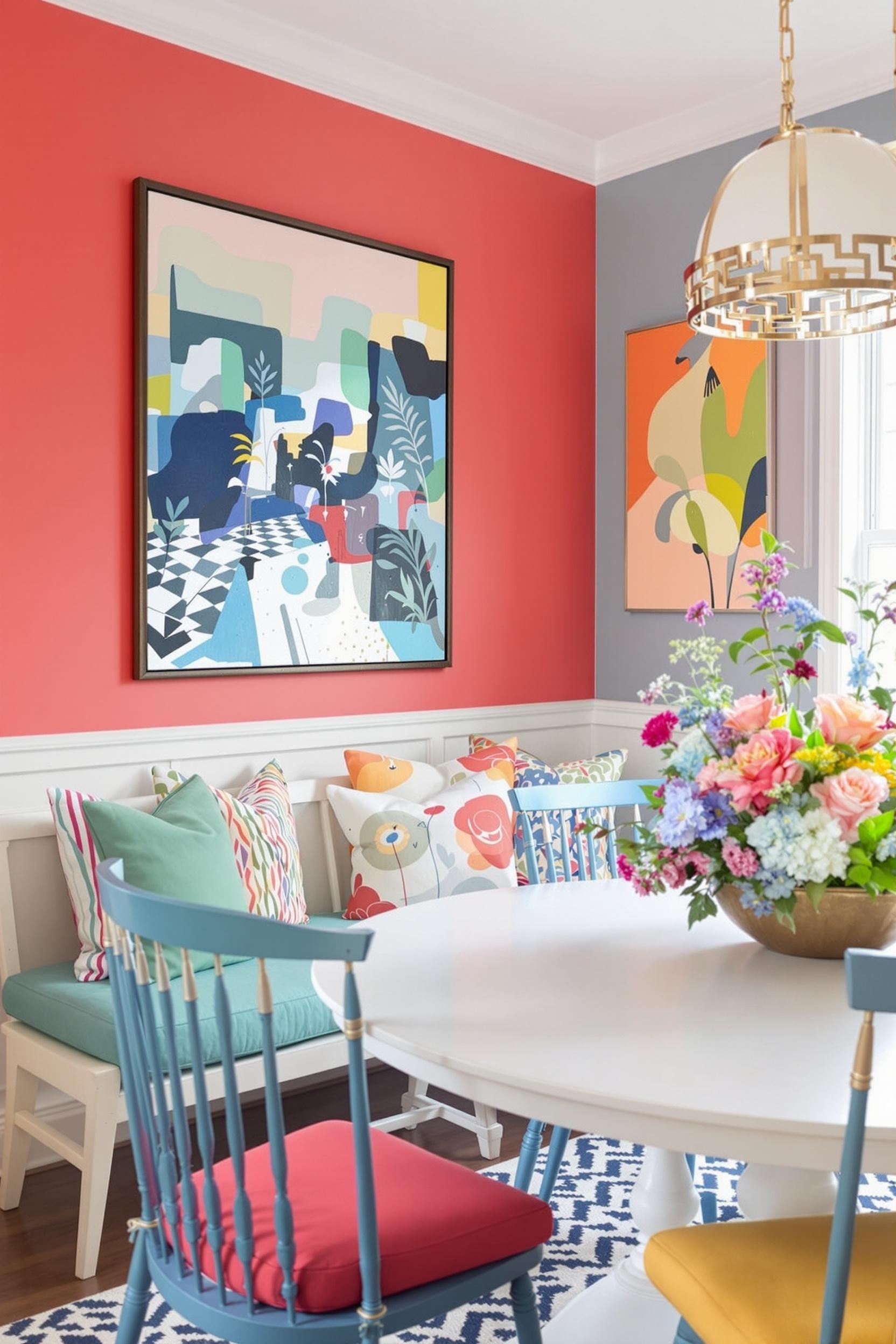
Color choice is essential to success. For minimalist ceiling paint designs, I often begin with a neutral foundation—light greys, taupes, or off-whites—and layer one or two bold accent hues. These work beautifully because they retain architectural calm while creating a colorful statement ceiling effect.
You might try a monochrome technique like sage to forest green transitions, or soft lavender paired with deep plum at the edges. This approach is prominent in muted pastel interiors where soft tones bring sophistication without overwhelming minimalist spaces.
Remember to test your painted ceiling color combinations under various lighting conditions. Light interacts differently throughout the day, and the same color might appear cooler or warmer depending on sunlight angle and bulb warmth. North-facing rooms benefit from warmer paint shades, while south-facing spaces can handle cooler, bolder tones.
Creative Ways to Paint Ceiling in Minimalist Homes
I’ve found that smaller design moves—like line borders or ceiling-to-wall transitions—can be just as striking. Try measurable accents like a stripe over the kitchen ceiling to center an island or a solid color panel over an entryway. These are perfect if you’re new to ceiling color blocking and want to test waters first.
You can explore more ideas from my favorite guide on transforming your home with paint zones, especially for multifunctional or small footprint homes.
DIY Tips for Geometric Ceiling Paint Patterns
Thinking about doing this yourself? It’s totally doable! Here’s what I use for great results:
- High-quality painter’s tape for extra clean lines
- Use a level or laser measure to outline your zones
- Start small—a single band or corner—then grow your design as you gain confidence
- Use low-VOC paints to keep indoor air safe and fresh
If you’re painting more than one color, let each section fully dry before taping over it to avoid bleeding. Planning is everything—take pictures of your space from different angles to strategize your layout before you even pick up a paintbrush.
Color Blocking for Emotional Impact and Spatial Psychology
Ceiling color blocking also harnesses design psychology. Lighter hues lift the ceiling, while darker bordered edges add a cocooning mood. This illusion enhances intimacy, comfort, or openness depending on your design goal. Here’s my guide that breaks color psychology down: Monochrome Magic.
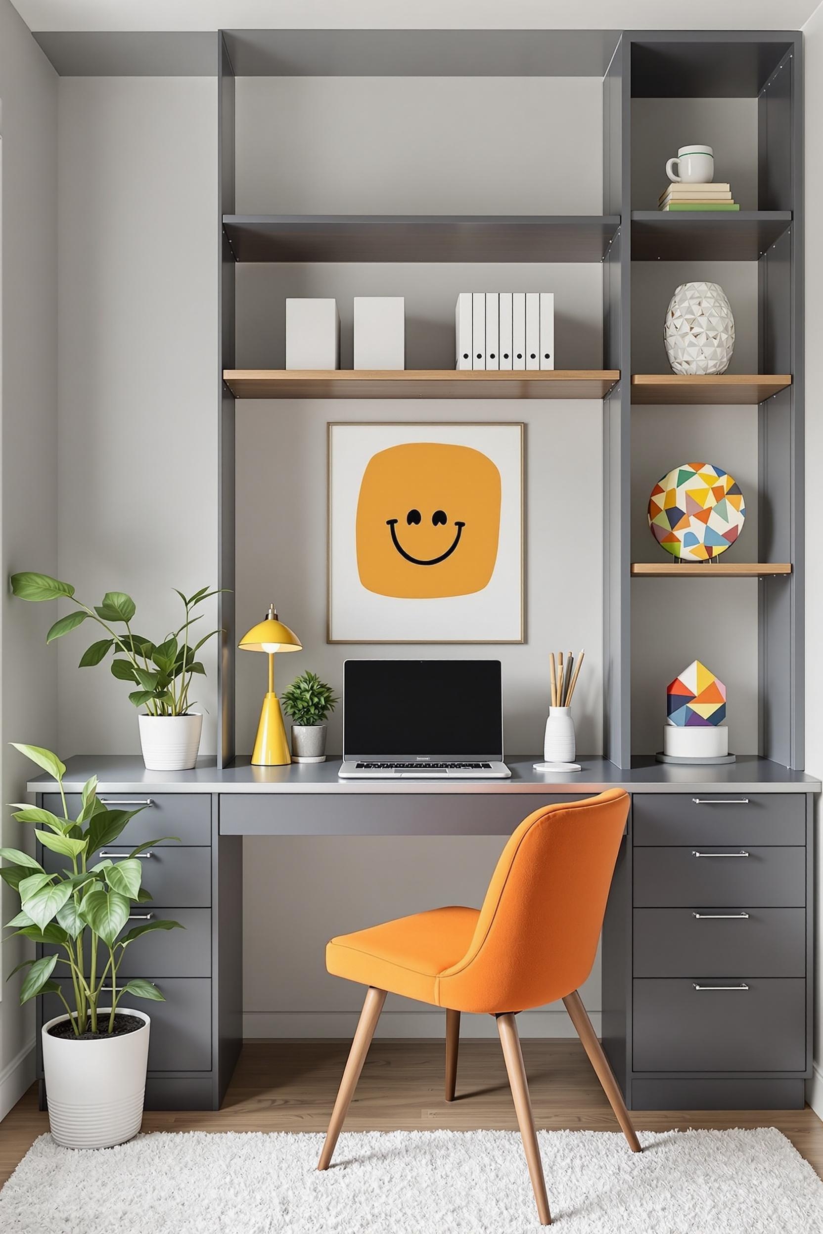
In a home office, opt for shades of blue and subdued grays that enhance focus and calm. For a child’s room or creative studio, go with bold color zones in orange, coral, or teal to inspire imagination and energy. Know what emotional tone your space calls for, then you can select better suited ceiling accents.
Transform Your Home: Free Color Blocking Design Guide Awaits!
Are you ready to take your ceiling from flat to fabulous? I’ve created a full-color blocking guide tailored for minimalist homes that walks you through every step of ceiling transformations.
Unlock Your Design Potential: Free Minimalist Ceiling Color Guide
In this guide, you’ll discover how geometric ceiling paint patterns and color blocking strategies can:
- Expand room depth and height using strategic shapes
- Visually divide open plan homes
- Embrace color without disrupting a clean aesthetic
Your Exclusive Design Transformation Toolkit
You’ll get color picking tips, geometric painting templates, and lighting insights. I even include design psychology principles to help you harness paint to reshape how a room feels.
Click below to download your free kit and bring ceiling color blocking magic to your own home interior.
Get Your FREE Design Guide Now!
Ceiling Color Blocking: Your Top Questions Answered
1. How do geometric ceiling paint patterns impact room perception?
They can reshape your entire space! By dividing the ceiling into zones, you can optically raise height or increase a sense of depth. Research shows that perceived spatial layout changes based on the brightness and boundaries you paint. With the right dynamic overhead design, you basically remodel the room without moving a brick.
2. What ceiling color combinations work best for minimalist designs?
Use a neutral base—like off-white or gray—and introduce 2-3 harmonious accent colors. Try tones like slate and ash or sage and moss. Monochrome layering works very well in minimalist homes, making the ceiling quietly powerful.
3. Is it okay for small homes and apartments?
Absolutely! In fact, ceiling color blocking works wonders in tight rooms. Keep the center of the ceiling light and the edges slightly darker for an open, lifted effect.
4. Can I DIY it?
Yes! It’s very doable. Start small. Plan shapes, measure carefully, and use painter’s tape for clear lines. Use test patches to preview how your colors perform under your lighting setup.
5. How does lighting affect ceiling color zones?
In every way! North-facing rooms need warm enhancement colors. South-facing areas can hold cooler, emotional hues. Always test colors morning through evening to see their full range.
Now that you have the foundational tools, strategies, and visual inspiration—there’s only one thing left to do: pull out that painter’s tape and look UP!


