

Color Blocking Window Frames: A Bold Makeover for Modern Minimalist Interiors
Have you ever walked into a space and felt something was off—like it needed just a spark more energy or a little bit of personality? I’ve found that color blocking window frames is one of the most creative and high-impact ways to achieve a dramatic yet refined transformation in any room. It’s especially powerful in minimalist homes, where clean lines and neutral tones offer the perfect stage for bold color accents.
This simple yet dynamic technique turns ordinary architectural elements into striking design statements. Whether you’re working with a small apartment or a spacious loft, a carefully chosen splash of color on your interior window frame accent colors can highlight views, add emotional depth, and reimagine the room’s personality. The best part? With strategic planning, even a small touch like this can create a massive visual impact.
Why Color Block Window Frames?
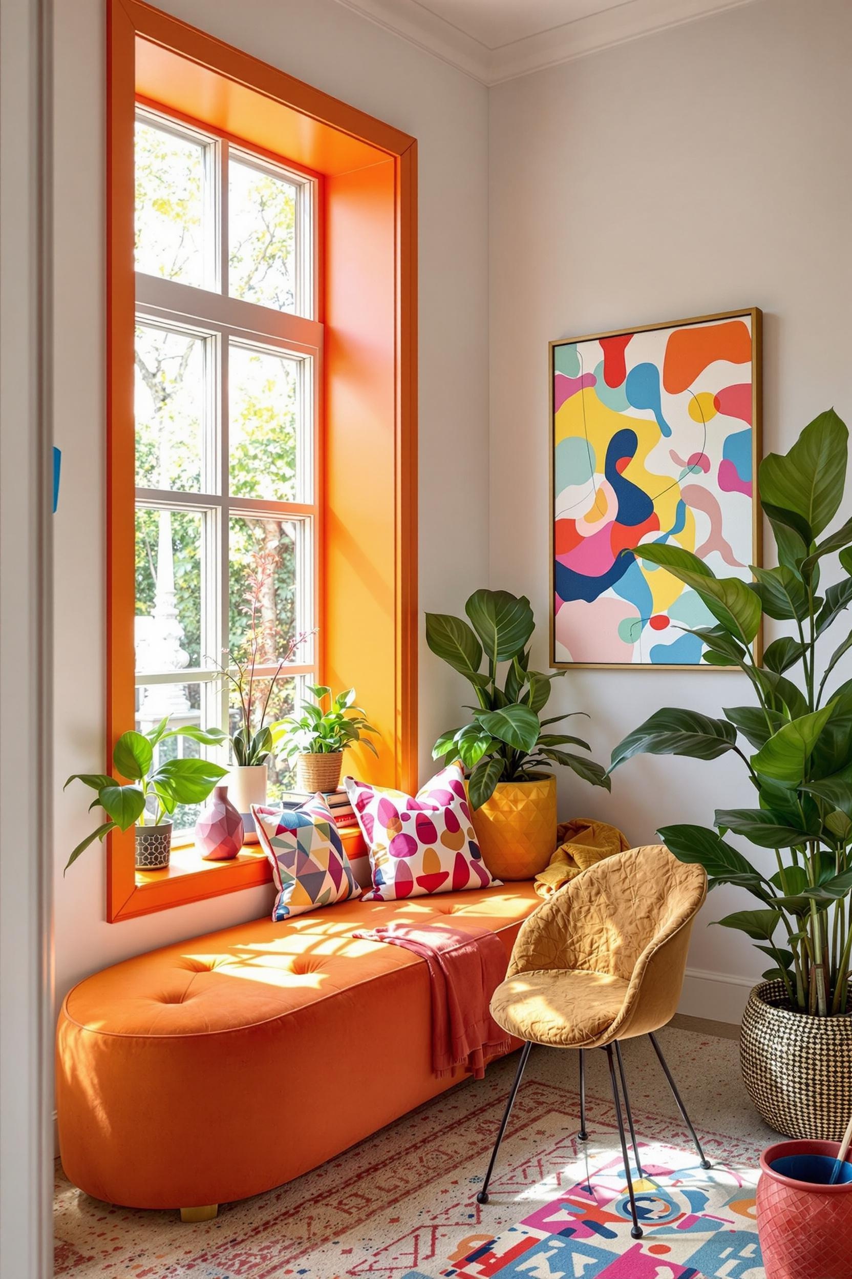
Color blocking originated from the art world—think Mondrian’s bold geometrics—and has evolved into a modern design movement. I love using bold window frame paint ideas to add both contrast and continuity to minimalist spaces. A black or navy frame set against white or light gray walls creates visual depth that feels both clean and daring.
Professionals agree. According to Dakota Windows, bold window frame colors can enhance architectural style and amplify contrast within a room. Bold colors on minimalist window trim, like deep green or burgundy, also fit beautifully in modern and Scandinavian homes without overwhelming the space.
Design Strategies: Make the Most of Contrast
I approach minimalist window trim paint based on one principle: balance. Color blocking window trim works best when the hue you select creates tension while still complementing nearby surfaces. For instance, a soft gray wall paired with a red ochre or deep blue frame adds excitement without chaos. Under bold color guidelines for minimalist spaces, this approach feels fresh, not forced.
This technique is also great at zoning space. By breaking visual monotony, a bold window frame can subtly define an area within an open-concept layout. It essentially acts like a room divider. I’ve used this in many homes I’ve designed, especially in living rooms and kitchens, to great effect.
Psychological and Emotional Effects of Window Frame Color
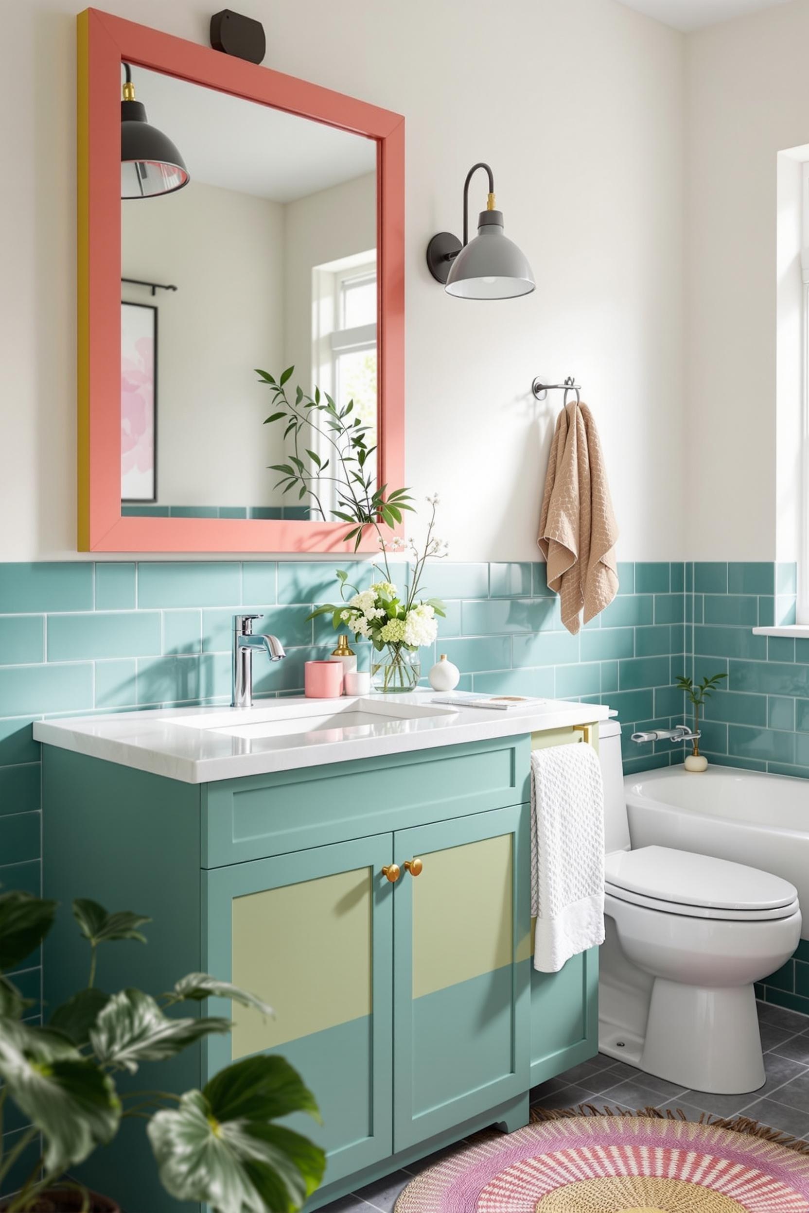
Color influences how we feel in our surroundings. When I use colorful window trim for contemporary homes, I always consider the emotional environment I want to create. A deep navy might evoke calm and confidence. A rich mustard can energize a space. You can even use contrasting colors to guide mood transitions between connected rooms.
According to Dezeen, colorful window frames in homes reinvent them as focal points, boldly drawing eyes and connecting interior design elements with architectural structure. Check out the Camberwell Cork House—a perfect case where green window frames tell a story in each room.
Paint Techniques and Practical Steps
Now, let’s talk about execution. You don’t have to be a professional painter to master color block painting for windows interior decor. What you need is careful planning, good materials, and a little patience. I recommend using:
- Painters tape for clean edges
- Exterior-grade paint for color integrity and durability
- A foam roller or high-quality angled brush
- Paint tester strips in different lighting environments
Want to break it down further? I go into deep detail on DIY color blocking tips here, including ways to manage precision and test paint contrasts against light changes throughout the day.
Modern Minimalism Meets Bold Color Choice
Adding color in minimalist design can feel tricky. But with strategic color placement, even the boldest hues can feel elegant—not overpowering. I often keep my walls and furniture in muted tones and let the bold color window trim designs steal the spotlight.
If you’re hesitant, start with just one frame. Based on 2025’s color trends, combining navy and apricot or black and sage are smart ways to try something new without compromising harmony. Once you’re more comfortable, build out from there using more modern color block window frame inspiration.
Architectural Harmony Through Bold Design
Window frames can support or fight your architectural features. Make them work with your existing style. For modern spaces, I like low-sheen paints for soft color blocking. In contrast, urban lofts can benefit from glossy black or metallics on frames for a strong industrial vibe, as discussed in neon-inspired interior concepts.
Color zoning magic, as I like to call it, turns passive areas like windows into visual anchors. If you want to explore this idea further, visit this piece I wrote on transformation with paint zones. I dive into color contrasts that guide flow and light movement through rooms.
Color Blocking Window Frames: Your Design Transformation Starts Now
Color blocking window frames is more than a design move—it’s an architectural upgrade. It’s a signature, a story, and an energy source for your whole space.
Transform Your Home: Exclusive Design Resources Await
I’ve created a toolkit to guide you through this process: professional advice, practical downloads, and even insider tips for getting those paint lines flawless.
Unlock Your Design Potential: Free Color Blocking Masterclass
If you’ve ever struggled with choosing or applying colors, check out my free Masterclass. It includes:
- Color measurement tips
- Advanced contrast calculation for minimalist spaces
- Lighting and reflection techniques
- Paint durability tips for interiors
Professional Design Toolkit
- Color wheel for minimalist settings
- Color matching guides
- Light interaction charts
- Tips tailored to your home’s architecture
Don’t let indecision hold back your creativity! Sign up below and begin your transformation today.
Unlock Your Design Potential Now
FAQs: Mastering Color Blocking Window Frames
Q1: How Do I Choose the Right Colors for Color Blocking?
Look at your current color palette and lighting. Select one strong hue that contrasts but complements. Try navy, forest green, or mustard yellow for personality without chaos.
Q2: Can It Work in Small Spaces?
Absolutely! Color blocking window trims makes small rooms pop. A bold frame or a small accent can create big visual depth and identity.
Q3: Best Paint Techniques for Clean Lines?
Use professional painter’s tape. Apply thin coats of exterior-grade paint with proper drying between layers. A small foam roller achieves the cleanest finish.
Q4: Do Colors Affect Mood?
Yes! Dark frames bring depth and calm. Bright tones like green and yellow lift the spirit. Let paint shape your room’s emotional feel.
Q5: Is This Just a Trend?
No. This design technique has roots in modernist art and architecture. It’s timeless when applied thoughtfully and supports both functionality and style.
Want more personalized advice? Sign up for my design newsletter where I share exclusive insights, ideas, and inspiration directly to your inbox. Let’s take your color blocking adventure to the next level.


