
Pastel Color Blocking for a Soft Minimalist Aesthetic
Have you ever stepped into a room and instantly felt calm—but also curious? That magic doesn’t happen by accident. It’s the result of smart design choices, and pastel color blocking in minimalist interiors is one of the most effective ways to make it happen. Combining gentle tones like soft mint, blush, apricot, and greyed-lavender with clean lines and neutral edges, this design method adds personality without clutter.
In this guide, I’ll show you how to master pastel color blocking techniques for your soft minimalist decor. You’ll learn to define functional zones, build emotion through color, and bring warmth to even the smallest apartment—all while staying true to minimalist principles.
Soft Pastel Color Blocking: Your Gateway to Serene Minimalist Design
I’ve seen so many clients give up on minimalist design because they worry it’s too stark or lifeless. But guess what? Minimalism doesn’t mean living in a white box. When you apply muted pastel color blocking properly, you can invite warmth, personality, and even joy into your home. Soft color blocks bring visual interest while preserving clarity and openness.
In fact, studies show that about one-third of people associate pastel hues with joy, and roughly 20% believe color can support psychological well-being. Strategic use of pastel blocks—like a mint green area behind a minimalist bed—can create tranquil visual boundaries that also offer emotional comfort.
Pastel Color Blocking: Strategic Design for Minimalist Spaces
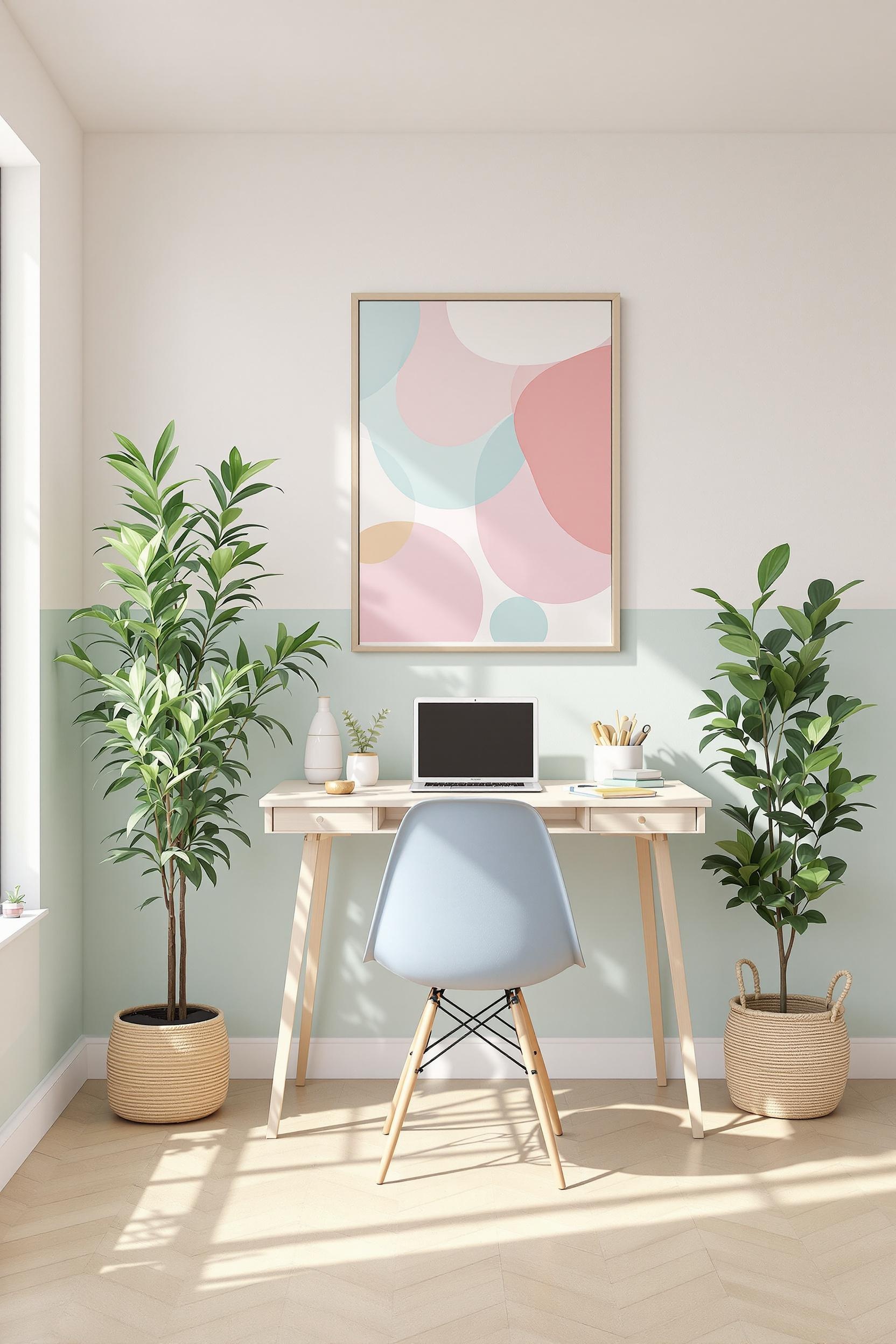
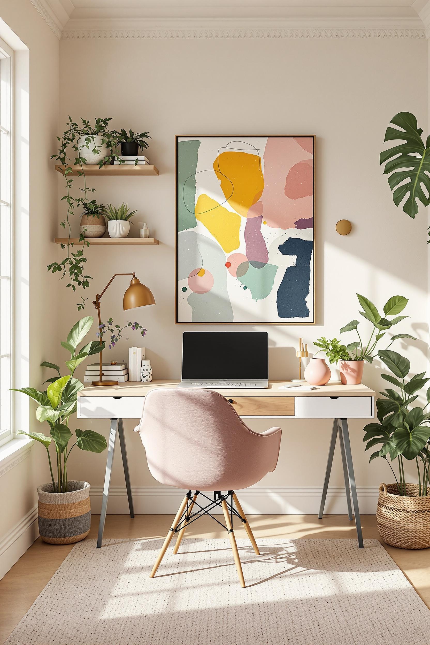
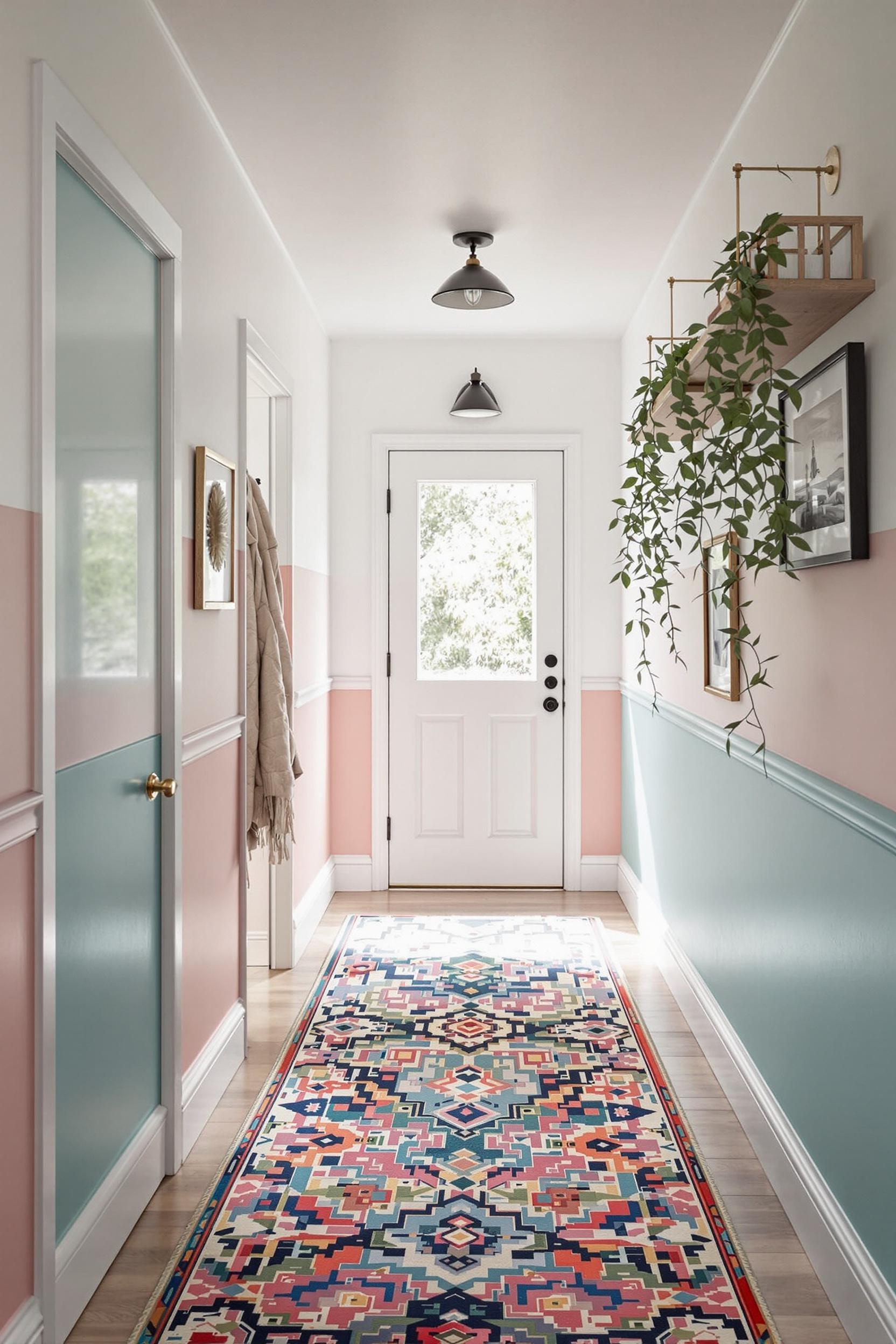
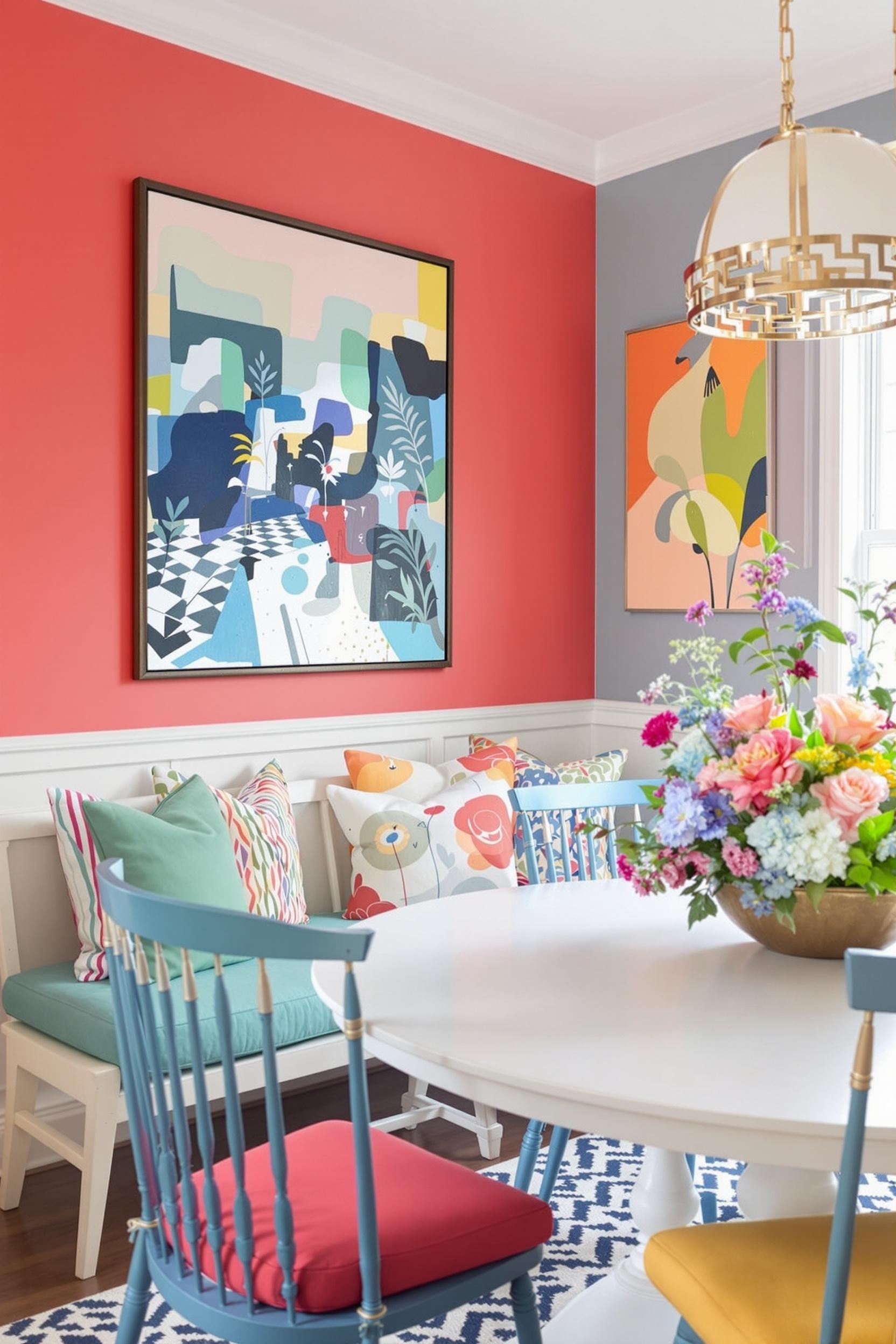
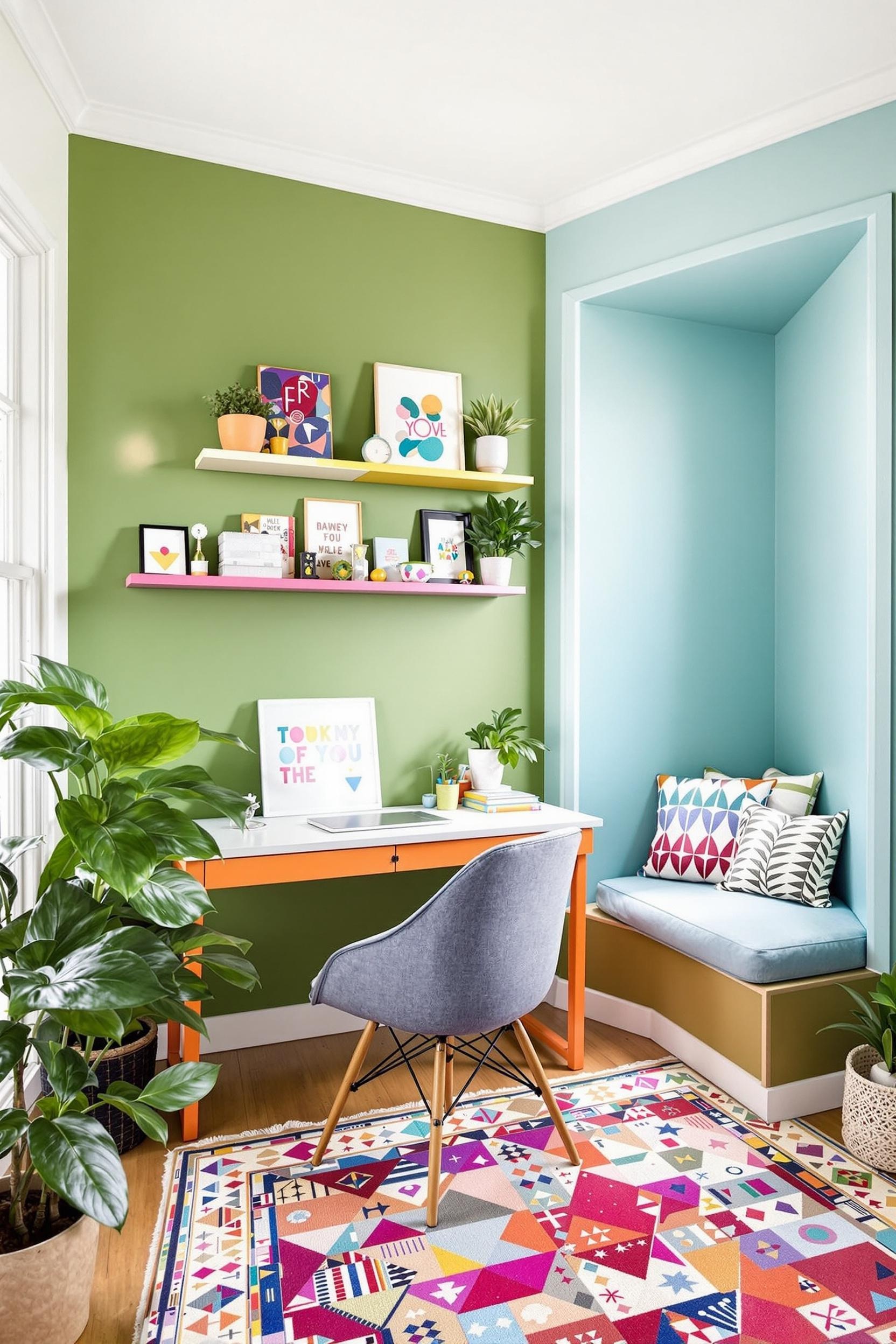
Pastel geometric shapes for minimalist nursery walls, soft color-coded home offices, and open-concept color zoning—these are tools I use daily. For example, a blush-toned wall block in a reading nook, paired with white surroundings, creates calm and subtle contrast. Meanwhile, vertical sage green color zones in living areas enhance openness without clutter.
Minimalism values intentional choices, and color blocking is no different. I aim to cover no more than 30% of a space with pastel tones, leaving room for light and negative space. The goal is always emotional clarity, not chaos.
The Psychology of Soft Hues in Minimalist Interiors
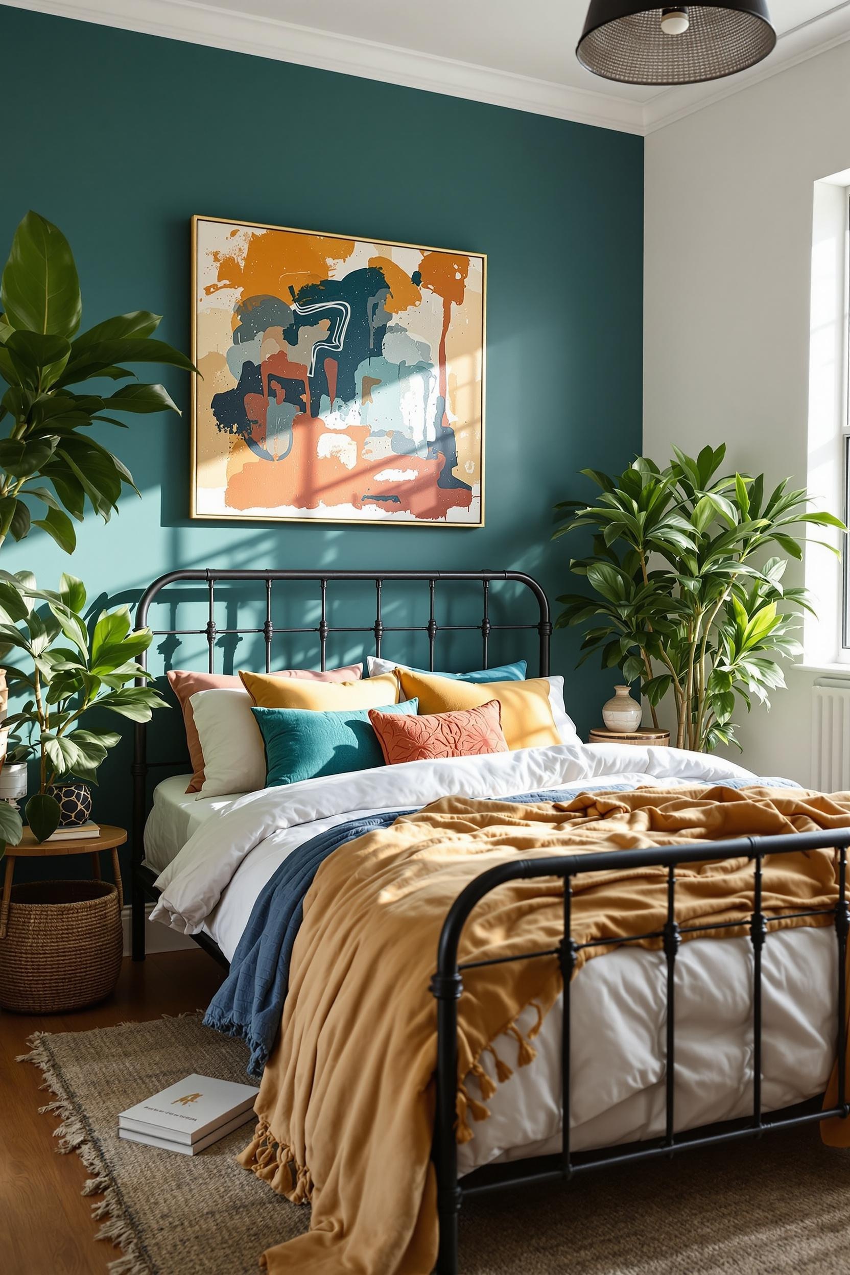
Soft pastel tones such as greyed lavender, pale apricot, and blush pink nurture restfulness, especially when paired with monochromatic color blocking. Blending textures—like matte blush walls and satin rose cushions—lets you layer dimension through paint, textiles, and furnishings. The result is a room that feels both organized and rich in personality.
Architectural Design Meets Minimal Color Blocking
Pastel zones can support functional design. I recently divided a client’s studio by putting a vertical pastel mint stripe behind the headboard and a blush rectangle near their desk. This subtle separation encourages both sleep and focus without adding walls. See how I structured other minimalist multipurpose rooms using color zones instead of barriers.
Color tells your brain that one side of the room serves a different purpose than the other. A sage green rectangle lining the wall behind a bookshelf tells you: “This is the reading corner.” Muted caramel along a kitchen island? Your subconscious will read it as: “Gather here, eat, and converse.”
Monochromatic Pastel Color Schemes: Go Deep Without Going Bold
Monochromatic color blocking is one of my favorite soft techniques. It adds sophistication and creates depth without complexity. I often start with a base tone—say, pale blush—and then layer in similar hues from cushion covers to drapery. The art is in keeping the undertone consistent while playing with intensity and texture.
When I define soft paint zones with this method, I aim for clarity and cohesion. You can explore more of these subtle schemes on projects like my small apartment transformations, where different pastel tones within the same hue family breathe life into compact areas.
Soft Pastel Blocking in Compact and Open Spaces
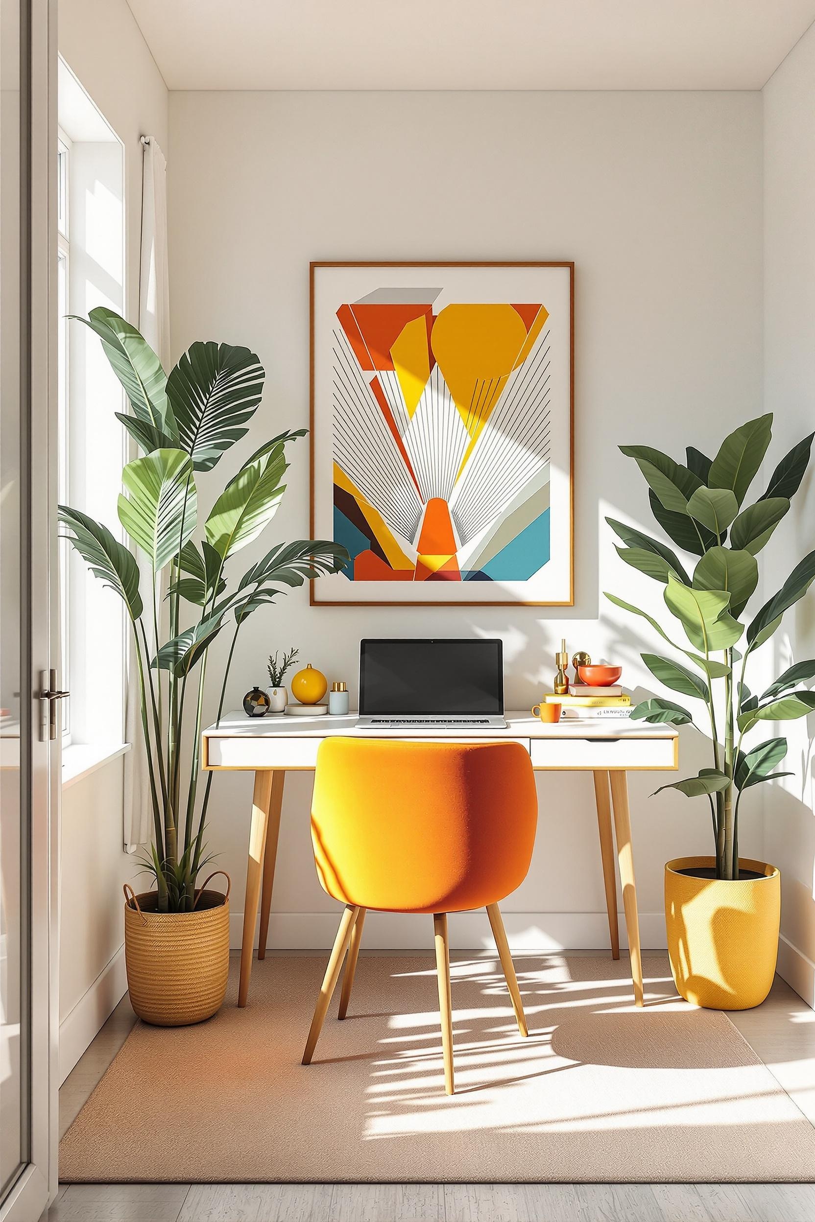
Two-tone pastel wall designs for modern minimalist offices can make even small rooms seem larger. I often recommend using soft mint blocks to stretch space visually. One trick? Anchor vertical blocks near a major light source to visually extend the wall height. Want proof? Peek at my redesign of a tiny apartment using color blocking.
For open-concept layouts, pastel color zoning transforms free-flowing areas without losing that sense of airiness. Blush pink for dining, a soft lavender work zone, and a creamy beige cooking station make the space feel intentional, organized, and emotionally engaging.
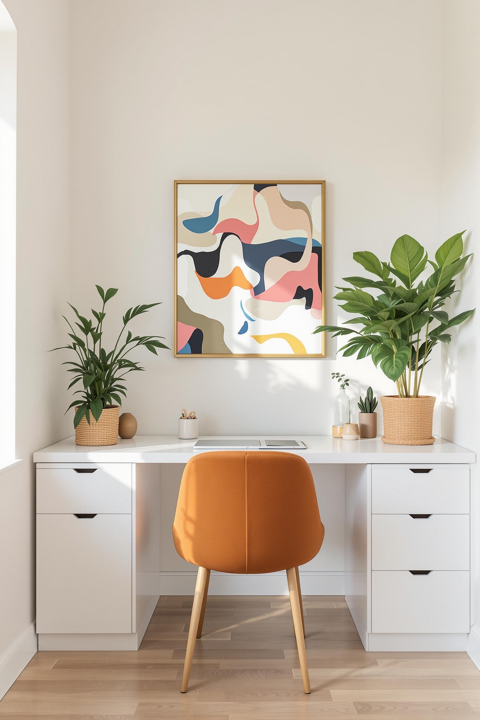
Using Pastel Color Blocking With Minimalist Furniture
Remember, your furniture should echo the space’s palette. I combine natural oak materials with muted pink or mint blocks to emphasize calm. A caramel-toned bench on a pale sage wall? Instant cozy elegance. Strategic pastel accessories—rugs, pillows, wall art—help build in softness without crowding the room.
Precision Techniques for Consistent Pastel Harmony
Layering starts with planning. Here are a few of my key pastel color blocking techniques:
- Pick just 2–3 pastel shades
- Balance them with neutral tones like white or warm gray
- Test with light direction in mind—pastels shift tone based on sunlight
- Create sharp-edged blocks for a clean minimalist look
- Repeat tones in textiles and fixtures for unity
If you’re ready to start experimenting, check out my guide on defining zones with bold but soft palettes. Innovation doesn’t need chaos—just intention.
Color Blocking in Bathrooms, Bedrooms & Beyond
Your bathroom deserves love too. A soft pastel ombré wall—fading from blush to creamy white—can make the room feel like a spa. Check out this example in action: Pastel bathroom wall transformation. In the bedroom, subtle mint and apricot color blocks can make a neutral headboard pop, helping define your sleep zone without visual clutter.
Your Minimalist Color Revolution Starts Here
Transform Your Space with Pastel Color Blocking Expertise
The journey of minimalist design doesn’t end with understanding—it begins with action. As an interior designer, I’ve helped many homeowners use pastel color blocking to elevate their soft minimalist design. Now it’s your turn to create an emotionally intelligent home that feels calm, curated, and you.
Exclusive Design Transformation Toolkit
Subscribe to my newsletter packed with pastel color interior design strategies. I’ll send you my expert tips on:
- Selecting pastel palettes for function and emotion
- Case studies, mood boards, and trend forecasts
<li
Unlock Your Design Potential Now!
Frequently Asked Questions: Mastering Pastel Color Blocking in Minimalist Design
Q1: How do I successfully bring pastel color blocking into minimalist interiors?
Use 2–3 soft pastel tones max. Place geometric blocks sparingly to cover 20–30% of the space. Let the negative space breathe around them.
Q2: Will pastel color blocking work in small spaces?
Yes! Lighter hues like mint and blush open up small areas. Use color zoning to create structure in limited square footage, such as sleeping vs. working spaces in a studio.
Q3: What pastel color combos work best in minimal interiors?
Try soft sage and muted lavender. Or go blush-pink monotone. Stick to tones with grey or beige undertones for a clean, neutral feel.
Q4: How much pastel color is too much?
Less is more. Stick to covering only about a quarter of the room with color blocks. Use geometry, not quantity, to make your statement.
Q5: Is pastel color blocking only for minimalist homes?
No! While it thrives in neutral or Scandinavian styles, pastel blocking can enhance Art Deco and modern transitional spaces too. The key is keeping contrast low and design intentional.
Conclusion: Define Your Space with Soft Intentionality
Pastel color blocking is more than a trend—it’s a design solution rooted in clarity, emotion, and purpose. Soft minimalist interiors don’t have to be stark or dull. They can feel joyful, sophisticated, and comforting. Whether you’re redesigning a studio or refining an open-concept home, now is the time to embrace pastels with purpose.
Ready to dive deeper? Don’t miss out on expert pastel design tips, moodboards, and real transformations. Subscribe below and start your minimalist design evolution!


