
Bold Colors in Minimalist Spaces: Your Design Revolution
Have you ever looked at a minimalist room and thought it felt too stark or lifeless? I’m here to show you how to transform your minimalist home into a vibrant, dynamic space without compromising its clean, streamlined aesthetic.
Minimalism doesn’t mean you’re limited to a monochromatic world of whites and grays. In fact, strategic color blocking and bold accent pieces can elevate your minimalist design from simple to spectacular. By carefully introducing vibrant hues, you can create visual interest and personality in your living spaces.
In this guide, I’ll reveal my professional interior design secrets for:
-
- • Selecting the perfect bold color palette
-
- • Strategically placing colorful accents
-
- • Maintaining minimalist principles while embracing color
- • Creating visual balance and harmony
Minimalist design is all about intentionality – and that includes color selection. By understanding color theory and using purposeful design techniques, you can craft a space that feels both serene and energetic. Whether you’re drawn to minimalist living room concepts or seeking colorful home decor inspiration, this article will transform your approach to interior design.
Key insights I’ll share come from years of professional experience in color blocking techniques and minimalist design principles. Get ready to reimagine your living spaces with bold, intentional color choices that speak volumes about your personal style.
Bold Colors in Minimalist Spaces: Breaking Design Boundaries with Vibrant Accents
Have you ever looked at a minimalist room and thought it felt too stark or lifeless? I’m here to show you how to transform your minimalist home into a vibrant, dynamic space without compromising its clean, streamlined aesthetic.
Minimalism doesn’t mean you’re limited to a monochromatic world of whites and grays. In fact, strategic color blocking and bold accent pieces can elevate your minimalist design from simple to spectacular. By carefully introducing vibrant hues, you can create visual interest and personality in your living spaces.
In this guide, I’ll reveal my professional interior design secrets for:
• Selecting the perfect bold color palette
• Strategically placing colorful accents
• Maintaining minimalist principles while embracing color
• Creating visual balance and harmony
Minimalist design is all about intentionality – and that includes color selection. By understanding color theory and using purposeful design techniques, you can craft a space that feels both serene and energetic. Whether you’re drawn to minimalist living room concepts or seeking colorful home decor inspiration, this article will transform your approach to interior design.
Key insights I’ll share come from years of professional experience in color blocking techniques and minimalist design principles. Get ready to reimagine your living spaces with bold, intentional color choices that speak volumes about your personal style.
Bold Colors in Minimalist Spaces: Breaking Design Boundaries
Understanding the Art of Minimalist Color Integration
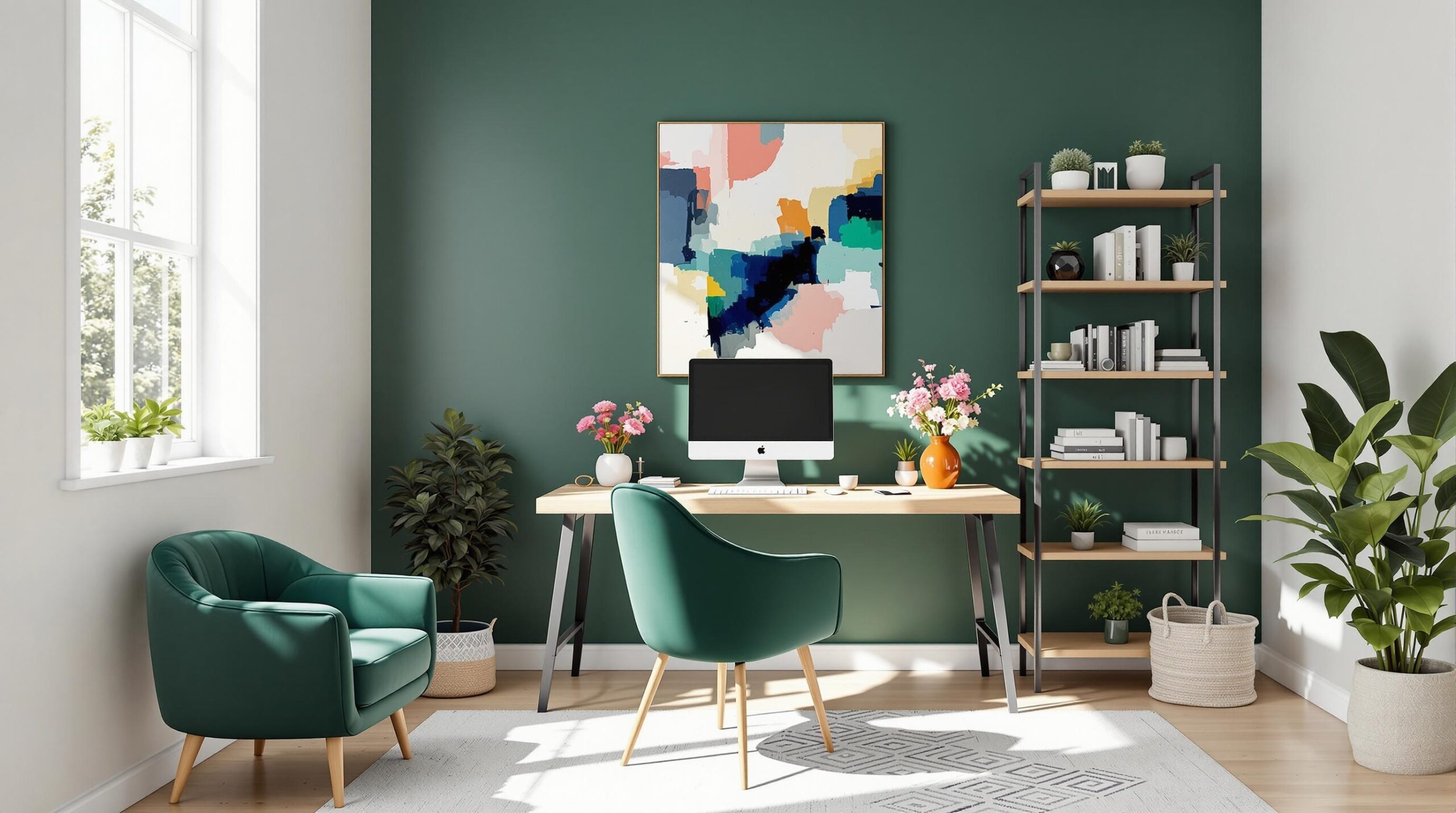
As an interior designer with years of experience, I’ve discovered that minimalist design is far from being bland or lifeless. The key is strategic color implementation that transforms spaces while maintaining clean, intentional aesthetics. Color blocking has become my secret weapon for breathing life into minimalist interiors.
According to Architectural Digest, color blocking is more than just a trend – it’s a design philosophy that allows for bold expression within structured spaces. By carefully selecting and placing vibrant hues, you can create remarkable visual impact without overwhelming the minimalist principles.
Key takeaways for introducing bold colors:
• Start with a neutral base of whites, grays, or soft neutrals
• Choose 1-2 bold accent colors that complement your existing palette
• Use color strategically through focal pieces like artwork, furniture, or statement accessories
• Maintain visual breathing room and negative space
• Balance bold colors with clean lines and minimal clutter
My approach focuses on intentionality – every color choice should have a purpose. Whether you’re designing a minimalist living room or a vibrant home space, the goal is to create harmony between boldness and simplicity.
The magic happens when you treat color as a deliberate design element, not just a decorative afterthought. Think of your space as a canvas where each color choice tells a story of personality and purpose.
Bold Colors in Minimalist Spaces: Breaking Design Boundaries
Understanding the Art of Minimalist Color Integration
As an interior designer with years of experience, I’ve discovered that minimalist design is far from being bland or lifeless. The key is strategic color implementation that transforms spaces while maintaining clean, intentional aesthetics. Color blocking has become my secret weapon for breathing life into minimalist interiors.
According to Architectural Digest, color blocking is more than just a trend – it’s a design philosophy that allows for bold expression within structured spaces. By carefully selecting and placing vibrant hues, you can create remarkable visual impact without overwhelming the minimalist principles.
Key takeaways for introducing bold colors:
• Start with a neutral base of whites, grays, or soft neutrals
• Choose 1-2 bold accent colors that complement your existing palette
• Use color strategically through focal pieces like artwork, furniture, or statement accessories
• Maintain visual breathing room and negative space
• Balance bold colors with clean lines and minimal clutter
My approach focuses on intentionality – every color choice should have a purpose. Whether you’re designing a minimalist living room or a vibrant home space, the goal is to create harmony between boldness and simplicity.
The magic happens when you treat color as a deliberate design element, not just a decorative afterthought. Think of your space as a canvas where each color choice tells a story of personality and purpose.
Color Psychology in Minimalist Design
Understanding color psychology is crucial when integrating bold hues into a minimalist space. Each color evokes specific emotions and can dramatically impact the feel of a room. For instance, deep blue can create a sense of calm and sophistication, while bright yellow can inject energy and optimism into a space.
I recommend using the 60-30-10 color rule: 60% neutral base, 30% secondary color, and 10% bold accent color. This formula ensures visual balance while allowing your chosen bold colors to make a powerful statement. Color theory becomes your guidebook for creating harmonious, yet exciting minimalist interiors.
Bold Colors in Minimalist Spaces: Breaking Design Boundaries with Vibrant Accents
Color Psychology in Minimalist Design
Understanding color psychology is crucial when integrating bold hues into a minimalist space. Each color evokes specific emotions and can dramatically impact the feel of a room. For instance, deep blue can create a sense of calm and sophistication, while bright yellow can inject energy and optimism into a space.
Color has the power to transform a minimalist interior from bland to breathtaking. By carefully selecting and applying vibrant hues, you can create emotional depth and visual interest without compromising the clean aesthetic that defines minimalist design. The key is to approach color with intentionality and strategic placement.
Key insights into color psychology for minimalist spaces:
• Understand the emotional impact of different colors
• Use bold colors as strategic focal points
• Create visual harmony through thoughtful color selection
• Balance emotional expression with spatial simplicity
• Leverage color to enhance the minimalist design philosophy
I recommend using the 60-30-10 color rule: 60% neutral base, 30% secondary color, and 10% bold accent color. This formula ensures visual balance while allowing your chosen bold colors to make a powerful statement. Color theory becomes your guidebook for creating harmonious, yet exciting minimalist interiors.
Emotional Resonance of Color in Minimalist Spaces
Different colors can evoke specific emotional responses that enhance the minimalist design. For example, deep emerald green can introduce a sense of natural tranquility, while vibrant coral can add warmth and energy to a previously neutral space. The goal is to create a purposeful emotional landscape that complements the clean, intentional minimalist aesthetic.
By understanding the psychological impact of color, you can transform your minimalist home into a dynamic, emotionally resonant environment that tells a unique visual story. Each color choice becomes a deliberate design decision that speaks to your personal style and emotional landscape.
Bold Colors in Minimalist Spaces: Breaking Design Boundaries with Vibrant Accents
Emotional Resonance of Color in Minimalist Spaces
Color psychology plays a transformative role in minimalist interior design, offering a nuanced approach to creating emotionally compelling spaces. As an interior designer, I’ve discovered that the strategic use of color can dramatically elevate a minimalist room from simply functional to deeply personal and expressive.
Different colors evoke unique emotional responses that can enhance the minimalist aesthetic. Deep emerald green, for instance, introduces a sense of natural tranquility, while vibrant coral can inject warmth and energy into a previously neutral space. The art lies in creating a purposeful emotional landscape that complements the clean, intentional minimalist design.
Key insights for emotional color integration:
• Select colors that reflect your personal emotional landscape
• Use bold hues as strategic emotional anchors
• Create depth through intentional color placement
• Balance emotional expression with spatial simplicity
• Leverage color as a narrative tool in design
My approach focuses on understanding the psychological impact of each color choice. A minimalist living room isn’t just about clean lines and negative space – it’s about creating an environment that speaks to your inner emotional world. By carefully selecting colors that resonate with your personal style, you can transform a potentially sterile space into a dynamic, emotionally rich environment.
The 60-30-10 color rule remains my go-to strategy: 60% neutral base, 30% secondary color, and 10% bold accent color. This formula ensures that your bold color choices make a powerful statement while maintaining the essential minimalist principles of simplicity and intentionality.
Each color becomes a deliberate design decision that tells a unique visual story, bridging the gap between minimalist aesthetics and personal emotional expression. By treating color as a sophisticated design element, you can create spaces that are both visually stunning and deeply meaningful.
Bold Colors in Minimalist Spaces: Breaking Design Boundaries with Vibrant Accents
Creating Emotional Depth Through Strategic Color Placement
Color is a powerful design tool that can transform a minimalist space from sterile to spectacular. As an interior designer, I’ve learned that intentional color placement is the key to creating emotionally resonant minimalist environments. The secret lies in understanding how to strategically introduce bold colors without overwhelming the clean, purposeful aesthetic that defines minimalist design.
In my professional experience, the most successful minimalist spaces use color as a deliberate storytelling element. It’s not about adding random splashes of color, but creating a carefully curated emotional landscape that enhances the room’s fundamental design principles. By treating color as a sophisticated design element, you can breathe life into seemingly stark spaces.
Key strategies for emotional color integration:
• Select colors that reflect your personal emotional narrative
• Use bold hues as strategic visual anchors
• Create depth through intentional color placement
• Maintain the core principles of minimalist simplicity
• Balance emotional expression with spatial clarity
My approach focuses on the psychological impact of color in minimalist living spaces. Whether you’re designing a vibrant home environment or a serene retreat, color becomes a bridge between functional design and personal expression.
The 60-30-10 color rule remains my go-to strategy: 60% neutral base, 30% secondary color, and 10% bold accent color. This formula ensures that your bold color choices make a powerful statement while maintaining the essential minimalist principles of simplicity and intentionality.
By approaching color as a nuanced design element, you can transform minimalist spaces into deeply personal, emotionally compelling environments that tell a unique visual story. Each color choice becomes a deliberate decision that speaks to your individual style and inner emotional landscape.
Transforming Minimalist Spaces: Your Bold Color Journey Starts Here
As a professional interior designer, I’ve guided countless clients through the exciting process of integrating bold colors into minimalist spaces. Now, I’m ready to share the ultimate roadmap for transforming your home from plain to extraordinary.
The journey of adding bold colors to a minimalist home is about more than just aesthetics – it’s about creating a personal narrative through intentional design. Throughout this guide, we’ve explored how strategic color placement can breathe life into minimalist interiors while maintaining the core principles of simplicity and purpose.
Key takeaways from our color blocking adventure include:
• The 60-30-10 color rule is your blueprint for balanced design
• Bold colors are powerful storytelling tools in minimalist spaces
• Color psychology plays a crucial role in emotional interior design
• Intentionality is the key to successful minimalist color integration
• Every color choice should be deliberate and meaningful
Your minimalist home is a canvas waiting to be transformed. By applying these principles, you can create spaces that are both serene and vibrant, personal and purposeful. The magic happens when you approach color as a sophisticated design element that reflects your unique style and emotional landscape.
I challenge you to take the first step. Look around your space and identify one area where a bold color accent could make a dramatic impact. Whether it’s a statement art piece, a vibrant throw pillow, or a single painted wall, your minimalist home is ready for its color revolution.
Want to dive deeper into minimalist design and color integration? [Subscribe to our newsletter] for exclusive tips, design inspiration, and expert insights delivered straight to your inbox. Join our community of design enthusiasts and transform your home, one bold color at a time!
Don’t keep this design wisdom to yourself – share your color blocking journey in the comments below! What bold color are you excited to introduce to your minimalist space? Your story could inspire fellow design lovers to break free from design limitations and embrace their true aesthetic potential.
Transform Your Space: Color Block Like a Pro
In the world of minimalist design, adding bold colors can be transformative. I’ve discovered that strategic color blocking can breathe life into a monochromatic space without compromising the clean, streamlined aesthetic.
Color Blocking Techniques
When incorporating vibrant hues, I recommend:
• Selecting 2-3 bold accent colors
• Using large geometric color panels
• Choosing furniture or artwork as color focal points
Join the Color Revolution: Your Design Community Awaits!
I’m excited to invite you to take the next step in your minimalist design journey! Here’s how you can dive deeper:
• 🎨 Subscribe to Our Newsletter: Get exclusive color blocking tips, design inspiration, and expert insights delivered straight to your inbox! [Sign up now at our Color Block Home Newsletter]
• 💬 Share Your Transformation: Have you successfully added bold colors to your minimalist space? Drop a comment below and inspire our community!
• 📱 Spread the Inspiration: Loved this post? Share it on social media and tag us! Help other design enthusiasts discover the magic of color blocking.
• 🖌️ Take Action: Don’t just read—apply! Choose one color blocking technique from this post and transform a room this weekend.
Your design adventure starts now. Let’s make minimalism colorful, one bold stroke at a time! 🏡✨
#MinimalistDesign #ColorBlocking #InteriorInspo
Bold Colors in Minimalist Spaces: Your Ultimate Design Guide
As an interior designer passionate about minimalist design, I’ve discovered that adding bold colors can transform a minimalist home from simple to spectacular. The key is understanding how to strategically introduce vibrant hues without overwhelming the clean, streamlined aesthetic.
Color Blocking Techniques for Minimalist Interiors
Color blocking is an excellent method to introduce bold colors in a minimalist space. I recommend selecting 1-2 primary accent colors and applying them strategically in geometric shapes or focused areas. For example, a bright yellow geometric artwork or a deep blue accent chair can create dramatic visual interest in a white-dominated room.
Frequently Asked Questions About Colorful Minimalist Design
Bold Color Integration
How can I add bold colors to a minimalist home without losing the minimalist aesthetic?
Choose 1-2 saturated colors and use them sparingly as strategic accents. Think a single bold throw pillow, a statement art piece, or a vibrant area rug against a neutral background.
What color palette works best for minimalist spaces?
I recommend high-contrast combinations like navy and white, emerald green with light grays, or burnt orange with crisp whites. These create visual drama while maintaining simplicity.
Where should I place bold color elements?
Focus on key areas like:
– Accent walls
– Statement furniture pieces
– Artwork
– Decorative accessories
– Single wall in a room
How much color is too much in a minimalist design?
The 80/20 rule works perfectly: 80% neutral tones, 20% bold colors. This maintains the minimalist essence while introducing visual excitement.
Can I use patterns with bold colors in minimalist design?
Absolutely! Geometric patterns or simple, clean-lined designs work excellently. Choose patterns with minimal complexity to maintain the minimalist philosophy.
Practical Color Application Tips
What materials complement bold colors in minimalist spaces?
Natural materials like wood, stone, and metal provide excellent neutral backdrops for bold color introductions. They add texture without competing with vibrant hues.
How do I choose the right bold color?
Consider:
– Room’s natural lighting
– Existing furniture
– Emotional response to color
– Overall home color scheme
Expert Color Integration Strategies
I recommend using the color wheel to select complementary or analogous colors that create harmony. For instance, pairing deep teal with soft coral can generate a sophisticated, balanced look.
Remember, minimalist design with bold colors is about intentionality. Every color choice should be deliberate and meaningful.
External resources like Architectural Digest offer additional insights into color integration techniques.


