

Neutral Meets Bold: Mastering Minimalist Color Blocking Strategies
As an interior designer, I’ve discovered that subtle color blocking is a transformative design technique that breathes life into spaces. By carefully balancing neutral foundations with bold accent colors, you can create visually stunning environments that tell a unique design story.
Color blocking isn’t just about random color placement – it’s an art form that transforms rooms through strategic hue interactions. The magic happens when you understand how different colors communicate and create emotional experiences.
Key Insights into Subtle Color Blocking:
• Neutrals provide a calm, sophisticated base
• Bold accents create visual energy and interest
• Strategic color placement transforms room dynamics
• Minimalist approach maximizes design impact
• Careful color selection communicates personal style
Mastering the 60-30-10 design rule is crucial for creating balanced spaces. This approach involves using 60% neutral base colors, 30% secondary tones, and 10% bold accent colors to create a perfectly balanced visual experience.
Professional designers understand that color blocking is more than placing colors side by side. It’s about creating a meaningful dialogue between hues that feels both modern and timeless.
Recommended Color Interaction Strategies:
• Analyze color temperature and emotional impact
• Balance cool and warm color tones
• Use geometric shapes for visual interest
• Consider natural and artificial lighting
• Maintain a consistent color narrative
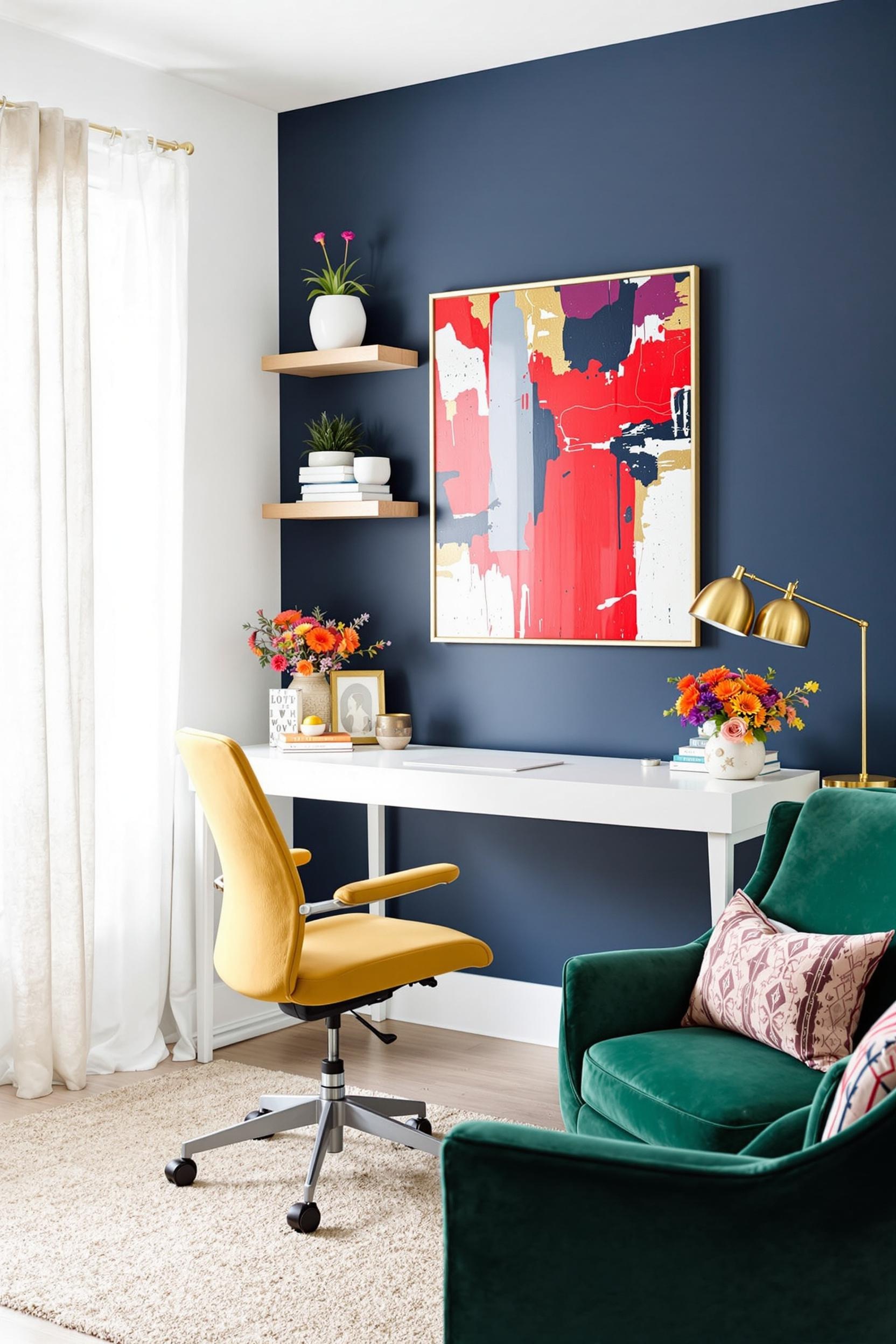
Pro Tip: Cool neutrals like dove gray create calm sophistication, while warmer neutrals like ecru add depth. Bold accent colors such as emerald green or cobalt blue can become powerful focal points in understated spaces.
The true artistry of subtle color blocking lies in its ability to create visual interest without overwhelming the senses. Whether you’re designing a living room, bedroom, or home office, these techniques will help you transform your space into a sophisticated environment.
Transform Your Space: Color Blocking Magic Awaits!
Are you eager to master the art of subtle color blocking? Here’s how you can dive deeper:
1. Subscribe Now: Sign up for our exclusive newsletter and receive:
– Expert design tips
– Exclusive color blocking tutorials
– Insider trends and inspiration
2. Share Your Creativity:
– Comment below with your favorite color blocking experiences
– Tag us on social media with #ColorBlockHome
– Show us how you’ve applied these techniques
Join Our Design Community Now!
Frequently Asked Questions: Mastering Subtle Color Blocking
**What is subtle color blocking?**
It’s a sophisticated design technique that combines neutral tones with strategic bold accents to create visual interest without overwhelming the space.
**How do I start color blocking with neutrals?**
Begin with a neutral base palette of whites, grays, or beiges, then introduce 1-2 bold accent colors. Start small with a single wall or accent piece.
**What are the best color combinations?**
Try these winning combinations:
– Soft gray with deep navy blue
– Cream with emerald green
– Taupe with burnt orange
– Charcoal with mustard yellow
Pro Tip: The secret to successful subtle color blocking is restraint. Less is often more when creating a sophisticated, modern look.


