
Create Zones with Paint Colors: A Minimalist Color Blocking Guide
Have you ever walked into an open-plan space and felt unsure where one room ended and another began? You’re not alone. I’ve experienced this firsthand, where the living room seems to blend into the kitchen, which flows into the dining area without clear boundaries. That’s when I discovered the magic of color zoning with paint.
Creating clear, functional zones within your home doesn’t require knocking down walls—or putting new ones up. With the right color block wall paint ideas, you can create unmistakable areas for dining, relaxing, working, and more, all while maintaining a minimalist aesthetic.
Why Color Blocking Works: A Science-Backed Design Strategy
Color zoning techniques have been shown to reshape how we perceive space. Environmental psychology studies demonstrate that high-contrast zones shift focus, improving function and flow within multifunctional homes such as open-concept plans and small apartments (source).
The designs I use align with strategies backed by research. For example, blue and green tones promote calm and focus—perfect for work areas. Warm colors such as orange or yellow bring energy and sociability, ideal for dining and lounge areas. Want peace and openness? Soft neutrals and pastels define space subtly without overwhelming minimalistic homes (source).
Strategic Color Blocking: Paint Zones Without Physical Dividers
If you’re ready to add purposeful paint zones, the most effective method starts with identifying the function of each area in your open layout. For example, I might define a home office using a vertical navy-blue stripe behind a desk. That crisp block of color anchors the area and subtly tells the brain, “This is where focus happens.”
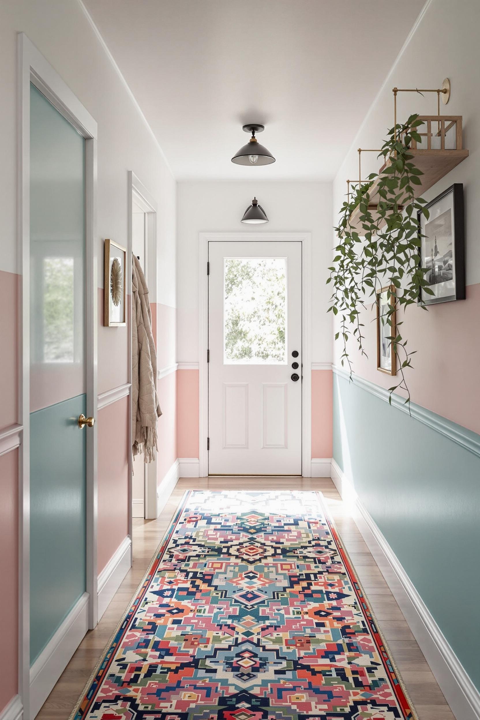
In a minimalist home, I love pairing a neutral backdrop, like creamy white or soft gray, with 1–2 color blocks like sage green or terracotta for modern interior color zoning. It’s essential to restrict your palette to 3–5 colors throughout an entire room. Too many accents create chaos rather than calm.
Painting Tips for Clean, Crispy Lines
- Use high-quality painter’s tape—do not skimp!
- Apply paint in two thin layers for sharp color edges.
- Smooth wall surfaces offer the cleanest visual results.
In my experience, you can also enhance harmony by choosing your color block tones based on items you already own—such as a patterned rug, favorite artwork, or printed curtains. I applied this method recently in a loft where the wall paint echoed colors from a framed tapestry. The result? A cohesive space that felt custom-designed without anything new being installed physically.
Color Zoning in Small Apartments and Open-Plan Living
Zoning with paint colors is especially useful in spaces without traditional rooms. In my projects with studios and micro-lofts, I’ve used color zone tricks like geometric shapes and low-contrast palettes to range from dramatic to soft.
Start by identifying use areas—sleep, work, eat, relax—then choose paint color blocking for living room zones that complement these purposes. Try these ideas:
- Sleeping zone: Soft olive green half-wall behind the bed
- Dining corner: Bold ochre trapezoid shape around the table
- Living area: Vertical coral stripe behind the couch
Each painted segment only needs to cover 10–15% of the wall to have a defining effect. That’s the power of minimalist paint color ideas when done right.
Vertical Color Magic: Expanding Perception in Tight Spaces
Vertical zoning isn’t just about separation; it plays tricks on your eyes. Strategic vertical lines not only segment the room but also stretch the visual height of the space. I often recommend vertical color transitions to elongate the feel of low-ceiling homes or to draw attention upward in tiny living zones. Visit this guide to vertical color magic for design inspiration.
Paint Techniques by Room: Functional Color Block Inspiration
You can apply these color blocking techniques to any room. I’ve written full guides for specific spaces—see below for some favorites:
- Home Office: Deep, focused tones
- Bedroom: Relaxing muted accents
- Kitchen: Energizing yellows and spicy reds
- Nursery: Softening geometric zones
Even entryways get a glow-up with a wall of citrus orange or emerald. It’s a fantastic way to welcome guests into a curated house that’s also functional. And if you’re pressed for square footage? Try color block style for tiny home libraries too.
Create Zones with Paint: The Recap
As we’ve seen, you can dramatically redefine your home using smart paint strategies. Every project I’ve done with minimalist color blocking has led to a clearer sense of function, flow, and emotional comfort.
Top Color Zoning Tips
- Use a neutral base with 1–2 bold paint accents
- Let function guide paint placement—each color tells a story
- Limit color choices for a minimalist but effective look
- Experiment with vertical lines to stretch space perception
Whether you’re working in a studio apartment or a sprawling open-concept home, color blocking allows you to define purpose without clutter. And the bonus? You stay true to minimalist design while adding life and energy through strategic color decisions.
Your Color Revolution: Design Spaces That Speak Without Walls
Color zoning is more than a trend — it’s a transformative tool for smart, beautiful interiors.
Transform Your Space: Get Exclusive Design Insights Now
I invite you to join a community passionate about purposeful, colorful design. By subscribing to our exclusive newsletter, you’ll get access to advanced guides, clinical insights, and color blocking wisdom you won’t find anywhere else.
Here’s what you’ll get:
- Actionable color zoning tips from pros
- Monthly expert paint techniques
- Trends and tools in modern interior color zoning
- Emotional design cues that help define space with minimal effort
Studies show that thoughtful zones support better mood, organization, and functionality. Ready to explore the power of color?
Unlock Your Design Potential Now!
FAQs: Mastering Color Zoning in Your Home
Q1: How Can I Use Color Blocking to Define Zones in a Small Apartment?
Choose a light base like white or gray. Then block out areas using bold colors—deep blue for work, warm terracotta for sleep—covering only small portions of walls to maximize space perception.
Q2: What Are the Best Minimalist Color Blocking Interior Techniques?
Stick with three to five colors. Crisp lines matter—use painter’s tape and neutral tones for base colors. Then add bold blocks to define zones based on room function.
Q3: How Do I Choose Color Block Wall Ideas for Minimalist Homes?
Always start by looking at what’s already in your home: artwork, rugs, or furniture. Match blocks to those elements for a cohesive feel. Vertical color blocks offer added height in minimal spaces.
Q4: Can Color Zoning Work in Open-Concept Living Spaces?
Definitely! Use contrast to separate areas without walls. Try a sea green wall for dining, gold for lounging, or navy for your desk nook.
Q5: What Are Some Modern Interior Color Zoning Strategies?
Think outside the box shapes. Try diagonal or arch blocks. Tap into how each color makes people feel—green calms, yellow excites, and gray maintains harmony. Pair psychology with function for a winning combination.
Let smart color choices guide both form and feeling. Your wall might be blank now, but your home’s story is waiting to be painted.
Sign Up for More Design Magic:
Don’t miss out on monthly design techniques, color palettes, and real-life makeover stories.


