
Color Harmony Unleashed: How to Transform Your Open Floor Plan Through Strategic Color Zoning
Have you ever stood inside an open-concept space and felt overwhelmed by how to make it feel cohesive yet defined? I’ve helped many homeowners face this exact challenge. The secret? Strategic use of a cohesive open floor plan color palette and minimalist color blocking techniques. Through color zoning, you can create functional, beautiful living areas—without ever adding extra walls. Whether you’re working with a lofty urban apartment or a breezy coastal home, this method transforms blank space into a personalized visual experience.
Revolutionize Your Space with Color Blocking Interior Design
Open floor plans thrive on cohesion and clarity. Without walls, color acts as your best design tool to define function and flow. This is where color blocking interior design becomes so powerful. Through color zoning, each area—dining, living, working—develops its own identity while preserving a seamless, unified space.
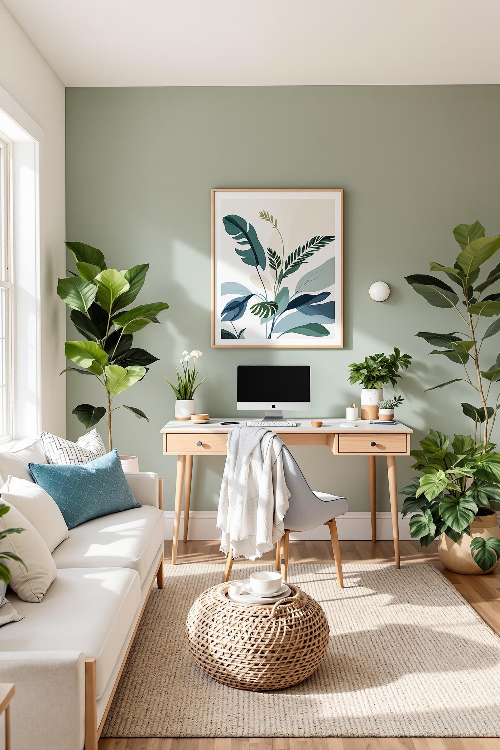
In 2025, the minimalist open plan color scheme is shifting toward more earthy and biophilic palettes. Think sage green in the dining area, soft terracotta for gathering zones, and warm greiges anchoring the entire space. The latest design trends all point in this calming and natural direction.
As someone passionate about simplicity in design, I often opt for a base of soft whites and neutral tones across an open floor plan, playing with slight shifts in hue to subtly mark division. To maintain cohesion, I recommend choosing your primary color first—this acts as the connective thread running from one end of the space to the other. I explain this philosophy further in this color zoning guide.
The Psychology Behind an Open Floor Plan Color Palette
Your color decisions affect more than your layout—they impact mood and how people interact in your home. Warm tones like ochre, mustard, and burnt sienna subtly pull people together, making them perfect for social spaces like dining rooms. Cooler hues, such as muted purples or misty blues, help calm the mind—ideal for open-concept offices or reading corners.
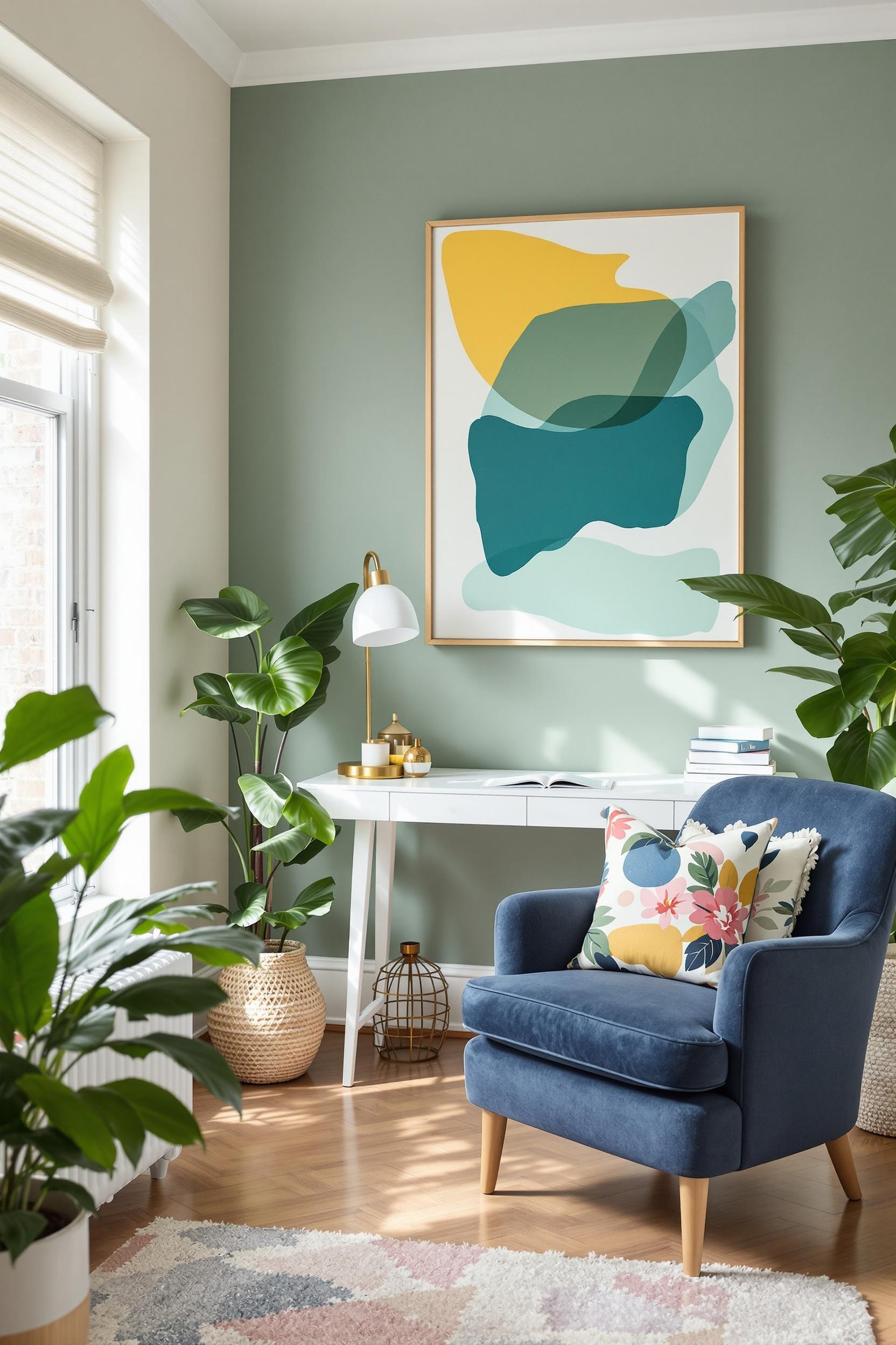
This emotional harmony is central to the success of any color zoning strategy. When I helped redesign a penthouse open plan last year, we used soft pastel zones to create a soothing flow from the cookspace to the lounge area. Zones of misty blue and soft clay were introduced, guided by sunlight and intentional design. Articulating functional boundaries in this way enhances the open layout without turning it into a chaotic free-for-all.
Using Color Blocking to Define Function in Open Spaces
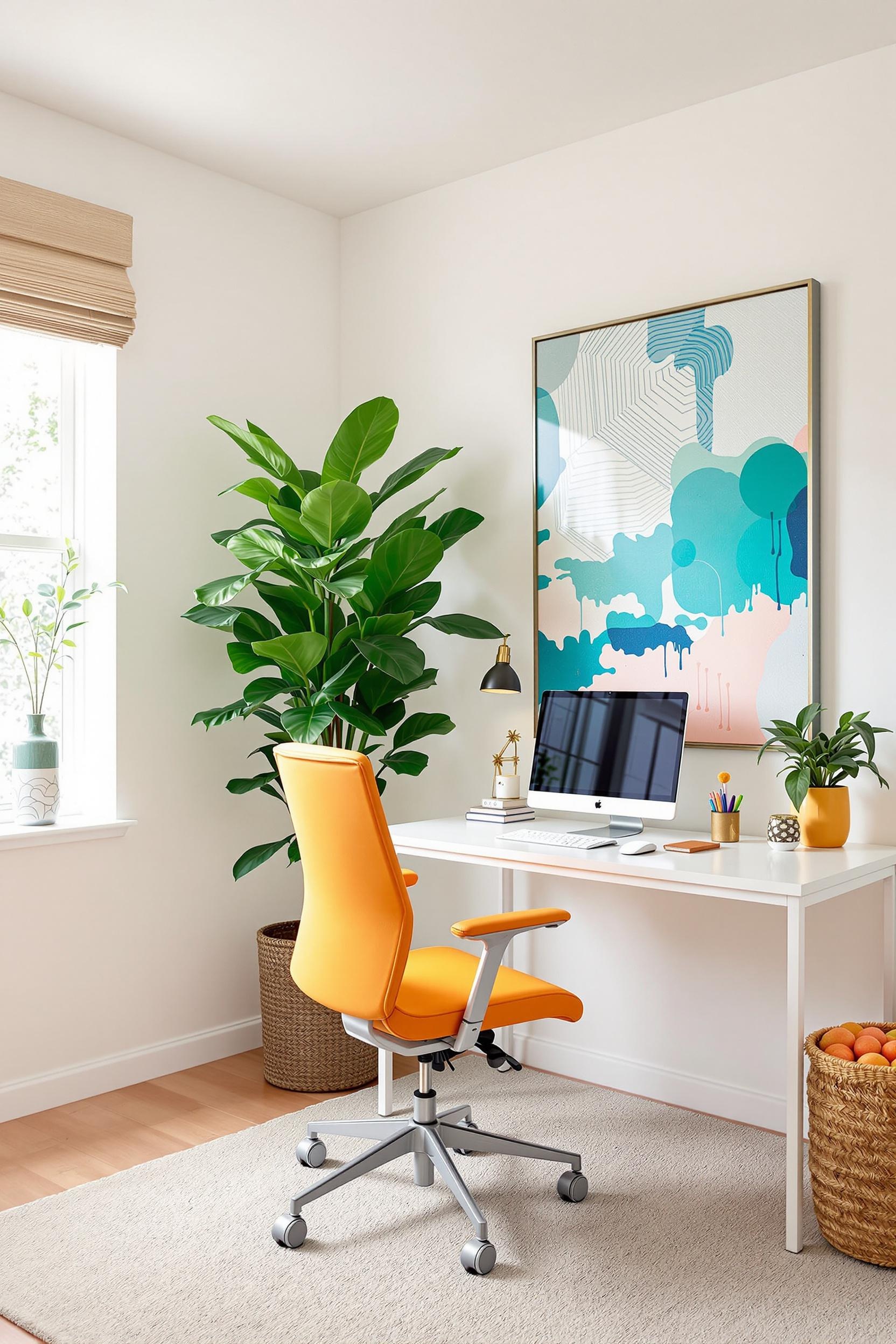
If your open concept layout includes multifunctional zones—like a kitchen/dining combo or a living room that doubles as a home office—you can make each area feel distinct while staying unified. I like creating a bold color accent in the kitchen, then bring that same tone into an accessory or painted trim in the adjacent room to tie the scheme together.
When I work on open rooms that also happen to be small, I use color blocking techniques for small open floor plans that make them look larger. Positioning a pastel ceiling accent over your dining nook, installing vertical color panels on key dividers, or using a hunter green or deep navy on an accent wall can all suggest height and width.
Want impact without going overboard? Limit yourself to a maximum of three color patterns: one bold, one secondary, and one for subtle texture. This keeps your space visually clean and harmonious—one of the top principles I recommend for minimalist interior success.
Color Transitions and Lighting Considerations
Natural light plays a huge role in how colors appear at different times of day. Before finalizing any scheme, I test each hue’s appearance under morning, midday, and evening light. This process makes a world of difference—especially in spaces receiving uneven lighting across zones.
In darker zones like dining areas or nooks nestled between larger windows, I suggest using warmer tones in line with bold maximalist color blocking. A warm yellow (“Chinese Emperor”) or clay red keeps the energy lively and cozy. Bold doesn’t have to mean busy. When paired with neutrals, vibrant tones create comforting transitions while still honoring the minimalist aesthetic.
Defining Zones with Strategic Paint Applications
When planning your open floor plan paint colors, think of color as flow. I sometimes refer to this strategy as “chromatic navigation”—where your eye is gently guided from one function to another with soft shifts in hue or saturation. You can channel this through subtle feature walls, rug patterns, textile layering, or divided ceiling sections.
My favorite tricks include:
- A terracotta feature wall behind a dining table to promote warmth
- A soft sage to define a workspace nook
- Flat soft gray in transition corridors or walkways
- Hunter green shelves for open-concept library shelves
This really shines in spaces like open lofts where zoning is key. These kinds of varied flourishes help define activity areas while sticking to one visual family of hues.
Practical Examples: Blending With Minimalism and Nature
The magic of minimalist open plan color schemes is that they create peace. That’s why I lean heavily into earthy neutrals and organic hues inspired by nature: moss green, soft sand, lavender-gray, driftwood taupe. Options like these tie together beautifully and create flow from the floor up to the ceiling.
Nature-inspired palettes don’t just look great, they feel good too. Design psychology shows these tones support tranquility—perfect for grounding your open layout without losing its airy, free-flowing character. Explore biophilic color schemes for open plans to better understand why the outdoors can influence a calming indoor palette.
Start with your most public zone—usually the living room—and select colors that feel relaxed but grounded. Work outward, using lighter variations or complementary schemes for surrounding areas like dining or kitchen nooks. Consider a “gray and blue color scheme for coastal open spaces” if you’re adding crisp, clean contrast in a brighter setting.
Your Color Revolution Starts Now: Transform Your Space Today!
As we’ve journeyed through the intricate world of open floor plan color zoning, I want to empower you to take immediate action and transform your living spaces. This section isn’t just about inspiration – it’s about practical implementation and your personal design revolution.
Design Your Dream Space: Color Blocking Masterclass for Homeowners
Color blocking isn’t just a trend—it’s a strategic way to reimagine your space. Ready to dive in? I’ve created a method that fully maps out your color transformation journey. By applying minimalist color blocking principles, you’ll:
- Create functional boundaries without walls
- Use color strategically to organize your home
- Apply 2025 design trends with confidence
Free Color Consultation: Your Design Transformation Starts Here
This is your chance! I’m offering a limited number of free 30-minute strategy sessions. You’ll receive:
- A personalized color zoning consultation
- Expert insights on layout and tones
- Access to exclusive 2025 color trend recommendations
Open Floor Plan Color Zoning: Frequently Asked Questions
FAQ 1: How Do I Choose a Color Palette for an Open Floor Plan?
Begin with a consistent neutral such as warm gray, soft white, or muted greige. Then, layer in nature-inspired tones like sage and terracotta. |More on this method from Benjamin Moore’s minimalist color palette suggestions.
FAQ 2: Can Color Blocking Work in Small Open Concept Spaces?
Yes! Color blocking works great in tight areas. Try color zoning to give the illusion of separation without walls using pastels and soft accent shades.
FAQ 3: How Does Lighting Impact Color Zoning?
Lighting changes how we see color. Earthy elegance trends recommend testing colors in both daylight and evening light before you commit to a scheme.
FAQ 4: What Psychological Effects Do Colors Have?
Blues and greens calm the mind. Warm tones like yellows and reds energize and invite conversation. Use this knowledge to create the right vibe in each area.
FAQ 5: How Often Should I Refresh My Color Scheme?
Update every 3–5 years or as your style evolves. Use accessories to refresh color zones between repaints. 2025 trends focus on timeless, earthy colors, making touch-up transitions easier.
Color blocking and zoning aren’t just design strategies—they’re storytelling techniques. Each palette narrates the purpose and energy of a room. Ready to guide that story?
Get more inspiration delivered straight to your inbox.


