
Open Plan Color Zoning: Create Bold, Minimalist Spaces with Color
Have you ever walked into an open-plan home and felt unsure how to make the space feel functional yet cohesive? I’ve faced that exact challenge in many projects. That’s where open plan color zoning comes in—a powerful, minimalist design strategy that uses paint and strategic color choices to organize a room without physical dividers.
Instead of traditional partitions, I use color blocking for open plan layouts to visually separate living zones. This method gives cleaner lines, intentional flow, and a fresh, modern feel. Whether you’re decorating a large loft or a cozy studio, using bold color transitions in open concept spaces helps define purpose while maintaining openness.
Transforming Open Spaces: The Art of Color Zoning in Minimalist Homes
Color zoning for open plan spaces is more than a design trick; it’s a lifestyle shift. Open-plan layouts feel airy, but without direction, they lack function. Color zoning helps shape how each area is used—without putting up walls.
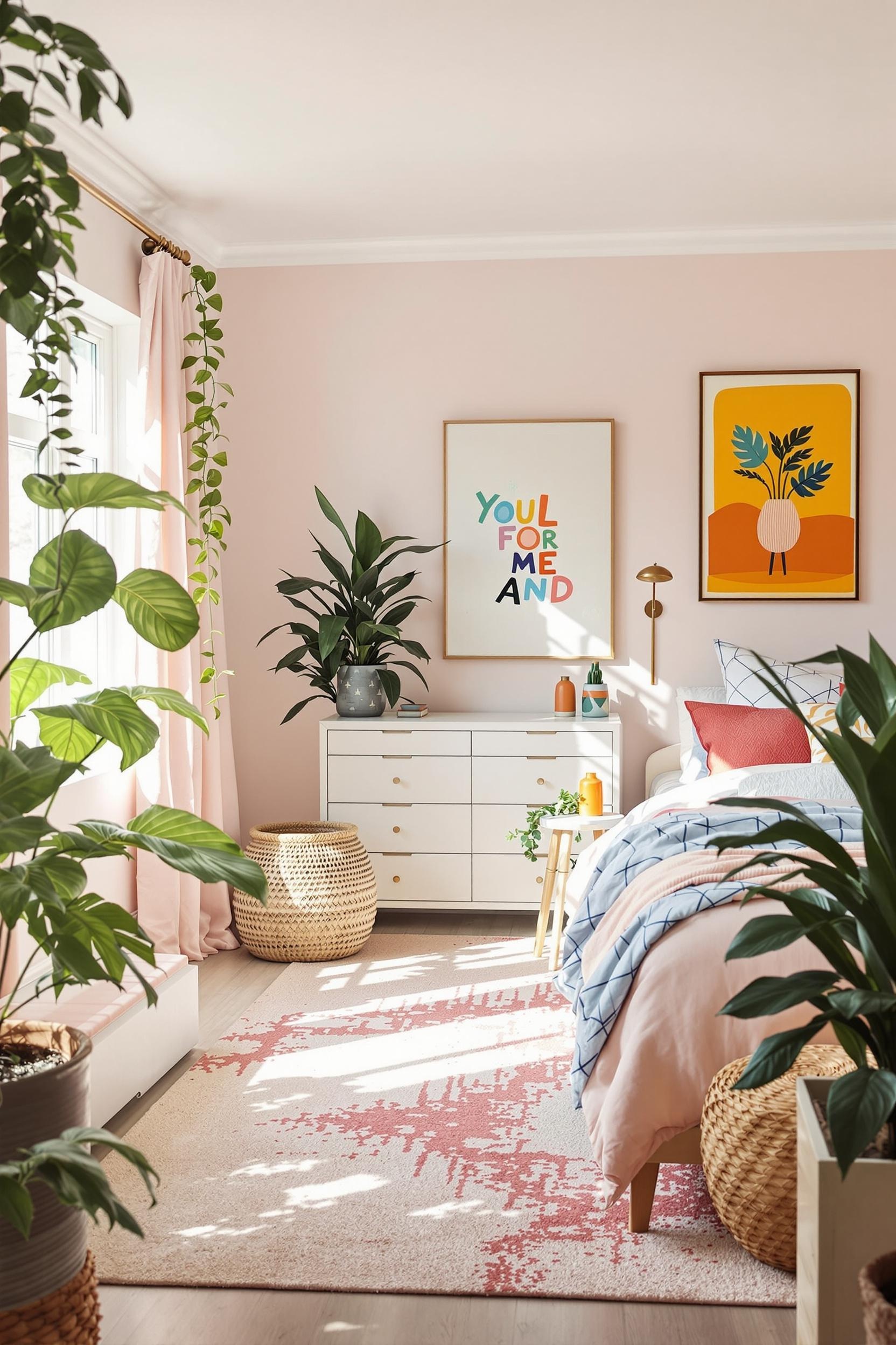
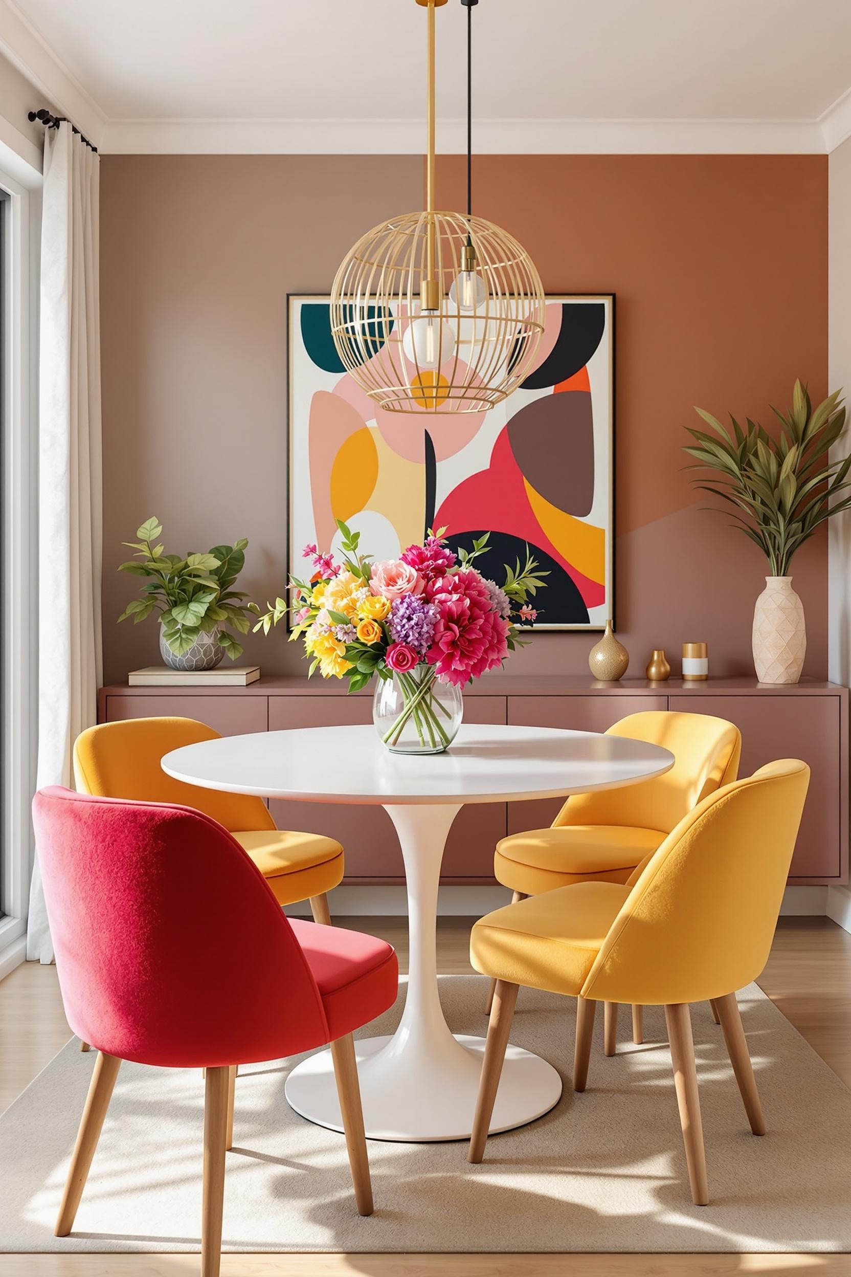
This approach goes hand in hand with minimalist color block interiors. A modern dining nook might feature earthy terracotta walls, while the adjacent living zone transitions into cool navy or soft gray. By using minimalist color blocking techniques for open floor plans, every part of your open layout gets its own identity.
Color Zoning Strategies: Defining Open Plan Spaces with Minimalist Precision
From my experience with projects big and small, here are reliable ways to zone an open-concept layout:
Psychology of Color Boundaries
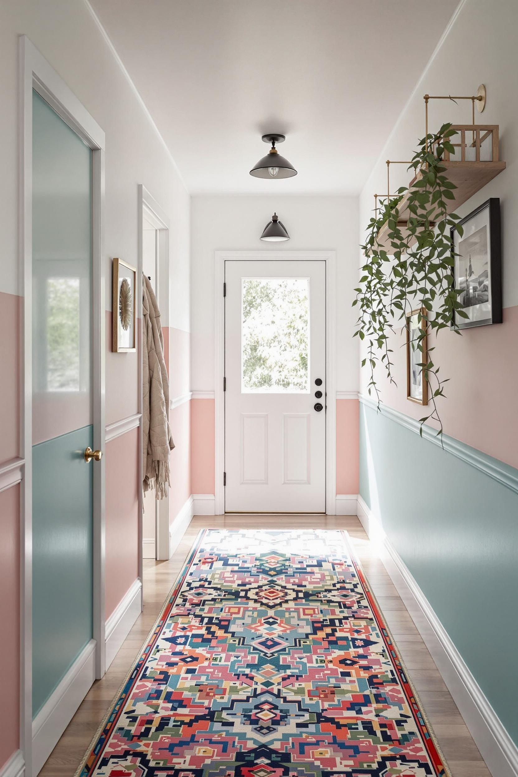
According to experts at LivingEtc, our brains process color shifts as spatial boundaries. I apply this concept using varied tones of the same hue. For instance, a light warm gray in the kitchen could evolve into a deep charcoal in the adjacent lounge. The result? A natural transition that feels intentional. If you’re unsure of this balancing act, check out this guide on how color blocking with paint zones can promote flow across spaces.
Crafting Functional Zones
- Start with a neutral foundation: warm beige, taupe, or gray unify the space.
- Add an accent color to define zones: emerald for the dining area, denim blue in the office corner.
- Match your palette to furniture accents like rugs, artwork, or shelving.
In minimalist interiors, less is often more. I recommend using complementary tones instead of stark contrasts. A light-to-dark transition often works wonders in small open-plan apartments.
Color Zoning Mastery: Minimalist Techniques for Open Spaces
The Influence of Color Psychology in Open Plans
A cohesive color palette improves navigation in larger formats like lofts or combined kitchen-living rooms. For subtle transitions, try layering warm neutrals and then including elements like emerald green or muted plum. This strategy creates functional zones, whether you’re zoning a home office or kitchen like this one where bold paint transitions sculpt each function.
Design Techniques to Keep It Flowing
- Neutral Base: Use one tone through the main space. Beige, soft black, and warm gray are perfect backdrops.
- Tonal Accent Areas: Pick accent walls or floor borders in related hues to separate functions.
- Architectural Details: Ceiling beams or furnishings in matching shades help guide the eye.
Explore more ideas on modern color zoning for open concept plans here.
Color Zoning: Transforming Spaces with Minimalist Precision
I use the term “color zoning” often because it fits best. It’s not so much about painting a wall randomly, it’s about aligning visual cues with your lifestyle. One side of the room for entertainment, another for work. This lets you create small reading nooks, dining areas, or home offices without cluttering the layout.
Functional color transitions like lighter shades near windows and deeper shades in gathering zones increase comfort. Don’t forget to use rugs, accent lamps, and textures to reinforce these soft divisions. Want ideas for furnishing and accessories? Try my strategic color placement techniques with minimalist furniture.
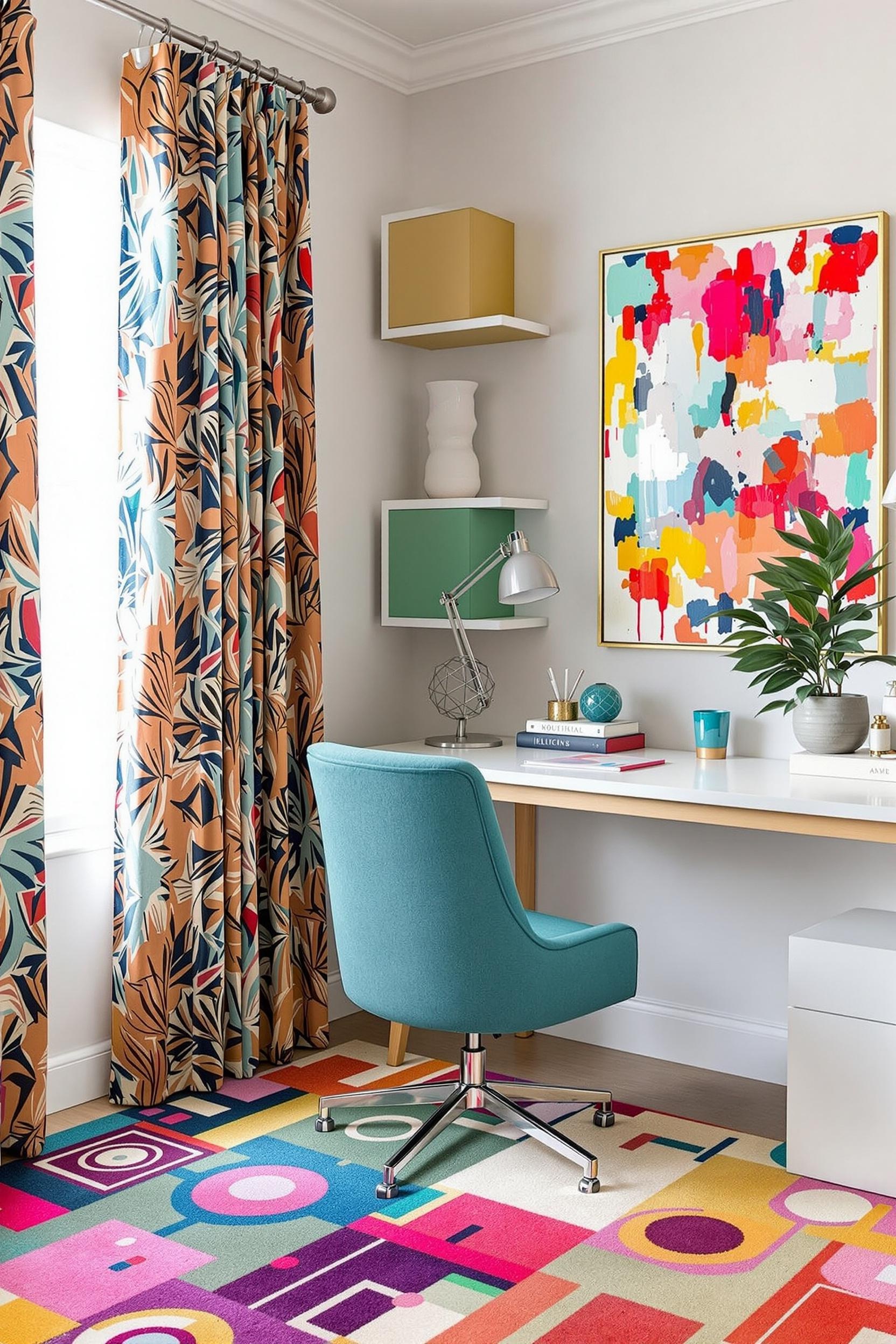
This method is also helpful in home office designs or living room setups, where dedicated attention spots or media corners need emphasis.
Transform Your Space: Color Zoning Starts Now!
Unlock Your Home’s Hidden Potential
Every open-plan area hides potential. By applying intentional paint transitions and keeping your palette small, you transform chaos into a minimalist dream. Discover how open plan paint zoning can increase flow and purpose. You’ll enhance how you interact with your space—no remodel needed.
Your Color Zoning Transformation Starts Here
- Master color psychology in interior design
- Apply minimalist color blocking strategies to any room
- Use cohesive color transitions to shape your layout’s functionality
Ready to move from inspiration to transformation?
Beyond Design: A Lifestyle Revolution
Color zoning offers more than style—it allows your home to serve you better. Whether using open concept color transitions or solid color blocks for definition, you start designing for life, not just decoration.
I’d love to know how you’ve applied these techniques. Drop a comment or question, or reach out for help. And if you want more resources, expert tips, or exclusive guides—subscribe below.
Frequently Asked Questions: Your Color Zoning Guide Explained
Q1: How do I use color to create zones in an open-plan space without harsh lines?
The trick is to choose a cohesive palette and use subtle changes in tone. Start light in one area, then shift slightly warmer or darker to mark new zones. Let your space breathe, like this paint-based zoning guide explains.
Q2: Best colors for minimalist color zoning?
Stick to warm grays, soft taupes, or muted whites, adding accents like navy, pastel sage, or warm terracotta. For inspiration on mix-and-match schemes, visit this post on top 5 paint ideas for minimalist color blocking.
Q3: Can it work in small spaces?
Absolutely! Color zoning works best in tight areas. Light shades and graduated transitions make small open plans look larger and more organized. Try these small space color zoning ideas.
Q4: How does lighting affect this strategy?
Lighting changes how we see color. Test your chosen shades throughout the day to see how natural light transforms them. Make use of shadows and beams to enhance natural separation of zones.
Q5: Common mistakes to avoid?
Don’t use too many bold contrasts side by side. Avoid abrupt transitions and keep the tone subdued. Maintain balance across the whole space by using intentional transitions and keeping elements fluid. For more insight, read about minimalist color design basics.
Ready to learn more, or need tips specific to your layout? I’d love for you to become part of the community.
“`


