
Color Zoning in Open Plan Spaces: Transform Your Home with Strategic Color Blocking
Have you ever walked into a modern open-plan home and thought something wasn’t quite right? The furniture looks great. The lighting is good. But somehow, the space still feels a bit undefined. That’s where color zoning ideas for open plan spaces become a game changer. I’ve used this strategy many times in my work to turn disconnected spaces into functional, purposeful rooms that flow beautifully.
With the rise of minimalist and open-concept living, many homeowners struggle to bring structure to their space without breaking up the openness. That’s where color zoning for minimalist homes and interior design color flow come in. By using subtle color differences, bold accents, and thoughtful transitions, I create visual boundaries that separate functional areas like living, dining, and workspaces—without ever putting up a wall.
In this article, we’ll dive into:
- Basic principles of color zoning
- Minimalist interior color blocking strategies
- Techniques for seamless transitions
- Psychological effects of color in open-plan designs
- Tips to get started in your own home
Understanding the Basics of Modern Open-Plan Zone Design
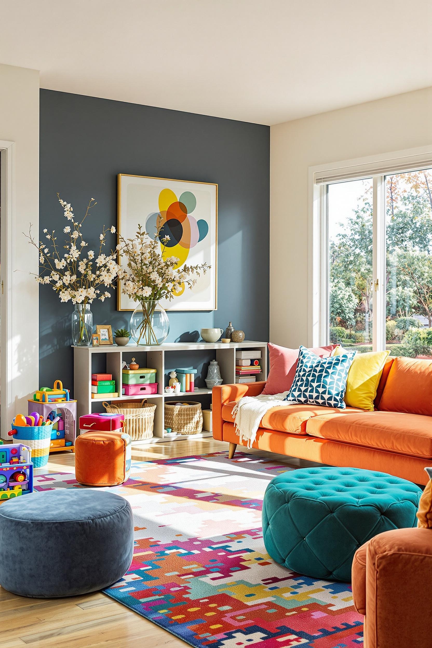
Color zoning uses color to define spaces in a way that’s smooth and stylish. Instead of putting up walls or heavy partitions, I let the paintbrush do the work. Want the living room to feel cozy? Use soft neutrals and a rug that matches. Want the dining area to pop? Introduce a bold focal wall in just the right tone. Think of it as drawing invisible borders that help guide movement and purpose—all while keeping that sense of openness.
I like to start with a neutral palette for open-plan layouts. It’s the perfect blank canvas. Then, I add color zoning with neutral tones or bold accents to give function and identity to each space.
Minimalist Color Blocking: Creating Impact with Less
When it comes to minimalist interior color blocking, less is truly more. I often recommend working with soft whites, warm grays, and subtle taupes. To add visual interest, I pick one or two areas where I introduce geometric shapes or bolder accent color.
It’s not just about slapping color on the walls. It’s designing with intention. A muted green might help calm a reading nook, while a terracotta accent can energize a workspace. When applied sparingly and purposefully, these touches amplify the feeling of the room without overwhelming it. Even better, this method is very budget-friendly—a huge win!
A great way to play with color schemes for open concept spaces is to create a gradient effect. Maybe the shade shifts slightly from one zone to another. It’s this kind of subtle difference that makes open plan living color harmony feel effortless yet refined.
Creating Function with Color: Practical Implementation Tips
I love using paint as my main zoning tool. It’s affordable, flexible, and gives instant character. Here are some of my go-to strategies:
- Use soft color transitions instead of bold lines
- Paint just one wall or portion of the wall to define a zone
- Coordinate rugs, throw pillows, and art within each zone’s palette
- Use directional lighting to enhance color contrasts
Need ideas to start? Choose a base color like oatmeal or a muted gray. Then add a deeper version of that hue in the dining area. A creamy white in the kitchen keeps things light and cohesive. This technique makes small homes feel bigger and gives larger homes more intimacy.
The Psychological Impact of Interior Design Color Flow
Color isn’t just visual—it’s emotional. Over the years, I’ve learned how powerful strategic color placement can be. With the right tones, you evoke calm, energy, focus, or comfort. That’s why I use different colors to suit different functions.
For example:
- Cool tones like soft blue or sage green: great for offices or reading areas because they reduce mental clutter.
- Warm tones like clay, terracotta, or amber: perfect for gathering spaces like kitchens or living rooms.
Color zoning ideas for open plan spaces aren’t just about what looks good. They influence how you behave and interact with the space. I love seeing how a slightly deeper wall color pulls someone toward the dining table—or how a cooler-toned wall invites stillness.
Visual Storytelling Through Color: Zoning As Narrative
When designing for clients, I think of each room as a chapter in a visual story. The colors I choose tell that story. I let each zone build on the next. But I always maintain one unifying thread so the whole space feels cohesive—not chaotic.
This approach is especially helpful in color zoning for minimalist homes. With fewer objects and decorations, the color has more responsibility to define the space. That’s why I recommend using lighter tones as the base and building depth with shadows, subtle shifts, and textural paint finishes.
Color Zoning Techniques: Maximizing Functionality Without Walls
Practical Tips for Separating Open Spaces With Color
Defining zones without building walls requires balance. I always make sure my palettes are connected, even if the colors vary by zone. That way the eye moves across the room smoothly.
Here’s what works well:
- Stick to one base color like soft gray
- Use varying tones of that color for different areas
- Add contrast with materials, like matte and gloss paint
- Layer in muted color accents through rugs or furniture
This technique not only makes your space feel organized but also more styled and intentional. It helps you really feel “at home” no matter what the room is used for.
Creating Seamless Transitions Using Color Schemes
Want to switch up zones without harsh boundaries? I suggest using gradual shifts in paint color. This is where interior design color flow shines. Fade from ivory to pale tan, then into a gentle moss green near your reading nook.
Also try painting geometric patterns or color blocks that begin in one area and end in another. This little touch can connect zones while still keeping them clearly distinct.
Color Zoning Unveiled: Your Ultimate Guide to Transforming Open Spaces
At its best, color zoning with neutral tones can open up your entire home. Instead of walls and separations, color becomes your primary organizing element. Whether you’re playing with a pop of mustard behind your couch or toning down the home office with a whispery blue, you’re making every zone feel special.
Some of my favorite color zoning ideas for open plan spaces rely on simple and adaptable principles:
- Use one neutral base across the home
- Introduce 1–2 bold accents depending on the space
- Keep your palette cohesive by carrying undertones throughout
Don’t be afraid to try minimalist design with bold colors either—just use them selectively. A single deep navy or olive tone can do wonders when it’s placed with intention.
Transform Your Open Space: Color Zoning Magic Revealed
By now, you should have a solid understanding of how modern open-plan zone design works through color. Don’t wait to try it—start with one corner of your home. Whether it’s a painted arch in the entryway or a colorful wall behind your dining area, these small changes add up.
Join Our Design Community
Don’t miss out on cutting-edge interior design strategies. By signing up for our newsletter, you’ll get:
– Exclusive color zoning tips
– Monthly design inspiration
– First access to our expert guides
– Special subscriber-only content
Spread the Design Love
Loved this article? Share it with your friends and fellow design enthusiasts! Drop a comment below telling me:
– Which color zoning technique excited you most
– How you plan to implement these ideas in your home
– Your favorite color combination for open spaces
Take Action Now
1. Subscribe to our newsletter
2. Share this post on social media
3. Comment with your design dreams
4. Start transforming your space today!
Remember, great design is just a few strategic color choices away. Let’s make your home extraordinary together!
Frequently Asked Questions About Color Zoning in Open Plan Spaces
What is color zoning in open plan spaces?
Color zoning is a design technique that uses different colors or paint treatments to visually separate functional areas within a single open space without using physical barriers. It helps define different areas like living, dining, or working zones while maintaining an overall cohesive look.
How can I use paint to create zones in an open plan area?
I recommend using accent walls, geometric paint patterns, or subtle color transitions to define different spaces. For example, you can use a deeper tone for a dining area and a lighter shade for the living space, creating visual boundaries while maintaining an open feel.
What are the best colors for open concept spaces?
Neutral tones like soft grays, whites, and beiges work wonderfully for creating a harmonious open plan design. For more drama, consider adding bold accent colors in specific zones to create visual interest and define functional areas.
Can color zoning work in a minimalist interior?
Absolutely! Minimalist color zoning focuses on subtle color variations, clean lines, and a restrained color palette. Think monochromatic schemes with slight tone variations or geometric color blocking using neutral shades.
What are some low-cost color zoning techniques?
Some budget-friendly approaches include:
– Using paint to create accent walls
– Applying geometric paint patterns
– Using removable wallpaper
– Strategically placing area rugs
– Incorporating colored furniture or accessories to define zones
How do I create visual boundaries without closing off the space?
Use soft color transitions, subtle geometric shapes, and carefully placed furniture to create natural divisions. Lighter colors can make spaces feel more open, while slightly deeper tones can subtly define different areas.
What are some tips for maintaining color cohesion in an open layout?
I suggest:
– Choosing a consistent base color palette
– Using varying shades of the same color family
– Incorporating complementary colors
– Maintaining a consistent undertone across different zones
– Using similar textures and materials to tie the space together
Can furniture help with color zoning?
Definitely! Furniture can be a powerful tool for color zoning. Use furniture with distinct color accents, area rugs in different hues, or strategically placed color-coordinated pieces to define and separate different functional areas.
What color tones work best for different zones?
– Social zones: Warm tones like soft oranges, yellows, and warm neutrals
– Relaxation areas: Cool tones like soft blues, greens, and calming grays
– Work spaces: Neutral tones with subtle energizing accents
How can I create a focal point using color zoning?
Use a bold, contrasting color on one wall or in a specific area to draw attention. This could be a vibrant accent wall in the living area or a deep-toned kitchen backsplash that stands out from the surrounding neutral palette.


