
Modern Color Zoning Techniques: Transform Your Minimalist Home with Bold Design
Have you ever walked into a space that felt perfectly balanced, open, and inviting—yet there were no visible dividers? That harmony you’re feeling might have come from modern color zoning interior design techniques. In my work as an interior designer, I’ve used these approaches to turn ordinary homes into functional, sensational experiences. Whether you’re in a cozy studio or a sprawling penthouse, minimalist color zoning can help you maximize space and enhance mood using nothing more than the power of color.
What Is Modern Color Zoning?
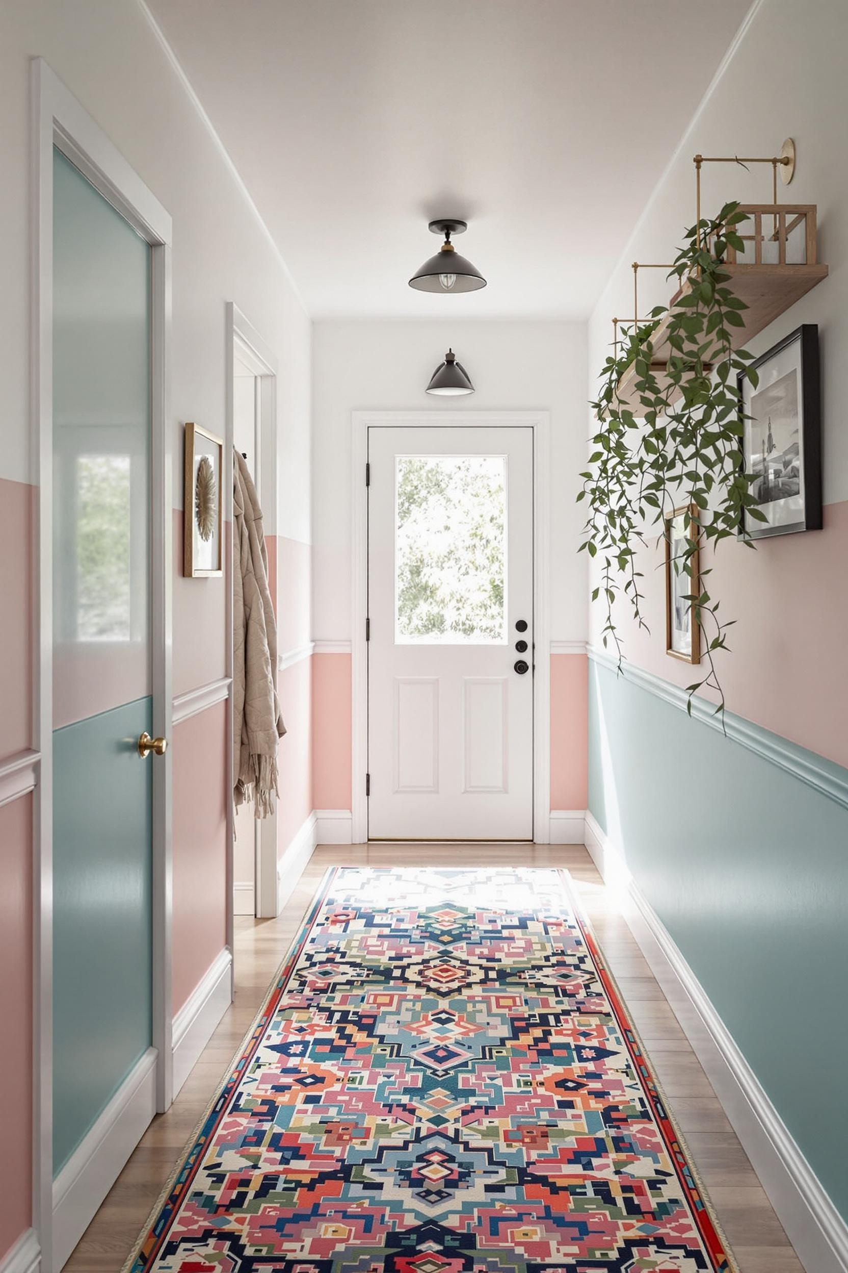
Color zoning is a smart design technique that uses different colors to define spaces within a room. Instead of using walls or dividers, you use paint, textiles, furniture, and lighting to separate areas visually. With this approach, you can divide a room into a work zone, lounge area, or reading nook—all with just color.
Modern color blocking for minimalists focuses on geometric design, clean lines, and a limited but impactful color palette. The aim? To create distinct zones while keeping your space visually uncluttered, supportive, and adaptable.
Why Is Color Zoning Important in Minimalist Interiors?
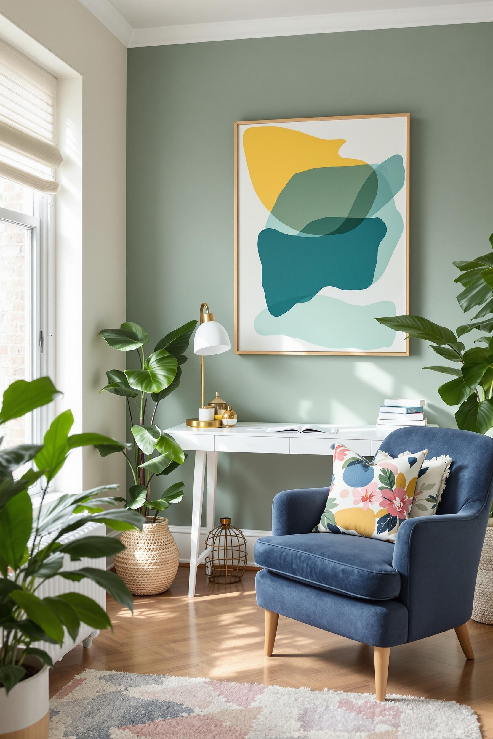
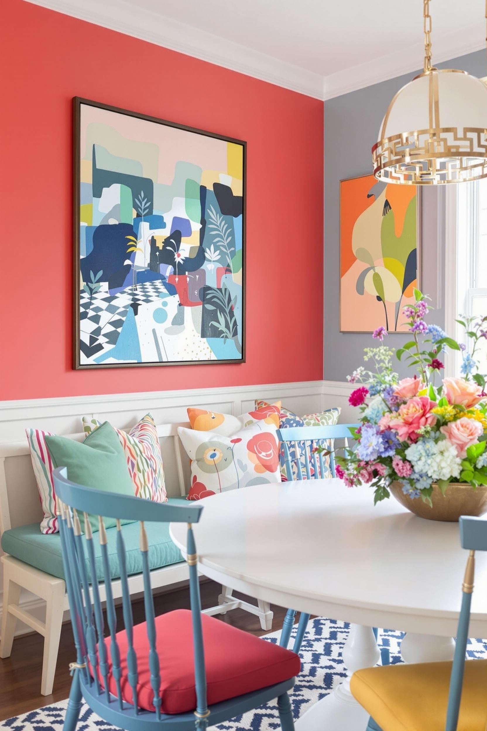
Minimalist homes may be sleek and simple, but without the right zoning, they can also feel cold or disconnected. I use the 60-30-10 rule—a foundational zoning strategy where 60% of the room is a dominant color (typically neutral), 30% is a secondary color, and 10% is a striking accent. This principle is one of the easiest ways to maintain balance and style while applying neutral foundation and vibrant details.
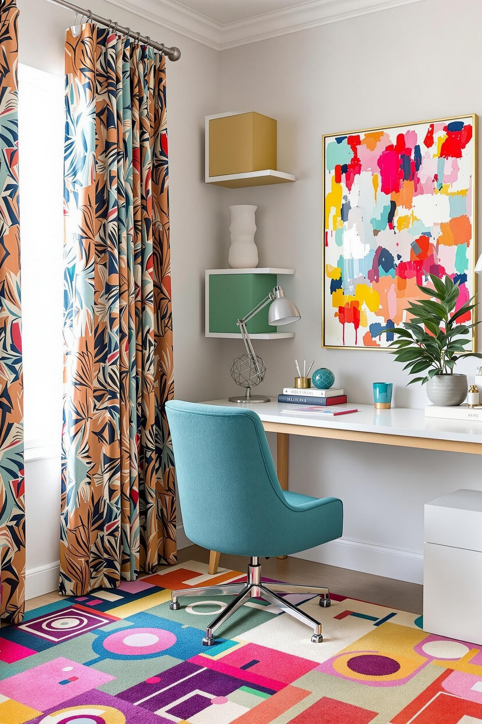
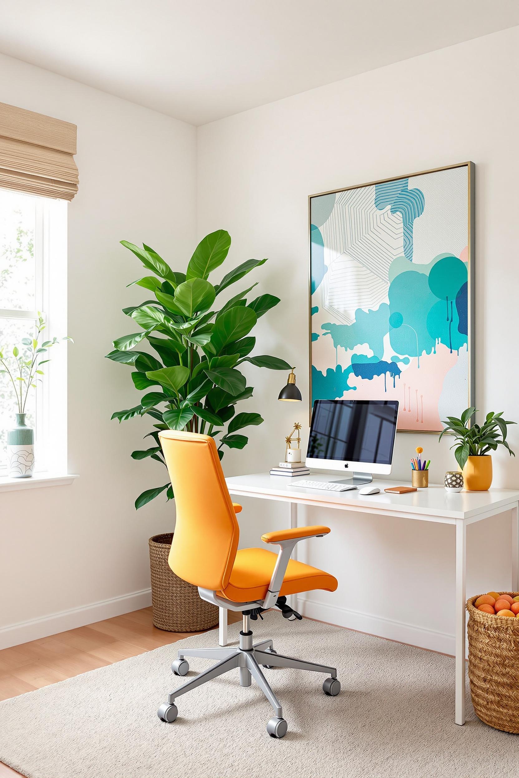
Designing for Functionality: How to Apply Color Zoning at Home
One of the first homes I ever transformed with zoning was a 500-square-foot apartment. Using modern color blocking techniques, I turned one open space into four distinct areas: a work zone, sleeping nook, reading lounge, and dining corner. Each had its own color block to define it.
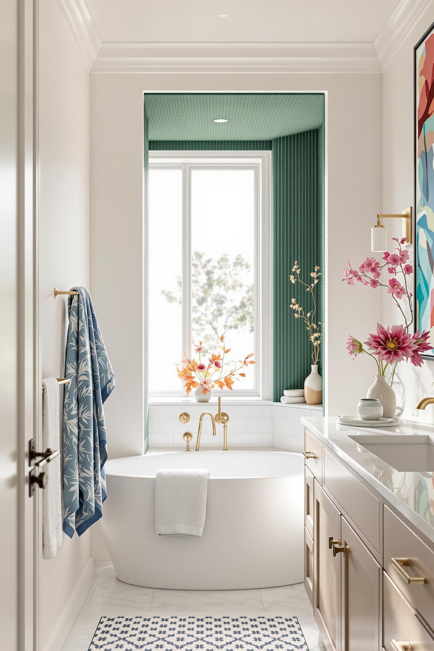
For smaller areas, consider how you can use lighter hues to make spaces feel bigger. Use deeper shades to create intimacy where you want people to settle in, like in reading corners or cozy dining spaces.
Color zoning in bedrooms is especially transformative. For example, I often apply a bold accent behind bed headboards, like a rich navy or terracotta, to anchor the sleep zone, while the rest of the space maintains a calm, muted palette.
Psychology Meets Paint: The Science Behind Color Zoning
According to recent design forecasts, color will dominate interiors in 2025 with strategies like “color folding,” which smoothly blends hues between zones for a gradient effect. I’ve seen this shift firsthand—the best designs cater to both form and feeling.
Modern zoning takes color theory seriously: cooler tones like soft blues and greens create calm, while warmer tones like mustard and coral stimulate energy. This principle is especially useful in open-plan spaces where you want to separate zones for work and play without physical dividers.
Color psychology also suggests that darker blocks shrink space, perfect for making a home office nook feel private and separate within an open room. Lighter hues expand space, visually enlarging your living area.
Technology Enhances the Color Zoning Experience
One of the most exciting parts of color zoning today is the integration of lighting. Smart bulbs let you shift your color zones throughout the day—cool white while working, soft amber to unwind. Learn how people are applying these strategies in real homes with guides like Smooth Color Magic.
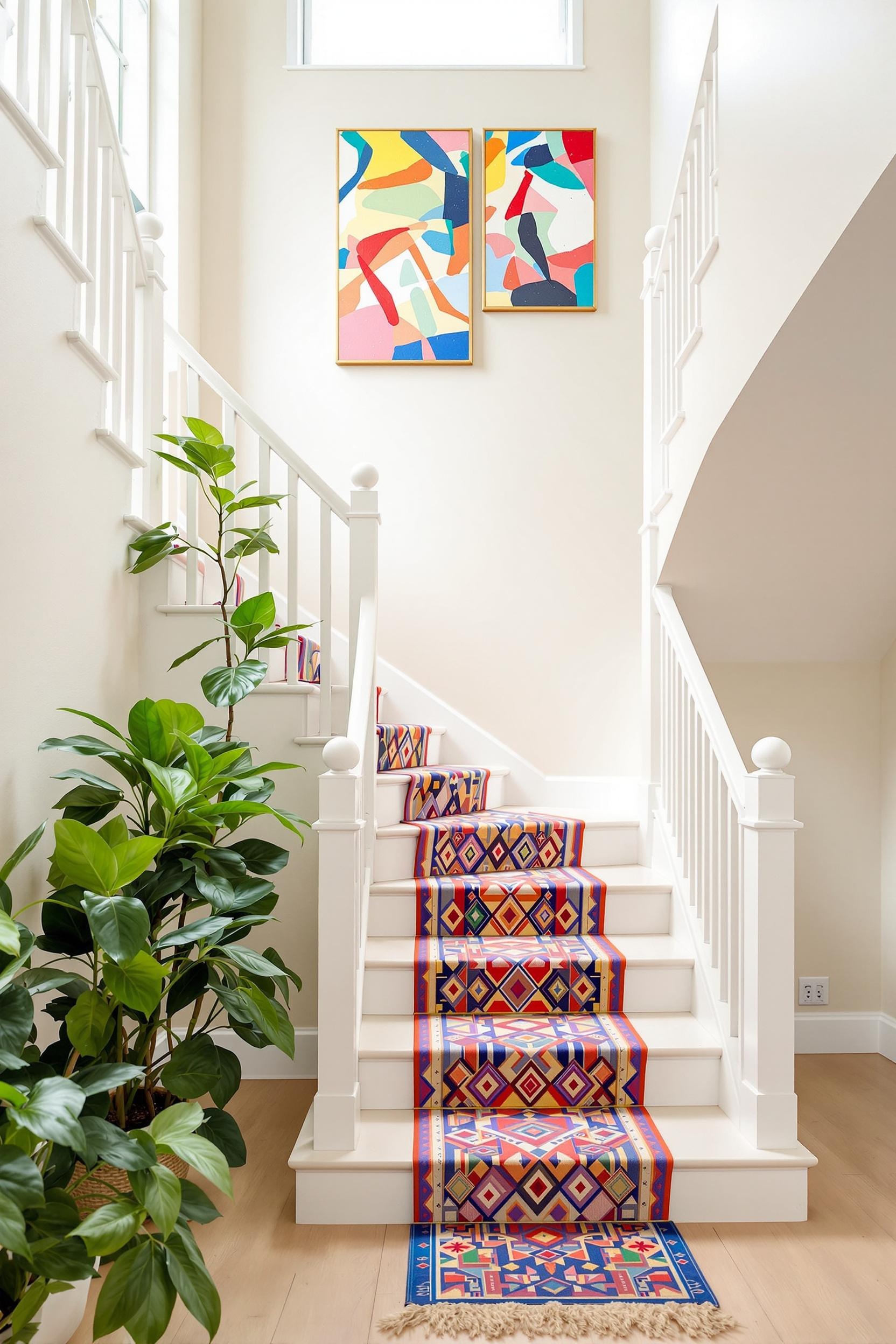
You can also layer color zoning with textures and accessories. Everything from furniture to throw pillows can create boundaries and flow, reinforcing zones without clutter.
Practical Tips to Start Your Color Zoning Journey
- Use area rugs to underline color zones
- Apply paint zones behind key furniture
- Define workspace with cool, focus-enhancing hues
- Relaxation zones should use warm, soft shades
- Apply contrast sharply or use blending gradients (“color folding”)
Don’t be afraid to experiment. The beauty of color zoning is that it’s flexible. Change the look with a new accent wall, swap accessories, or refinish furniture. Let your creativity guide you—your space should support how you live, not just how it looks.
Master Your Space: Color Zoning Design Challenge Awaits!
Ready to take your home from good to unforgettable? Join our exclusive Color Zoning Design Challenge and create a home that reflects your style and needs using thoughtful color zones.
The challenge isn’t about following trends—it’s about understanding how color transforms open spaces. Discover how to increase emotional comfort, functionality, and visual appeal without knocking down a single wall.
Why Join the Color Zoning Revolution?
- Define multi-use spaces in one room
- Create functional color zoning in small apartments
- Get hands-on guidance from design pros
What You’ll Get:
- Color psychology sheets
- Professional feedback
- Monthly color zoning ideas
Join the Color Zoning Design Challenge
Color Zoning FAQs: Your Ultimate Guide to Modern Interior Design
Q1: How does color zoning work in minimalist design?
Color zoning works by using simple, bold palettes to define areas without walls. Think geometric shapes, clean edges, and bold contrasts. Explore this concept further with our guide to minimalist color blocking.
Q2: Can color zoning make my small space look bigger?
Yes! Use light, reflective tones strategically. Divide zones using lighter bases and darker accents to visually dig deeper into your space.
Q3: What are effective color combinations for zoning?
Try these palettes that follow the 60-30-10 formula:
- Soft gray base, navy midtone, mustard yellow accents
- White base, terracotta for warmth, emerald green for boldness
Explore these neutral and vibrant schemes.
Q4: How do I zone an open-plan space?
Use bold backdrops in functional corners—such as a deep green wall behind a desk nook or cool, calming blue behind your work zone. Use smart lighting or subtle contrast between walls and floors.
Q5: Is color zoning just a trend?
No. Color zoning is more than trendy. It’s a way of sculpting emotional flow within your home. New paint and lighting technology make zoning flexible, dynamic, and adaptive. Check out how bold designs use color to connect technology with human emotions.
Conclusion: See Your Home in a New Light
Color zoning blends creativity, science, and personal style. You can define space, improve mood, and boost functionality using nothing but hues and lighting. Whether you’re working in a tight studio or sprawling loft, remember: Color isn’t just a finish—it’s a foundation.
Your space should feel like your own. Use color to craft boundaries, encourage behaviors, and uplift your mood. Let your rooms speak with hues instead of walls. Color zoning is more than interior design—it’s intelligent living.
Want more color zoning inspiration in your inbox?


