
Monochrome with a Pop: How to Transform Your Home with Minimalist Color Blocking
Have you ever stepped into a striking room bathed in black, white, or gray but interrupted by one vibrant pop of color—and instantly felt the magic? That’s the understated brilliance of monochrome interior design paired with a bold accent. In the world of color blocking and minimalist design, this is how you bring personality into simplicity.
As a seasoned interior designer, I’ve seen how bold color pops can transform sterile white spaces into emotional sanctuaries. The secret? Combining the soothing psychology of minimalist monochrome rooms with thoughtful bursts of color that ignite creativity, serenity, or even passion.
This post is your guide to mastering the power of color psychology, geometry, and modern color blocking techniques—all while sustaining the clean lines and neutrality minimalism is known for.
The Core of Monochrome Minimalism with Color Accents
Minimalist decor works on the principle of “less is more,” but that doesn’t mean bland. By using a single color palette room with colorful highlights, like 70% neutral tones mixed with 30% accents (the 70/30 rule), you add life to simplicity. Most designers, including myself, favor this ratio because it delivers harmony and impact.
I often start with a base of shades like ash gray, soft white, or charcoal. These tones create space for the accent color to shine without overpowering the room. Using a neutral backdrop as a foundation for color allows your bold additions—think mustard yellow, deep red, or cobalt blue—to act as dynamic focal points.
Why This Technique Works: Emotional Benefits & Visual Balance
The psychological impact of a monochrome palette with pop goes far beyond aesthetics. Scientific studies on color psychology show that humans respond to color with emotional reactions. For example:
- Blue: peaceful and calming—ideal for bedrooms or home offices
- Green: full of life, great for creative spaces
- Red: energizing—perfect for passion-centered rooms like dining areas
- Yellow: cheerful, lifts moods and brightens kitchens
When I designed a living room using color block inspiration, I maintained a white couch and gray walls, but added a bold ochre area rug and cobalt blue chair. The room went from dull to invigorating in minutes—and the family told me it became their favorite zone to gather.
Strategic Color Blocking Techniques for Minimalist Homes
Color blocking isn’t throwing color randomly. It takes planning and structure—geometry plays a huge role. One way is through accent walls. Another is dividing areas by color zones—for example, adding a soft navy wall behind a desk to define focus in a home office.
Some of the best minimalist color blocking placements include:
- Contrasting furniture like a red sofa in a gray room
- Statement art with bursts of bold color
- Moody bathroom tiles paired with white walls
- Bold backsplashes in monochrome kitchens
- Color blocked textiles layered with neutral bedding
Decor Tips for Every Room Using Monochrome with Pops
Living Room
Start with a minimalist black-and-white palette. Choose a bold armchair in emerald green or a geometric corner rug in contrasting hues. Try alternating cushions with metallic and velvet textures to keep things visually rich.
Kitchen
In mostly white or gray kitchens, add color with stools, pendant lights, or a cobalt-tiled backsplash. These details don’t overpower but become conversation starters instantly.
Bedroom
I recommend keeping the bedding neutral and layering with a vivid throw or color-blocked pillows. A small change like this gives your space a bold update without cluttering.
Need proof? Check out how I used bold bedding in a gray bedroom to completely shift the emotional tone from cold to cozy.
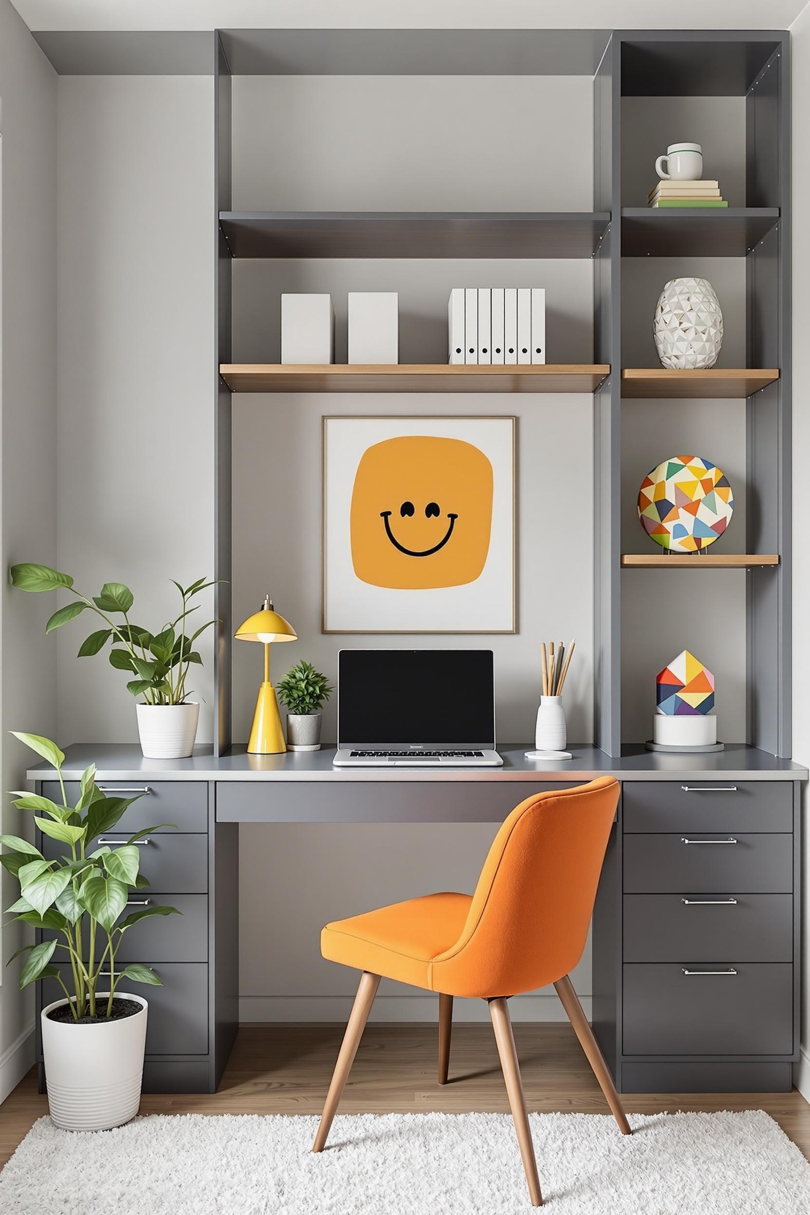
Office or Workspace
Color zones help define creativity and focus. Try painting the wall behind your desk a soothing olive or energizing teal. Learn more ideas inside this guide to color zoning for home offices.
Key Materials & Textures That Amplify the Impact
A common mistake I see is focusing only on color without balancing texture. In monochrome interiors, texture changes the perception of depth. Smooth, matte, glossy, and metallic surfaces create light variation. Layering velvet with sleek ceramics or mixing stone with wool completes the tactile story.
And don’t forget reflective surfaces. They bounce light and enhance even the smallest pop of color. This technique especially shines in small minimalist apartments.
Color Your World: Transform Your Home with Minimalist Design Magic
Fueling Your Personal Color Revolution
Now that we’ve explored minimalist color strategy, I want to share how you can use these tools to redesign your home with confidence. This next section is your toolkit for transformation.
Your Minimalist Color Blocking Starter Plan
Here’s what you need to get started:
- Step 1: Do a color audit of your space. Consider how your current palette makes you feel.
- Step 2: Choose an accent color that aligns with what you want emotionally—calm, energy, creativity?
- Step 3: Try color experiments with low-commitment items like pillows, art, or lamps. Need support? Dive deeper into practical color blocking advice here.
Join My Exclusive Color Community
I invite you to be part of my minimalist color blocking design circle! Members receive:
- Monthly mood board challenges
- Tips using color psychology to steer home energy
- Design consultations and early access to new palettes
When you sign up today, you’ll receive:
- Free color psychology PDF guide
- Minimalist room planning worksheet
- Design tips that help you reflect personality with clarity
Unlock Your Design Potential Now!
Remember, adding color is not just about paint or pillows. It’s about curating an atmosphere that supports well-being. Through thoughtful placement and smart accenting, you’re not just decorating—you’re telling your story through design.
Frequently Asked Questions About Monochrome Design with Color Pops
Q1: How do I use color blocking in a minimalist bedroom?
Start with 70% neutral shades (white or gray). Choose a bold color like emerald as a pillow or headboard. Keep lines clean and the pop purposeful.
Q2: What are the best accent colors for black and white rooms?
Top picks include emerald green, cobalt blue, mustard yellow, and deep crimson. Each one adds emotional depth against stark contrasts.
Q3: I want to keep my space calm. How do I add color subtly?
Try accessories like wall art, vases, or throws in soft bolds. These allow flexibility without losing the minimal aesthetic. Incorporate these visual tips to get started.
Q4: Is this approach good for small spaces?
Yes! Color zoning visually divides a room, making it feel organized and larger. Accent walls work wonders in compact spots.
Q5: How can I align color with how I want my space to feel?
Use emotional triggers: blues for focus, reds for passion, greens for energy, yellows for happiness. Read more inside this emotional design overview.
Final Thoughts: Let Color Tell Your Story
Designing in monochrome with a pop is about more than style—it’s about emotional resonance. With tools like the 70/30 balance rule, bold accents, and color psychology, you turn simplicity into art.
Let your home be a reflection of what you feel and who you are. And don’t forget to share your color journey—I’d love to see your transformations!


