
Nature-Inspired Color Pops: Transforming Minimalist Spaces with Organic Elegance
Have you ever stepped into a room that made you feel instantly calm, yet uplifted? That’s the magic of nature-inspired color blocking in minimalist interiors. As an interior designer passionate about harmonizing clean lines with organic beauty, I’ve seen just how powerful these earthy, strategic color pops can be. In 2025, more homeowners are finding that blending simplicity with nature’s palette is both grounding and revitalizing. According to emerging design insights, 60% of experts agree: nature integration is leading the way.
I often help clients achieve this by using earth tones in color blocking – think forest-inspired greens, desert terracotta, and coastal blues. These shades create warmth and harmony without sacrificing the clean feel of minimalist design. If you’re exploring color blocking for minimalists, you’ll be thrilled to find that even small pops of nature-inspired colors can breathe life into a space.
Earth Tones: The Natural Foundation for Minimalist Color Blocking
Let’s look at nature’s palette. Earth tones—like sage, clay, ivory, and warm greys—not only suit modern design but evoke serenity and organic beauty. As confirmed by design experts, 46% of professionals say earthy palettes are the most popular trend in interiors this year.
When curating minimalist color palettes, it’s helpful to start with a theme. For example:
- Desert: Terracotta, sandy beige, rust brown
- Coastal: Pale blue, seafoam green, driftwood gray
- Forest: Moss, mushroom gray, deep forest green
These palettes offer unlimited creative balance of neutral and bold tones. I worked with a client who wanted a serene bedroom. We used a slate green accent wall behind the bed, paired with soft mushroom-colored linens—it was transformation through subtle storytelling.
Color Blocking Tips: Layer Natural Colors with Minimalist Precision
Adding color blocks in minimalist interiors is less about abundance and more about placement. I advise my clients to follow the 80/20 rule—80% neutral foundation, 20% bold, nature-inspired color. That small percentage makes the entire space come alive.
Try incorporating color blocks through:
- Geometric shapes on walls
- Painted furniture legs and side panels
- Color-zoned ceiling spaces or nooks
Recently, I completed a project where small apartment space was transformed using this method. We added a terracotta square surrounding a reading nook—made the entire room feel like a secluded desert escape. Learn how to do this step-by-step with my guide on bringing bold colors to minimalist homes.
The Psychological Impact of Earthy Color Pops in Interiors
Why do these natural tones feel so good? Because they actually are. According to biophilic research, we are wired to feel calmer and more connected in spaces that mimic nature. Studies show that 73.5% of minimalist design enthusiasts seek calming, soothing colors grounded in the natural world.
This design approach isn’t just functional—it’s healing. A forest green block in your home office might help you focus, while a soft moss wall in the dining area encourages comfort and connection.
Color Pops That Tell a Story
To make your retreat feel personalized, it helps to let each color translate a landscape. For example:
- Terracotta curve = Southwest canyon warmth
- Slate gray stripe = Mountain dusk serenity
- Sky blue diagonal = Coastal breeze above sand
Think of each pop as a postcard from the outdoors. For those wondering where to start, these top five paint ideas for 2025 will ground your vision in actionable palettes.
Space-by-Space Nature-Inspired Blocking Guide
Living Room
Anchor the room around one bold geometric element. A vertical green or coastal blue color block helps direct energy without adding clutter. Living room blocking tips include pairing forest-tone textiles with sandy neutrals for a grounded aesthetic.
Bedroom
Go soft and serene. Use sky blue, sage, or soft tan to create zones of calm. A moss-inspired wall just behind the headboard fosters rest, while keeping the rest of the palette light and minimal.
Bathroom
In smaller spaces, keeping things subtle makes a huge difference. Use earthy tile patterns or block-colored containers to inject natural accents. Learn more about bathroom color strategies here.
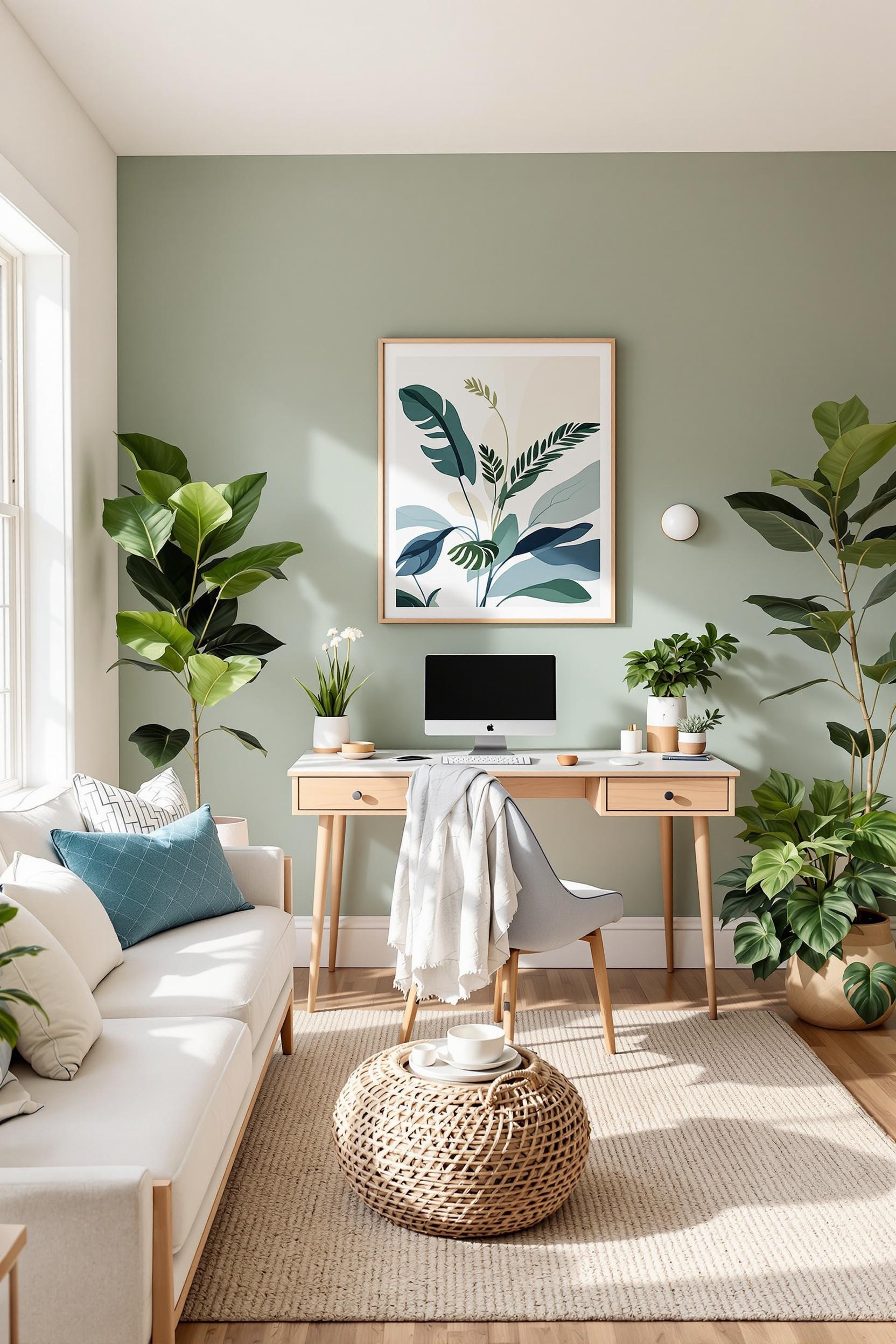
Office
Need focus? Deep, earthy greens help with cognitive performance! Place nature-inspired color blocks strategically behind and beside workspaces. Check out my guide on home office zoning with nature-inspired tones.
Transformative Techniques for Nature-Inspired Minimalism
If you’re still unsure of where to start, try these simple methods:
- Paint geometric zones on one wall, aligning with furniture edges
- Layer natural textiles and rich wood tones with blocks of earthy hues
- Use color dividers to separate open-plan rooms
Once you begin, you’ll find that earthy accent colors in minimalist spaces add sense and soul to your home’s design.
Transform Your Home: Nature’s Color Revolution Starts Now
Unlock Your Design Potential: Free Resources for Minimalist Color Enthusiasts
Are you ready to try minimalist nature-inspired color blocking in your space? I’ve curated a free toolkit for you—including guides, newsletters, and a personalized color palette generator.
Included:
- Nature-Inspired Minimalist Design E-Book
- Exclusive Video Tutorials
- Monthly Palette Newsletters
- Earth-Tone Color Strategy Sheets
With 46% of designers voting earth tones as a top trend and 48% highlighting dark greens, now’s your chance. These tools are crafted to help you apply these color zoning magic techniques in easy, fun ways.
Claim Your Free Design Resources Now!
Bonus: Join Our Community
Feeling inspired? Join our color blocking community and share your transformation. Discuss your color zone designs or offer feedback to others. Let’s build stunning, minimalist, organic homes together.
FAQ: Nature-Inspired Color Blocking Decoded
Q1: How can I use this in a minimalist home?
A: Start with neutrals, then add 20% nature-inspired tones. Terracotta, sage, soft blue—all great. Keep shapes geometric and purposeful.
Q2: What palettes are best for calming interiors?
A: Pull from desert, forest, or coast. For instance, use earthy terracotta, moss green, or calming slate gray. Simple, effective choices.
Q3: How do natural tones affect mood?
A: Earth tones reduce stress and create balance. They mimic nature and help us feel grounded and safe. That’s why they’re trending!
Q4: Is this style suitable for apartments?
A: Absolutely. Use small-scale blocks—furniture, artwork, accent corners. Even a single green curve or warm orange square makes a difference.
Q5: What are some beginner-friendly color blocking techniques?
A: Try these:
- One accent wall in a natural shade
- Painted sections of shelves or doors
- Layer color behind mirrors or headboards
Nature will do the rest. Let it tell your home’s story.
Your Next Step: Stay Inspired
Still exploring ideas? Get monthly updates and tips straight to your inbox!


