

Neutral Foundation, Vibrant Details: Color Blocking Your Minimalist Home
Have you ever walked into a home that feels both serene and alive? That magical combination happens when you blend a neutral color foundation with vibrant color accents. This is the heart of modern minimalist color blocking. It’s a design style I passionately embrace — where simplicity meets bold expression, and clean lines coexist with unexpected color.
Whether you’re decorating a studio apartment or refining your family living room, the key lies in intentionality. I’ve helped countless clients transform dull spaces into dynamic ones by adding color-blocked details into minimalist rooms. So today, I’ll show you how to build a calm and flexible design rooted in a neutral foundation with bold details, using proven color blocking interior design ideas.
Why Neutral Color Foundations Work
Neutral tones like soft greige, creamy taupe, and earthy sand anchor your space. These colors reflect light, visually open up rooms, and allow your statement pieces to stand out. They act like a canvas – quiet but impactful. I often recommend a minimalist neutral palette when starting fresh in any room. It helps visually declutter while building a timeless mood that evolves with your style.
Lighting matters here too. In north-facing rooms, neutrals may look cooler, while western light brings warmth and richness. Keep this in mind when choosing shades. A room with the wrong neutral color in the wrong light can feel flat or sterile. I always do a lighting check at different times of day before finalizing wall paint.
Layering Texture Within Earthy Neutrals
Neutral doesn’t mean plain. On the contrary, soft layers can add warmth and richness. Think plush bouclé couches, raw wood beams, linen curtains, and matte ceramic tiles. Neutral-colored rugs and furniture let textures—like rough stone or ribbed wood—be the stars. It’s a key part of transforming minimalist spaces using texture and color.
Strategic Color Blocking Techniques
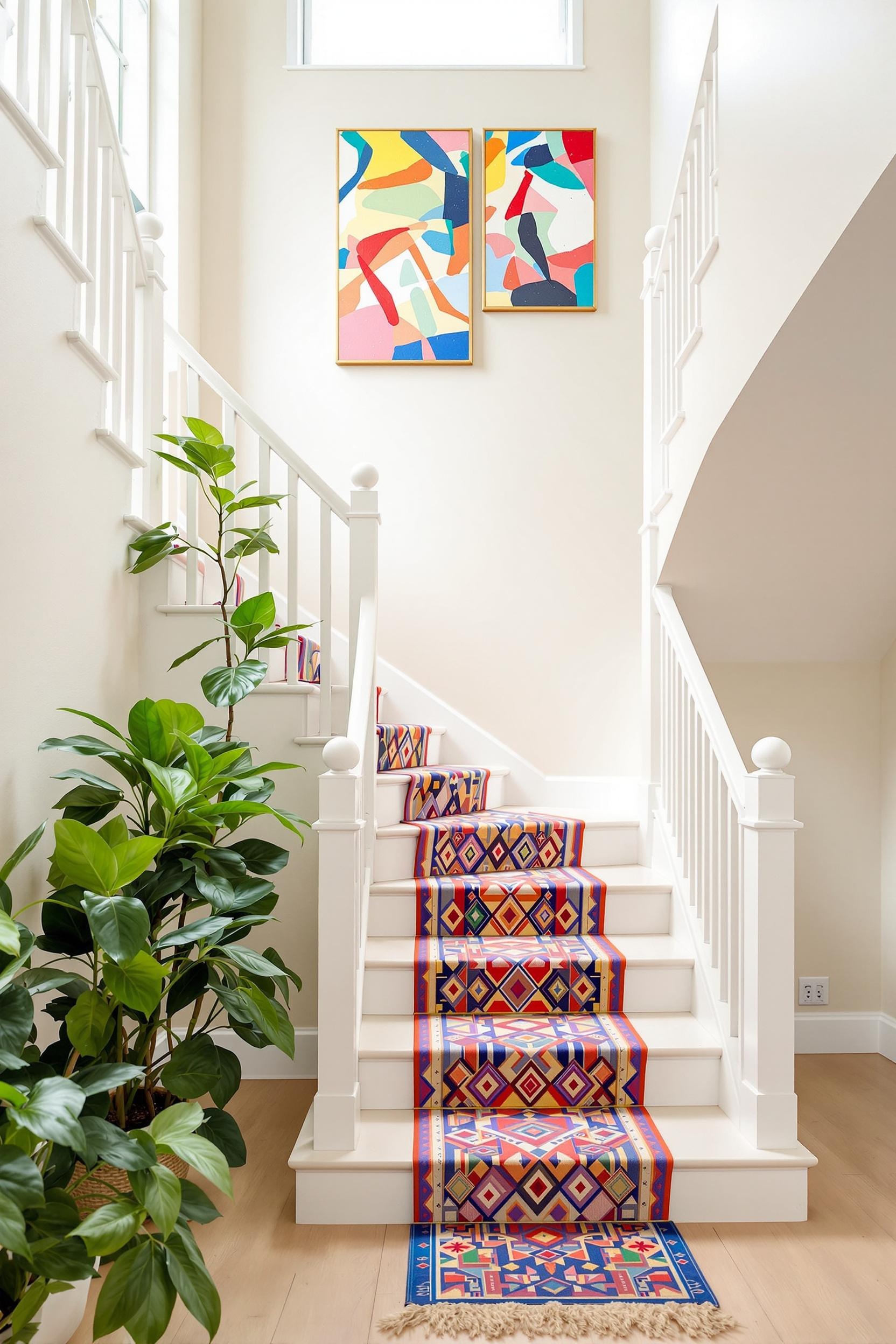
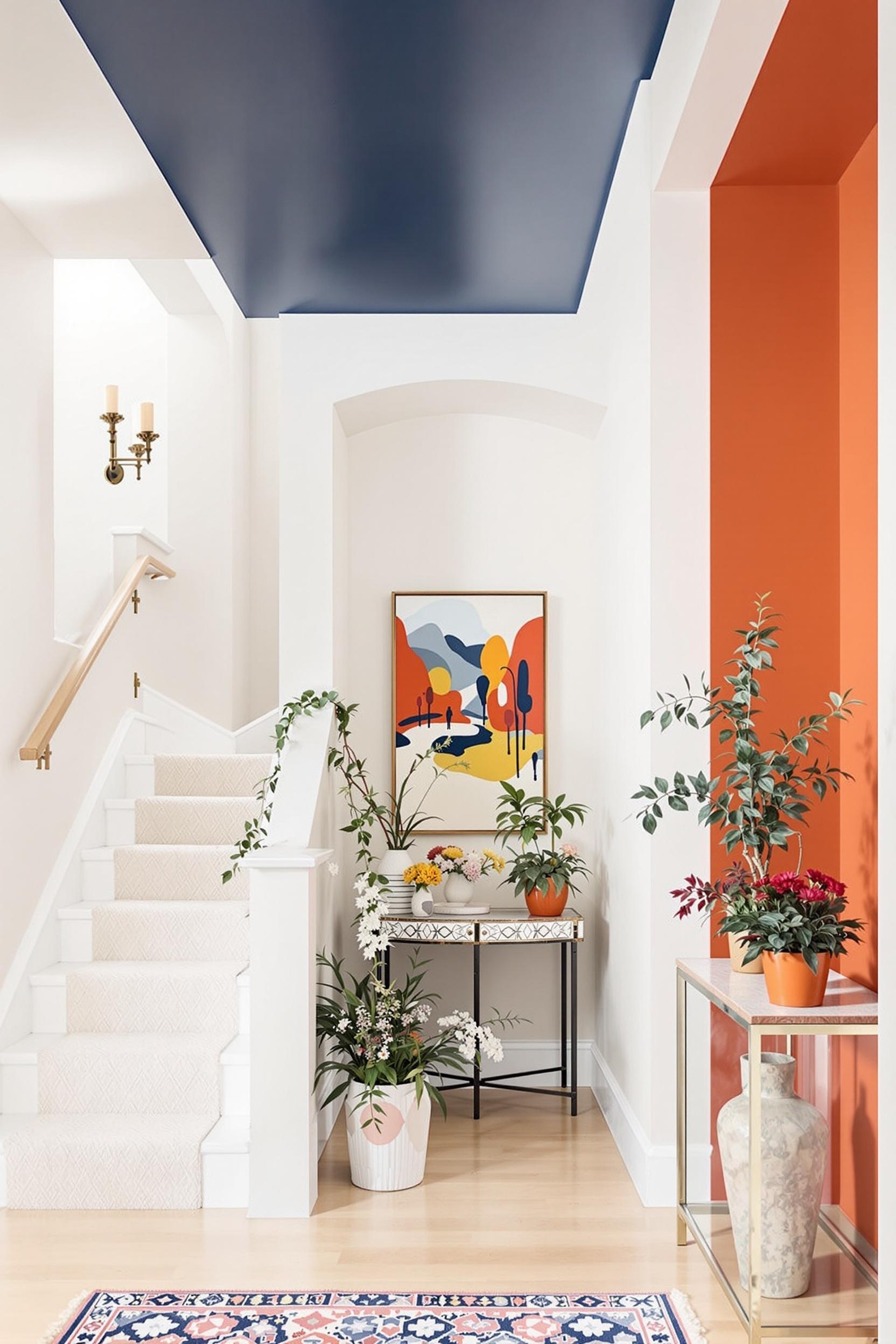
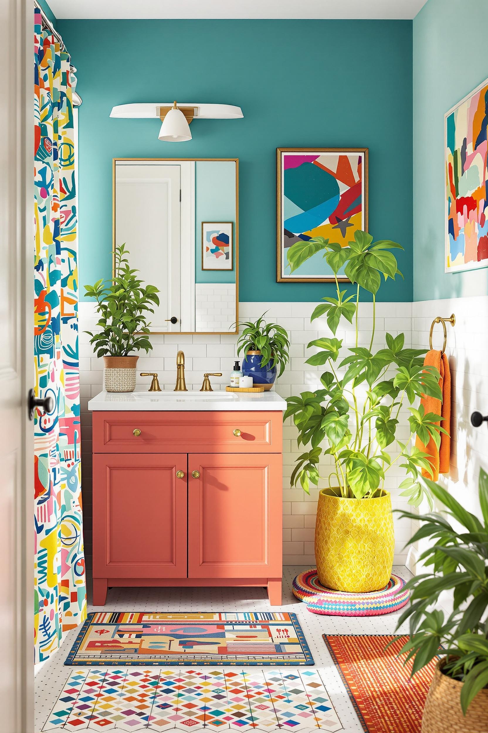
Once you’ve grounded your interior with a neutral color palette, it’s time to add contrast using intentional color touches. Here enters the hero: color blocking. This approach lets you highlight zones within open layouts, create drama in cozy spaces, or simply add visual flair where needed. The trick? Follow the 20/80 rule. This means 80% of your space remains neutral while 20% features vibrant accent colors for neutral home decor.
Here’s how I apply this principle:
- Paint a single accent wall in deep navy or emerald behind neutral furniture.
- Add a mustard yellow bench in an entryway with beige walls.
- Use boldly colored pillows against soft linen couches.
- Hang geometric artwork featuring color-blocked shapes.
Each of these adds spark without overpowering. I explain this in more detail in my guide on blending neutral backdrops with vibrant zones. Color blocking works well for small rooms too, giving the illusion of space. Horizontal blocks can make the room feel wider, while vertical ones add height!
Vibrant Color Accents That Work with Neutrals
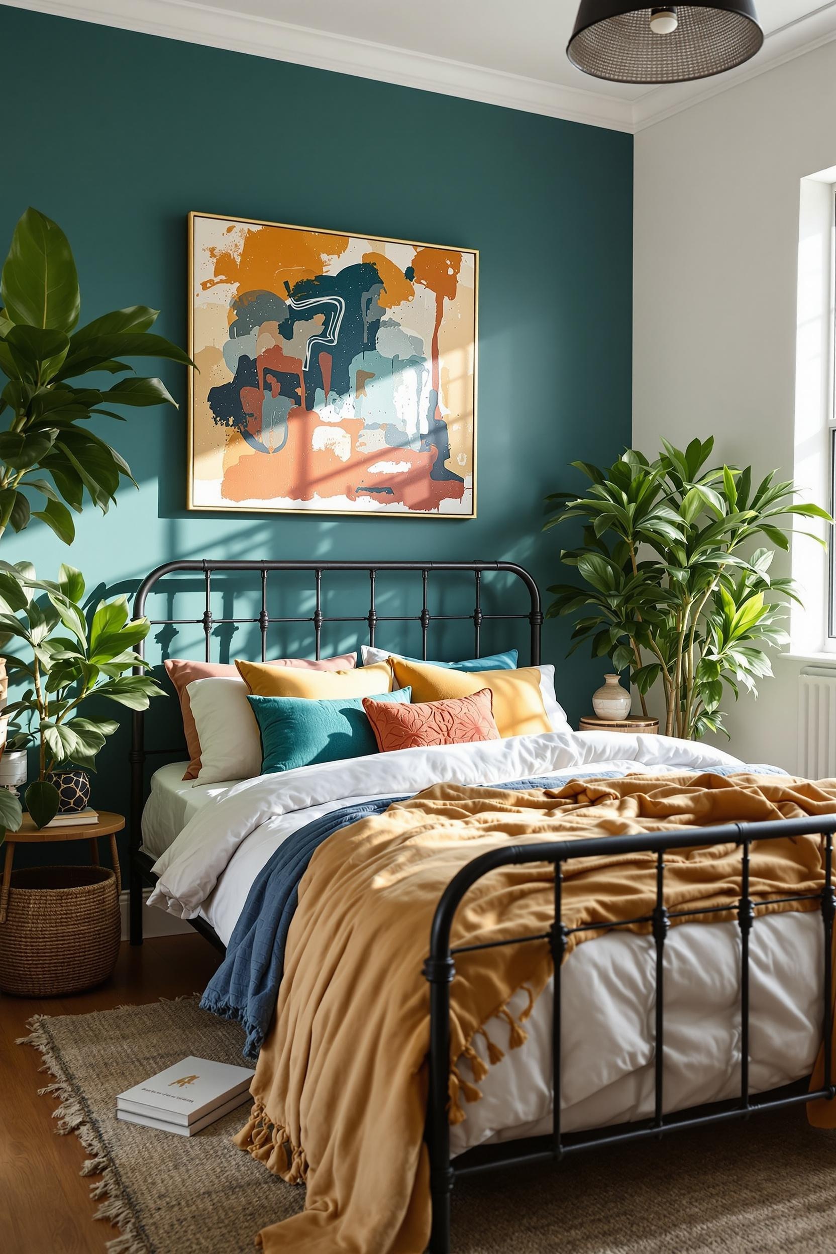
Choosing accent colors is personal, but some shades naturally pair better with taupe or greige. For a punch of elegance, I love jewel tones like:
- Forest green – calming yet dynamic
- Burnt orange – earthy but energizing
- Deep navy – sophisticated and modern
Muted pastels like dusty lilac or sage green also work if you want a softer look. I share more pairing ideas in my post on adding bold colors to minimalist spaces.
Color Blocking Furniture to Create Depth
Walls aren’t your only canvas. I often add color with furniture. A vibrant bed frame or painted wooden dresser instantly makes a neutral room feel lively. You can see how this strategy works in my guide to color-blocking bed frames, or learn how I transform neutral furniture in this color block furniture post.
Color Zoning for Modern Minimalist Spaces
For open floor plans, color zoning is your best friend. You can define a workspace, relaxing area, or dining zone using contrasting color blocks. In this guide to zoning open floor plans, I show how color can function like invisible walls. This boosts functionality without making your space feel crowded.
Lighting: The Secret Element of Color
Lighting changes everything. A color might look stunning in morning light but too dull by evening. That’s why I test paint swatches in changing light before each project. Northern exposure can make colors appear cool, while western light enriches warm tones. Learn more about these light tricks in one of my favorite sources, ShabbyFufu’s 2025 design trend roundup.
My Favorite Design Tip: Keep It Flexible
The best thing about working with a neutral base? It evolves with time. Want a seasonal change? Swap burnt orange accents for icy blue in winter. Or rotate throw pillows and artwork to update your vibe for under $100. That’s neutral maximalism made easy.
The Power of Digital Tools in Planning
If you’re unsure about how things will look, don’t guess — plan! I use visualization apps like RoomSketcher and SketchUp to map out color zones digitally. It’s part of my professional toolkit and something I highly recommend to DIY decorators.
Want to explore these design tools further? Learn from my Modern Color Blocking Design Guide where I dive into color psychology and digital prepping. I also go over common mistakes and how to create vibrant interiors with strategic placements.
Your Design Revolution Starts Now: Transform Spaces with Confidence
As we’ve journeyed through the intricate world of color blocking and minimalist design, I’ve shared insights to help transform your space. Now it’s time to act and become the designer of your home’s story.
Unlock Your Design Potential: Free Color Blocking Masterclass
The journey starts here. I created a detailed guide that bridges the gap between inspiration and execution. My Color Blocking Masterclass is your ticket to creating a space that reflects your style while following design principles.
- Nail the 20/80 rule of color blocking
- Understand lighting’s effect on color
- Use digital tools architects love
- Build timeless neutral foundations with vibrant accents
Join Our Design Community
My newsletter is more than just updates — it’s a full color-blocking toolkit. When you subscribe, you’ll get:
- Printable strategy guides
- Monthly trend reports
- Exclusive tutorials
- Design tips straight from professionals
Unlock Your Design Potential Now
Why This Matters
In a cookie-cutter world, your home should be your sanctuary — one that speaks to your personality. Whether it’s a compact apartment or a luxury home, your foundation can be calm and your accents bold.
Frequently Asked Questions: Mastering Neutral Foundations and Vibrant Details
Q1: How do I choose the right neutral foundation for my minimalist home?
Pick tones like greige, warm taupe, or beige. For north-facing rooms, select warmer neutrals to offset cold lighting. These create calm for accent colors to shine.
Q2: What are the best accent colors for a neutral minimalist interior?
Emerald green, deep blue, mustard yellow, and muted pastels work well. Choose shades that complement your wall hue and reflect your personality.
Q3: How can I use color blocking to make a small room feel larger?
Use lighter neutrals and strategically place vertical color blocks to draw the eye upward. Horizontal lines can widen a small space.
Q4: Is color blocking only for wall designs?
Not at all! Try color-blocked bed frames, sofas, pillows, art, or rugs. Accessories work wonders.
Q5: How often should I update my color scheme?
Keep your neutral base for 5–7 years, update accents every 2–3 years. Removable wallpaper and switchable décor items make this easy.
Sign Up for More Tips
Want more design ideas delivered straight to your inbox? Don’t miss out on trend alerts, early workshop invites, and free tools.


