
Space-Defining Paint Colors: Transform Your Home with Modern Color Blocking
Have you ever stood in a room and felt unsure of its purpose? Or worse—felt boxed in? If so, you’re not alone. Many open-plan or small homes lack spatial clarity. Here’s your secret weapon—space-defining paint colors. By using color blocking interior paint, you can divide, anchor, expand, and organize your living areas without building a single wall.
Throughout this guide, I’ll walk you through how to use paint techniques to define spaces, create visual boundaries, and make your home feel more spacious and cohesive. We’ll explore minimalist geometric paint patterns, the right color combinations for each room, and tips for making small rooms look larger. Whether you’re adding personality to a studio apartment or bringing structure to an open floor plan, color blocking has your back.
The Psychology of Space-Defining Paint Colors
Color isn’t just decoration. It shapes how we feel and move through space. Research confirms that color psychology in space-defining paint helps us experience rooms more clearly. Light and cool hues—think white, soft gray, and pale blue—open up a room visually, creating airiness. Darker shades, like navy or charcoal, ground a space and create coziness.
Strategically placed colors act as architectural cues. A bold accent wall can define a living room within a larger space. A lighter ceiling paired with darker walls gives the illusion of higher ceilings. And using warm vs. cool colors can create emotion-rich zones—like calm for a reading nook or energy for a workout corner.
Strategic Color Blocking in Minimalist Homes
I’ve used minimalist color block wall ideas in countless client homes. Minimalist design doesn’t mean boring beige. When done right, it’s structured, bold, and intentional.
I typically start with a neutral base—like white, soft taupe, or powder gray. Then I add one or two vivid accent colors. Some of my favorite combos include sage green + terracotta + ivory or charcoal + pale blue + bright white. These align with the 60-30-10 rule: 60% base, 30% secondary, and 10% accent.
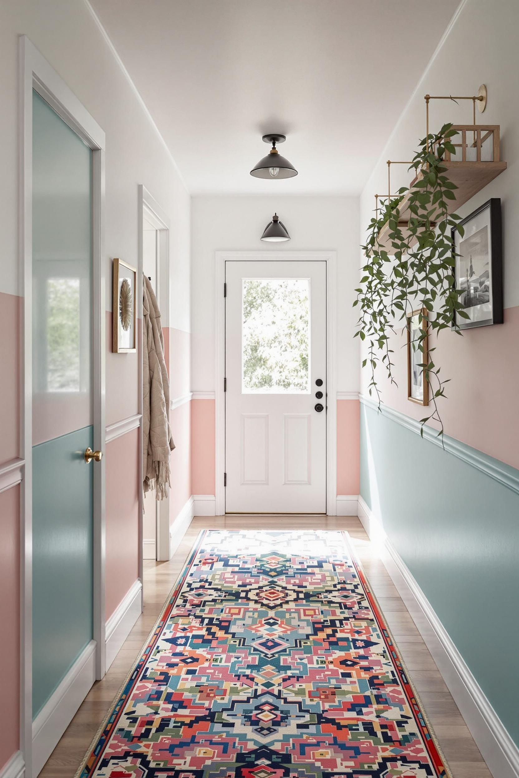
Minimalist design thrives on clarity. That’s why bold colors in minimalist spaces only work when they are precise. A vertical blue stripe can heighten a ceiling visually. Painting opposing side walls in a darker shade makes the room feel narrower and cozy. These subtleties make a home dynamic without using more decor or furniture.
Color Blocking Techniques for Each Room
Living Spaces
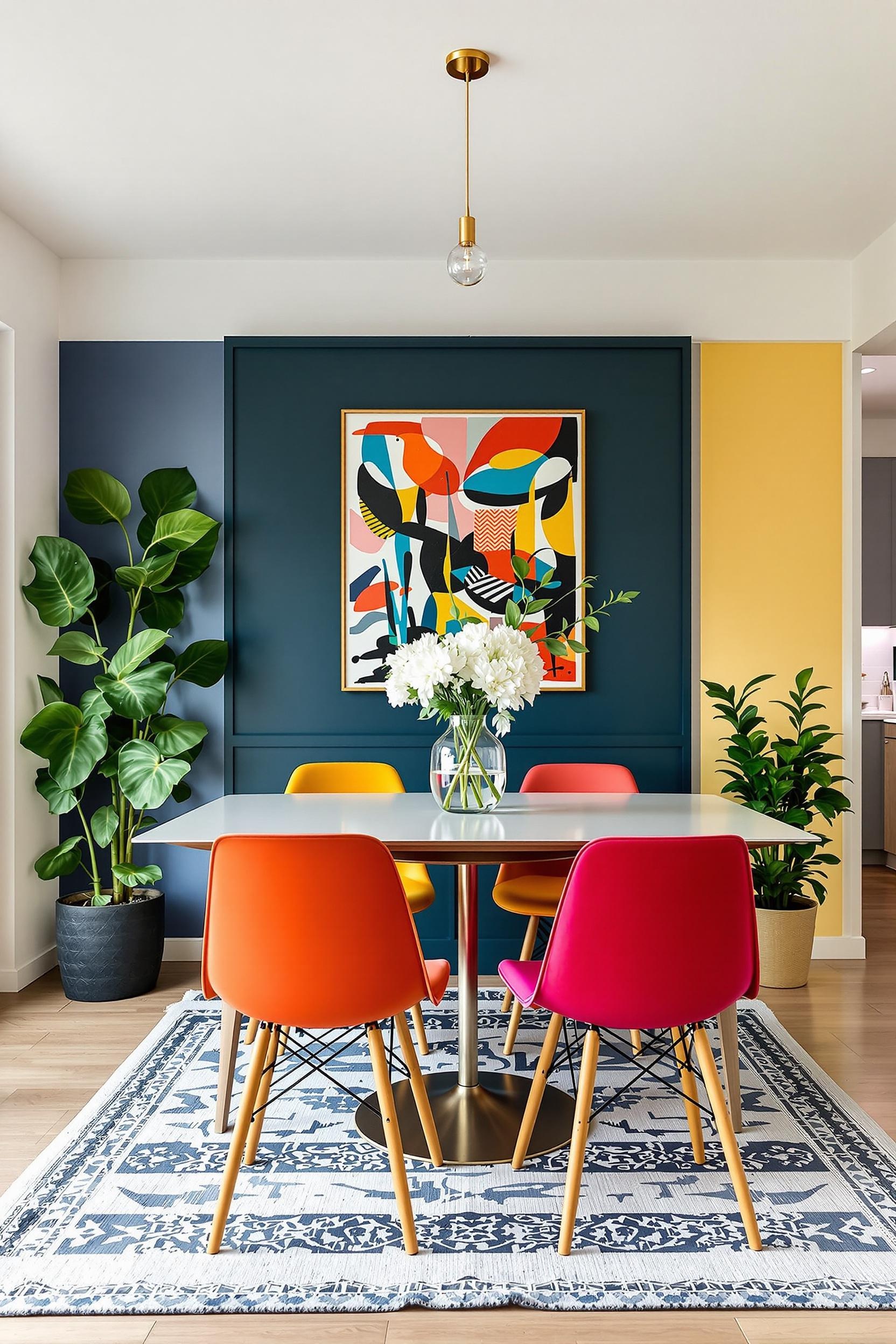
In open floor plans, interior paint colors for zoning spaces are essential. For example, use sage green for the entertainment area and a lighter shade like ivory for conversation nooks. Add punchy navy or mustard through shelving or small geometric wall sections to define cozy corners.
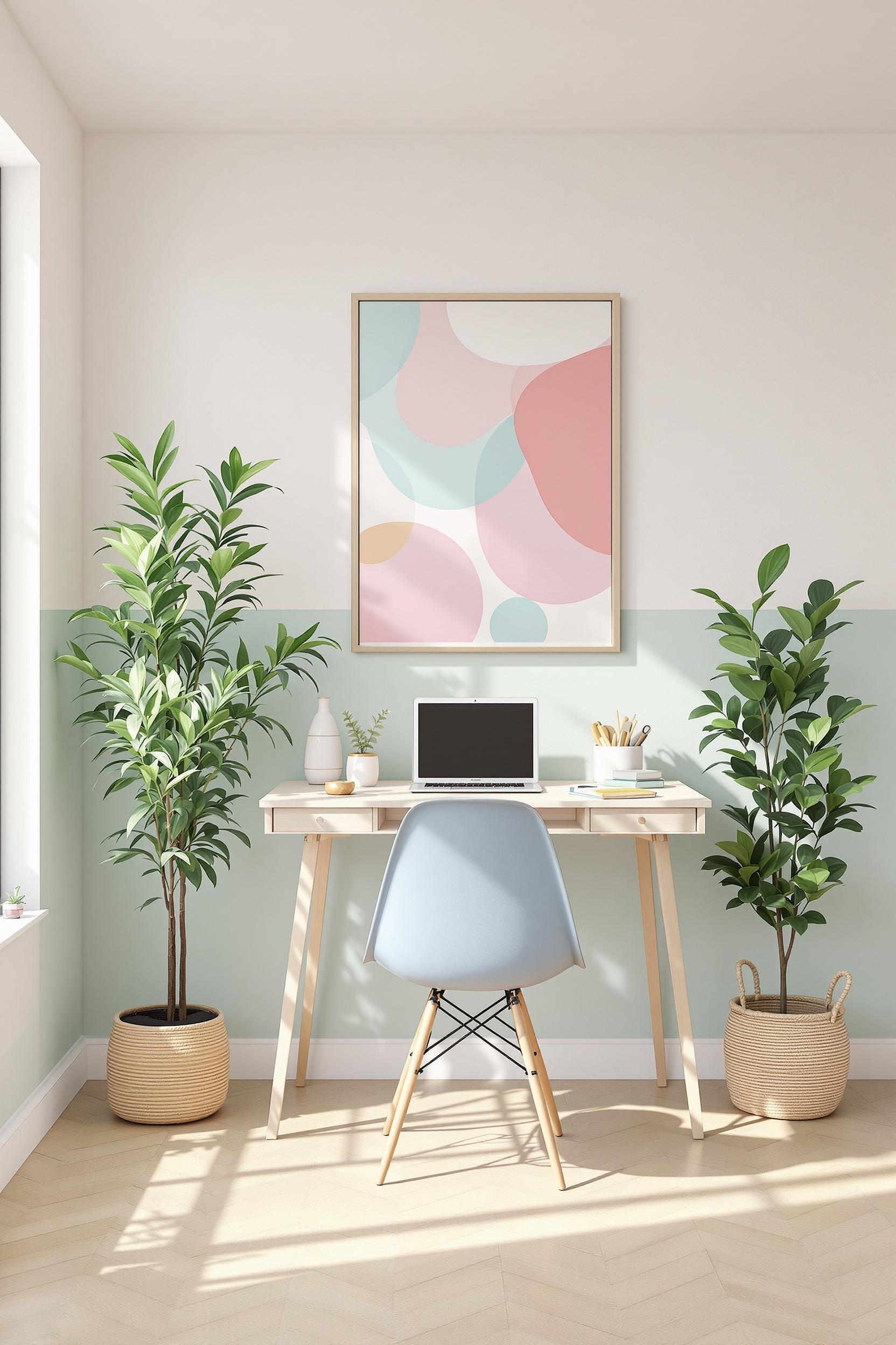
Bedrooms
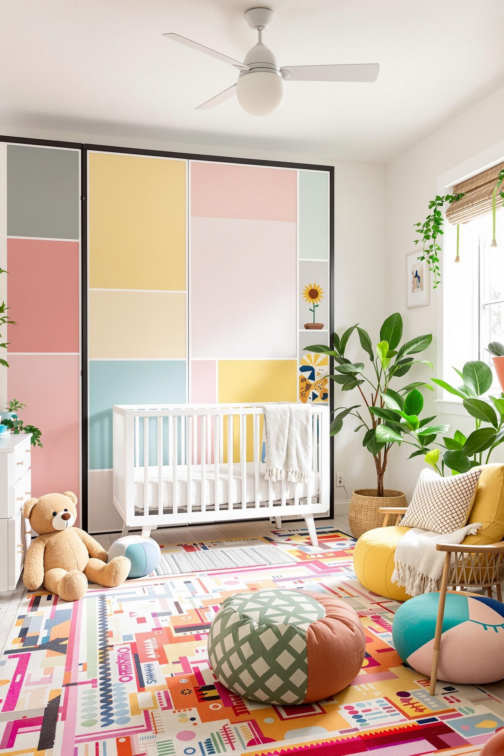
Bedrooms should feel restful. I’ve used soft pastel color block wall paint ideas like dusty rose, soft peach, or pale teal to create a peaceful atmosphere. A vertical color block behind the headboard draws the eye up and defines the sleep zone—perfect for color blocking headboard walls.
Kitchens
In kitchens, paint defines culinary zones. One client had a studio apartment where I used deep emerald behind the cabinets to frame the kitchen, contrasted by clay pink in the dining zone. It dramatically changed the spatial flow. You can try this with color blocking magic in kitchen spaces to separate form and function beautifully.
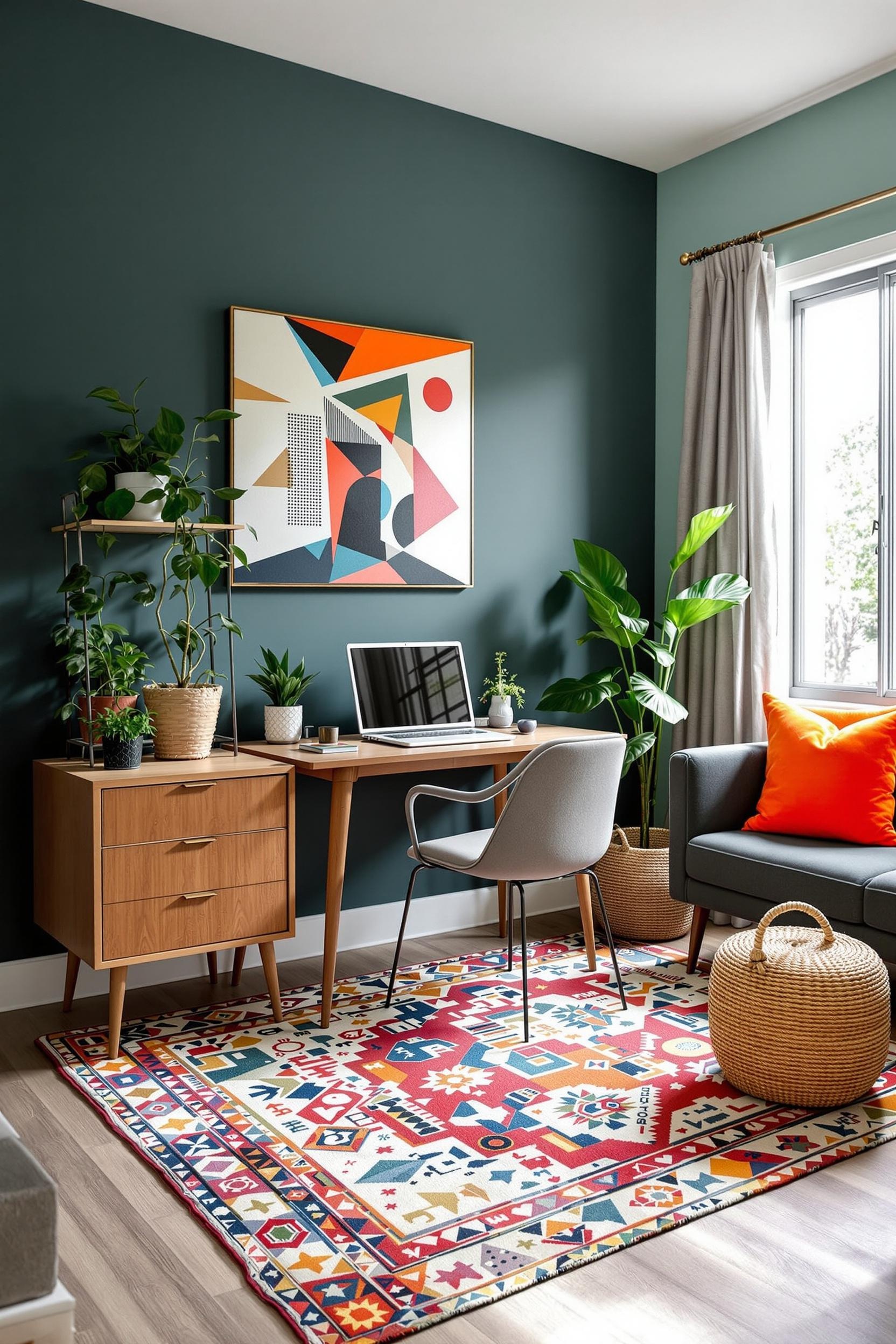
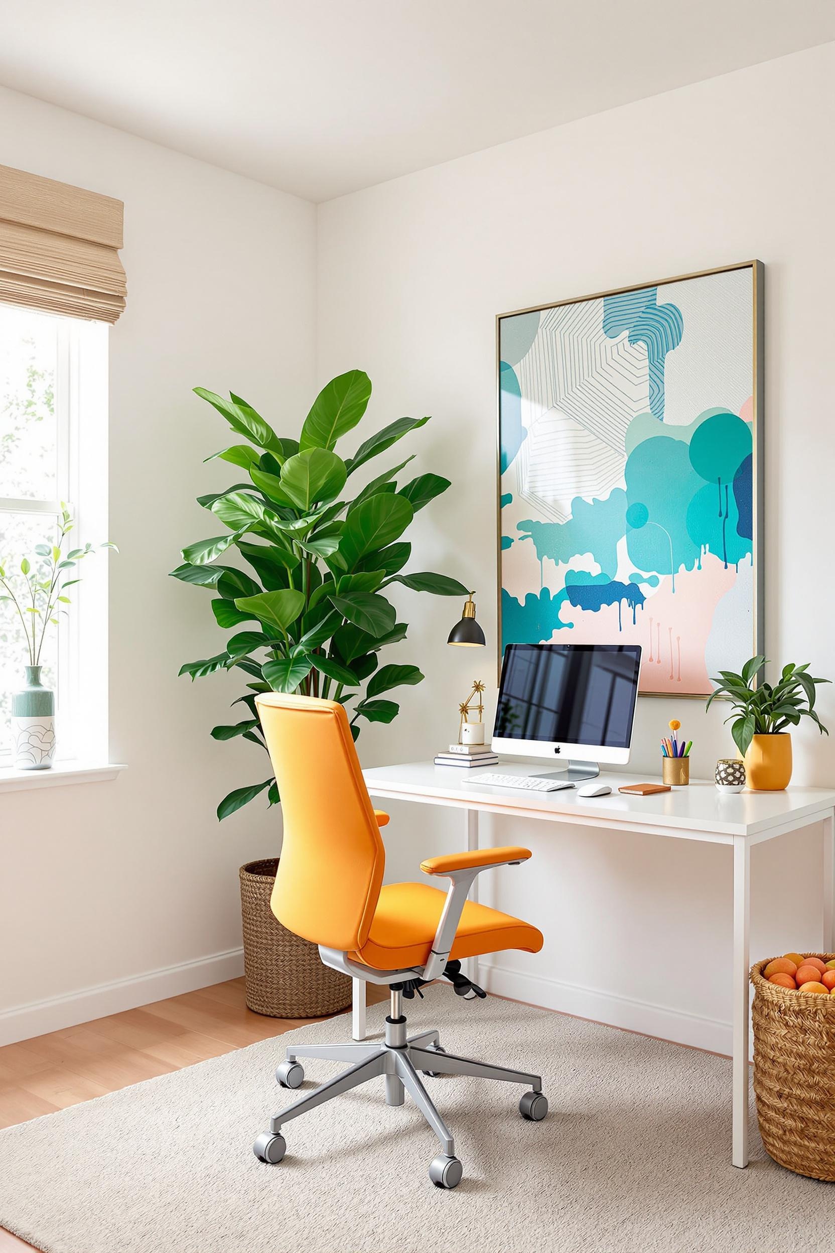
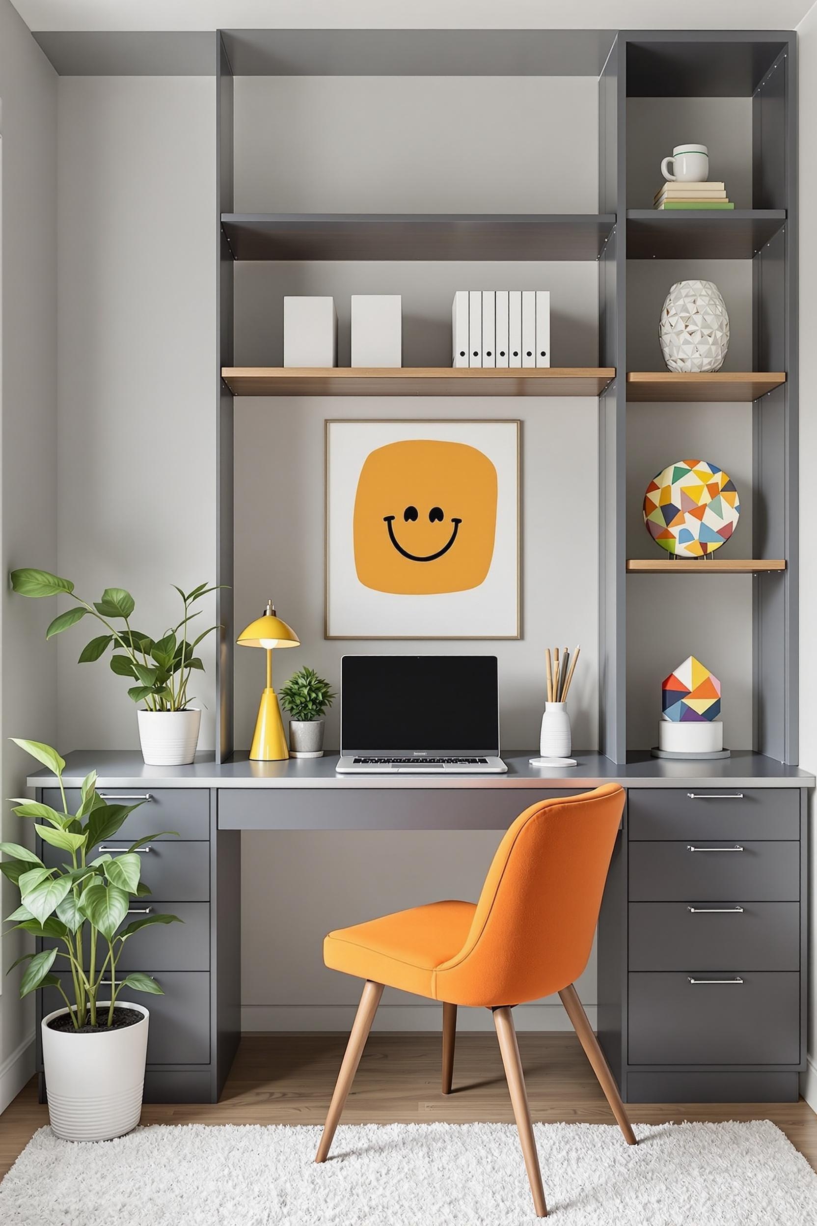
Home Offices & Studios
Modern space separating wall paint colors are great for offices. A bold burnt orange wall can energize the mind. Use it on one side paired with white walls to avoid overstimulation. Muted blues or olive green also create focus. For even smaller spaces, I recommend tiny apartment color blocking tricks like high-contrast vertical lines to elongate space visually.
Geometric Color Blocking: Bold + Simple = Magic
Geometric color block painting for interiors grabs attention and defines use. I once sectioned a loft’s relaxation area by painting a wide horizontal band along one wall in ochre yellow. The tone created a visual pause, distinguishing the zone from the rest of the white room.
Try vertical blocks for ceiling-height illusion or diagonal lines for energy/movement. Color blocking is like architectural framing with paint—it tells your brain where to look, stand, and feel grounded. You can also incorporate room dividers painted in matching schemes to continue the flow.
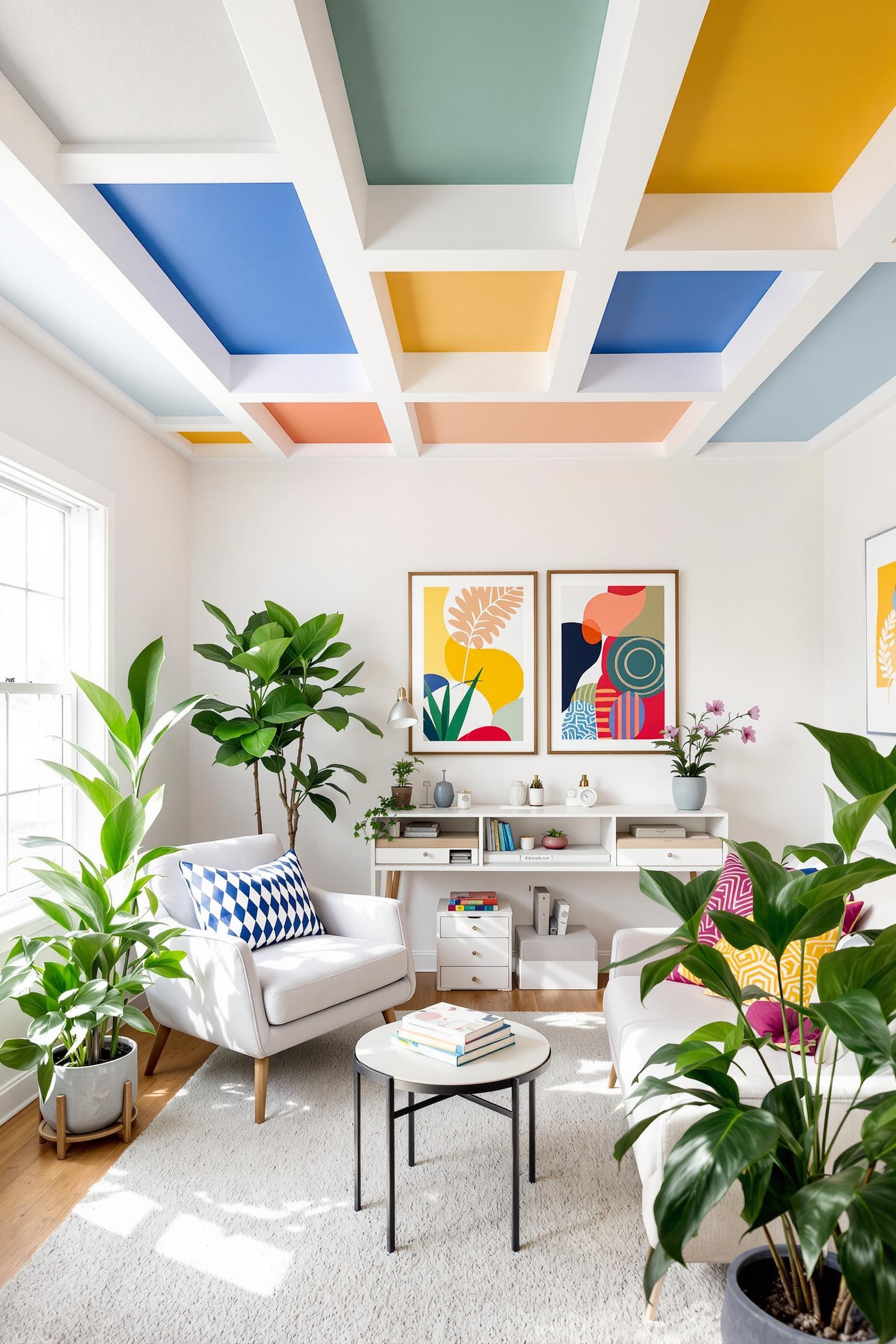
And don’t forget theme-continuing ceilings. A painted ceiling with a border strip accent adds drama in a minimalist way. Choose a color 1-2 shades darker than your dominant wall tone to keep it calm but noticeable.
Designer Tips for Successful Color Zones
- Pick 2–3 main colors max.
- Use the 60-30-10 formula in minimalist color blocking paint ideas.
- Always test swatches in different lighting (natural, overhead, artificial).
- Start with one room, then expand the theme across spaces for harmony.
- Add repetition through pillows, rugs, or furniture in matching colors.
Your everyday layout challenges—awkward corners, open layouts, small rooms—are solvable. Whether you want space-defining paint colors for small rooms or a modern paint palette for an elegant office, follow the principles of paint zoning to keep your home livable and dynamic.
Transform Your Space: Free Design Revolution Starts Now!
Color blocking isn’t just a trend—it’s a complete transformation. I’ve seen firsthand how color can shift the entire vibe of a home. Whether you’re renting a studio or renovating your dream place, the right wall palette can completely change your experience.
Unlock Your Design Potential: Free Expert Insights Await
If you’re ready to explore bold transformations without breaking walls, join the newsletter. You’ll get:
- Monthly color psychology deep dives
- Minimalist paint tutorials
- Real-world design stories
- Spatial psychology insights
- Exclusive color palette downloads
Unlock Your Design Potential Now!
Ready to reimagine your home? Subscribe today. Before and after photos are welcome!
Frequently Asked Questions: Mastering Space-Defining Paint Colors in Minimalist Design
How Can I Use Space-Defining Paint Colors to Make a Small Room Look Larger?
Use soft blues, crisp whites, or pale greys. Then, try vertical color blocking to lift the ceiling visually. Paint ceilings lighter for an expanded effect.
What Are the Best Color Blocking Techniques for Open Floor Plans?
Use color zoning. Choose analogous or complementary hues to define different spaces without barriers. Let walls and ceilings flow in coordinated transitions. A muted lemon may define a dining area while charcoal frames the kitchen.
How Do Minimalist Color Blocking Principles Work in Different Rooms?
In bedrooms, use soft, restful tones. In home offices, go bolder to boost focus. Always stick to 2–3 complementary colors for balance.
Can Color Blocking Help Solve Challenging Spatial Design Problems?
Yes! Try making narrow rooms wider with light tones on long walls. Hide awkward outcroppings with darker tones. Accent focal walls to mimic depth. Paint is your architectural ally when physical change isn’t possible.
What Are the Most Effective Color Combinations for Minimalist Spaces?
Try duos or trios like:
- White + dove gray + navy
- Beige + sage + terracotta
- Charcoal + soft blue + crisp white
These combinations ground, energize, and soften your surroundings for a balanced look.
Begin Your Color Blocking Journey
Everything you need is right here. Each wall is a statement. Each hue is a purpose. Color isn’t just about aesthetics—it’s functional, emotional, and strategic. Use space-defining paint colors to tell your home’s story room by room.


