
Split Wall Color Blocking: A Minimalist Design Revolution
Have you ever walked into a room and felt something magnetic—but couldn’t quite put your finger on it? That’s the power of split wall color blocking, a stunning interior design technique that brings life, depth, and definition to minimalist spaces. As a designer passionate about both beauty and simplicity, I can tell you that a well-executed split wall isn’t just art—it’s architecture through color.
This smart painting method divides a wall horizontally or vertically using two or more strategic hues. Done right, it can visually expand a tight room, ground a lofty space, or even define separate areas within an open floor plan.
In this post, I’ll walk you through the design principles and psychology behind modern color block wall ideas, including two tone wall painting ideas, minimalist color block accent wall designs, and vertical color block wall inspiration. You’ll learn why designers—including myself—use minimalist color blocking to tell stories with paint, and you’ll get clear, actionable steps for using these color blocking techniques in your home.
Master Horizontal and Vertical Color Block Wall Techniques
Implementing split wall color blocking is more than a coat of paint—it’s spatial storytelling. Let’s explore how it works.
Horizontal Color Blocking: Expand and Elevate
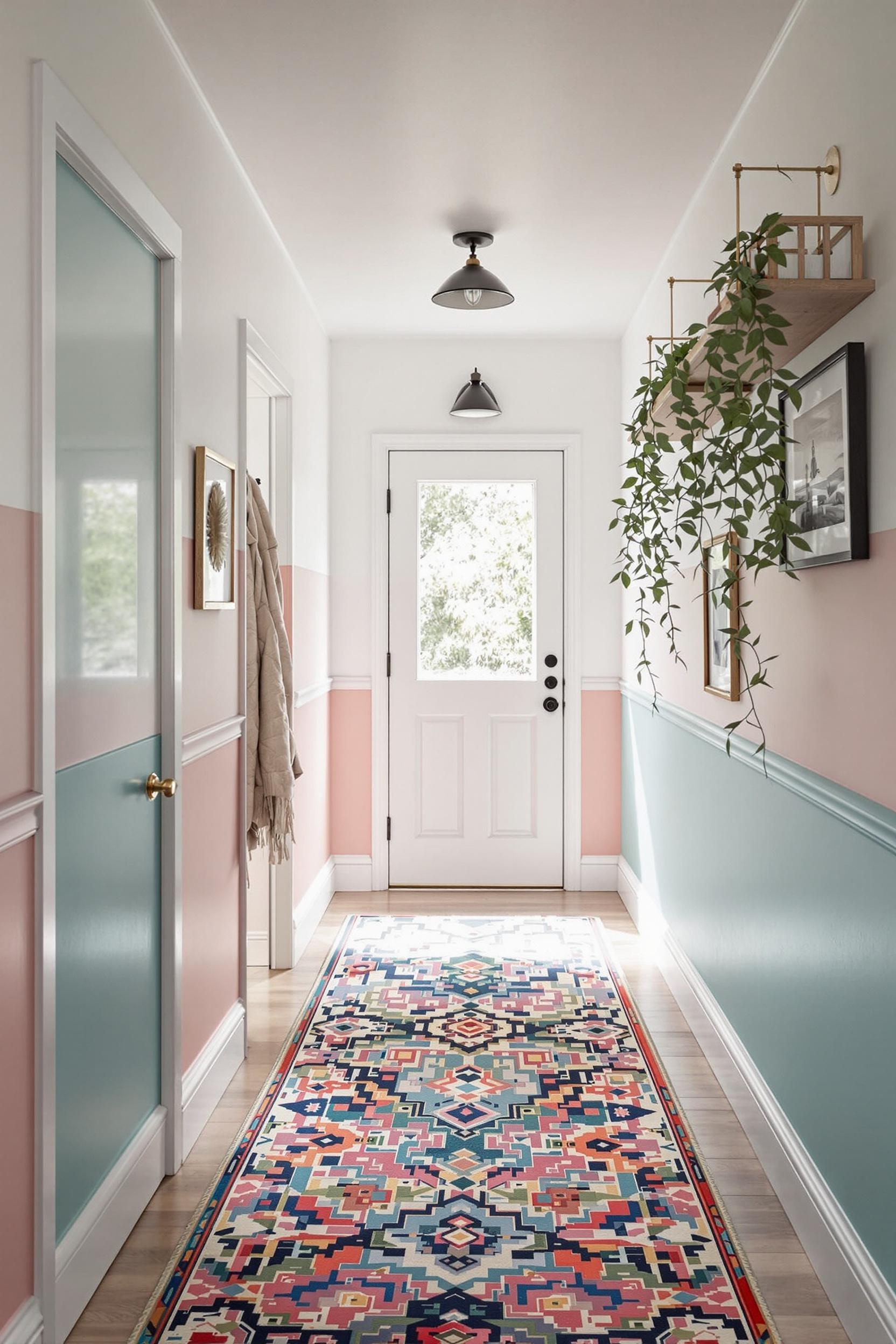
Horizontal color block walls divide the space from side to side. Painting the lower half in a darker color and the top in a lighter tone makes the ceiling feel higher and adds balance. This is perfect for rooms that need grounding, like bedrooms or cozy nooks. One of my favorite applications was in a small urban apartment where a deep navy lower wall stabilized the space while a soft ivory upper half opened it up. The results were dramatic!
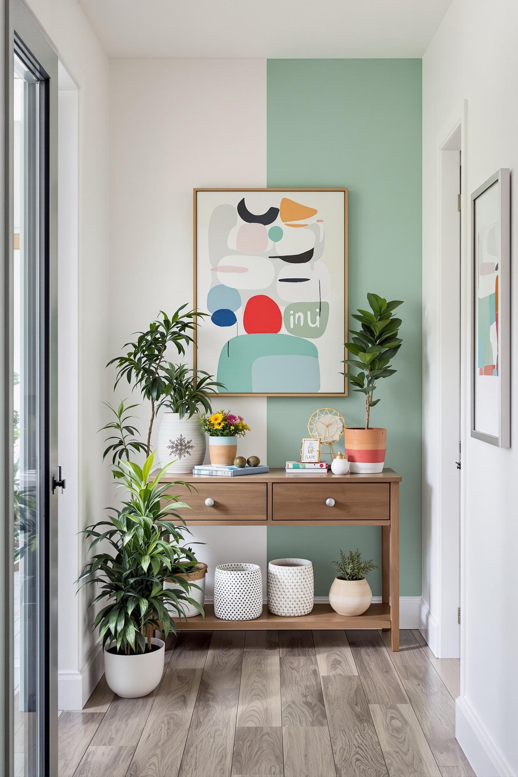
Vertical Splits: Define Zones Without Dividers
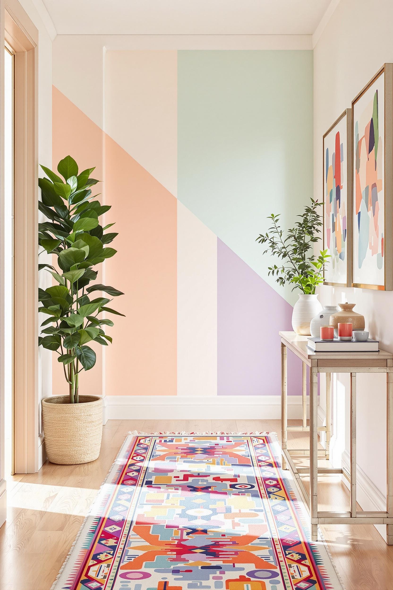
On the other hand, vertical divisions work beautifully in open-concept spaces. Think studio apartments or multipurpose dining-living rooms. I’ve used this color zoning method to create separate dining or workstation areas without any physical partitions. Vertical split walls elongate rooms and draw the eye upward.
Smart Color Choices: Complementary vs. Analogous Color Blocking
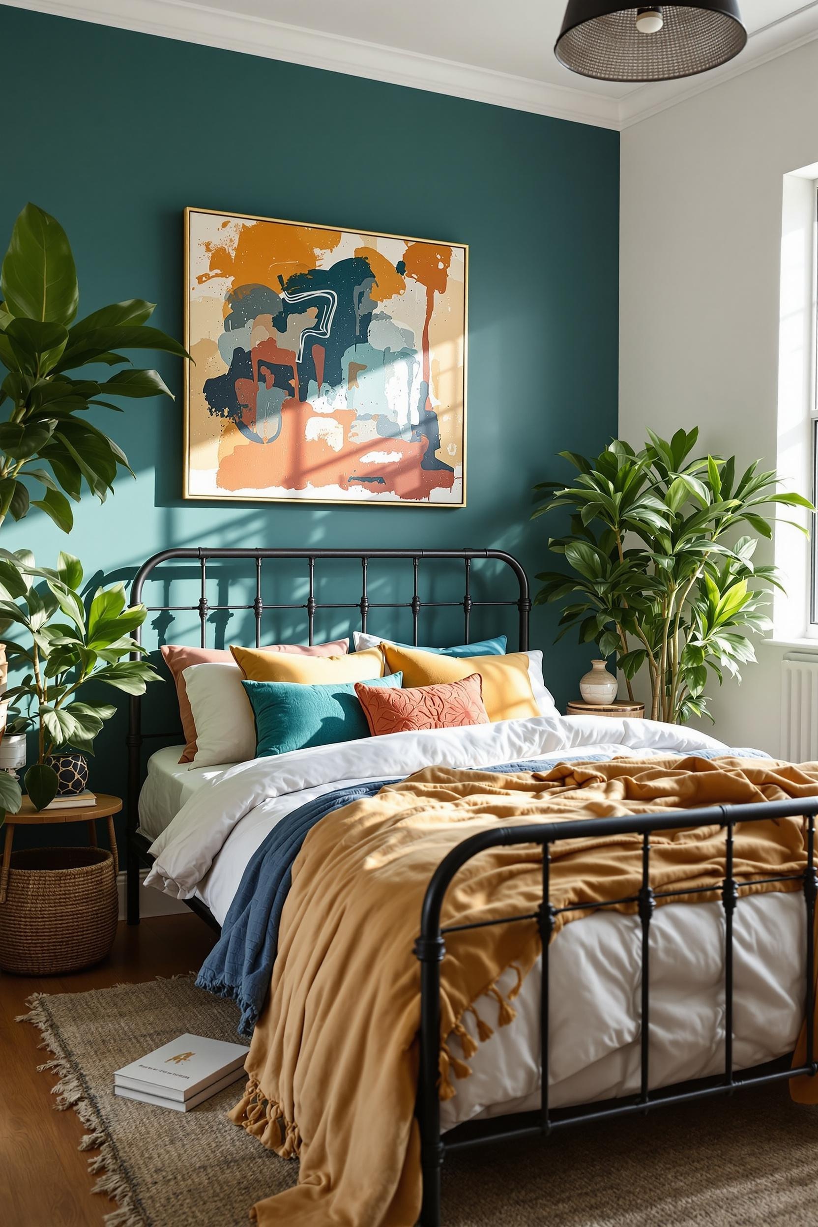
Color selection matters. In minimalist interiors, I often work with either complementary hues—colors across from each other on the color wheel—or analogous tones, which are next to one another. Research shows that complementary schemes energize a room. Ideal if you’re adding impact to a working or active living space. Analogous color palettes create a calm, soothing atmosphere, perfect for bedrooms or reading corners.
Two Color Minimalist Painting Ideas
- White + Emerald Green = Sophisticated energy
- Light Gray + Blush Pink = Modern serenity
- Charcoal + Pale Yellow = Mood contrast with warmth
Whether you’re aiming to invigorate a modern living room or add calm to an office, two tone wall paint color combinations offer enormous flexibility. You can explore more inspirational color ideas here.
Color Blocking Psychology Meets Minimalist Interior Design
Design is about feeling as much as function. Studies show that using contrasting blocks on a wall activates alertness, while muted counterparts soften sensation and reduce anxiety. I use these principles to shape the mood of spaces I design.
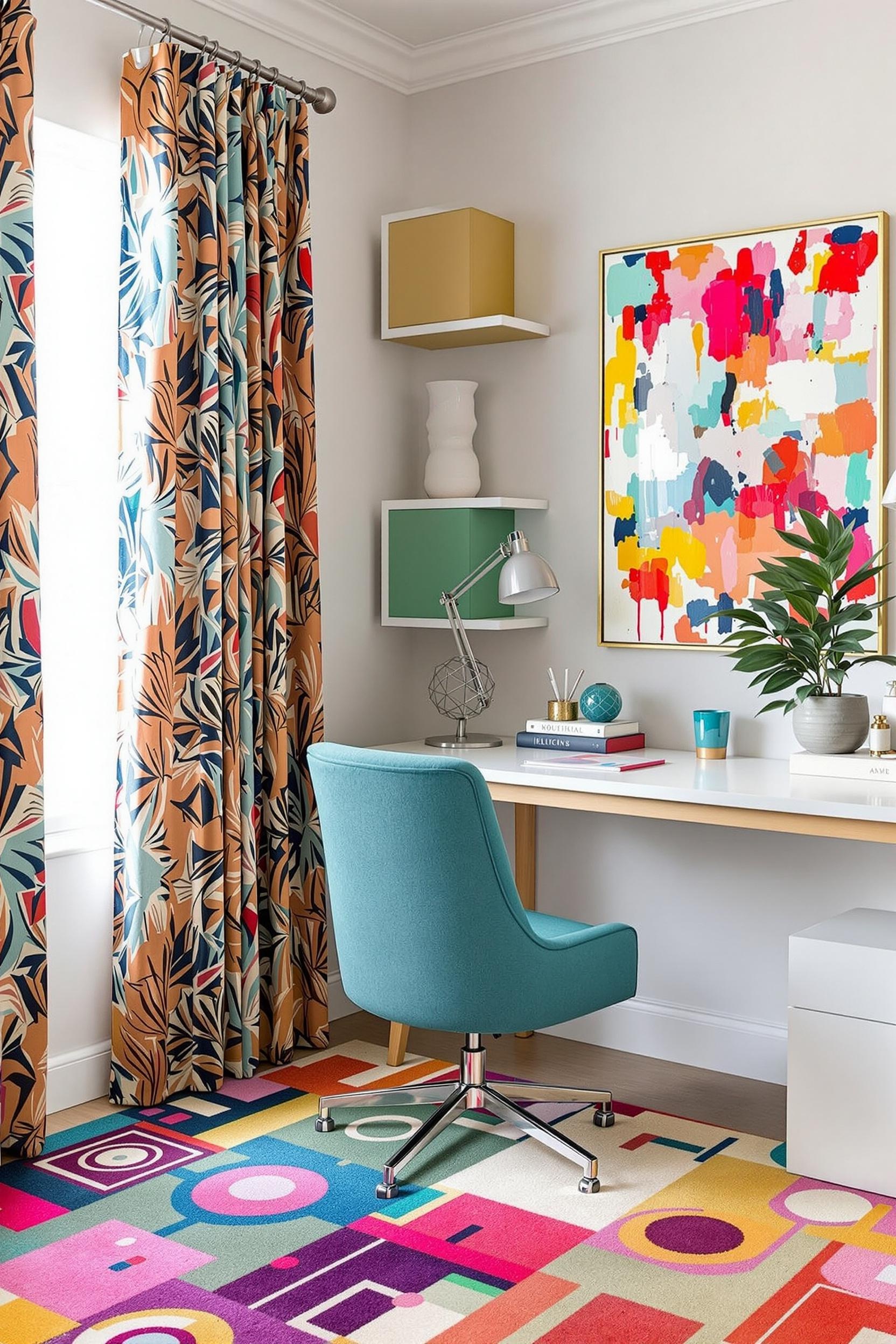
Imagine a home office with vertical split walls. On the left side, a muted sage green promotes relaxation. On the right, a soft cream expands the light. One space, two functions—defined entirely through thoughtful paint choices.
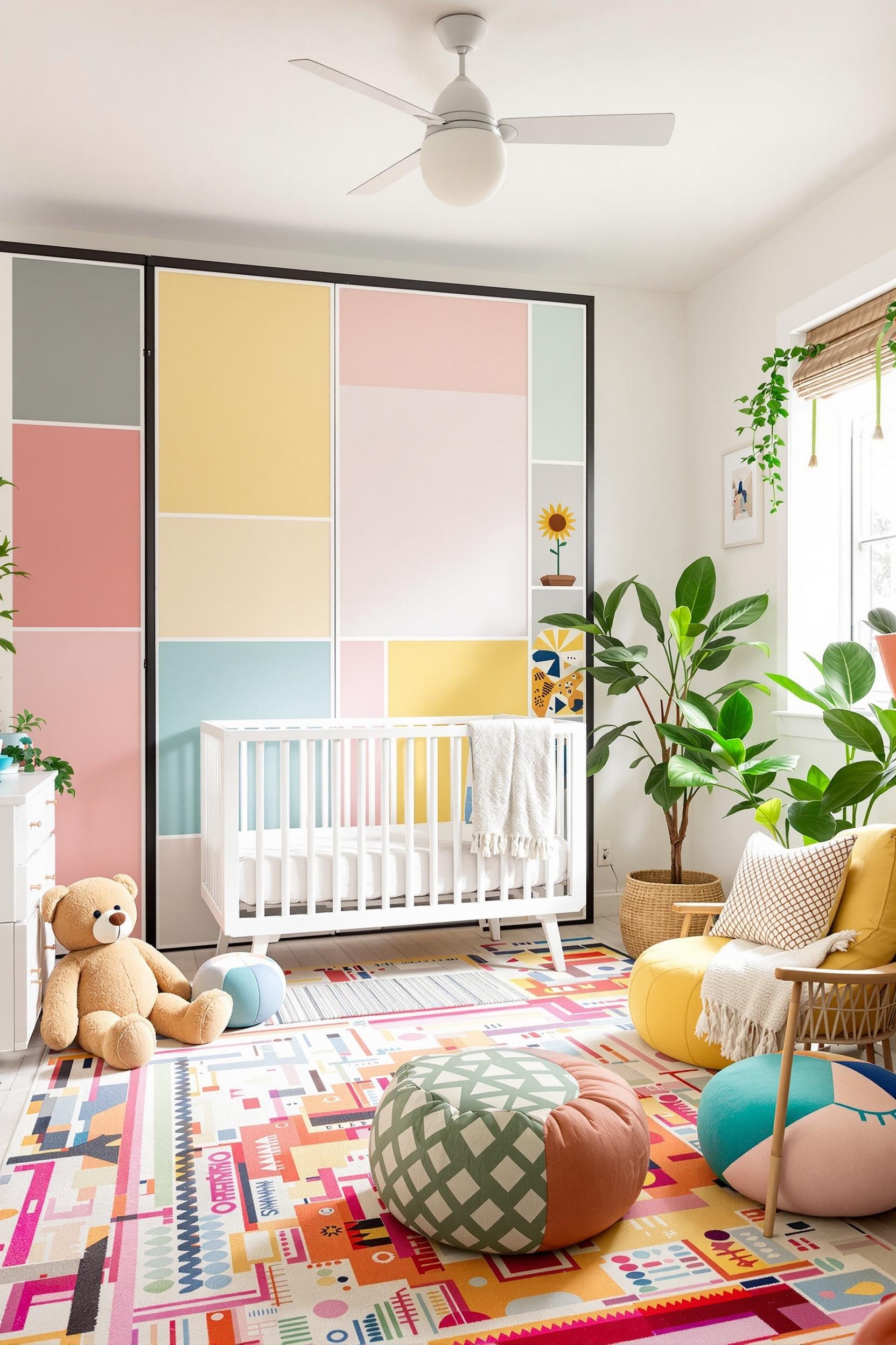
Minimalist Geometry: Less is Always More
To keep things clean, stick to three colors or fewer. Too many hues can clutter a minimalist palette. A basic formula I use in most projects:
- White or neutral base
- Bold accent for definition
- Secondary complementary or analogous shade for balance
This approach works wonders. It supports paint zoning in an open kitchen or allows a narrow hallway to suddenly feel stretched and airier. It’s not just decoration—it’s transformation.
Real-World Impact: Color Blocking That Transforms Homes
Split wall color blocking has practical magic that goes beyond style. Interior design studies show a 22% increase in perceived spaciousness when rooms use this method properly. That’s huge for small bedrooms, entryways, or that multipurpose corner that doubles as a workspace.
According to one professional design survey, 68% of open-plan designs used split walls to highlight features like doorways or alcoves. It makes sense. You’re guiding the eye to what matters most. Another 54% of designers use split wall accents to separate functional zones in lofts, while 70% report that this strategy reduces visual clutter. Minimalism thrives on such precision.
Explore More Applications:
- Divide rooms artistically using paint
- Highlight furniture with matching split walls
- Entryway transformations with bold tones
Quick DIY Tips: Get That Pro Look on Your Own
I’ve helped many clients who wanted to try color blocking themselves. Here are simple steps that anyone can follow:
- Use painter’s tape to preview your split. A laser level helps keep edges straight.
- Paint the lighter color first. Let it dry before taping off your line to apply the darker shade.
- Select matte or low-sheen finishes. High gloss reflects more light and might create visual noise in minimalist designs.
Check out this full DIY color block wall guide with step-by-step visuals.
Transform Your Space: Color Blocking Design Revolution Starts Today
Now that we’ve explored the magic of split wall color blocking, let’s put it into action. With the right guidance, you can revolutionize your living space with just a few cans of paint and smart planning. I’ve created a free beginner’s guide that makes it easy for anyone to start implementing these powerful strategies.
Unlock Your Design Potential: Free Color Blocking Starter Guide
My downloadable kit includes:
- Tips to measure and divide your wall precisely
- Color palette combinations that work in every room
- Affordable tools and techniques
- Professional secrets to avoid common mistakes
Need More Help? Join My Private Newsletter
Sign up and receive:
- Monthly design challenges for your home
- Expert tips on modern color blocking
- Interviews with trendsetting minimalist designers
- Ideas to make small spaces feel extraordinary
Unlock Your Design Potential Now!
Frequently Asked Questions About Split Wall Color Blocking
Q1: What Exactly is Split Wall Color Blocking in Minimalist Design?
It’s a simple painting technique that uses color to divide a wall horizontally or vertically. Using contrasting or complementary colors, you create zones, shape moods, and add depth. The result? Rooms feel structured and more intentional—even with minimalist layouts.
Q2: How Difficult Is It to Create a Professional-Looking Split Wall Design?
It’s easier than it looks! With proper prep—like quality painter’s tape and a level—you can achieve clean, crisp lines. Here’s my go-to DIY guide that breaks things down into simple steps.
Q3: Can Split Wall Color Blocking Work in Small Spaces?
Absolutely. Vertical or horizontal splits in small rooms visually stretch the area. In fact, research shows this approach increases perceived space by up to 22%. I often use it in tiny bedrooms and compact kitchens.
Q4: How Many Colors Should I Use in One Room?
Keep it simple: no more than three. A neutral, an accent, and a complementary shade maintain balance while still offering visual interest.
Q5: Is This Just Another Trend?
Not at all. Color blocking interior design is rooted in color psychology and timeless design principles. Architectural color blocking continues to shape modern interiors by combining beauty and function.
Final Thoughts
Split wall color blocking is more than just a design trick—it’s a tool for creating engaging, organized, and harmonious environments. Whether you’re refreshing a corner or redesigning an entire space, this technique offers a minimalist yet expressive approach.
The best part? You don’t need to be a professional to try it. You just need an idea, inspiration, and a little guidance. And I’m here to help every step of the way.


