
Combining Color Blocking with Textures: Transform Your Minimalist Space Through Sensory Design
Have you ever walked into a room and immediately felt both energized and at peace? That level of balance doesn’t happen by accident. As a professional interior designer, I’ve learned that the strongest designs don’t scream—they speak. And one of the most powerful voices in minimalist style today comes from combining color blocking interior design with texture. This approach lets you craft refined, elegant spaces that feel layered, warm, and undeniably modern.
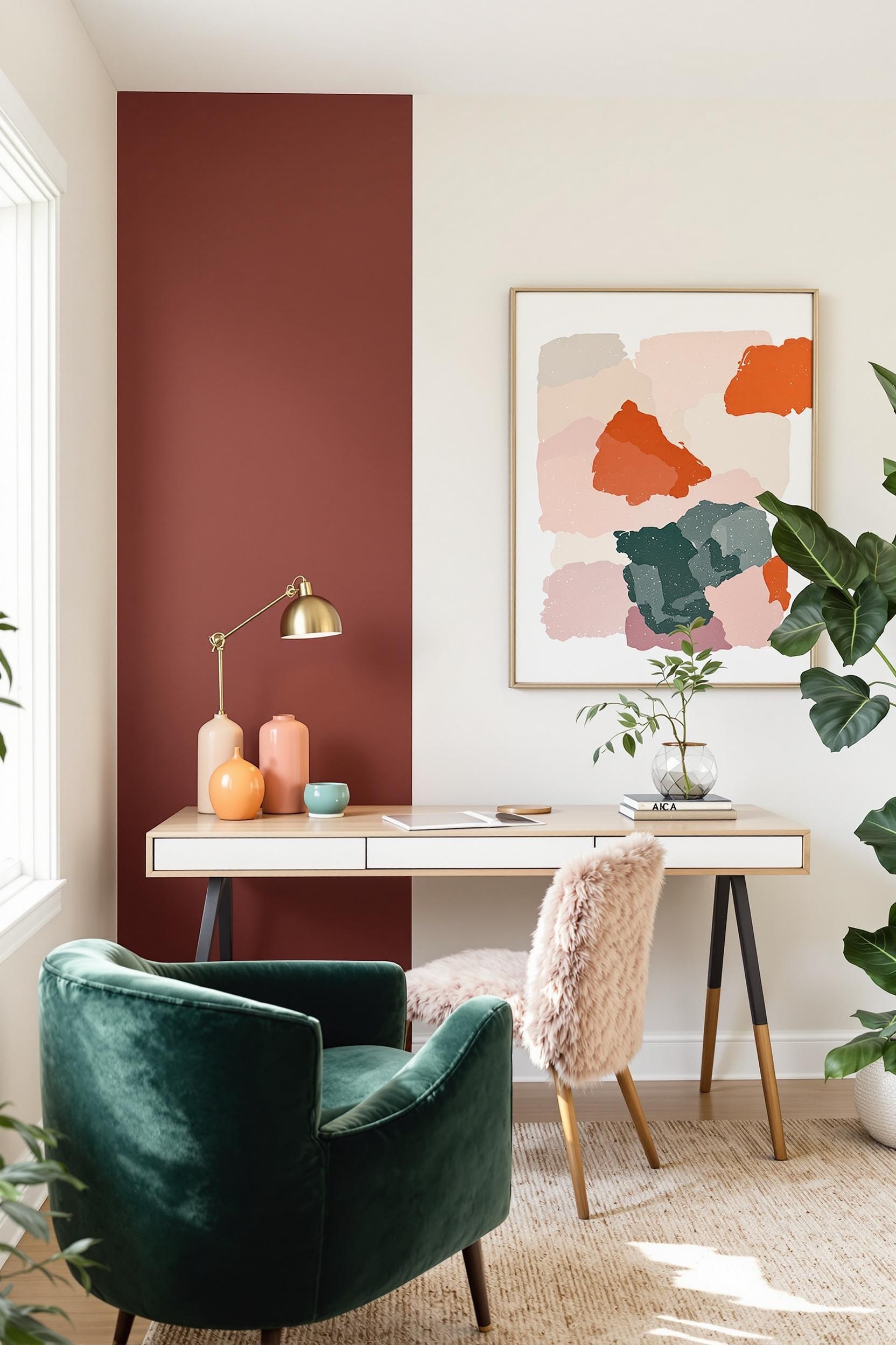
Color blocking is an essential technique in minimalist color palettes. You’ve probably seen bold walls or defined zones that use blocks of complementary shades to energize pared-back rooms. But what takes it a step further—and transforms a space from good to unforgettable—is texture. That means woven throws, velvet cushions, coarse linen curtains, brushed metal, or raw wood. These elements don’t just add depth; they make a home feel richer and more personal.
The Power of Sensory Design: Why Texture is the Game-Changer
Minimalist color block decor doesn’t have to be sterile. In fact, it shouldn’t be. I’ve found that the more I pair neutral walls with textured accessories like chunky rugs or linen pillows, the more the space comes alive. And I’m not alone. Experts agree that textured surfaces increase warmth and energy in minimalist interiors through multisensory engagement.
It’s not just about how a surface looks. It’s also how it feels—soft velvet tones down a bright accent wall, while brushed concrete complements a soft powder blue paint. Architectural psychology shows that our brains crave a mix of sensory input. This explains why smooth white walls alone can feel cold—but layer in a raw wood coffee table, a seagrass rug, and tactile ceramics, and suddenly the room feels grounded and complete. Read more about these design strategies in my post on strategic design transformation.
Creating Texture Zones with Color Block Interiors
In open layouts or smaller living rooms, you might wonder how to create balance. That’s where textured zoning shines. A matte black dining nook wall, for example, becomes the perfect stage for a timber dining table and nubby wool chairs. This defines “zones” without needing physical dividers. As I explore in my article on color zoning magic for open-plan spaces, the key is contrast that aligns in tone but not in texture.
I often recommend pairing color block wall texture concepts with elements like:
- Woven light fixtures against bold painted walls
- Velvet sofas in front of geometric color broken panels
- Matte-and-glossy painted wall combinations
- Neutral rooms with a textured color block tapestry
In compact spaces, layering neutral tones with texture stretches the perceived size. Need ideas? In one recent project, I painted one apartment wall navy but added a woven jute headboard and stone side table to keep things grounded. It’s all about balance between color and material.
Mastering Material Pairings: How to Choose Wisely
Texture works best in contrast. Here are my favorite pairings for color blocking minimalist rooms:
- Matte painted walls with glossy metal décor
- Smooth ceramic lamps paired with chunky knit cushions
- Glass tabletops sitting on textured wood bases
- Neutral linen couches against color blocked ombre walls
These ideas not only offer tactile interest but give the eye resting points. When used properly, a red accent wall won’t overwhelm. Instead, it draws attention to the soft tones and textures throughout the room. For more inspiration, check out my post on bold colors in minimalist spaces—where texture meets vibrance.
Bringing It Into the Bedroom: Softening with Texture
The bedroom is the best place to apply layered, color blocking textured wall paint interior design. Large bold colors can energize too much if they stand alone. Here, I’m a big fan of tone-on-tone texture. For example, a soft blue-gray painted wall combined with a velvet headboard, knotted bedding, and a raw wood frame. Try this technique in your own space or read more in my guide on mastering bedroom color blocking.
Also, consider using textured wall decals, ribbed wallpapers, or even tufted wall panels. These can pair with minimalist furniture in smart ways—like those I describe in my minimalist furniture and color placement strategy.
Small Space, Big Texture Impact
Do you have a studio or condensed floorplan? Textural color blocking is especially powerful here. Use it to organize space visually without sacrificing flow. I once broke up a small entryway with a vertical color block using cream and clay tones—then installed a slate tile shelf that added both function and texture. Learn how to do this for yourself in my tutorial on transforming your entryway.
In your kitchen, try painted cabinet zones enhanced with patterned tiles or matte wood shelves. My post on bold color blocking in kitchens shows how textures in breakfast nooks and cabinets change everything.
Go Vertical: Textures in Geometric Color Blocking
If you’re looking for a bold upgrade, geometric color blocking with texture offers design possibilities like no other. Install rectangular, trapezoidal, or diagonal shapes using wallpaper, contrasting paint finishes, or vertical wood panels. Use these elements to elongate walls or highlight corners. Some ideas I detail in my vertical color blocking guide are perfect for apartments and lofts too.
Want even more adventurous tips? Dive into my piece on maximalist color blocking, where I walk through bolder, textural combinations without ever compromising on intention.
Conclusion: Crafting a Harmonious, Textured Narrative
Designing with textured color block walls and furnishings is more than a trend—it’s a thoughtful, artistic way of living. It lets you communicate warmth, sophistication, and simplicity all at once. You craft a home that looks curated but still feels deeply personal, tactile, and human.
Unlock Your Design Potential: Color Blocking Texture Revolution
Transform Your Space: Expert Design Strategy Revealed
Design should tell your story—not just follow trends. That’s why I created an exclusive newsletter for readers who want to dive deeper into modern color blocking interiors and layered material design.
Why Professional Design Knowledge Matters
Understanding how minimalist color block decor and materials affect how your home looks and feels is vital. My design strategies empower you to:
- Create meaningful, multisensory rooms
- Avoid visual monotony in minimalism
- Develop cohesive designs using texture
Your Exclusive Design Masterclass: Next-Level Techniques
Sign up now to access:
- Advanced color blocking texture strategies
- Tips from interior design pros
- Exclusive styling guides
Unlock Your Design Potential Now!
Why Our Design Community Is Different
Unlike other design circles, my approach blends science, function, and artistry. You’re not just subscribing—you’re stepping into your next design chapter.
Frequently Asked Questions About Color Blocking and Textures
Your Ultimate Guide to Textural Color Blocking Design
Below are the most common questions I receive about using color blocking and textures in minimalist spaces:
Q1: How do I effectively combine color blocking with different textures in a minimalist space?
Start with 2-3 colors. Pair elements like matte walls with shiny tables, or painted surfaces with rough throws. Balance is key.
Q2: Can textural color blocking work in small apartments?
Absolutely! Use vertical color blocking and texture to stretch visual space. Try blending smooth walls with a wooden panel or ceramic side table.
Q3: What are the best texture combinations for color blocking?
Use matte and glossy pairings, soft woven accessories with sleek metals, or glass elements next to rough wood. These add balance without clutter.
Q4: How do I avoid making my space feel cluttered with too many textures?
Limit yourself to 2–3 textures. Choose a neutral base and add contrast with accents. Keep some visual space open for breathing room.
Q5: Are there budget-friendly ways to do this?
Yes! Try pillow covers, tapestries, rugs, or ceramic objects. Focus on quality textures, not expensive renovations. Even peel-and-stick wallpapers can work well!
Bonus Pro Tip: Think about how textures shift in daylight. Matte walls soften morning light, while reflective gloss catches evening glow.
Start curating your space with intention. When color blocking meets texture, your home becomes a masterpiece that doesn’t just look beautiful—it feels like you.


