
Mastering Two-Tone Contrast: A Minimalist Guide to Color-Blocked Interiors
Have you ever stepped into a room and instantly felt energized or calm without knowing why? That’s the magic of two-tone contrast interior design. I’ve spent years exploring how minimalist color blocking in interiors can completely transform a space—without overcrowding it. From studio apartments to open-concept homes, color blocking with contrasting hues adds personality, creates depth, and defines functional zones.
Today, I’ll walk you through the key rules, tricks, and ideas that make this technique both powerful and practical. Whether you’re into bold statements or softer subtleties, two-tone contrast is your gateway to a home that feels modern, intentional, and alive. Let’s explore how color blocking minimalist interiors can bring your spaces to life through shape, color, and balance.
Understanding Two-Tone Wall Color Ideas: The Basics
Two-tone walls use two paint colors to create impactful visuals in a room. But the power lies in how and where you place these colors. I recommend following the 70/30 color rule: use one primary tone (typically a neutral like white, beige, or gray) to cover 70% of the space. The remaining 30% can be your accent color—bold or muted, depending on your vibe. If done right, this creates balance without competing visual chaos.
One of my favorite references is Elle Decor’s spotlight on two-tone wall combinations that revolutionize rooms from ordinary to dramatic. Their example of white walls paired with nautical blue accents illustrates how dual-tone walls can strongly define space while remaining minimalist-friendly.
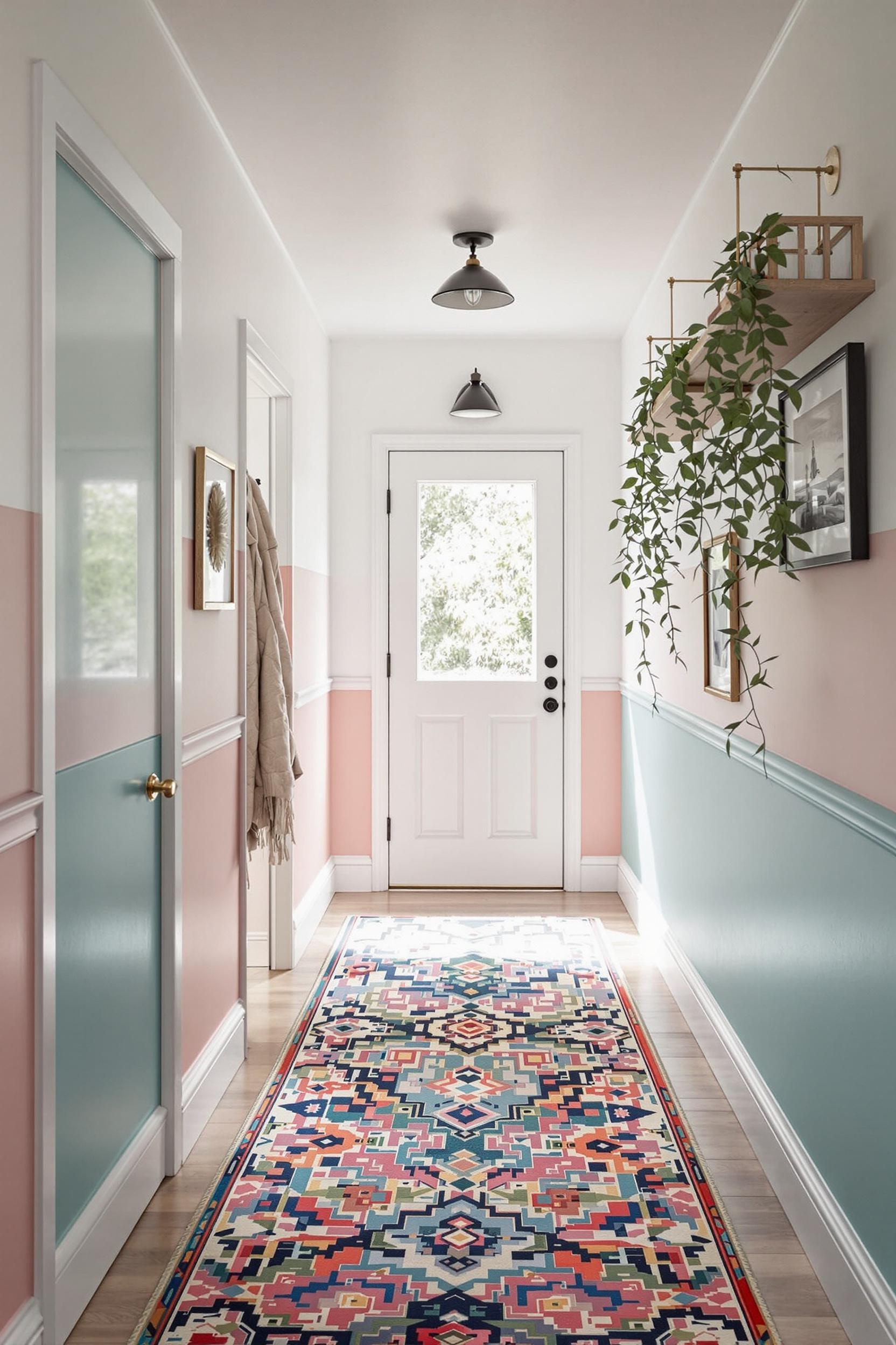
Strategic Color Zoning: Maximizing Small Minimalist Spaces
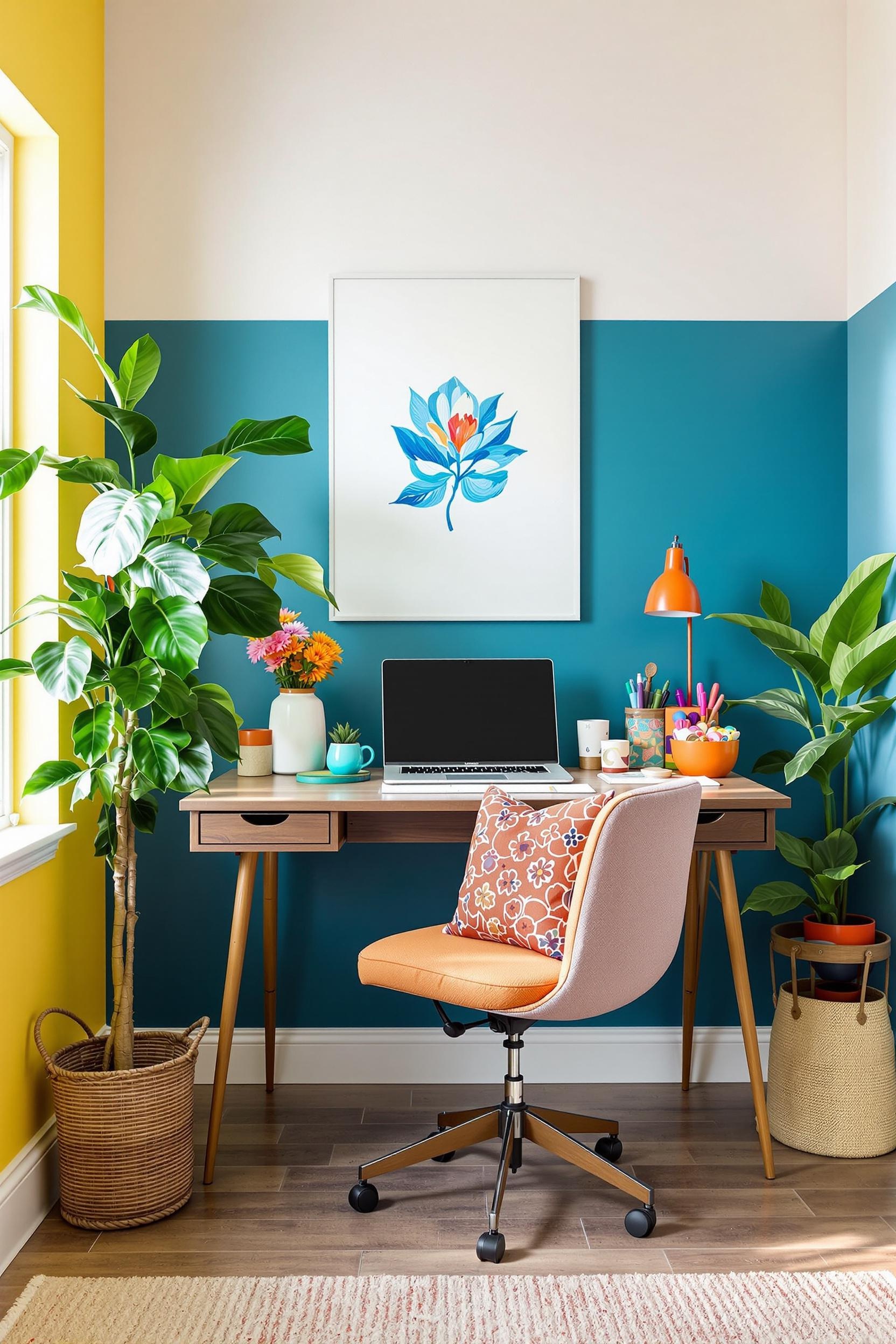
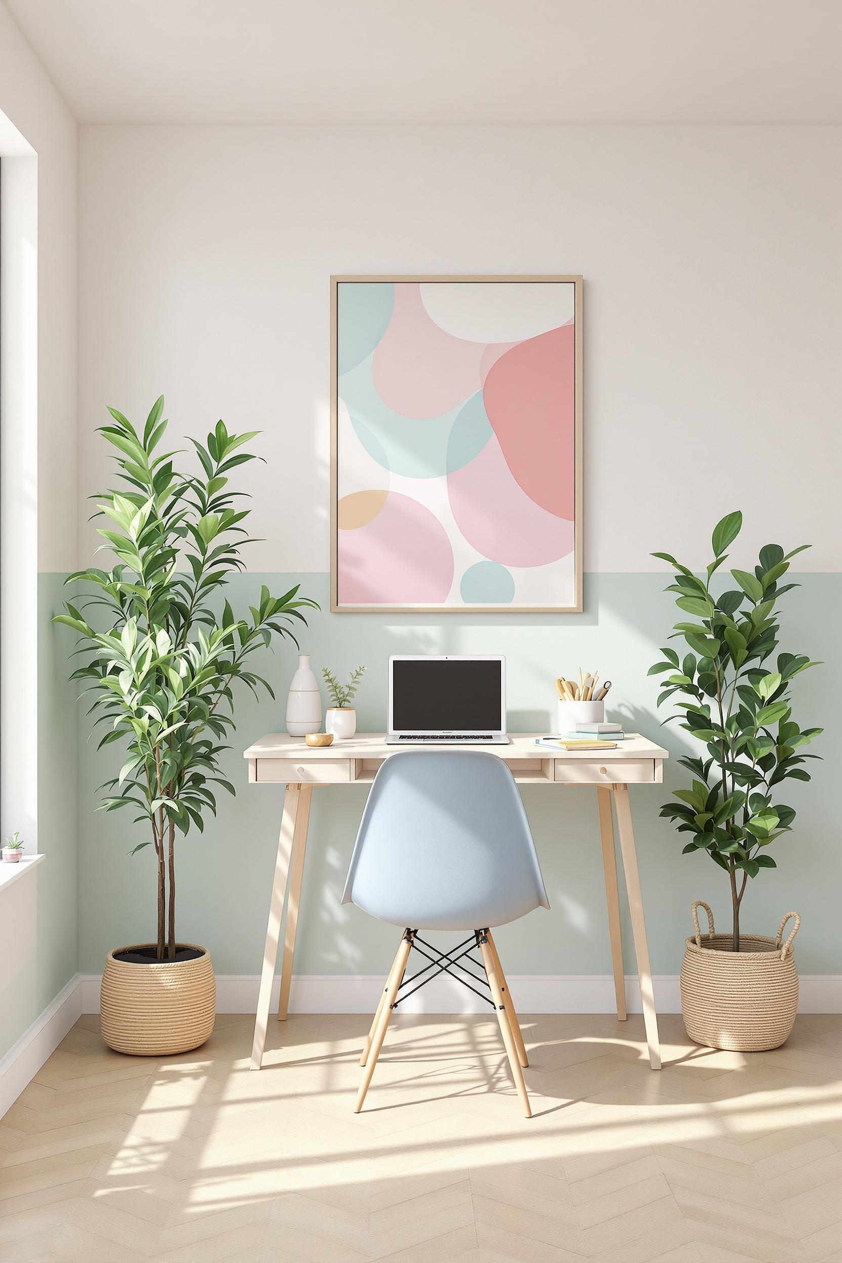
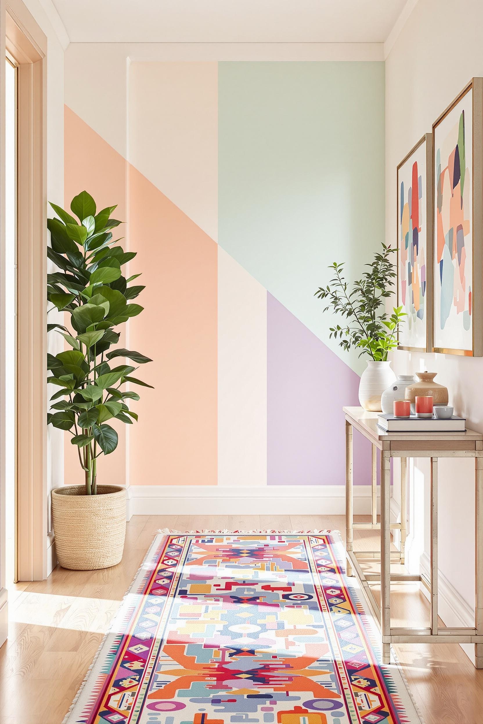
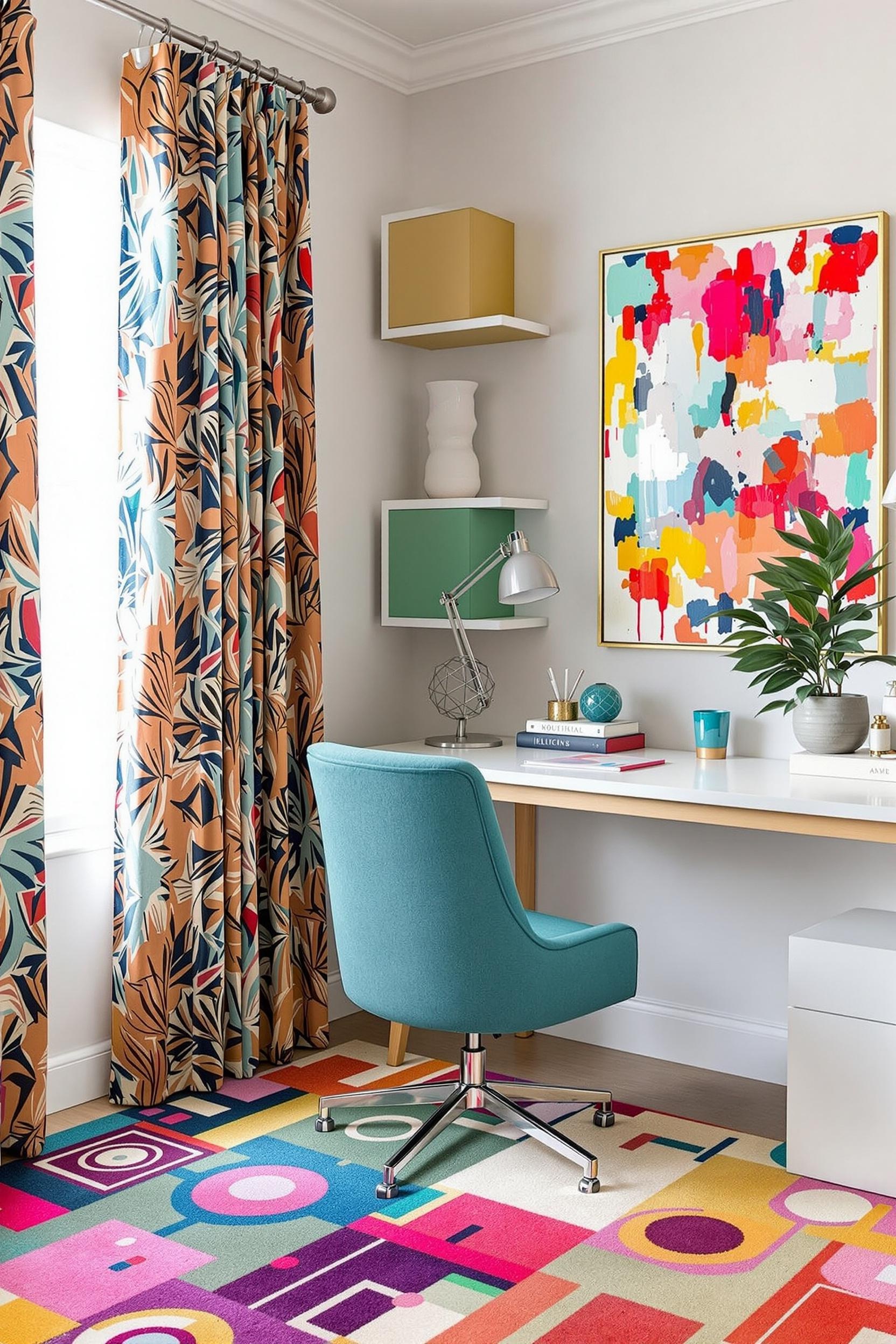
In compact areas like apartments or home offices, two-tone color schemes work magic. I’ve used vertical color blocking techniques that create the illusion of height. Try painting the lower portion of your wall in a darker shade and transitioning into a lighter hue as you move upward. This not only draws the eye up but also makes ceilings seem taller.
For open-concept layouts, I suggest zoning separate areas—like dining and living spaces—with paint rather than walls. This soft division aids function while holding onto openness, a key minimalist trait.
Two-Tone in the Kitchen: Not Just for Walls
Contrast isn’t only for walls. I love applying modern two-tone kitchen cabinet designs where upper cabinets are light and lower ones dark. This grounds the space while keeping the overall design airy on top. A great example is this Color Blocking Kitchen Guide where bold and neutral pairings bring warmth and structure into minimalist layouts.
Play with textures too—mix matte finishes with glossy or pair painted wood against metals. Let your cabinetry do the heavy lifting in adding character to your kitchen, without cluttering with added décor.
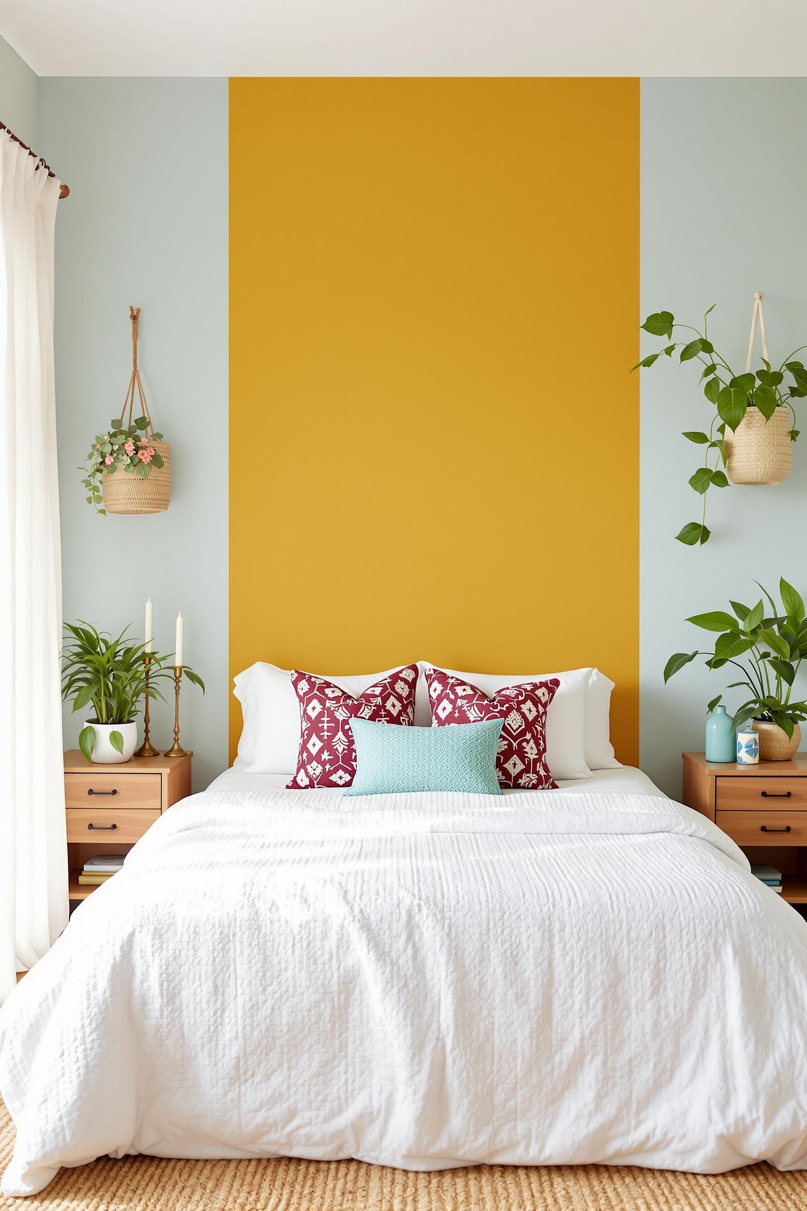
Minimalist Two-Tone Wall Paint Ideas for Bedrooms
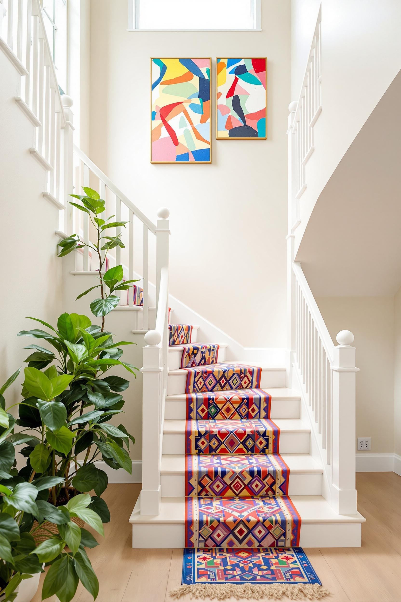
Bedrooms are sacred spaces, so the key is balance. To keep it minimal while introducing style, I used two-tone wall ideas for headboards by painting just the area behind the bed in a darker tone. This creates instant depth. Popular bedroom palettes I recommend include soft sage and blush or charcoal and pale beige.
If your aim is subtle elegance, explore pastel color blocking, which brings warmth without noise. These muted tones help enhance relaxation and are more forgiving in small spaces.
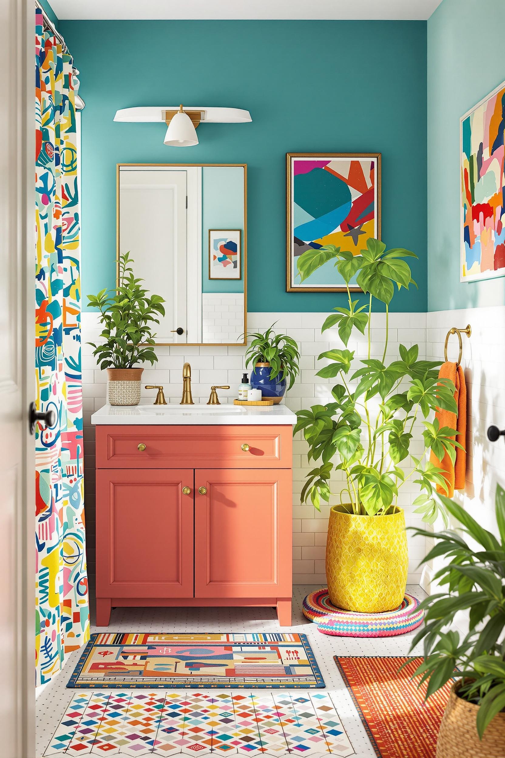
Two-Tone Bathroom Design: Clean Meets Character
Bathrooms often get overlooked, but they can really benefit from a minimalist two-tone bathroom design. Use bold color blocks on wall tiles, vanities, or even baths to strike contrast against bright walls. This is an especially impactful choice in rental homes where permanent modification isn’t allowed. Try peel-and-stick tiles or painted vanity accents like I did in this bathroom design transformation.
The Psychology Behind Two-Tone Color Schemes
Contrasting colors do more than look good—they feel good when placed right. Research supports that dark bases (like navy) with light tops (like ivory) give a spacious, grounded feel. According to The Nord Room, transitioning from deep base tones to lighter uppers can “lower” high ceilings or make walls recede, fostering openness.
Want drama? Choose high-contrast combos like navy and white. Want calm? Go low contrast with sage and warm taupe. In my neutral meets vibrant strategy, I discovered that using transitional hues boosts flow. This trick softens the shift between two tones and makes spaces feel cohesive, not choppy.
Color psychology also suggests that each tone affects mood. For instance, sage green enhances calmness, while terracotta brings warmth and passion. Why not use this science to design spaces that speak to how you want to feel every day?
DIY Color Blocking: Start Small, Dream Big
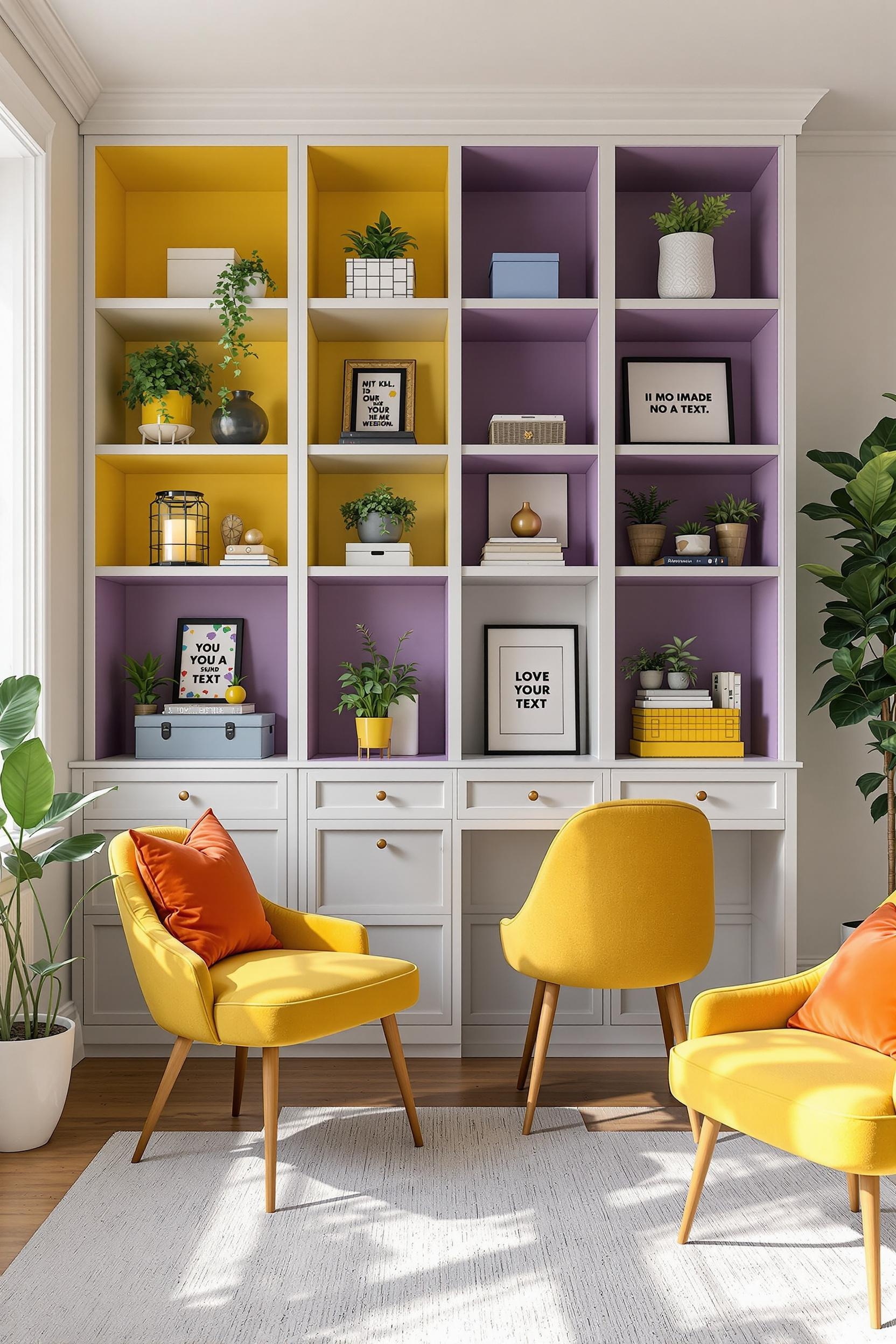
Don’t let fear stop you from getting creative. DIY two-tone wall upgrades are totally doable. I usually start by taping off a color block, giving myself a clean edge. Try painting a accent corner wall or a framed rectangle behind a bookshelf. These micro-blocks add visual rhythm without overpowering the calm.
Color blocking furniture is also trending. For example, check out how a sideboard or modular shelf with two contrasting tones can break up monotony. Small upgrades like two-tone drawers or painted room dividers create a punchy, designer look with minimal investment.
Conclusion: Transforming Your Space with Two-Tone Contrast Mastery
Throughout this journey, we’ve explored how two-tone contrast in interior design transforms bland spaces into expressive environments. Whether it’s a carefully painted wall, split-tone cabinetry, or a bold furniture upgrade—the power lies in intentional color placement.
To recap the essentials:
- Follow the 70/30 rule for balanced impact
- Use color zoning to define space functionally
- Leverage color psychology to influence mood
- Use digital planning and testing tools for smart execution
Minimalism isn’t about lack of color—it’s about thoughtful choices. Two-tone design adds complexity while still following minimalist rules.
Transform Your Home: Minimalist Color Blocking Starts Here!
Your Ultimate Guide to Two-Tone Design Transformation
Color blocking isn’t just about aesthetics—it’s a mindset. If you’re ready to embrace it, here’s how:
Unlock Your Design Potential: Personalized Color Blocking Strategies
For small homes, vertical contrast adds vertical lift. Stick to similar saturation levels. Keep your accent zones to one or two surfaces, like behind a bed or on lower cabinets.
Before painting, use apps like Benjamin Moore’s Color Portfolio to preview combinations. I always test colors digitally and then paint swatches before committing.
Mastering the Color Blocking Learning Curve
Design is a journey. Mistakes are part of growth. Learn what works and what doesn’t. Stay focused on mood, simplicity, and accurate placement. Your aesthetic is about who you are more than the trend you follow.
Design Your Dream Space: Take the First Step Now!
Get weekly color blocking ideas and tips by signing up for my newsletter!
Unlock Your Color Blocking Potential
Sign up now and grab the free “Minimalist Color Blocking Starter Guide” – a $47 value – to jumpstart your transformation!
Your Color Blocking Community Awaits
I’d love to see your transformations! Join our community to exchange ideas and grow together. Remember, modern two-tone home transformation begins with confidence and curiosity.
Frequently Asked Questions: Mastering Two-Tone Contrast in Minimalist Design
- How Do I Choose the Right Colors for Two-Tone Contrast?
Stick with 70% neutral and 30% accent color. Pick tones with matching undertones. Use digital tools for testing. - Can Color Blocking Work in Small Spaces?
Yes! Vertical blocks and strategic accents can expand the space visually. - Biggest Mistakes to Avoid?
Beware of too many colors, ignoring lighting, and clashing undertones. Simplicity wins. - How Do I Know If My Combo Works?
Use mood boards, samples, observe in morning-night lighting, and trust your instincts. - Is It Expensive?
Not at all! Paint is cost-effective. DIY blocking tools like painter’s tape help achieve polished looks affordably.
Need a nudge? Read more about smart minimalist palettes here: Neutral Foundation & Vibrant Details.
Ready to Start?
Sign up now and begin your personal transformation journey through minimalist color blocking!


