
Vertical Color Blocking Walls: Transform Your Space with Bold Design Techniques
Have you ever walked into a room and instantly felt drawn in by the color and balance? That’s the magic of vertical color blocking walls. It’s one of the most effective ways to add character and dimension to a space without filling it with clutter. As an interior designer who loves minimalist interior color blocking, I use this technique to bring personality to rooms while keeping things clean, simple, and vibrant.
Whether you’re working in a cozy apartment or a large, open-concept home, vertical color blocking can reshape how you view and experience space. It uses vertical panels, lines, or stripes of color—not just to style walls, but to transform the energy and flow of a room. With two-tone vertical wall designs or subtle transitions, this method adds height, depth, and personality with just a few paint strokes.
In my projects, I often see how vertical accent walls color blocking reshapes spatial perception. Want your room to feel taller? Try lighter colors at the top and darker shades below. Need to divide areas in an open room? Use two complementing colors placed vertically to define zones without using a single wall or piece of furniture.
Understanding the Power of Vertical Stripes in Interior Design
Why Interior Design Vertical Stripes Work So Well
What I love most about interior design vertical stripes is their flexibility. They help solve practical challenges while enhancing a room’s look. Vertical lines and color variations can make low ceilings feel taller and tight spaces seem wider. That’s especially useful in city apartments, small bedrooms, or entryways.
I usually recommend starting with just two or three shades. It keeps things clean and focused. With color blocking minimalist design ideas, simplicity is key. Bold doesn’t mean busy. Pairing soft cream with terracotta or navy with light gray keeps things balanced and adds visual drama without overwhelming the space.
The right placement and scale of your blocks matter, too. Thin vertical lines add rhythm. Broader blocks make a bold statement. Use them to highlight features like tall windows or a nook, or even to make a simple hallway pop.
The Psychology Behind Vertical Contrast Wall Painting
How Colors Change Mood and Perception
One of the biggest lessons I’ve learned in design is that color influences how we feel in a space. According to studies on color theory and environmental psychology, the placement and tone of colors can create feelings of calm, energy, intimacy, or focus.
Vertical contrast wall painting, in particular, guides the eye upward, adding an uplifting mood while shaping how we emotionally engage with a space. A warm hue like mustard or rust grounded at the base adds coziness. A neutral or cooler shade near the ceiling lightens the mood. Combining the two gives you warmth and airiness all in one design.
That’s why I often use this in small space designs. Rooms feel bigger and more open, but still grounded and inviting. It’s a trick that works wonders and supports both the emotion and function of the home.
Design Tip: Consider Lighting and Color Tone
Light plays a huge role in how your colors will look. Natural light brings out soft contrasts, while artificial lighting may deepen saturation. Before painting a full wall, try swatches throughout the day. This is especially helpful when working on vertical color design for small spaces, where coloring mistakes are immediately noticeable.
Using Vertical Color Blocking in Different Rooms
Modern Interior with Vertical Stripes in Every Space
Each room in your home serves a different purpose, so your use of modern interior with vertical stripes should reflect those needs:
- Living Room: Two-tone vertical wall designs anchor large spaces. Use contrasting shades to create a focal point or define conversation zones.
- Bedroom: Soft vertical panels enhance calmness. Cool blues or greens work well here, soothing the mind and promoting rest.
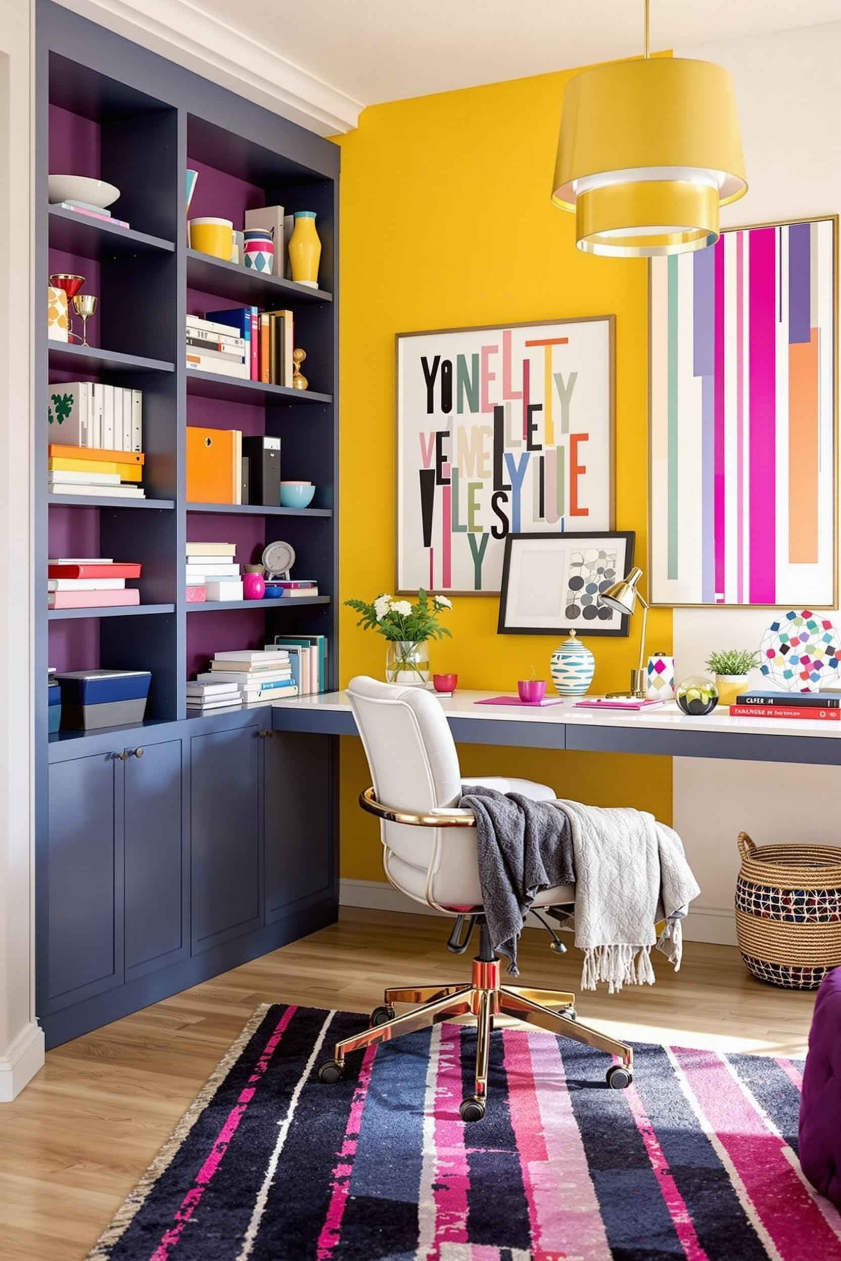
- Home Office: Try bold, energizing shades like deep teal or mustard. Vertical blocks behind or beside your desk increase focus and creativity.
With a few brush strokes, you can add stunning architectural presence without touching the structure. I love pairing minimalist home color block ideas with cozy textures like linen or wood for depth. And when in doubt, neutrals framed with narrow black or charcoal vertical stripes never disappoint.
Crafting Your Unique Style with Vertical Blocks
Getting Started with Color Blocking Minimalist Design Ideas
Start with colors you love, and scale from there. Think about how you want to feel in the room. If you’re seeking peace, opt for gentle blues or soft taupes. Want energy and playfulness? Look to coral or chartreuse. Then decide where the blocks should go—centered on a wall, wrapping corners, or framing key furniture.
Balance is essential. With color blocking minimalist design ideas, every line, edge, and tone matters. This doesn’t mean the space has to look rigid—it just means each element should feel intentional.
Also, think beyond paint. Vertical color blocking can be done using textured wallpaper, wood planks, ceramic tiles, or fabric wall panels. These are excellent additions when going for vertical accent walls color blocking in more tactile or cozy designs.
Vertical Color Design for Small Spaces: Small Scale, Big Impact
In snug spaces, every visual detail counts. That’s why vertical color design for small spaces is so powerful. Small rooms often lack architectural details. But by strategically using color stripes or half-walls, I give these rooms structure and drama—without bulky furniture or fixtures.
Paint a single narrow stripe that pulls the eye up to visually “lift” a ceiling. Frame a bookshelf with two contrasting vertical bands. Or divide wall space in thirds with vertical panels in muted tones. These elements are visually stimulating but still streamlined—exactly what minimalist interior color blocking aims for.
Remember, design is personal, and your space should tell your unique story. By subscribing to our newsletter, you’ll unlock a world of design possibilities that will inspire and empower you to create spaces that truly reflect your personality.
Frequently Asked Questions About Vertical Color Blocking
What is vertical color blocking in interior design?
It’s a design technique that uses vertical panels or stripes of color to add depth and definition to flat surfaces. It’s most popular for walls but works on furniture and architectural features too.
How can I use it in small spaces?
Use lighter neutrals in narrow vertical stripes to make rooms feel taller. Stick with 1–2 soft shades to avoid crowding the space visually.
Favorite color combinations for vertical blocking?
– Soft sage + warm cream
– Navy + light gray
– Terracotta + off-white
– Pastel blue + beige
– Emerald + taupe
Is this a DIY-friendly method?
Yes! With painter’s tape, a level, and patience, you can create clean, crisp blocks. Start with a base coat, measure carefully, and tape off your vertical sections before painting the contrast shade.
How does it change room perception?
It boosts ceiling height visually, defines subtle zones, adds movement, and brings structure to open layouts.
Where does it work best?
Try it in:
– Living rooms
– Home offices
– Bedrooms
– Entryways
– Dining nooks
What’s a minimalist option?
Use muted colors, narrow stripes, and clean lines. Keep the palette limited and avoid extreme contrasts.
Can I use other materials?
Yes! Wood slats, wallpaper stripes, ceramic tiles, or textured fabric and matte finishes all work well in modern interior with vertical stripes.
How do I pick the right colors?
Test swatches in your space. Use the color wheel to find complementary shades. Choose hues that align with existing interiors and how much light the room


