
How to Use Color Blocking in Interior Design: A Minimalist’s Guide to Bold Beauty
Have you ever walked into a room and felt instantly uplifted—or uncomfortably overwhelmed—by its colors? That’s the power of color psychology at work. As an interior designer who adores modern, eclectic styles, I love using color blocking interior design techniques. It helps me bring emotional depth and structure into minimalist spaces using purposeful pops of color.
In today’s modern interiors, color blocking is more than a trend—it’s a transformative design strategy. Whether you’re living in a tiny studio or a multi-room home, this technique uses blocks of contrasting or complementary colors to create visual balance, define areas within a room, and make your space feel exciting, yet intentional.
Color Theory in Action: Why Color Blocking Changes Everything
Minimalist color block interiors rely heavily on color theory. Complementary colors (like blue and orange) pop with energy, while analogous palettes (like blue and green) soothe the eye. For those looking to break out of a monotone space without creating chaos, this technique offers the perfect balance.
Studies show that only 11.3% of design lovers prefer vibrant schemes, so if you’re among the majority who lean minimalist, the key is to find your contrast carefully. Neutrals like white, beige, or charcoal make the ideal backdrop to express bursts of color while maintaining calmness and order in your space. If you’re looking for inspiration, check out this post on using bold colors in minimalist homes.
Designing With Emotion: The Psychology Behind Color Blocking
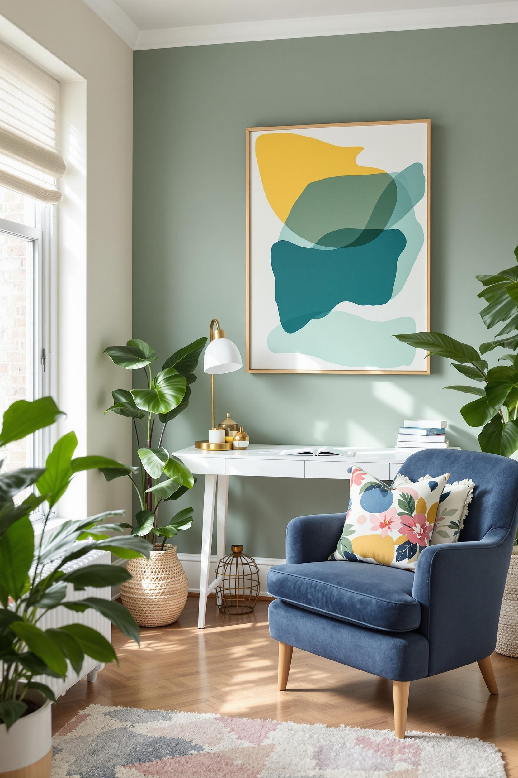
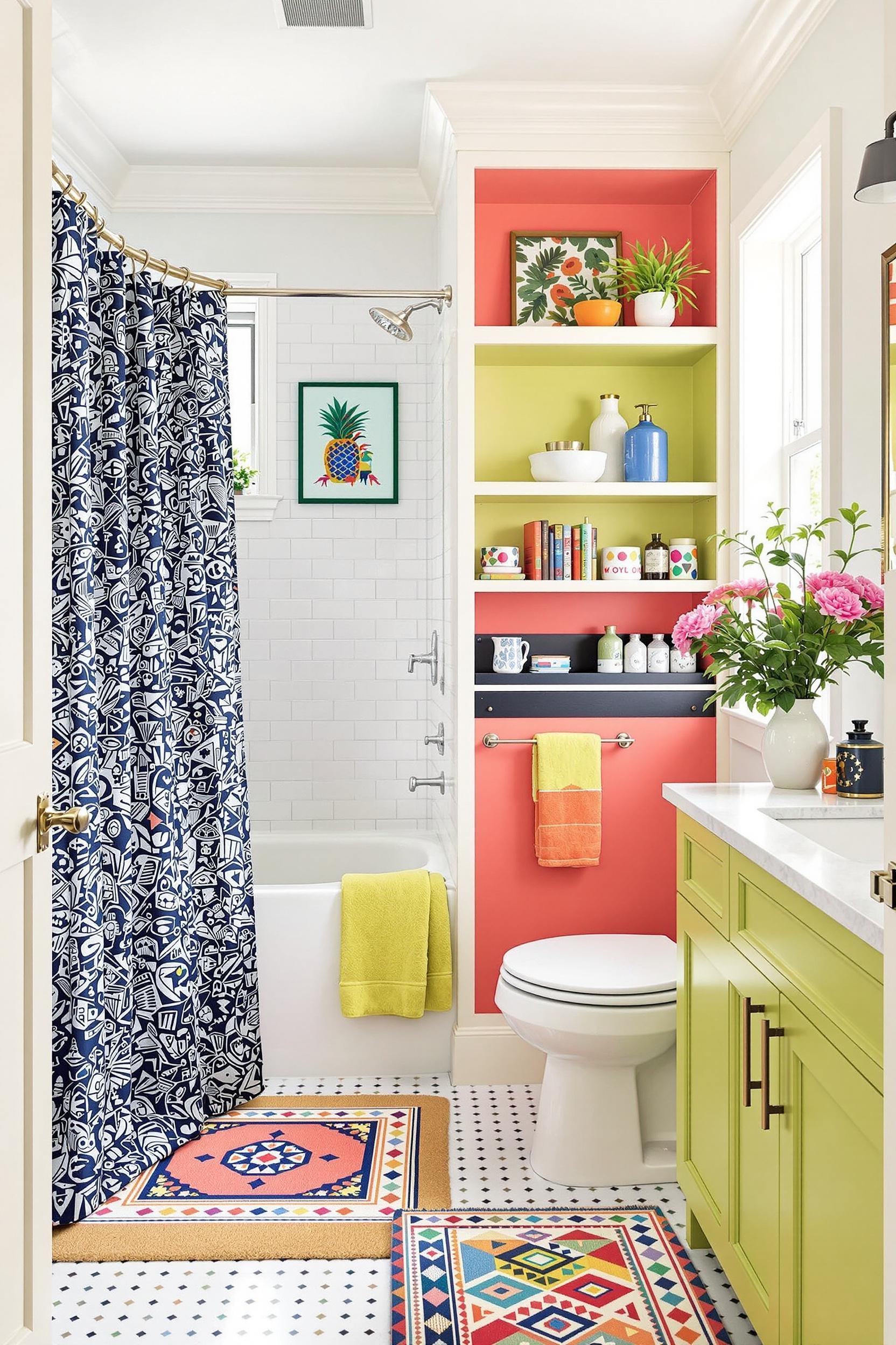
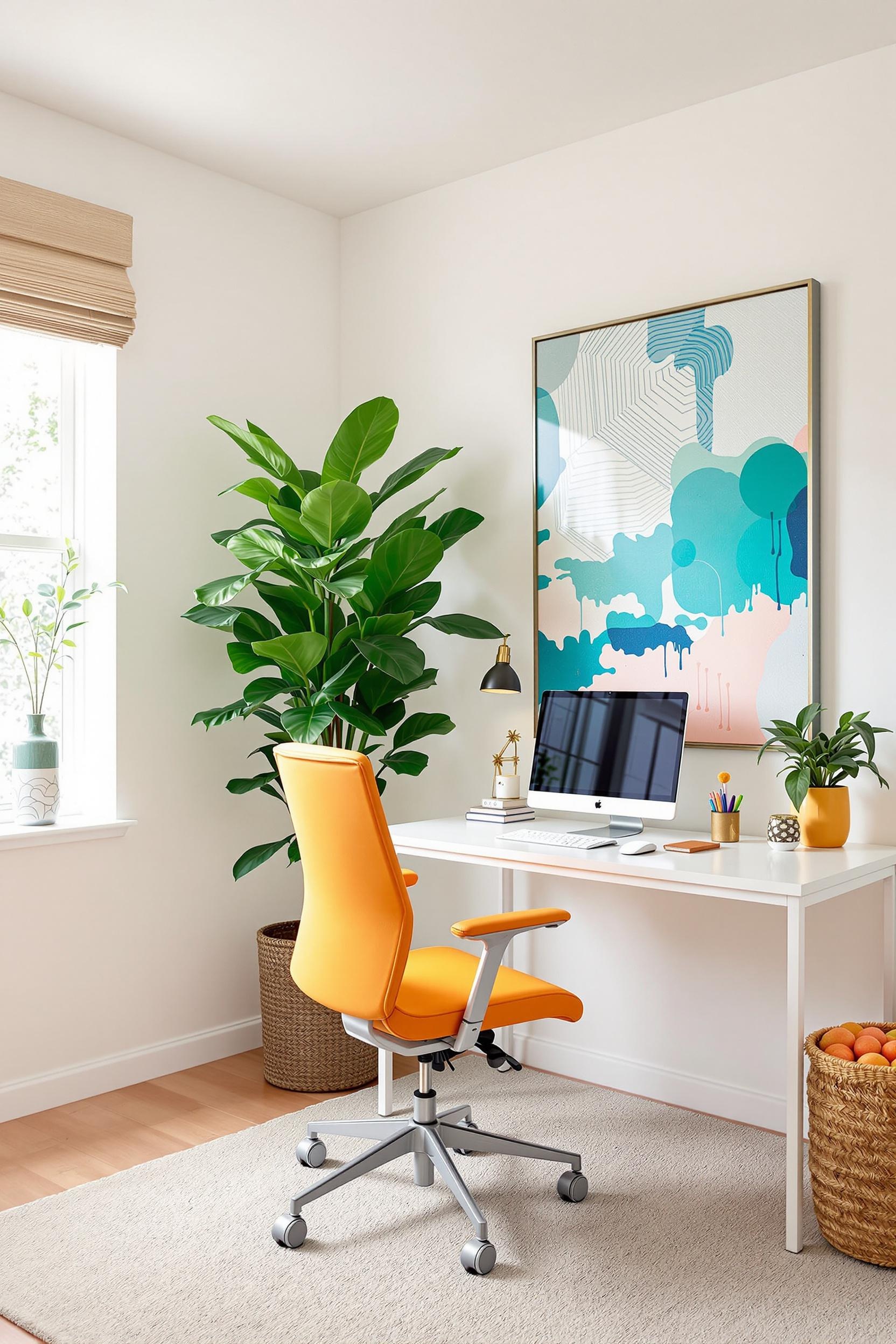
Colors communicate feelings. Deep shades like navy or forest green calm the mind, while terracotta and mustard yellow bring warmth and energy. I use this concept deliberately in every room. In a home office, for example, I often recommend a soft sage green block on the back wall to boost focus. Then I add a mustard yellow pop—perhaps in artwork or a chair—to inspire creativity. For deeper insights on color psychology, take a look at this APA article, which explores environmental impacts on emotion.
Minimalist Color Blocking Techniques: Balance Simplicity With Substance
Here’s how I guide my clients in modern color blocking:
- Neutral Foundation: Start with white, beige, or warm gray walls.
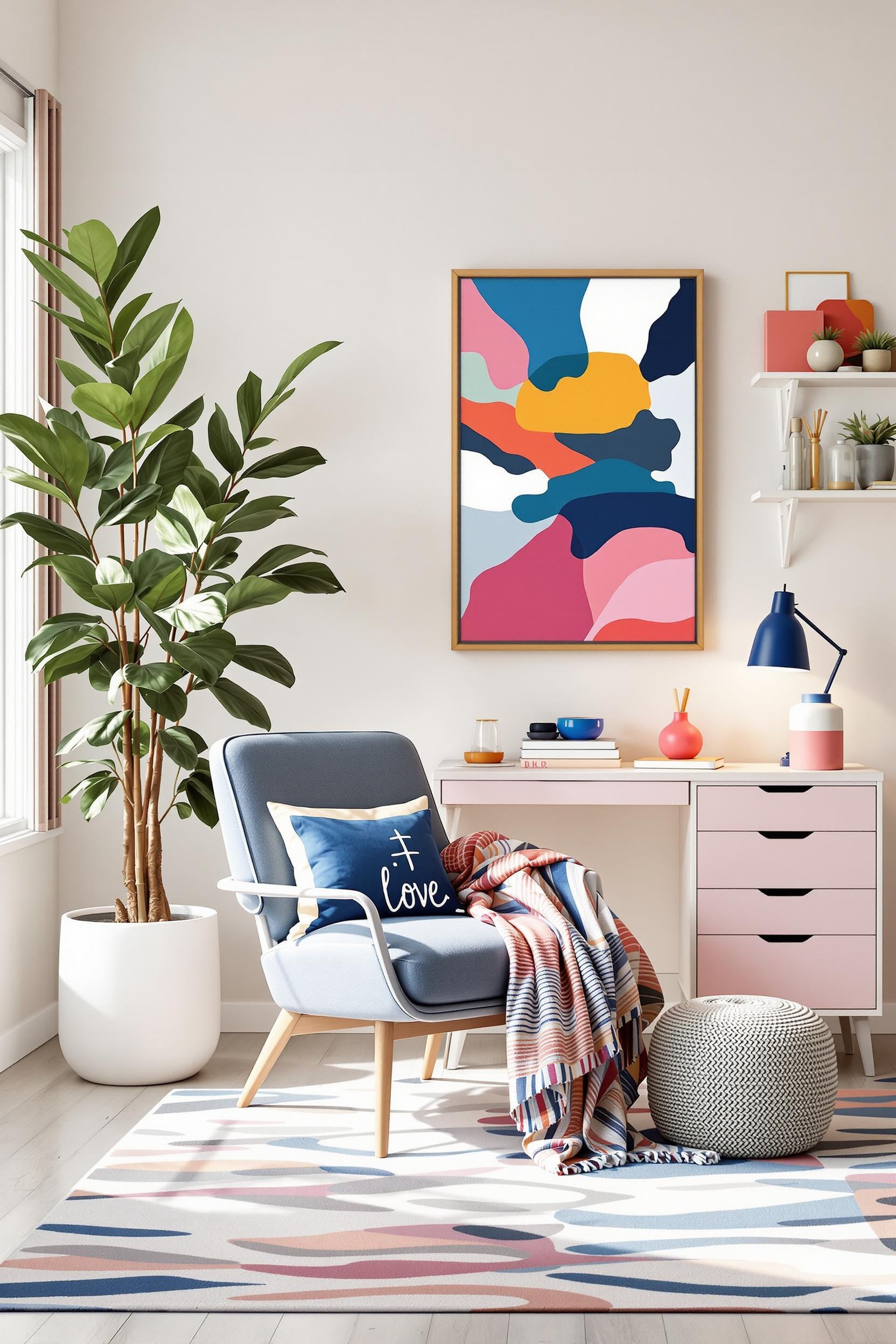
- Add 1–2 Bold Colors: Choose complementary tones with clear intent. For example, navy blue with rust orange, or mint green with blush pink.
- Keep Geometry Clean: Stick to rectangular blocks or organic arches—both work, but be consistent.
- Limit the Palette: Two to three colors are usually sufficient for a strong, modern interior design statement.
To explore how to apply these ideas to accent walls, visit this DIY guide that walks you through color block walls step-by-step.
Color Zoning: Divide and Conquer Without Walls
One of my favorite tricks as a designer is using color blocking to define zones. This is especially useful in open-concept layouts. Imagine a beige living room with a color-blocked coral section marking a dining nook, or a soft emerald green wall separating a cozy reading corner. The space becomes layered and purposeful without introducing bulky dividers. If you’re working with an open layout, don’t miss this guide to color zoning for open plans.
Texture Matters: How Color and Texture Work Together
Color blocking isn’t just about color—texture adds another dimension. A matte deep blue wall absorbs light differently than glossy teal cabinetry. Velvet, linen, brushed metal—all these materials affect how we perceive color.
When I suggested an emerald velvet chair paired with a matte pastel yellow wall to a client, the room instantly gained depth. Combined finishes can elevate even the smallest block into an eye-catching feature. Explore more texture and color tips in this texture magic guide.
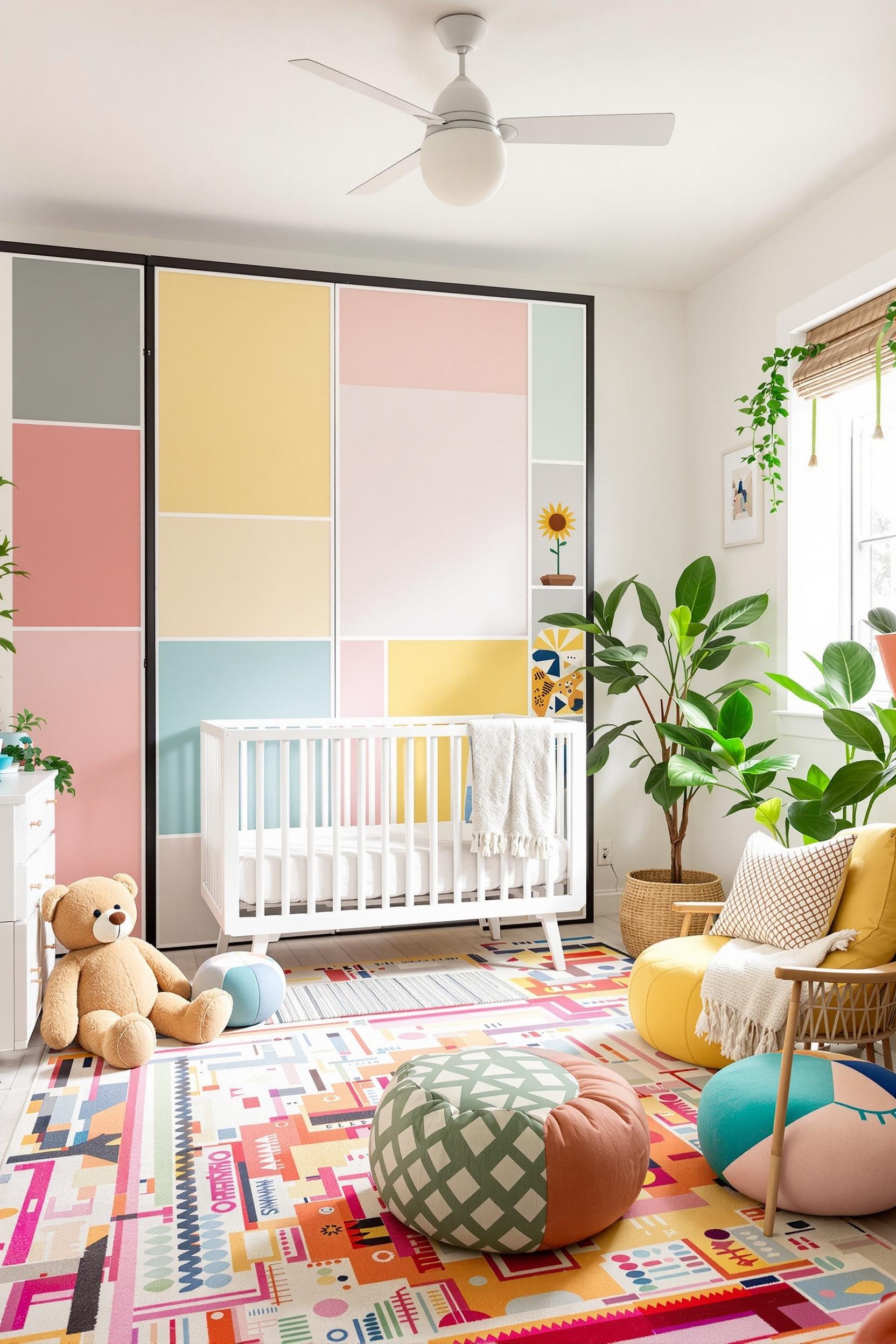
Using Furniture as Color Blocks
Color blocking doesn’t have to live on walls. Furniture is a powerful tool for injecting color without painting. Think bold sectionals, vividly painted chairs, or bi-color bed frames. For detailed ideas, visit this post on color block furniture.
Not only does this approach break up bland areas, it also keeps things flexible. Many clients who rent love this solution since painting isn’t always allowed. Want a no-commitment way to experiment with form and function? Try including bright accent rugs, throw pillows, or curtains in vibrant shades—as discussed in my curtain and rug styling post.
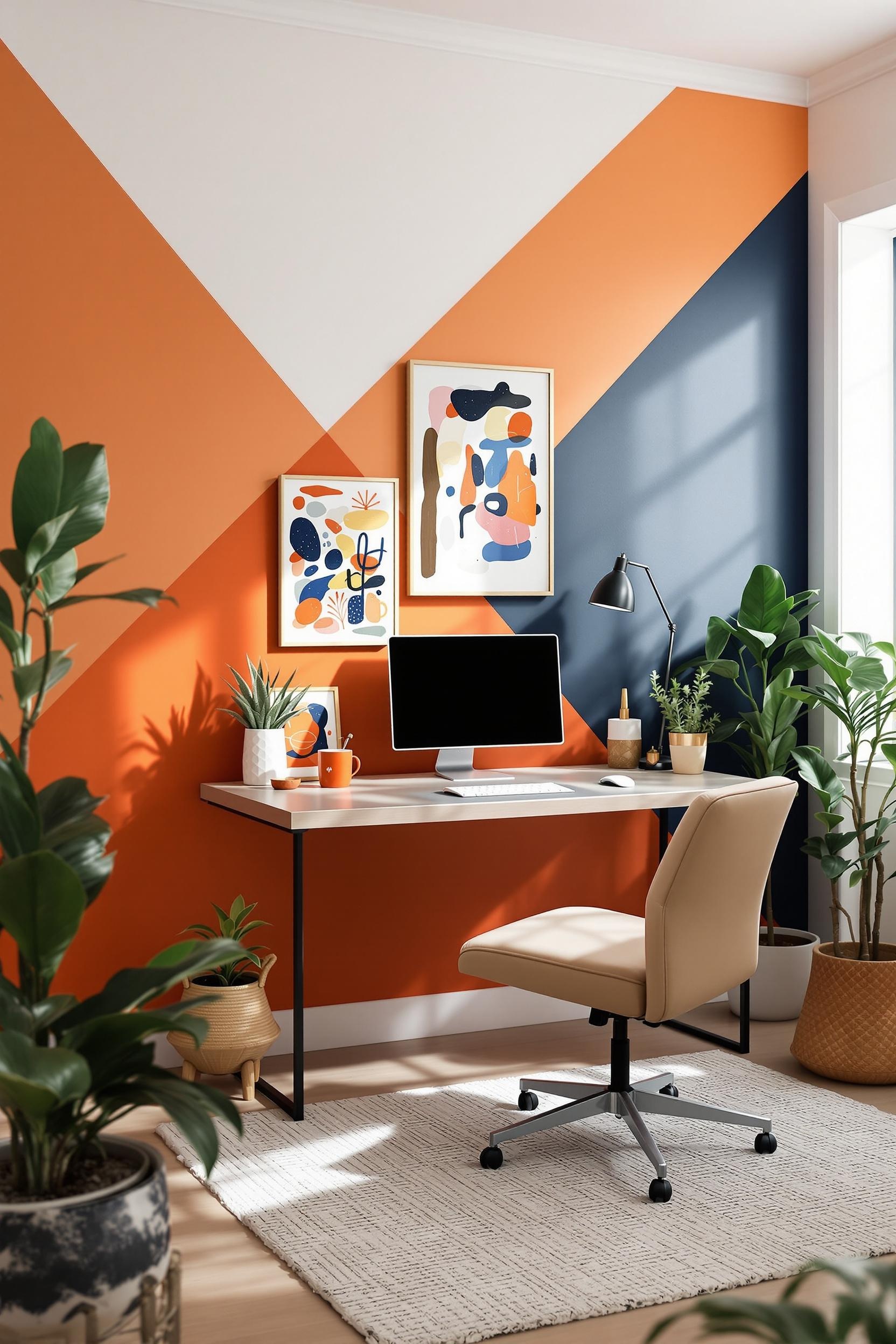
Geometric Color Blocking for Visual Impact
Want something more daring? Use geometric color blocking paint ideas to create drama. Triangle accents behind a bed, vertical lines extending from ceiling to floor, or circle motifs can reshape how a space feels. To take your designs to the next level, check out geometric secrets for bold block design.
Strategic Placement Tips for Small Rooms
For small spaces, it’s all about precision. Color blocking can expand walls visually or create zones where there were none. Pairing lighter tones with bold verticals helps height and space feel enhanced. Here’s how to use color blocking to make a room feel larger.
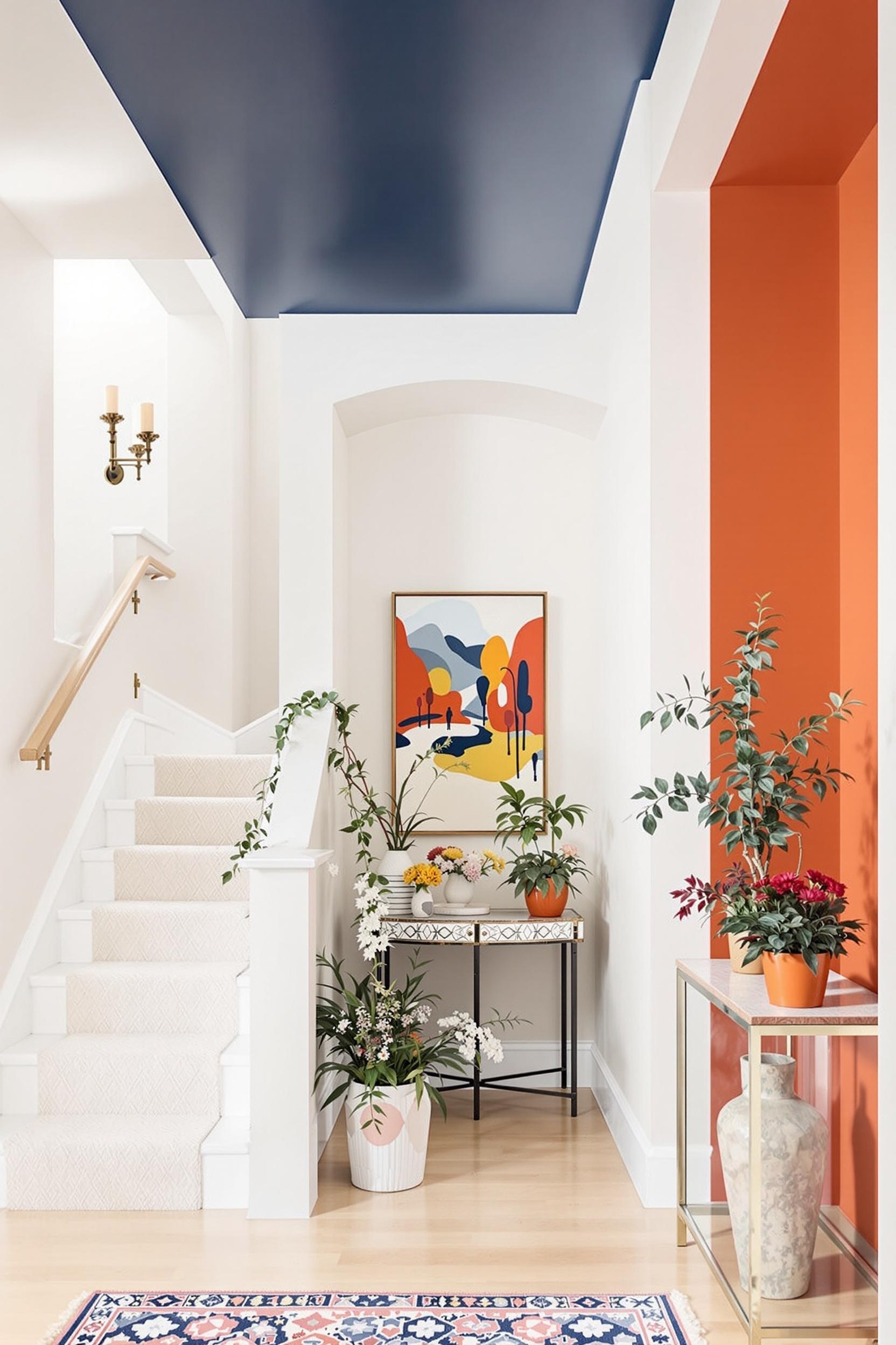
Also, don’t underestimate the power of the ceiling! A color-blocked ceiling in muted slate or lavender can make the whole room feel intentional and styled top to bottom. Learn more from my detailed guide on transforming ceilings through color.
Advanced Color Blocking Strategies for Serious Style
Once you’ve mastered the basics, it might be time to experiment with advanced strategies like applying color blocking to architecture, lighting, shadow lines, and wall trim.
Use bold hues to highlight built-in shelves or frame a doorway. In open homes, it helps guide guests visually through functions without ever saying a word. Take a closer look at this approach with room divider strategies that use color as separation.
Transform Your Home: Color Blocking Design Resources Await!
Color blocking is more than a design trick—it’s a lifestyle shift. Here’s how to continue your journey:
Unlock Your Design Potential: Free Color Blocking Masterclass
Learn how to:
- Use geometric shapes to define rooms
- Pick palettes that work with minimalist styles
- Use color to guide focus and flow
Explore minimalist color blocking techniques
Personal Color Consultation
Want a one-on-one color blocking blueprint designed by a pro? I’ll help you create:
- Custom color schemes
- Furniture-based color blocking
- Texture-enhanced design strategies
Stay Inspired: Join Our Design Community
Sign up to get:
- Color blocking trend reports
- Exclusive designer tutorials
- Tips customized for your interior goals
JOIN OUR COLOR BLOCKING COMMUNITY
Design with intention—begin your colorful transformation today.
Frequently Asked Questions (FAQs): Mastering Color Blocking in Interior Design
What Exactly is Color Blocking in Minimalist Interior Design?
It’s the use of large, solid color areas to define sections of a room. In minimalist spaces, it’s used to add visual interest and emotion while keeping clutter low.
How Many Colors Should I Use in a Color Blocking Design?
Two to three is ideal. Start with a neutral and add a pop or two. Learn more about neutral foundations with vibrant accents here.
Can Color Blocking Work in Small Spaces?
Absolutely! It helps add structure and can actually expand the feel of a small room. See more strategies at this color blocking guide for small rooms.
Is Color Blocking Expensive?
No! It can be done with just paint, removable wallpaper, or even bold curtains and rugs for renters.
How Do I Choose Colors That Work Together?
Use the color wheel. Complementary colors catch the eye, while analogous ones calm the mood. More on minimalist palettes here.
Ready to Start Your Color Journey?
Color blocking lets you express creativity and function in your living space. Whether you’re experimenting with furniture, painting color block walls, or jazzing things up with bold accents, there’s no wrong way to begin.
Sign up today and start getting inspiration straight to your inbox!


